


BadSeed84
-
Posts
3,647 -
Joined
-
Last visited
-
Days Won
1
Posts posted by BadSeed84
-
-
Why was Duke playing the Browns earlier?
-
 5
5
-
 9
9
-
 1
1
-
-
14 hours ago, MCM0313 said:
I dunno. I think the navy blue one is still a contender for worst ever. The white was always the lesser of two evils for me.
I felt the opposite, the white one's look like Arena Football League uniforms even more so.
-
2
-
-
-
1 hour ago, 5ss22 said:
Definitely looks nicer in this picture, but it would still be better if it just said Philadelphia or really anything besides city of BROTHERLY love.
My thoughts too, just one word has the tacked city of. & love look bad.
-
1
-
-
5 minutes ago, PlayGloria said:
Wow that is something I did not know. Honestly, that's even more bizarre than the piping and the hem stripeless jersey. What in the world was going on over at Reebok during that time?

-
1
-
3
-
-
1 hour ago, infrared41 said:
This is the better Brownie logo.
I wish they went with this at mid-field instead of the "talk to the hand" logo
-
1
-
1
-
-
5 hours ago, BBTV said:
The Jets green jerseys are closer to what the Eagles wore in the '80s-'95 than the Eagles new throwbacks are.
Coulda just used that fabric and saved people lots of headaches.
I'm finally getting the jersey I ordered July 31st this week.
-
2
-
-
They selling steaks now?
I fear the next time they change because it gets worse each time.
-
1
-
-
17 hours ago, VDizzle12 said:
Bingo.
This logo is so terrible on so many levels. It only lasted a few years, which ended up being the only time in my life I actually watched wrestling. I just assumed it was supposed to be some abstract symbol. Literally never noticed the WCW for the longest time. So not only does it look incredibly stupid, I wonder how many people actually noticed the letters.
WCW was already losing steam by then but that logo change really signaled the point of no return for them to me.
-
2
-
1
-
-
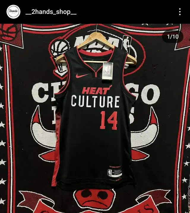
1 hour ago, sawakita33 said:
Great find @fortunat1! They also have a better look of the Heat Culture jersey.
I know it gets said quite a bit but this really looks like something Walmart would sell.
-
3
-
-
I will have you know, you can display up to 18 uniform sets.
-
1
-
-
-
8 minutes ago, Haz_Matt said:
5 for the fight is still involved and LVT is partnering with the charity.
Still a tacky sponsor patch.
-
1
-
-
10 minutes ago, Morgan33 said:
The colours might have been influenced by 90's colour fads individually, but collectively there hasn't been anything like them before or since. Other teams might have used purple and teal together but none of them could be mistaken for the Mighty Ducks. Even the shades of purple (Eggplant) and teal (Jade) were unique as was the decision to compliment them with such a small but effective amount of yellow. I would say their original uniforms have transcended 90's fads.
Why could it not work as well in 2023? Nostalgia has been the main driving force in NHL uniform design, since the aftermath of the Edge debacle, and it has been recently expanded to include the 90's. The Ducks current colours and logos look more dated with each passing season.And it's much better to be using a unique color scheme than one as close to the Flyers.
-
3
-
-
1 hour ago, 5ss22 said:
The green looks kind of bright, but there's a massive difference between this bright studio and the Target Center in the early 90s.
Bulls red looks the same there. But what I am seeing is their print logo back then the green looks brighter.
-
5
-
-
53 minutes ago, BBTV said:
Maybe because they didn't play a single down in the Delaware Valley? Maybe because they made no effort to connect with the community or even advertise in the market?
I don't know if it could work, and I've said a hundred times that I think Franklin Field is the only way it can, but the ridiculous hub model made it so they didn't even have a chance.
Yea, that's why I said, they get a spot it could work, will take time (hence uphill battle) but could get a following like the Soul did.
-
No one in Philly gave a crap about the Stars, so unless they get them a stadium (And even then, its an uphill battle) then they could go.
-
2
-
-
2 hours ago, monkeypower said:
If these two reports are to be believed, I'm thinking it's the Rock.
Going to the calendar, the XFL championship was on May 13th and then the USFL championship was on July 1st.
Reading the tea leaves, I can't imagine the league that reportedly initiated merger talks shortly after the other league's season was over is in an advantageous position.
I would get the feeling The Rock wants out then make a sweet ass payday at WrestleMania along with whatever other projects he has (well when the actors strike ends)
-
58 minutes ago, Cujo said:
 MID.
MID.
Are they calling these their Bird Crap uniforms?
-
1
-
-
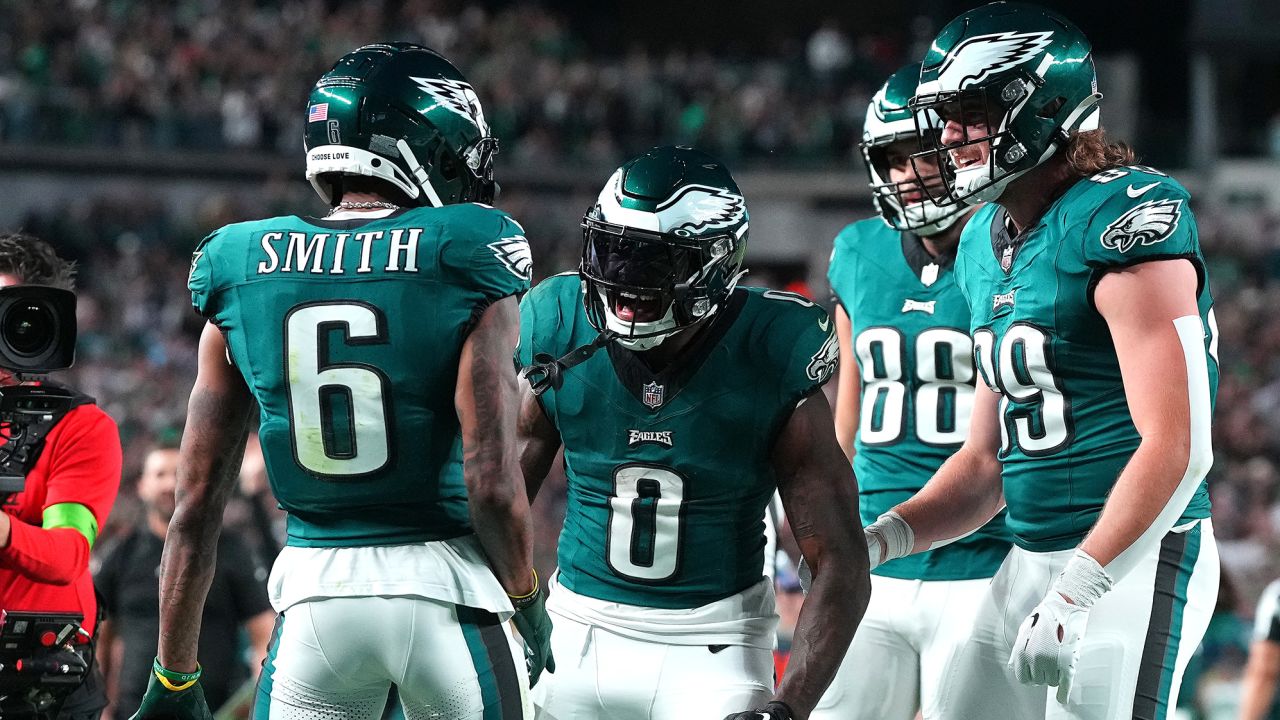
The Emblem parts that were chrome is now white, looks cheaper imo.
They were using the simplified logo for a few years now.
-
19 minutes ago, rorinator said:
Looks like the Eagles jerseys still have their old wordmark despite a new one being introduced a season ago (not that I'm really complaining)
The same thing happened with the Patriots.
-
3 hours ago, pepis21 said:
Top right corner is intresting with that Jazz old shorts. Why someone put them to a photo?
Warriors looks kinda like mashup od their current alternate with 19/20 Hawks City and Heat doesn't look promising.
I wonder which team is between Heat and GSW. Thunder? Color and pattern on stripes looks pretty similar to current OKC City.
The Jazz are are the shorts to these.
https://twitter.com/BensHoops/status/1537844499145101312/photo/1
-
4
-
-
39 minutes ago, kmccarthy27 said:
and the green was used to top on those closing screens at the end of WWE and UFCs shows.
And the money they'll make.
It looks like the logo for a Nerf product.
-
1
-
-
1 hour ago, dont care said:
If by that you mean sharing no elements then sure. The fonts are different, the swoosh is the opposite way and straight not arched. I really don’t see what you see as being the same elements.
I saw it too, its more the general elements. Italics (UFC) and underscore (WWE),
-
4
-


/cdn.vox-cdn.com/uploads/chorus_image/image/72663056/1689641387.0.jpg)
New Logo for Monumental Sports Network
in General Design
Posted
It's better than the old one, since that just looked like the Marathon gas station logo with a star.