


BadSeed84
-
Posts
3,648 -
Joined
-
Last visited
-
Days Won
1
Posts posted by BadSeed84
-
-
1 hour ago, Sec19Row53 said:
I agree. I like Pepsi Zero (and Coke Zero) better that their "diet" versions.
Mountain Dew Zero??? Holy hell is that too sweet for me.
Diet Pepsi > Pepsi Zero Sugar
Coke Zero > Diet Coke
And overall, Coke Zero > Diet Pepsi > Pepsi Zero Sugar > Diet Coke for me.
Diet Wild Cherry Pepsi > Cherry Coke Zero Sugar.
-
 1
1
-
-
The all lower case & simplification/too stripped down trend is over thankfully.
-
1
-
-
5 hours ago, simtek34 said:
It appears that Pepsi-Cola made with Real Sugar isn't getting any rebrand, for some reason. Pepsi's website, PepsiCo's website, and retailer websites still show it with the old "fat guy leaning down" logo that was just retired.
I noticed this too, which is weird since that one tries to be nostalgia looking. Just give it the Pepsi globe without text with the cool script underneath.
-
2
-
-
8 hours ago, sayahh said:
Who else is also expecting a Mt. Dew logo redo (redew)?
(Also, it looks like PEPS1 more than PEPSI, IMO.)
That and the P's is what keeps this from being perfect.
If Mtn Dew went back to Mountain Dew that would be nice.
-

They have arrived
-
1
-
-
I think teams can only wear throwbacks during an anniversary.
The 76ers anniversaries coming up based on when they celebrated it before.
The 80th season the entire franchise: 2025-2026
65th season of the 76ers - 2027-2028
So they may finally bring out the Iverson's in 2025-2026.
-
1 hour ago, BBTV said:
I actually kinda hate that script because there's no way anyone would actually write like that. You'd have to start with the tail, push it (if you're a righty, drag if you're lefty), and then make the S (which still doesn't really flow naturally into the e).
I am pretty certain you would start there.
-
1 hour ago, Cujo said:
Exactly. Throwback to the days of 55-10?
0-4 In Super Bowls vs the Cyberhorse being 3-1
Yarrrg
-
Hearing they are going to file for bankruptcy.
Classic shield logo was better days for them.
-
1
-
-
21 hours ago, PERRIN said:
Falling from first to second most popular beer in the U.S. isn't really failure but ok
I'm not old enough to drink, and if I were I'd steer clear of Bud Light because it's crappy beer, but even I think their 'fall' is incredibly stupid. Crazy how much of a fuss people can throw over literally nothing.
Losing the #1 spot is still a loss. And someone posted Twitter/X despite that still being a top social media platform. I have been old enough to drink beer for a long time, and rarely have Bud Light cause I never cared for its lack of taste (I'll ask for a Miller Lite if I am out at a bar or Yuengling).
If I did like Bud Light mind you, I would still be drinking it, not giving a crap (And have had AB beers, the people that post the whole list of Anheuser-Busch beers are a bit silly), the move to appeal to a different demographic (young people) didn't work out, so it does still count on whether one agrees with why it happened or not.
-
 2
2
-
-
-
1
-
 2
2
-
 1
1
-
 1
1
-
4
-
-
2 hours ago, VDizzle12 said:
Not sure what was going on with the Browns pants last night. But they seemed to be more see through than I remembered. Everyone looked they had sat in white chalk, but it was just the compression pants underneath.
It was really bugging me the entire game. Did Nike switch up the pants too or are these the same ones teams have worn for years?
Apologies if this has already been talked about....
You don't have to apologize for Clevejacking.
-
2
-
-
4 hours ago, Lights Out said:
Are we sure that's not just 2K getting the details wrong? Not like that hasn't happened many times before with sports games.
No, most figured they would just be changing the dropshadow to the bottom right.
-
1
-
-
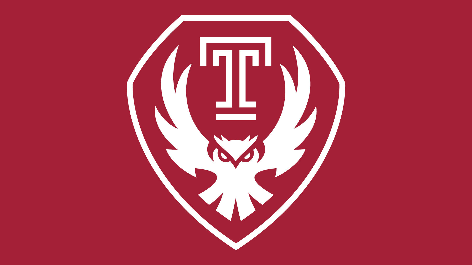
Temple has replaced their athletics logo.
https://news.temple.edu/news/2023-07-31/new-logo-signals-new-era-temple
I really like this, the old one while classic had overstayed its welcome (and they hid have the head behind OWLS lately I see.
-
3
-
 2
2
-
-
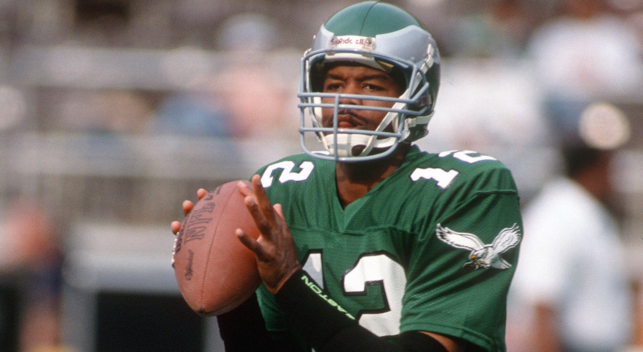
The one thing that bothers me about the Eagles throwback and all the pics and stuff released.
Where is the classic wordmark?
There is even a picture of Eagles written in many different styles but NOT the classic wordmark everyone loves.
What is the endzone going to be? I just hope its not something lame like the endzone here from 1995. (And I fear it since you just see regular serifed font used in the pics)
-
1
-
-
1 hour ago, BBTV said:
I will never understand why a team's mascot would destroy a piece of equipment that's vital to the team's ability to compete. If the Panther is breaking all the sticks, what will the team do? Same with the Sharks.
Claw the opponents clearly for the Panthers.
-
4 hours ago, monkeypower said:
It was on the green jerseys.
Well yea, but inprint use and such (Obv the white jerseys) they used the green version,
-
12 minutes ago, MCM0313 said:
I didn’t know there *was* a white version.
Same here, only saw the green version.
-
I also saw a pic of a Miller Lite case with this logo on it, so it seems like they are going with the white version of the Eagle logo.
-
5
-
-
On 7/24/2023 at 1:05 AM, M4One said:
Adam Silver and every NBA owner's dream court? An ad for every bucket.
Should've put a warning to mute that crap first.
Also I could see this being done and in regards to it being used in multi-use arena's. Wouldn't it still just be LED squares that connect to each other? I could see it still being possible, though one would think it would be quite expensive to do for all NBA teams.
-
3 hours ago, DCarp1231 said:
This just confirms the Jets are allergic to green
I also have a feeling since the Eagles throwbacks will be the Kelly Green, the Jets chose white since so they aren't similar.
-
The Phillies give MLB the finger and keep all 5 uniforms.
-
Just now, Brave-Bird 08 said:
wow someone has never done an Indiana night before.
Nah, I haven't had my last dance with Mary Jane yet.
-
4
-
1
-
-
The players have to feel goofy doing the posing for the video, with some crap rap like music in the background.
Trying so hard to be cool.
-
3
-


New Logo for Combined WWE/UFC company TKO
in Sports Logo News
Posted
I saw it too, its more the general elements. Italics (UFC) and underscore (WWE),