


BadSeed84
-
Posts
3,648 -
Joined
-
Last visited
-
Days Won
1
Posts posted by BadSeed84
-
-

Everyone wishing Under Armor ended up with the uniforms right about now.
-
 7
7
-
-
Vudu Fandango sounded pretty dumb too.
-
1
-
-
I don't get boycotting the companies, can you blame any company for taking the opportunity to be on three sleeve of a MLB team?
If say Wawa goes on the Phillies sleeve, I don't hate Wawa all of a sudden.
-
On 2/17/2024 at 3:05 PM, DCarp1231 said:
FIFY
The thing is, this is for when a logo is associated with failure, all 3 of those logos are the same logos Sony, Columbia, Marvel all used during their successful years, maybe if Marvel changed their logo sure. Like I am sure one of the DC logo's could be used.
Which would be this one.
-
1
-
 1
1
-
-
18 minutes ago, Bmac said:
I'm confused. Many teams have taken inspiration from past local professional hockey teams for Winter Classic uniforms. Suddenly we're deciding the Blues aren't allowed? Give me a break.
I was thinking the same thing, other teams have done some far reaching stuff as well for inspiration.
St Louis Braves was their minor league, which was the Blackhawks farm team, so they just wore Blackhawks uniforms
So the other choice is this.
Just replace Flyers with Blues in St Louis blues colors and replace the stars with the Blues logos
I did a quick crappy photoshop of what they would look like, I didn't replace all the stars,
-
52 minutes ago, WSU151 said:
Cardinals’ president Bill DeWitt provided comments to Uniwatch in a December 2023 column:
His response had a mix of good news and bad news: “We are maintaining the chain-stitching next year with the new Nike template — I had to fight hard to keep it. But the compromise was that it will need to be applied to a patch, which will then be applied to the uniform.”
Seems to me something happened between then and now.
For as much money mlb, nike racks in, there is no excuse for this.
-
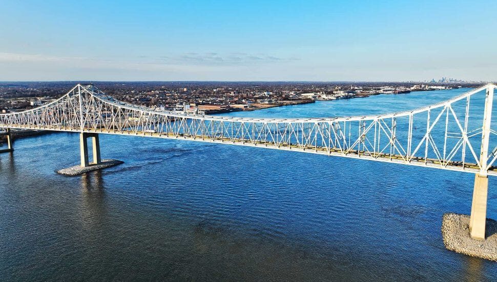
Now when I looked at the Union jersey I figured it was a vague snake pattern making the stripe pattern, along with it having XV's hidden.
No no, its supposed to be a bridge pattern.
Union fans have been awaiting the return of the center stripe for many years,” said Shaun Kreider, Philadelphia Union Senior Creative Director. “With 2024 being the club’s landmark 15th season, we felt it only right to revisit the classic design, but with a modern twist. Originally inspired by the trusses of the Commodore Barry bridge that serves as a backdrop to Subaru Park, the XV jersey symbolizes a bridge from the past to the present and the Union’s commitment to bridging the gap between fans and their team with countless initiatives like the Union Creative Collective, who’s input brought this kit to life.”
-
 1
1
-
-
1 hour ago, batman1211 said:
Aren't there rules against political pandering on this board?
I'd argue regardless of what side one is on, they could find the joke funny.
-
12
-
-
12 minutes ago, aawagner011 said:
Pretty sure you are correct, looking at the photos in this tweet
Yep, really sucks.
-
 3
3
-
-
1 hour ago, namefornamesake said:
There's no way that these are real.
-
2
-
1
-
-
-
To save people from clicking spoiler clicks after spoiler clicks
-
1
-
1
-
-
They better be changing their logo as well.
Also another Nike design changed
-
7 hours ago, seasaltvanilla said:
I'd argue Gritty is Chaotic Neutral and the Phanatic is Chaotic Good.
Phanatic is the Chaotic who drinks and has a good time but knows his limit and doesn't wake up with a hang over.
Gritty is the binge drinker who doesn't know when to stop and wakes up passed out on someones lawn.
-
They look like tongues.
-
12 hours ago, pepis21 said:
If Grizzlies wanted to imitate a concrete court they should make it form a real concrete. It would be innovative to NBA standards. Of course few knees would blow up in a game process, but it would give a real atmosphere of street courts.
And needs the nets missing, maybe even have one just be the backboard with no basket at all lmao (Now I am basing this off Philly courts)
-
1
-
 2
2
-
-
7 minutes ago, TrueYankee26 said:
I can understand why some Philly people are tired of Rocky being a symbol to the city
I can't understand why a New Yorker thinks he has any place to say what Philly people are tired of.
-
3
-
 1
1
-
 2
2
-
-
9 hours ago, BBTV said:
Wish companies would stop slapping liberty bells on every philadelphia product, wish the Phillies would drop it from they logo, and wish it wasn't (along with Rocky) an unofficial "logo" for the city in general.
I'll never use the term "lazy" to describe a design, but it's at best "un-imaginative" and cliche. Maybe that's what the Phillies wanted, but I hate it.
Between these caps and the ones that use simply the 1992-2019 logo, really disappointed this year. It's a shame, because there's a lot of good ones buried in each series we've seen so far.
I just wish it had a blue bill & squatchee, which the one bell hat did but had the Phillies wordmark in the bell and looked dumb, they were so close.
I'll just continue to wear this. (I would love this just without the piping and blue bill & squatchee)
-
And most places they used a logo the more horizontal word only one works much better.
-
6 hours ago, BBTV said:
LOL, Phillies one has a logo they retired 4 years ago.
Here is the regular version....they didn't even get the underline color correct (it should be red, not blue)
Also lots of comments that this still should be the Phillies logo.
-
2
-
-
51 minutes ago, coco1997 said:
They're the colors of the Philadelphia flag:
well duh,
-
That tweet says could have been worse?
No, it is complete
 , its not gaudy yellow and light blue but it looks like some :censored: that a shady store in North Philly would be selling.
They gave up the red jersey FOR THIS?
-
2
-
 1
1
-
-
On 1/29/2024 at 3:49 PM, tBBP said:
Boyyy the Natinals don't know what they want to look like right now, do they? Got all kind of Frankensteining going on there...
Which is exactly what Nike loves
-
2
-
-
2 minutes ago, DCarp1231 said:
Nationals are ditching their city connect jerseys after 2024.
The first domino has fallen.
Or it means they'll have an even worse one in 2025
-
6
-


MLB 2024 Uniform/Logo Changes
in Sports Logo News
Posted
Even the regular morning shows are talking about it, Preston & Steve here in Philly were discussing it.
This is baddd,