


Anubis2051
-
Posts
917 -
Joined
-
Last visited
Posts posted by Anubis2051
-
-
13 minutes ago, JohnnyCowboy5 said:

Have we seen a batterman in another color before or is this the first? And the NE logo?
-
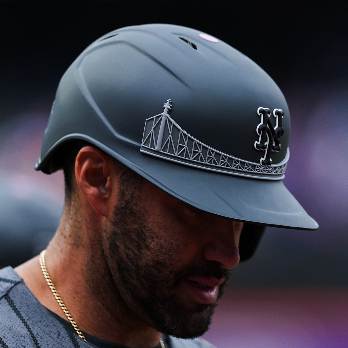
6 hours ago, NOLAPelicans23 said:
These look cool, but they should've finished the bridge. The hat has a natural endpoint at the edge of the front panel, the helmet doesn't, so the bridge just looks awkward finishing in the middle.
-
 3
3
-
-
3 hours ago, MJWalker45 said:
I'm surprised we haven't seen the velcro cap yet.
Me too honestly, it would probably sell well too. With a patch like this:
I wonder if the issue is NE can't really claim that hat style?
-
1
-
-
53 minutes ago, MJWalker45 said:
They do look like morale caps that some units wear, so at least there's that.
I know it's branch specific, but I wouldn't hate seeing a Scrambled Eggs Design one year:
Patrol Cap design maybe?
Or the simplest, a tactical hat, with Velcro patch:
-
9 minutes ago, BadSeed84 said:
I think it's one of the better looking ones, would rather the team logo's be in just a flat military green.
And no matter what these should just be fashion caps and not worn in a game (and ESPECIALLY the mothers/fathers day hats as well)
Regular team colors with camo would be okay, but every branch wears their own pattern now, so you'd be favoring one over the others. Maybe the US flag on the side like the old 9/11 hats would be best? Or just an "Armed Forces Day" patch?
Ironically, the only time I've really liked the way camo look inside a logo is a hat Turtle wears in an old Entourage episode:
Been trying to find that hat for years, it doesn't exist as far as I can tell.
-
1
-
-
-
 1
1
-
 1
1
-
-
1 hour ago, tBBP said:
I'll second the part about the shirts...'47 Brand's cotton-blend t-shirts are top-shelf.
4 hours ago, PlayGloria said:Please no one touch 47 brand. One of my favorite brands in the world. Their stuff has gotten a bit overpriced, but what hasn't. I love their hats and their shirts are probably the softest on the planet.
They're incredible and some of my favorites, but Homage is softer I think...
-
42 minutes ago, tBBP said:
I feel you, except...Fanatics also owns Mitchell & Ness now (and I believe '47 Brand, too). M&N's stuff ain't what it used to be when it was still its own little independent shop. Doggone shame, too.
It appears '47 is still private
-
4
-
-
2 hours ago, Sodboy13 said:
Two weeks in, and we have our NBA "oops my uniform fell apart" moment.
Is anyone building a reel of all the issues yet?
-
2 hours ago, Brave-Bird 08 said:
Just bring back the Mercury Mets vests, cowards
They are, on 7/27 with a fan giveaway no less!
-
1
-
1
-
-
What's going on with the Rawlings logo on some players? I noticed a bunch of Guardians players with it as well. Didn't the league purchase Rawlings several years back?
-
3 hours ago, GriffinM6 said:
Here you go then.
Hear me out actually. Mix the blue and orange ala the Shea neon players, it would be unique and a tie in to the team's history:
-
7
-
 1
1
-
-
37 minutes ago, aawagner011 said:
Drop the white from the patch and the swoosh and I don't hate it. Drop the blue as well and I start to love it.
-
 1
1
-
-
7 hours ago, BadSeed84 said:
From reddit:
The shirtseys have holes in the numbers (And I'm going to guess it doesn't matter if the team has the holes or not in their jerseys)
I give them 2 washes at most before they form cracks easily.
They did this for some teams a while ago...I know I have a Pirates McCuttchen shirt from like 2013 with the holes, and a Yankees pre-Nike Stanton (so like...2018-19?) with the same.
-
1
-
-
33 minutes ago, FiddySicks said:
Yeah I never understood what their angle was wearing a black vest in the first place, but it was even more odd when they paired it with the matching sleeves. The most baffling thing is they kept it around for nearly two decades.
I’ve always had this suspicion that they wanted to initially pair it with purple sleeves/socks and black pants, but chickened out at the last minute.
I believe that was the plan
-
5
-
1
-
-
Field of Dreams Jersey for comparison
-
13 minutes ago, Lights Out said:
That's not exactly true. Prices have fluctuated quite a bit over the years. Back in the NES, SNES days, you'd see $70 games because those cartridges were expensive and came with high licensing fees, and those costs were passed on to the customer.
When Sony entered the market, they drove prices down for a while by pushing for CDs (a cheaper storage medium) and charging lower licensing fees. Prices didn't creep up to $60 until the Xbox 360 launched, and $70 games didn't make a comeback until this generation.
Of course, I'm glossing over a lot of other factors, like how consumers didn't necessarily feel the high price of games in the '80s and '90s because it was common to just rent them from Blockbuster instead. Or how the sticker price of current games doesn't include all the paid DLC, microtransactions and such that drive the actual price of the complete game even higher. Or, on the other hand, how not every modern game launches at the maximum possible price.
You forgot that most modern games don't include any physical medium anymore, and are just a download.
-
19 minutes ago, TheBigFiz21 said:
I guess the Rangers are investing their money in all the right places if they're not interested in a patch or didn't jump at QuikTrip for a deal.
Holding out for Buc-ee's
-
3
-
-
13 hours ago, JohnnyCowboy5 said:
Whats this meaning?
I can never tell what's Han and Leia's theme and what's Marion's theme...
-
1
-
-
23 hours ago, The_Admiral said:
If Philadelphia were to have a symbol, what do you think it should be?
Driving ten under the speed limit in the left lane with their blinker on.
-
2
-
-
3 hours ago, dont care said:
How are they similar other than being hats?
Emphasis on bright colors and alternate logos? Many of them seem to be identical, or nearly identical (no contrast bill on some, etc.)
-
4
-
-
Surprised no one has mentioned the similarities to the 2018 Players Weekend hats:
-
1
-
1
-
-
3 hours ago, BBTV said:
I'm betting the jaggedness of the PHILLY font is supposed to evoke Ben Franklin "discovering" electricity with the lightning bolt - key thing.
OMG this gets worse and worse.
I think it's supposed to evoke this:
-
2 hours ago, VikWings said:
It's not like Philadelphia has a known or iconic flag like say Chicago or (I know it's a state) Maryland. It just seems lazy.
FWIW, Baltimore's flag is related to the MD flag:
-
1
-


MLB 2024 Uniform/Logo Changes
in Sports Logo News
Posted
Portland will never get another pro sports team. They make Oakland look safe.