-
Posts
920 -
Joined
-
Last visited
Posts posted by Anubis2051
-
-
3 hours ago, BBTV said:
I'm betting the jaggedness of the PHILLY font is supposed to evoke Ben Franklin "discovering" electricity with the lightning bolt - key thing.
OMG this gets worse and worse.
I think it's supposed to evoke this:


-
2 hours ago, VikWings said:
It's not like Philadelphia has a known or iconic flag like say Chicago or (I know it's a state) Maryland. It just seems lazy.
FWIW, Baltimore's flag is related to the MD flag:

-
 1
1
-
-
3 hours ago, MJD7 said:
The City Connects were always intended to have a 3-year lifespan. It’s a slight improvement on the NBA model, to have a new City jersey every year, which has resulted in progressively worse designs.
They’ll almost certainly have a new one in 2025. Since the cherry blossoms seemed to be pretty popular, we’ll likely get an updated version, hopefully with pink as the base color this time.
(I’ve really been quite the champion for pink lately…)
just dump the WSH and I’ll be happy-
 1
1
-
-
-
3 hours ago, Brian E said:
so what are we thinking for the mets CC uni? skyline? neon? some goofy "GOTHAM" thing? a jersey with a bunch of chop shop signs?
I'm betting neon. The neon ballplayers have been all over their in stadium graphics the last 2 seasons.
-
 1
1
-
 2
2
-
-
4 hours ago, Pyromania1983 said:
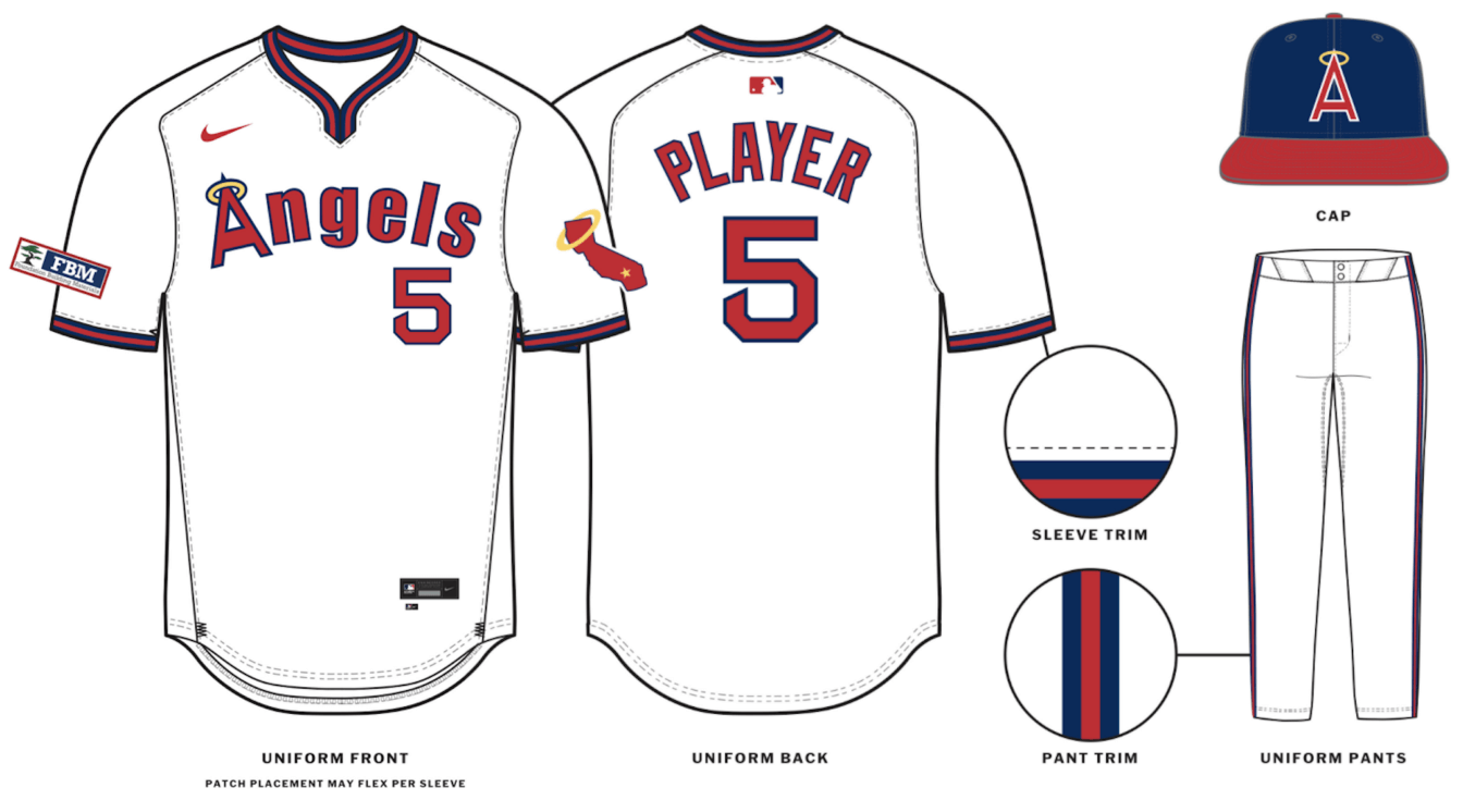
Looks like Angels are adding the pullover throwback uniforms: https://uni-watch.com/2024/01/22/exclusive-angels-adding-pullover-throwback-confirming-earlier-hints/
I legitimately thought this was a giveaway...
-
-
On 1/15/2024 at 4:40 PM, Morgan33 said:
It was certainly looking dated even before Reebok ruined their jerseys... Lightening the green to what they have now was definitely the right move. Maybe they could make an alternate based off the cup jerseys but with the new shade of green and with the gold retained.
I love the Stars current uniforms in a vacuum but it's disheartening how far removed they are from the look associated with the franchise's pinnacle. Having an alternate with some gold would go a long way to fix that and bridge the gap between the two era's... Whatever they decide to do, those Skyline Green monstrosities have to go. They looked dated the second they were released and are not fit for a pro team IMO.
Their Neon is by far their best look:

-
 1
1
-
 1
1
-
 2
2
-
 1
1
-
 1
1
-
 3
3
-
 2
2
-
 1
1
-
 1
1
-
-
17 hours ago, Ark said:
I want reverse pinstripes
That's what the concession folks all wear, which tbh I think will be enough to keep them from doing it.
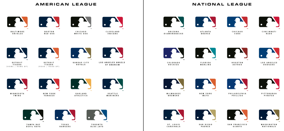
Has anyone seen an updated version of these graphics? Or the individual logos?


-
1 hour ago, tBBP said:
I just learned something today. Wow...never saw that before.
I love finding out things like this...thanks for posting this!
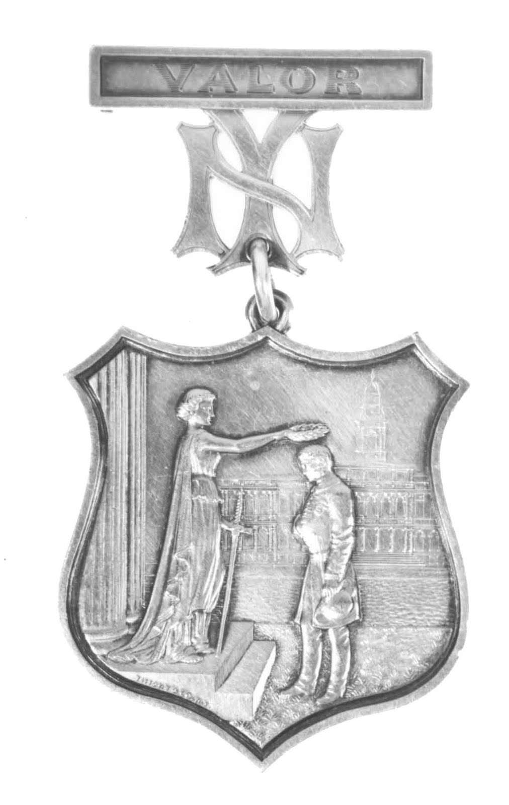
It was designed by tiffany! Here's a good article on this: https://www.mlb.com/news/yankees-new-york-logo-origin
-
On 12/15/2023 at 11:20 PM, coco1997 said:
I mean, would anyone really be opposed to the Yanks wearing a jersey that actually said “Yankees” on it?Yes, yes we would:

-
 2
2
-
 1
1
-
 1
1
-
-
On 12/15/2023 at 6:43 PM, Around the Horn said:
There is no design that could ever connect with the city more than an interlocking NY on top of blue pinstripes
Which makes sense, considering it came from the city first:

And other teams recolored it:

-
 3
3
-
-
2 hours ago, Marlins93 said:
I was in that store not long ago myself while I was on a business trip and saw those items you mentioned. The hat I believe has been for sale online for awhile now. So I don't think it's a new item. I don't see the shirt for sale online, though.
I will also point out that I recall the MLB flagship store had a ton of the regular red and blue City Connect stuff too. I didn't get the impression that this teal reimagining was replacing it. I'd chalk it up to the "fashion" category that provides alternatives to the field worn stuff, but that's just my hunch.
Didn't see that hat, however the t-shirt was prominently displayed in the City Connect section of the store (in the back, next to the register) where all the other teams city connect gear was being shown off.
1 hour ago, BBTV said:But after George died, the Yankees caved to every silly gimmick uniform MLB has trotted out (or at least hats)like the father's day. They kinda lost their "we value our brand too much for this" cred, which is a shame, because I respected them for it. George probably wouldn't even have allowed the swoosh - or at least would have resisted as much as possible.
The Yankees actually caved two years before George died, in 08 they did the first 4th of July hat:

Jeter became hit leader the next year while the Yankees were wearing red hats:
It's been downhill ever since.
-
 1
1
-
-
On 12/7/2023 at 12:57 AM, Marlins93 said:
Not calling BS, but this seems weird for a number of reasons. First of all, those colors are purported to have significance for the "Sugar Kings" history, so it seems hard to swap them out with the tired and cliche vice colors, for example.
And the Marlins have one of the few City Connect identities that's objectively good and universally praised. If you walk around the ballpark, it's pretty obvious that those sell well. I suppose Nike could be trying to do something more like what they do with the NBA. Basically replacing the city jerseys frequently even if they are popular.
What baffles me the most is that the Marlins would be entering their sixth season (in 2024), with this horrific rebrand instituted after Jeter's group bought the team. Now that the dust is settled, I really don't think this current identity is appreciated by the fanbase. If you walk around Marlins Park, far more people are wearing City Connects or OG Florida Marlins stuff. I'm very vocal in my hatred for this branding, but I genuinely don't think the look has been warmly embraced by the fanbase. And most fans would like some kind of return to the retro branding on a larger scale than sporadic throwback nights.
So I would agree that I don't think this is happening, however today I was in the MLB store in NYC and there was lots of city connect Marlins gear recolored to teal. Notably one tshirt was the crown logo, with the Florida fish logo (the round one) on the sleeve.
-
 1
1
-
-
On 11/26/2023 at 6:45 PM, Kramerica Industries said:
I wonder if any chance that can be attributed to being a 4:25 national game for the Eagles today (and obviously a SNF game previously) and getting a little more attention to detail than a 1:00/4:05 regional game would get. For one quick example, when the Dolphins wore Week 8 throwbacks, CBS used the regular Dolphins logo.
My thought is only applicable to CBS, because NBC used the Eagles throwback logo earlier this season but didn't do the same when the Patriots wore throwbacks during a SNF game in Week 2 (also didn't use the throwback Giants logo when they wore throwbacks either). I'll have to take a look at the CBS schedule to see if they've had any other 4:25 games this year where the featured game involved one of the teams wearing throwbacks.
From what I understand, sometimes it comes down to if the team provided the files or not.
-
 2
2
-
-
What's your favorite fan modified logo that exists? For example, the Yankees Apple logo:

Or the Dodgers Palm Tree:

-
1 hour ago, -Akronite- said:
Dunno but I went in there once to hit the bathroom after getting off the PATH and it was the worst bar experience of my life. Toilet paper seemed to be covering the floor (the main room, not the bathroom). When I got downstairs for the toilet there was a stall with no door and some chode offering a bump while I tried to take a piss. I'm sure the gameday atmosphere is... sufferable.
This is about what I would expect. I use the NJT Terminal bathroom in a pinch...
-
 2
2
-
-
2 hours ago, adsarebad said:
Why is it called that?

Vague country theming that's changed hands 1000x and kept the name because it has value. It's all super tight v-neck tshirts and lines around the corner type bar...
-
11 hours ago, Bill0813 said:
Texas vs Arizona sounds more like college football.
-
 1
1
-
-
2 minutes ago, BBTV said:
But there was at least one - I thought more - team that dropped a jersey because of the alleged rule even though they don't have a CC.
Tampa, for example, dropped their road gray and there's a quote from their VP of brand in this article that says it's because of the 4+1 rule. They had 1) white, 2) gray, 3) light blue, 4) navy, and 5) throwback.
So the Phillies are somehow flying under the radar. I'm assuming because their red is worn so sporadically (I think it's just road getaway days) and I'm not even sure if they sell it in stores. It's definitely not available online.

-
1 hour ago, Silent Wind of Doom said:
I thought the whole point of it being two games was because each is sacrificing one home game. Why would you do it with one team home both?
I coulda sworn the Yankees and Red Sox switched, but I may be misremembering.Yankees wore pinstripes for both, Sox went white game one, red with white pabnts game 2. Sox were the home team for both. Initially it was home-and-home but the Yankees have a weird clause in their lease that forbids them playing home games outside of NYC.
-
31 minutes ago, TBGKon said:
Sounds like theres an agreement to play in 2023, 2024 and 2026.
QuoteAs Major League Baseball works on logistical hurdles in its plan to open the 2024 regular season in Seoul, South Korea, it is committed to playing games in Paris in ’25.
The Yankees and Red Sox are among the teams that have expressed a strong desire to play in Paris, which will host the first MLB games in continental Europe, according to a source familiar with the plan. They may be competing for one of the two coveted spots. It is unlikely MLB would schedule a Yankees–Red Sox series, according to the source, if only because those teams played the first London Series games in 2019.
No site has been selected for the Paris games. MLB is looking at soccer venues, which are not always easily converted to MLB specifications. For instance, before deciding on London Stadium for the London Series, MLB considered historic Wembley Stadium as the venue but found the maximum distance for the right field wall to be 280 feet from home plate. MLB rules require parks constructed since 1958 to have a minimum distance of 325 feet.
As part of the collective bargaining agreement signed last year, MLB and the Players Association agreed to play regular season games at multiple international sites each year of the five-year contract, through 2026. South Korea and France would join Mexico, Japan, Australia and the United Kingdom as countries to have hosted regular-season MLB games outside of the U.S., Canada and Puerto Rico.
The tentative plan for next year is to open the season with the Dodgers and Padres playing in Seoul, as first reported by ESPN. The series has not been finalized because of “logistical issues,” according to the source. A plan for an MLB All-Star tour in South Korea after last season fell through over the summer. If the Dodgers-Padres series in Seoul cannot be finalized, MLB would consider opening the season in Tokyo, as it did in 2000, ’04, ’08, ’12 and ’19, though the teams picked to play in Japan could be different than the ones scheduled for Seoul.
This year, MLB is returning to London with the Cardinals playing the Cubs June 24 and 25. Another London Series is scheduled for 2024, with the Mets scheduled to play the Phillies. Games also are returning next season to Mexico City, where the Padres and Giants played last month. The Astros and Rockies are expected to play there in ’24.
In 2025, MLB plans games in Paris, Mexico City, Japan and possibly San Juan, Puerto Rico.
In 2026, games are tentatively scheduled for Mexico City, London and possibly San Juan. The World Baseball Classic returns in ’26, with sites to be determined.
A domestic special venue event, the Field of Dreams game in Dyersville, Iowa, is on hiatus because of renovations at the facility. The game could return in 2025 or ’26, according to a source familiar with the plans.
-
 3
3
-
-
London Series hats are out, looks like normal with the patch:


Thankfully not this:

-
 1
1
-
 1
1
-
 1
1
-
-
7 hours ago, GriffinM6 said:
Looking at the whole lineup of caps, some of these could work within the current team identities.
- Twins could wear this with a powder blue uniform (which I assume their CC will be)
- Cardinals could wear that with their powder blue alternates
- Rays were already mentioned
- Rangers one looks better than the crappy cap they currently wear with the powder blues
- If the Jays wanted to make the secondary color of the powder alternates royal blue, this hat could work
Biggest surprises to me:
- The Rays hat should be their full time
- The Padres hat is amazing -- I wouldn't hate adding powder to the color scheme full time.
- Cards looks great
- Pirates really pops
- The biggest shock of all, I LOVE how this looks for the A's











MLB 2024 Uniform/Logo Changes
in Sports Logo News
Posted
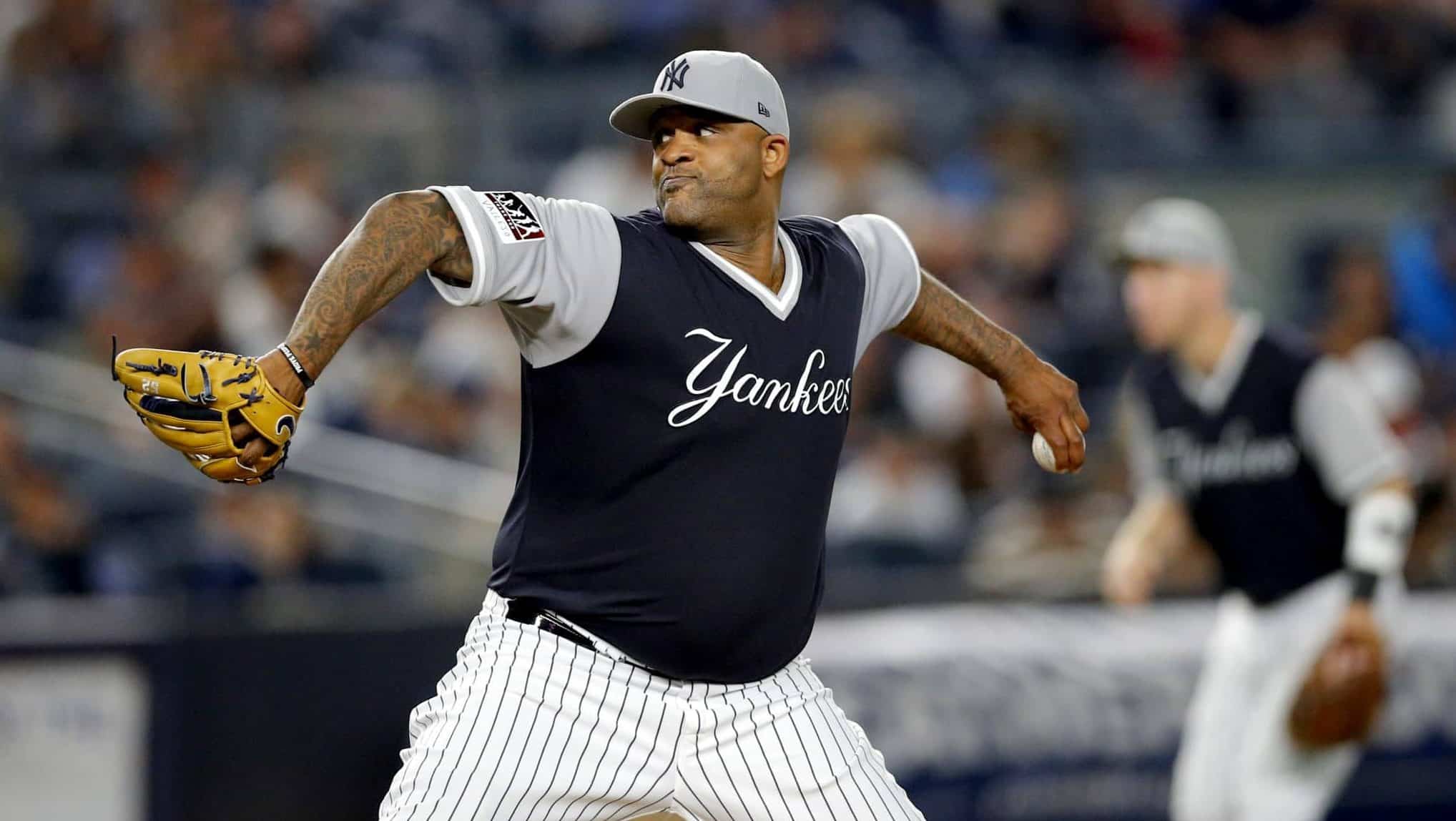
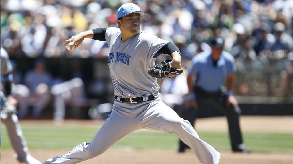
Surprised no one has mentioned the similarities to the 2018 Players Weekend hats: