

maz
-
Posts
6,889 -
Joined
-
Last visited
-
Days Won
1
Posts posted by maz
-
-
Came back to share how one of my school's biggest rivals, the Plum Mustangs, always copied the Denver Broncos but made them purple and gold...

...but has recently begun bastardizing the Pitt script instead.
Their ice hockey team appears to still use the Broncos logo, with a Capitals-esque wordmark, on throwback LA Kings unis...
I always give a pass to teams copying unis, however, since it is easy and cheap to get bulk jerseys on existing templates.
-
18 hours ago, Ark said:
I think this is a popular opinion but I don’t know where else to put it.
The New Jersey Devils should be a red and green primary team. Red and green pays homage to their location (New Jersey is the Garden State and the Jersey Devil is from the pine barrens in NJ). Wear red and black on 90s/2000s Night and Halloween and that’s it.
A lot of people use success to justify wearing a certain uniform regardless of its design merits. Therefore, I think there is a lot of love for the red and black given the success they had during the 90s and 2000s, and Brodeur playing his whole career in it, whereas they made the playoffs in just four out of ten seasons in the red and green (they've also only made it in twice out of the past 12, but I digress).
Red and green matches the area, red and black matches the name. Can't go wrong with either one, IMO. I've seen a lot of support around here for going back to green, so at least on the CCSLC I think you're actually in the majority.
-
High schools across America regularly recolor logos, and sometimes uniforms, of NFL and NCAA teams and use them as their own - or they just straight-up copy them. Did your school do this? If so, who'd they... borrow... Their look from?
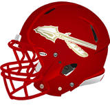
I'll start. My high school's team: The Penn Hills Indians. Starting sometime in the 80's or 90's, they began wearing replicas of the Florida State Seminoles' helmets:They did this all the way up until a few years ago, when they started wearing a red version with what I think is an original spear design:
Also, when we had an ice hockey team, they just took the Blackhawks logo and stuck it on a Flames jersey. Which is partially why I just wore a Chicago Blackhawks shirt I had to football games (where I saw Aaron Donald play before any of you did
 ).
).
(Also, for any of my fellow born-and-raised Pennsylvanians, I found this site which has a surprisingly comprehensive history of PA high school football helmets) -
On field designs:
I know it's tradition, but I've never really liked the NFL shield at midfield. Having two Super Bowl logos on the 25's always looked odd and felt redundant to me. The way they did it from XXXI to XXXVIII was my favorite: Helmet - Logo - Helmet at midfield. I have always enjoyed the Pre-XXXI helmets in the endzone graphics as well.I'm just a sucker for helmet graphics on the field.
That said, I really dig the simplicity of simply putting the team logo and wordmark in the endzones they've adopted recently.
-
 5
5
-
-
I did not say that every team that wears red and yellow needs to add black or looks boring. The Chiefs have one of the best looks in all of football, because it works perfectly, head to toe. It thrives in its simplicity, and that's why they haven't changed in over half a century. So no, they definitely do not need black. You don't always need black, and I didn't say you did.
Kelly green and yellow just don't work together by themselves like red and yellow do, and the A's and North Stars wearing them is a product of the 60's, where such a color palette belongs. Which was my actual point - black brought something to the table for the North Stars. So while the Flames are fine without black (which I did say), the North Stars adding it is, at worst, a lateral move. If they'd moved to a darker green like Oakland did, then I'd agree they wouldn't need black.
Then again, the "whatever they wore in the 60's or 70's = superior" philosophy reigns supreme on this site.
-
1
-
-
The North Stars and Flames both benefit from the black because it adds contrast to uniforms that otherwise feel too bright. For them, unlike other teams, it isn't for black's sake, but functional, IMO. Helps keep them both from looking painfully generic, also (I mean damn do the Flames look boring nowadays).
I'm in the same boat as all the others who say the Wild logo and colors are too good and unique to throw away for North Stars nostalgia.
EDIT: Don't get me wrong with Calgary. Sometimes less is more, and their look works. But at the same time any beer league team could slap their logo on it and nobody would know it's a Calgary jersey.
-
3
-
 1
1
-
 2
2
-
-
11 hours ago, shstpt1 said:
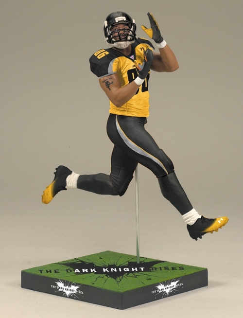
Could always use a Gold jersey like the Gotham Knights in The Dark Knight, filmed in Heinz Field. That was a good balance of the colors, and could workY'know what... they aren't as bad as I remember them being. In fact, I like them. And the Maulers already have a similar pattern on their uniforms. A simple color swap would be enough to achieve a similar look. This also shows gray is a good third color and would help them look a little different from the rest of the Pittsburgh pack (which the Pirates failed at when they brought in red as a third color in the late 90's for some reason).
-
4
-
-
I dunno. I agree it'd be cool to see a Pittsburgh team with different colors (just look at my fantasy football team I've had on here forever), and I actually really liked the purple and orange. But, and you can call it what you want, it is also cool to have all the teams match the official city colors (which go all the way back to the 1700's). Plus it still tends to stand out a bit more in a world full of red and blue teams.
The real challenge, however, is not looking like the Steelers (without going all black like the short-lived Pittsburgh Power did - being a summer league and all).
EDIT: Come to think of it, purple and orange doesn't really fit the theme of a team called the "Maulers" whose mascot is a construction dude wielding a giant hammer. So take that for what it's worth.
-
2
-
-
3 hours ago, SSmith48 said:
The 90's called, they want their obnoxiously oversized logos back.
I was just thinking that. If this had come out as a third jersey in 1997, it would have been par for the course of NHL jerseys of the time. Might've even been reverse retro'd into a red version this year or something like that.
I think it's totally fine as a one-time jersey. I always want to reserve full judgement until I see the whole uniform. The more I look at the jersey itself, though, the more I like it.
-
3
-
 1
1
-
-
My guess is, as far as the four division issue is concerned, they have white and black ones for each conference, and will switch out when necessary? Either that, or there are teal and pink ones too that we are not seeing.
If they use the reverse retro logos and we see end up seeing one with the robo on the shoulder then it looks like my wallet is about to be $230 lighter because damn.
-
They got it in at my local store and I tried a bottle today.
It's still Sierra Mist.
Teenage me is pleased.
-
2
-
 1
1
-
-
On 8/17/2022 at 12:39 AM, JerseyJimmy said:
I absolutely hate that modern uniforms need to be sleek and form-fitting. give me football jerseys with actual sleeves, please. hell, give me TJ Ford and his Longs.
(First of all, yeah, I know, I'm quoting a post from months ago. But I like reading threads in reverse order sometimes.)
I'm not sure this is unpopular, at least around here. I think a lot of people here especially like the looser/longer sleeves on football teams. I know that, as a fan of an NFL team that clings to its old sleeve stripes that do not fit on the modern tight sleeve, I wish long ones were still the norm. Roethlisberger was the last Steeler whose jersey looked "right" sleeve-wise.
vs.
Honestly though, if they'd just intentionally cut off the bottom gold and white stripes, it'd look fine on modern sleeves. But the change to italic font is already a source of rage for older Steelers fans. Intentionally changing the sleeve stripes as opposed to being forced into it wouldn't go over well with Yinzer Nation. That said, again, Ben's jersey looks better simply because of the sleeves.
-
2
-
-
Man, I loved Sierra Mist as a teenager (Mello Yello too). I had the rare hankerin' for some pop and actually was looking for it the other day for old time's sake. Mello Yello is never at the store I went to, Sprite just ain't the same, and I pretty much only find myself buying a Mountain Dew once every summer when Baja Blast is sold outside Taco Bell (again, for that teenage trips to Taco Bell nostalgia). I couldn't find it, and this explains why. At least they aren't changing the formula again like they did with Mist Twist.
-
1
-
-
I kinda like when teams have multiple commemorative patches (as long as they are not ads). Maybe it's because of the 1992 and 2017 Pens having so many (shown here as examples of what I mean), but when a championship team has multiple patches it just makes the uniform feel like it is more special somehow, partially because of its special connection to that year.
(Barely visible: Penguins 25th anniversary)
-
2
-
-
On 1/2/2023 at 6:16 PM, Ridleylash said:
That probably has something to do with the fact that the Pirates had relocated to Philly and folded well before Boston switched to black and gold, so there was no franchise in Pittsburgh to complain about the Bruins going from brown and gold to black and gold.
Not to mention the Pirates had already changed colors twice by the time they relocated; once to blue and gold, another to black and orange.
Not sure the Pirates would have (hell, at that time we had three RWB teams - Rangers, Americans, and Habs), but whatever the case, Boston's whole argument in 1980 was historical precedent, and the Pens countered that Pittsburgh technically had those colors first. It is fun, though, to think about the butterfly effect of if the Pirates never left Pittsburgh and folded. Would they have stayed black/gold? Blue/Gold? They likely would've changed the name, but to what? Is the Igloo ever built? Do the Bruins ever change to black/gold? Etc, Etc...
As for Seattle/VGK, I said it in another thread - I fully expect the Kraken to ignore the Metropolitans and look like some generic nautical decoration from a department store you see hanging in a beach house at the Outer Banks. And about the venue - I know the whole point of outdoor games is to be... Outdoors... But how cool would it be to have VGK, the Stars, or Kings, or Wild, etc. host a game in one of their cities' NFL stadiums?
-
Hopefully Vegas can come up with a good-looking "fauxback" like Nashville did a couple years ago. Would be nice if Seattle went for a Metropolitans look, but I get the feeling it'll instead look like one of those vintage nautical decorations you can buy on Etsy or something.
Also, I'm not exactly superstitious, but between the losses and injuries, I wouldn't be mad if the Pens never played outdoors again (unless they did PNC Park, I guess).
-
2 hours ago, FinsUp1214 said:
This is exactly why I really wanted and hoped Pittsburgh would have dipped back into double-blue.
6 minutes ago, Digby said:Wonder if the Penguins just wrung all they could from the double-blue throwback look with the Winter Classics and regular throwback from 08-14 or so and it doesn't sell the merch anymore.
This game is the only situation I would have been okay with that. Otherwise, it can stay in the 60's and 70's where it belongs. The novelty wore off quickly in 2008, and while I can't exactly give a good reason why, I hated having a blue third uniform all the way up until they finally nixed it. I can't speak for all Pens fans, but by the time they did stop wearing it, you already weren't seeing much of it around the arena.
This is all pretty funny when you consider the Bruins protested the Pens going to black and gold back in 1980, but because Pittsburgh had an NHL team that wore black and gold before the Bruins did - the Pirates - the NHL didn't stop them.
-
Boston already has Pittsburgh beat today in the "showing up in the baseball team's uniforms" department wearing (inaccurate) replicas of 1920's Red Sox uniforms, while the Pens wear... modern-day Memorial Day uniforms?
Cue the endless corny "WeLp GuEsS wE'rE lOsInG tHiS oNe NoW" jokes across Pittsburgh this morning... but seriously, over 130 years of history and these are the uniforms you choose to wear.
-
The first year the Pens had this as their third jersey was his last year in Pittsburgh, and it was hard to even find a photo of him playing in it.
EDIT: It's a shame that jersey is largely associated with one of the worst periods in Penguins history because, now that it's been gone for almost 16 years, I'm starting to realize how cool it actually was.
-
3
-
-
1 hour ago, tBBP said:
That one threw me off for a hot second.
Don't know that I'll ever get used to that...
I actually had to pause for a moment and stop myself from automatically typing "Heinz"

-
3
-
-
For the Steelers, I like the block font more, but really, the arguments for each font are valid. Being almost 30, the italic font is what I grew up with, and I always kind of used it as a way to differentiate between the two eras where the Steelers were most dominant.
Block font = Super Steelers of the 70's... IX, X, XIII, XIV... Bradshaw, Swann, Franco (RIP), etc.
Italic font = Steelers of the 2000's... XL, XLIII... Ben, Bettis, Ward, Polamalu, etc.
What they are rumored to be bringing back for this weekend that I am passionate about them making permanent again - gold endzones. I get why the field at Acrisure is painfully boring due to sharing with Pitt, but Pitt does wear the same shade of gold now...
-
Pens are kinda "meh". Doesn't look bad, per se, but I think both teams missed a huge opportunity here.
From day one I thought they should simply put them in the unis Pirates and Bruins each actually wore at the same time. Especially since it's the jersey the Bruins won their first cup in.
https://twitter.com/schwank17/status/1514568275300167681?t=C6VGGDfqJwWhDnq7IGbTsQ&s=19
All that being said, if they put the Pens in white pants, I swear to God...
-
It doesn't look bad, but it is still awfully boring. For me, it's an example of the recent twin (no pun intended) trends of:
1. Something getting "fixed" when it wasn't really "broken" to begin with.
2. Oversimplification out of a desire to be "sleek" and "modern" and fear of being "overdesigned" - usually resulting in a brand being a character-less reflection of itself.
A little bit of "overdesign" and slight flaws are okay sometimes. Come to think of it, for some reason, it "feels right" for a baseball team to be that way.
TL;DR - Looks good, but still a boring, unnecessary, lateral-at-best move.
EDIT: And I wholeheartedly agree with those who say the TC monogram needs to be on every cap.
-
2
-
-
10 hours ago, M4One said:
If the NHL does something like the retro's again, then the Wild should throwback to...the Wild. The name might seem awful to some, but they have had spectacular jerseys throughout their history. After going with a North Stars jersey the first time, they definitely should have gone with something from their own history this year. A red version of their original green jersey with green sleeves would have looked nice.
I've been thinking this all along. I absolutely understand the nostalgia for the North Stars, but the Wild have been Minnesota's team for over two decades now, and the North Stars were gone for a little under a decade before the Wild began playing. And, like you said, the Wild have had some decent jerseys in their own right. If they ever move back to North Stars colors full time, I'll be pretty disappointed. Forest green, red, and gold is one of the most unique color schemes in the NHL, and when I think about Minnesota (granted, as someone who has never been there), I think about vast forests and wilderness, which the Wild's colors communicate very well.
And if they insist on cashing in on North Stars nostalgia, the jerseys they wore with hints of black I grew up seeing in highlights and photos of the Pens' first Stanley Cup championship were always among my all-time favorite unis, and the black added a good amount of contrast to an otherwise way-too-bright jersey. A black version of one of those, like someone mentioned here, would look downright slick.
-
3
-


Unpopular Opinions
in Sports Logo General Discussion
Posted
The Avalanche looked better with black pants/glove/helmets.
Does it match? Does it make sense? No, I admit, it doesn't. But something about all the blue feels "wrong" to me. I can't put it into words.