

maz
-
Posts
6,889 -
Joined
-
Last visited
-
Days Won
1
Posts posted by maz
-
-
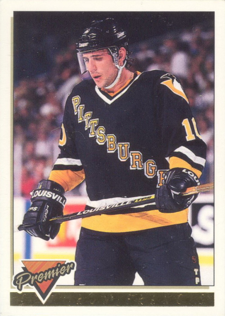
Somehow only just noticed today that the numbers on the Penguins' black helmets don't match the ones on any of their black jerseys and now I cannot unsee it.
-
On 11/3/2022 at 2:11 PM, Nordiks_19 said:
Now that we've finally seen the black Robo-penguins jersye, i have a new found appreciation for that look and wish they would've gone with it back in '92.
And it makes me realise how awful the
Rangers ripoffscript jerseys areThe idea that the Rangers somehow own the idea of putting your name diagonally on a jersey always has and will be ridiculous to me. (And I say that not as a Pens fan, but as a fan of the look. I loved when Colorado did it, for example).
Having that been said, IIRC, original Pens jersey in 1967 featured this because their first coach was a long time Rangers player and coach, and he liked the look of it, so he asked if the Pens could do it. So there is a modicum of truth to the idea coming from the Rangers.
-
 4
4
-
-
I really wish the Pens would just bring back the plain black pants for the third and RR jerseys. Especially the RR. Makes the uni way too busy with the thick stripe on the side.
EDIT: Looking again, the triangle yokes are way too wide compared to the original they're based on, which I am sure is due in part to how the Adidas jerseys are cut, but that makes for an even greater need for plain pants.
-
7
-
-
On 10/20/2022 at 11:28 PM, DCarp1231 said:
The amount of ads, large and small, coupled with the ridiculously alarming occurrences of the website freezing/glitching/crashing is egregious.
I know there’s an ad free version of the website now, but good grief that doesn’t mean inadvertently making the regular website borderline unbearable to use
Seconded. I understand ads are necessary, and honestly, truly, they would not bother me at all if wasn't resulting in all this other nonsense for those who don't pay for it. The mobile site was already janky, but now ads cover buttons needed to use it (specifically the ones at the top that let you access things like notifications and DMs). It also cracks me that this is happening now when a while ago I saw a CCSL Twitter post mocking another website for having a page inundated with ads.
I know you gotta do what you gotta do to keep the train rolling, man. I've been here 17 years (granted I became a lurker a long time ago), so you know I appreciate this place and want it to continue to do well. But come on.
-
7
-
-
On 8/24/2022 at 7:10 PM, GriffinM6 said:
Anyways, here's my quick and dirty mockup of the Penguins RR.

My money is on this, or something close, being what the Pens come out with, considering how they treated the first RR. If so, I would be pretty happy (though I'd hope they'd not flip the yellow and white). Also happy they are bringing back the robo, but would have been content with them not doing it as long as they didn't continue to use the "naked penguin".
So, overall, I'm more excited than I was before. I don't know why, but my gut was convinced they'd bring back the blue again - though, there's always the Winter Classic for that. (If they decide to bring these back, I'll be cool with it).
(I know, I dug up a post from like three weeks ago, I'm sorry)
-
the new york rangers navy blue vintage alternate jersey is absolutely beautiful, and one of the best sweaters in the league.
it is also light years better than the old liberty jersey.
This, except I'd go so far as to say they should just ditch the vintage white and replace the primary sweater with it. A white version, too.
-
I won't mind if the Islanders get a full-fledged re-brand. They're in Brooklyn anyway, might as well represent the region.
I agree. Their current uniforms are too '70s anyway and their crest is a jumbled mess.
I think you guys are more in the majority, because I've seen that all said here many times.
I, for one, love their entire look as it stands right now and would not change a thing except maybe darkening the colors again.
-
Guess what, guys! Mellon Arena became a parking lot today!

-
The Pirates are unique in that way. Much of their long history is either painfully average or straight up bad, despite their relatively high amount of world titles. The 19-aughts and 70s were the only decades of consistent competitiveness and success. Then there were a couple good years in the mid-20s and early-90s, and a major cinderella fluke in 1960.
You're absolutely correct about the mediocre and bad years, when a club exists for so long, those are practically impossible to avoid. The 19-aughts and 70s were outstanding, each decade had more achievement than the histories of many clubs today. From 1901 to 1992, the Bucs were winners roughly 66% of that span, an impressive record. The club also has the most batting champs in MLB history, and more primary hall of famers than teams like the Red Sox. Overall, even with the difficult times like the 1950s and the current losing streak, this is a storied franchise with a winning tradition. In the context of other MLB teams, it's accurate to place the Bucs about in the top third in overall franchise achievement.
Hence why I call them "The Shining Example of a Has-Been Franchise"
Forgive my negativity. It's difficult not to feel so jaded when such a storied franchise hasn't had a winning season in your lifetime.
-
The Pirates are unique in that way. Much of their long history is either painfully average or straight up bad, despite their relatively high amount of world titles. The 19-aughts and 70s were the only decades of consistent competitiveness and success. Then there were a couple good years in the mid-20s and early-90s, and a major cinderella fluke in 1960.
-
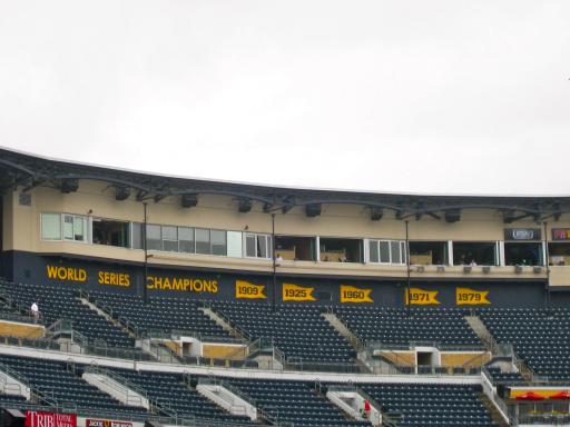
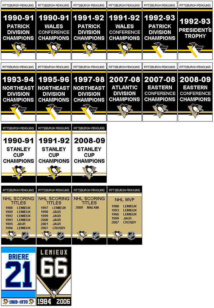
Went to the Pirates game tonight. Saw that this past offseason they added World Series banner signs under windows on the front of the pressbox behind home plate. Similar to those in the outfield in Atlanta.
Also, I forgot to mention earlier that, like since the park opened, the pirates' retired numbers are on signs on the front of the upper deck behind home plate.
Years later, I find a picture.
-
We'll gladly trade Tampa a team worthy of bad attendance.
-
I think this look that the Islanders previously had was amazing.

It suited the team very well. The extra amount of orange used on those made the jerseys less boring in comparisson to their 1998-2007 look. Not taking anything away from their current look though. For some reason, I think both looks are equally good.
While I didn't like it on the islanders, I did like the pattern nonetheless, and I thought it's similarity to the penguins' 80s/early-90s jerseys would've made them a good choice for the penguins rather than their current boring-as-hell design. It would've been a nice modernization of a look that a lot of fans are nostalgic for around here.
That said, I know it's an unpopular opinion around Pittsburgh at least, but I've always liked these:
And for some reason, recently, I've really started to miss the robo-pigeon logo.
-
-
I never understood the utter hatred for the "Robo Pigeon". But that's just me.
I always liked it. It was the logo I grew up with. I prefer the skating penguin, though. But I'd love to see the robo pigeon return as a shoulder patch. It worked well that way.
And the gradient monstrosity of a jersey mentioned above was unique because while it was so bad but still looked good in action somehow.
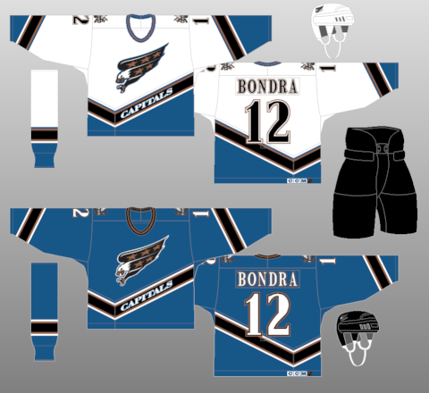
I've found that the jerseys with "Pittsburgh" on the front are actually kind of unpopular among pens fans, but I absoluetly love these things:


(If they use one of these blue ones at the Winter Classic, which judging by the logo at the press conference they are, I will be extremely happy.)
I think I'm also in the minority in that I disliked the penguins "triangle" jerseys they had before the edgeification. And I'm alittle sick of all the blue. It was great at first, but it got old. Ever since the first Winter Classic there's been too much of it around.
I also really like these jerseys:
Still hate the team with a burning passion, though.
-
-
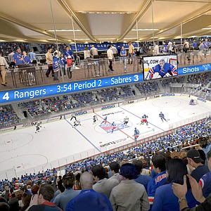
Are the seats really black? That's pretty cool.
It's nice that they have the rafter all to themselves for banners. Some of the Flyers / Sixers banners are hard to see, because they can't be hung in the middle like that. Also, the Flyers have gone to (at least for division, we'll see about conference this year) single banners with multiple years on them - think Celtics retired number banners. I guess they were running out of space cause of the Sixers.
I think the color is actually a charcoal gray, but it still looks good irregardless.
Whiteouts are going to look even more dramatic since black-dominated seating areas are now going to be the norm. (As opposed to the igloo's characteristic burned orange.)
By definition, a white out against black seats won't look any more dramatic than a white out against orange seats. Also, unless there are tons of empty seats (which I'm assuming that there hasn't been recently - a stark contrast to when I used to go to games there and just get a walk-up tic for $12) it won't be much of a big deal during the game. Still looks neat though when it's empty.
Pssh. Reality schmeality.

-
So there's a new wrinkle to the MSG renovation plans. They're going to add "bridge seating" that will be suspended from the ceiling to hold up to 1,000 more fans.
It's a great idea for almost any other arena, but it'll ruin the iconic "Fan Ceiling" that the Garden features.
Am I the only one who sees that ending disastrously?
That thing strikes me as a lawsuit waiting to happen.
I was thinking more than just a lawsuit....
-
Are the seats really black? That's pretty cool.
It's nice that they have the rafter all to themselves for banners. Some of the Flyers / Sixers banners are hard to see, because they can't be hung in the middle like that. Also, the Flyers have gone to (at least for division, we'll see about conference this year) single banners with multiple years on them - think Celtics retired number banners. I guess they were running out of space cause of the Sixers.
I think the color is actually a charcoal gray, but it still looks good irregardless.
Whiteouts are going to look even more dramatic since black-dominated seating areas are now going to be the norm. (As opposed to the igloo's characteristic burned orange.)
-
They could stand to lower them below the rafters and make them stand out rather than kindof hide up there, but that's just me being nitpicky.
-
The Babe with the Braves, and later as a coach with the Brooklyn Dodgers:

Man that indian head in the middle of "Braves" is annoying.
-
So there's a new wrinkle to the MSG renovation plans. They're going to add "bridge seating" that will be suspended from the ceiling to hold up to 1,000 more fans.
It's a great idea for almost any other arena, but it'll ruin the iconic "Fan Ceiling" that the Garden features.
Am I the only one who sees that ending disastrously?
-
I hate them regardless of any redesign.
-
A visit to the Mellon Arena answered my previous question. The banners are now arranged as such:
(Yes I did re-create them in paint. Took me about 3 hours at the beginning of last season. Then I just made new ones for this year in about 5 minutes.)


Unpopular Opinions
in Sports Logo General Discussion
Posted
The following two things are overrated:
Royal Blue - Any time a team changes to this from a darker shade, everyone loses their minds like it's the best aesthetic decision that team has ever made when it almost always is a lateral move at best, downgrade at worst. I'm not saying there is no place for royal blue, or that it looks bad. Some teams look great in it. But this idea that anytime a team moves to it from dark blue that it is objectively a big brain move, and better color than any darker shade they've used, is a fallacy. I think that, at least in the case of the Sabres, Oilers, and Islanders in the NHL, this is often due to nostalgia.
Gray facemasks in football - Unless your team has gray in its color scheme, its only value is, again, in its nostalgia. As far as looks go, it actually is not that amazing. It's a neutral color, so the facemasks themselves don't bother me. But, like with royal blue, the obsession people have for it is silly and is what annoys me the most.