
(2020_06_2313_56_02UTC).jpg.4d008d83e4a2253cc4b823cf1e3528e4.jpg)

mahnkej
-
Posts
387 -
Joined
-
Last visited
-
Days Won
3
Posts posted by mahnkej
-
-
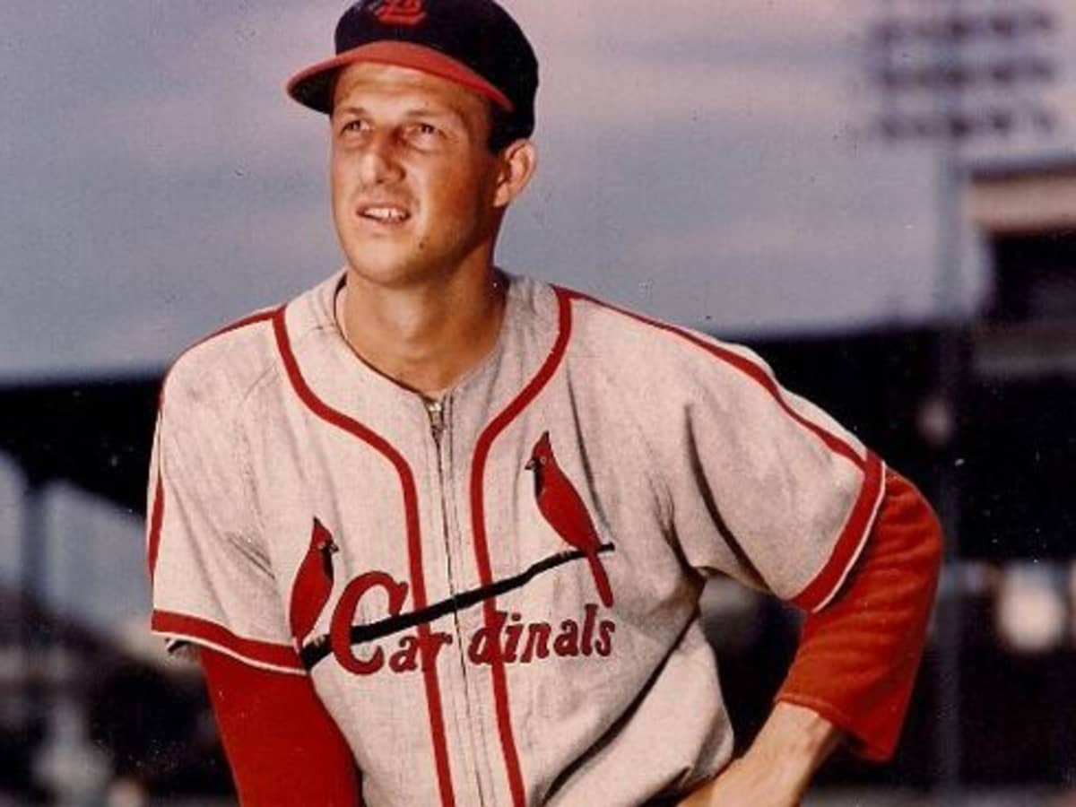
St. Louis Cardinals
Although the Brewers are my team, I can't deny it: the Cardinals have just about perfect uniforms. Behind the Yankees and possibly the Dodgers, this is the most iconic look in baseball. Simply put, the Cardinals are what a baseball team is supposed to look like.
That said, the home and road looks barely change at all. I did incorporate the alternate navy blue hats with the road look, something they used to do exclusively and something I wish they did more often. The 2nd alternate hat (red brim with the full Cardinal logo) is now used with the cream alternate jersey.
Powder blue alternate uniform is dropped, and an 80's-style throwback look with tri-colored stripes is introduced in its place. The other throwback is a 1950's-style jersey, with thick stripes on the sleeves and shoulders and the old-school navy blue hat.

-
 4
4
-
-
Seattle Mariners
I'm probably in the minority in saying this, but I'll go ahead and say it anyways: I really like the Mariners jerseys. Their teal alts, especially, are just sublime. Cheesy 90's font and all, I still love 'em. Maybe it's just my own dumb personal bias, growing up following players like Griffey, The Big Unit, Ichiro, etc... but I find it hard to imagine the Mariners completely rebranding at this point. So no major changes on that front.
What I did go for in this set, was consistency in design. All 4 uniforms (home, road, navy blue, teal) now use the same number style. Single headspoon stripe is also standardized throughout. Hats use the current "S" logo, only here it's re-colorized to be primarily white instead of gray. Simplified version of the baseball/compass logo is used on the sleeve, rather than the full roundell.
Throwback jerseys are in the style of the late 70's/early 80's, with royal blue, gold, and cream as the base colors. The end result is basically a hybrid between their current alternate home jerseys, and their beautiful City Connect jerseys.
-
4
-
 2
2
-
-
San Francisco Giants
I really like the Giants uniforms & colors, so I kept their same general design for my set. I did tweak some stuff around, as some of my changes include:
- Used the proprietary Giants font for the player numbers to give the jerseys a more classic, old-timey feel. I also used this font for the "San Francisco" wordmark on their road jerseys like they used to do back in the 80's
- Giants roundel logo is used as the sleeve logo for majority of uniforms; black alternate uses the Golden Gate Bridge logo instead
- Orange alternate uniform is changed to include the classic block "Giants" wordmark, whereas the cursive Giants script is used exclusively as a throwback look. Sleeve + collar stripes are also changed to be the same style as the Home + Road jerseys
- Black alternate uniform is tweaked to have double stripes on the headspoon + sleeves
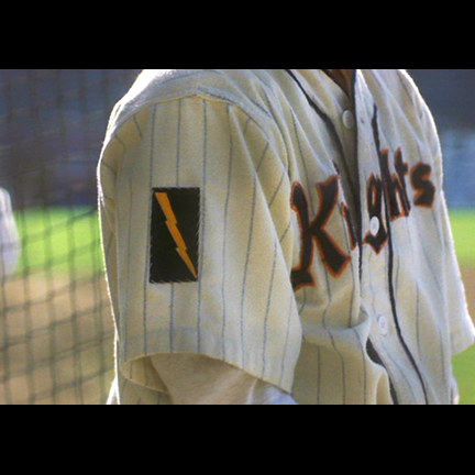
- In addition to the 80's throwback jersey, I created a new look that pays homage to both the New York (baseball) Giants and the fictional New York Knights from masterpiece The Natural. I included the iconic lightning bolt logo on the right sleeves as well
-
5
-
On 7/16/2023 at 11:22 PM, Yee Yee Go 'Stros! said:
I have always felt that the Padres are one of the only other teams that could pull off a look like the Pirates in the ‘70s. Just for kicks, could you do a mock-up with a brown hat, yellow jersey, and brown pants? I don’t know if you or anyone else would like it, but I’d love to just see what it would look like. I think it could (possibly) work.
Hey thanks for checking this out! I actually did sketch up a few gold jerseys for the Padres, I just didn't include them in the final product. Trying to keep these posts compact, etc etc.
Honestly I hadn't thought to use brown pants, but they look great when paired with the gold. Much appreciated for the idea!
-
2
-
1
-
-
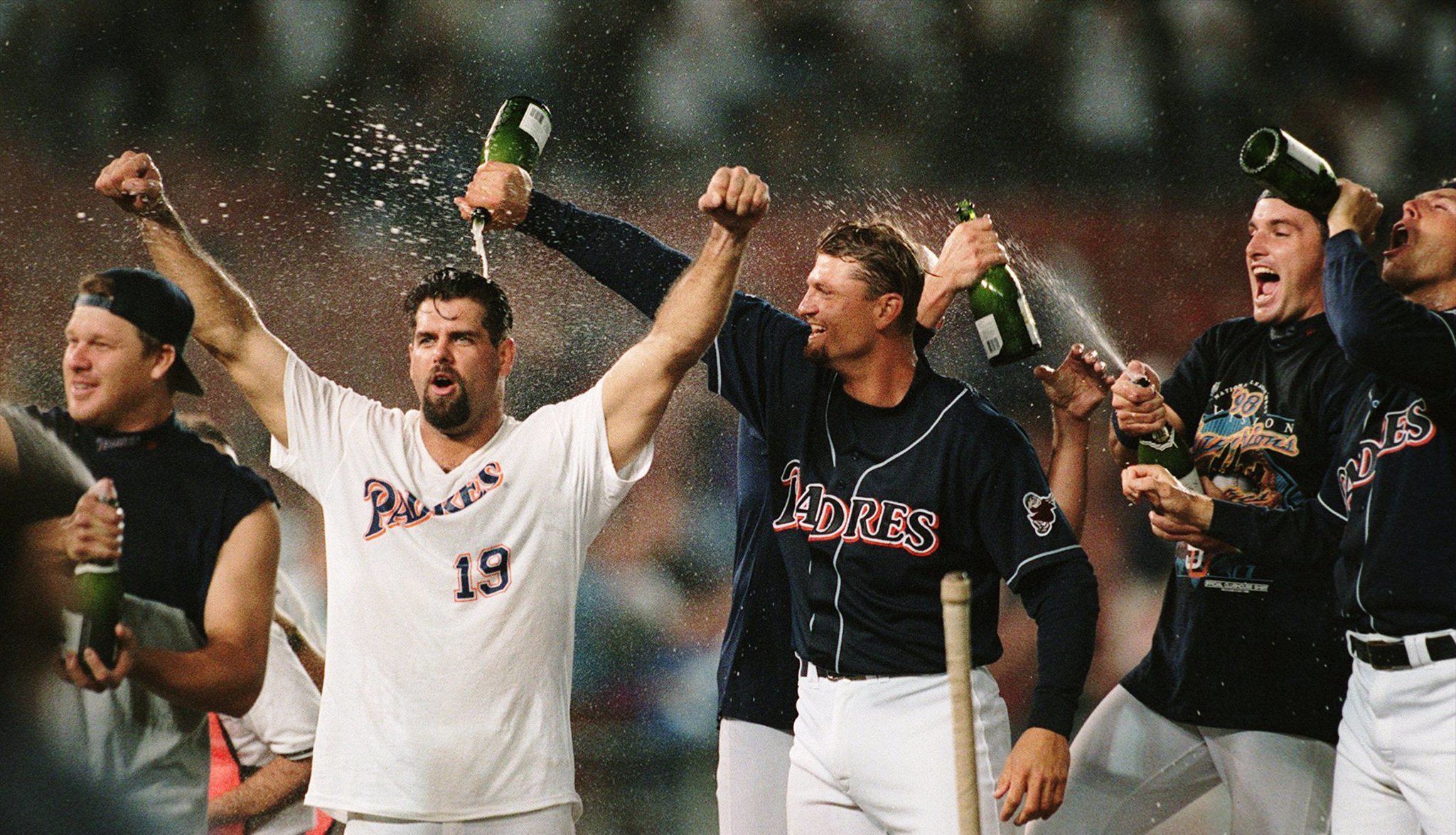
San Diego Padres
The Padres went from having one of the most boring uniforms in the game - to having some of the most exciting - in one swoop. Their rebrand to the classic brown and gold colors was absolutely a home run (no pun intended), so no major changes there. This set was mainly just tweaking to get things even better. Summary of changes are as follows:
- Road pinstripe uniform is dropped, in favor of a sand/brown alternate. I love the color, but the pinstripes don't look nearly as good on this set as they do on the home whites IMO. Sleeve + neck trim stays as is, and I also used this same style of striping on the pants (which is currently just a single fat brown stripe)
- Camo alternate jersey is brightened up a bit, and uses the desert version of MARPAT camo
- New home alternate uniform is introduced, this one a brown + gold version of their 2016 home uniform. I always thought this was a really underrated look, and was disappointed that is only lasted for one season
- Alternate road jersey is a brown + gold version of their old navy alternate uniforms. Again, underrated design... just the extremely boring colors killed it. Brown + gold makes it look like a proper set.
- Throwback jersey is a Padres 1998 navy blue alternate
-
6
-
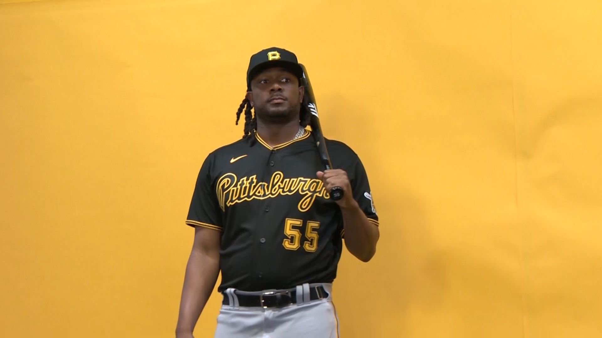
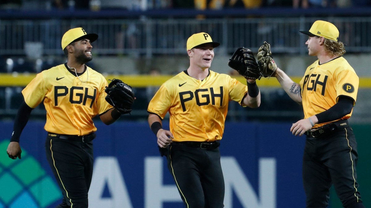
Pittsburgh Pirates
The Bucs have a damn near perfect look, so no major changes here. I used the proprietary Pirates' font for the player names, and also went back to a block style "Pittsburgh" wordmark on the road jerseys. Black alternates use a solid gold script instead of a gold outline font, while their other black jerseys are dropped in favor of a yellow alternate. This yellow alternate set also incorporates black pants, which is something their City Connect set got right IMO. I also included two hat choices for this set, one of them a gold alternate, the other an 80's style hat with horizontal stripes.
As far as the rest of the set goes, the first alternate is a pinstripe vest jersey. Pittsburgh has a rich history of wearing vest uniforms (something nobody in the MLB does anymore, sadly) and the pinstripes provide a nice contrast to the standard white home jerseys. Second set is a true throwback, this one being a 70's-style jersey with tri-color stripes and gold caps.
-
5
-
-
On 7/11/2023 at 3:10 PM, johne9109 said:
I personally prefer the second set, but with how red and blue heavy the MLB is I can understand the want to go with the first set
My thoughts exactly. Just trying to change things up a bit
-
1
-
-
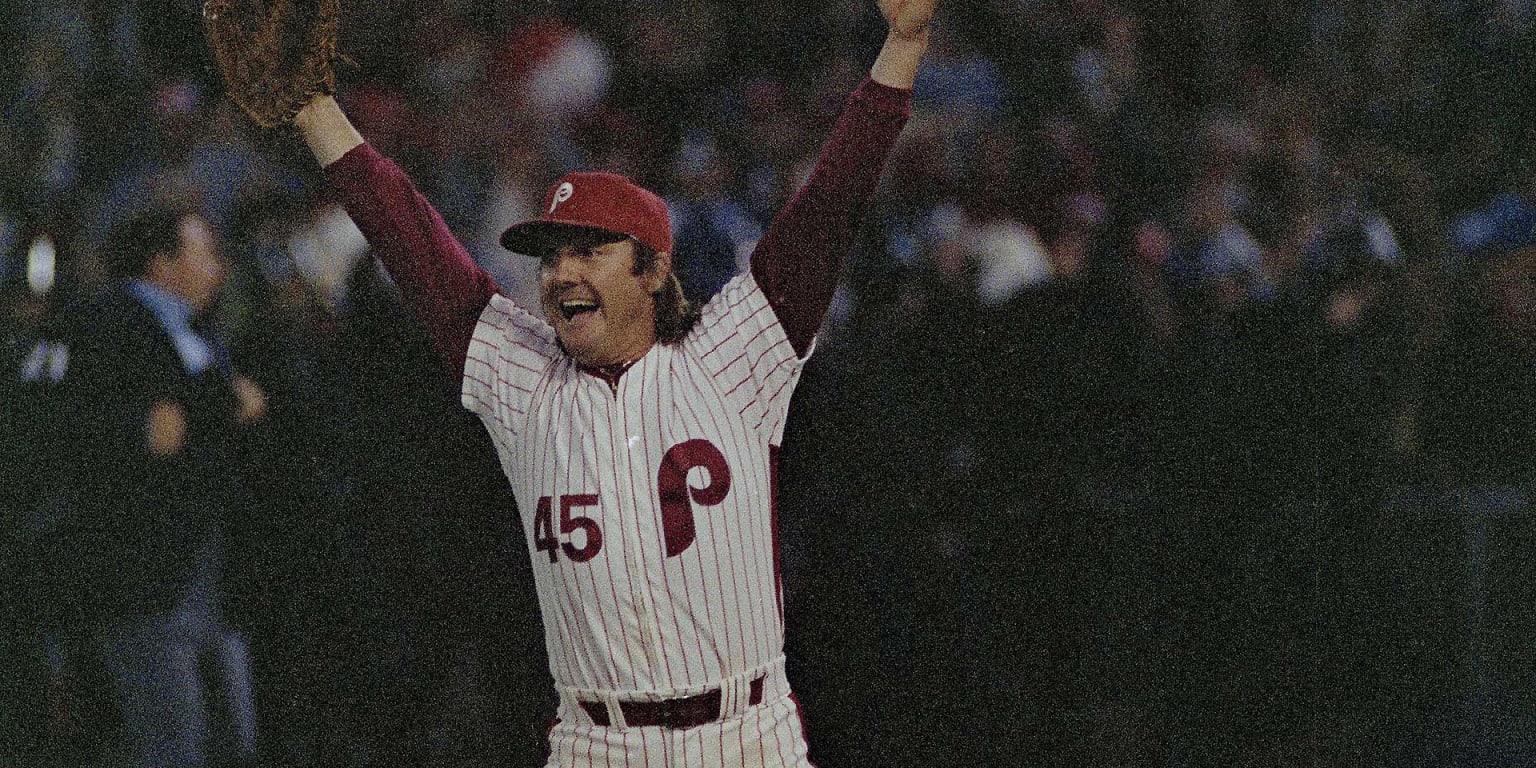
Philadelphia Phillies v2
In this set, the Phils stick with their current color scheme. Home + road uniforms are basically unchanged (like in the previous set, I used player numbers on the left sleeve). Cream alternate uniform uses a liberty bell logo on the left sleeve instead, while the red alternate uniform uses this notif on the front of the jersey. I also brought back their old blue brimmed alternate hats to use with the red alternates. Finally, a modern version of their 80's home uniforms is resurrected as a counterpart to their excellent powder blue throwbacks.
-
2
-
-
Philadelphia Phillies
The Phils have a great look, a real modern classic with clean colors + clean design cues. I guess if there's one knock on them, it's that their throwbacks are arguably still the best look. So for this set, I moved to their 80's color scheme of maroon red and powder blue full-time.
Home and road uniforms are mostly unchanged (except for the colors, of course), while I also brought back player numbers on the sleeves. Not sure why they went away from this... probably in anticipation of leaving the space for jersey ads (SO. :censored:ING. STUPID).
Powder blue throwback/alternate is maintained as is, while I also added a secondary jersey from the 60's which provides some nice contrast with its brighter shade of red.
-
5
-
1
-
 1
1
-
-
Las Vegas Athletics 2.0
The A's switch to a brighter shade of green across the board.
-
2
-
-
On 7/5/2023 at 12:43 PM, coco1997 said:
I agree with @Yee Yee Go 'Stros! about picking one shade of green and sticking to it. The A's have been walking the line between forest and Kelly green for a few years now and I think relocating to a new city would be the perfect opportunity for them to commit to Kelly green (or a new shade entirely) full time and firmly establish their Vegas identity.
I hear ya, there's definitely something to be said for consistency. I do like the idea of Kelly green as a designated "throwback color" in the same way the Philadelphia Eagles use it... but I get it. Kelly green looks awesome. . And they could easily just use that shade full time. I'm working on that for my next set.
-
On 6/28/2023 at 1:14 PM, coco1997 said:
That is a LOT of Mets jerseys!
 Personally, I'd look for multiple jerseys that are similar and try consolidating them into one design. For instance, I don't think you need two blue alts (I always thought the road alt with gray wordmark was butt ugly) and I think you could combine the two throwbacks into one; plain white with racing stripes could be a sharp look, or you could be really bold and make the racing striped set the home primary. Perhaps you could put the "NY" monogram on one of the jerseys (the black alt?) rather than just using the "Mets" script and "New York" wordmark everywhere.
I will say, I love that you added an orange alternate. It's so weird to me that the Mets haven't added that look to their rotation in real life.Thanks, and yeah, I ended up consolidating some things. Too much redundancy. I feel the same way about orange also, it looks great on the Mets BP jerseys + hats so I'd love to see them use it more in their game uniforms.
-
1
-
-
Oakland/Las Vegas Athletics
For this set, I'm gonna assume the A's do indeed move to Las Vegas after their current stadium lease is up. However, regardless of if they leave Oakland or not - I really hope they don't mess around with their uniforms. Oakland has some of the best sets in the game (and that's not just my opinion). They absolutely shouldn't move away from the green and gold color scheme, or the classic "A" hat. Personally, I'd just like to see them just replace "Oakland" with "Las Vegas" where applicable and call it a day.
With that said, my set stays pretty true to this idea. Home, Road, Gold + Green Alternate uniforms stay basically as is. I added some yellow trim to the sleeve logo, as well as a subdued 8-point Las Vegas star on the pants. Gold jerseys get white numbers. Kelly green alternate/faux-back uniforms are tweaked to include a cursive "Las Vegas" script in place of "Oakland". And finally, the throwback uniform is an old-school home set from the powerhouse 1970's era.
-
3
-
-
Nice work on this series! I really like what you did with Pittsburgh in particular, the bridges on the sleeves was a nice touch.
-
New York Mets
Switching over to the other half of New York, I found that my problem with the Mets was actually the opposite of my problem with the Yankees: rather than trying to come up with additional designs, I had trouble limiting myself to just 6. Everything the Mets have done in recent times - eliminating the drop shadowing, bringing back black home uniforms on Fridays - has been fantastic. Their home and road uniforms, in particular, are just about perfect. So nothing changes on that front.
The new uniforms that I made for this include an orange alternate jersey, in the same style as their old "Los Mets" jerseys. I also revived their 1986 road throwback jerseys, with the racing stripes on the pants and jerseys.
-
2
-
1
-
-
New York Yankees
Truth be told, this is really more of an "academic exercise" than anything. We all know damn well the Yankees aren't gonna change their uniforms. And honestly, there's no need to. The Yankee pinstripes are possibly the most iconic uniforms in all of sports, something synonymous with winning. Simply put, there's no need to mess with perfection.
With that being said, Home and Road looks stay as is. Alternate uniform is basically just a modified version of their Home BP uniforms, with a white brimmed cap. Throwback uniform is a new look I created, with a cream base and a hat logo is also tweaked to be the older style NY logo (as opposed to the current one).
-
2
-
-
Miami (Florida) Marlins v2
Pretty simple premise - in this version, the Marlins go back to their throwback uniform(s) full time. I did make a few updates to the design, but for the most part these are late 90's/early 2000's in all their glory.
-
2
-
-
On 6/21/2023 at 11:56 AM, chcarlson23 said:
I love this look for the Twins!! I love the new look anyways, but this is a better!!
The subtle pinstripes at home is exactly what they need! The numbers do look a little big on the back of the jerseys however. I’d also try and find a way to include the new Minnesota logo, as well as the M and StP logos, or maybe even Minnie and Paul. But this is an upgrade on an already fantastic set!
Thanks, much appreciated!
I actually looked around online for the new Minnesota + M/StP logos but couldn't find graphics of them anywhere. IDK, maybe they're hiding them behind a paywall somewhere? I did my best to recreate the state of Minnesota one for the home and road uniforms, because I do like them as well.
But regardless, thanks for the support!-
1
-
-
Minnesota Twins
Like the Brew Crew, the Twins did a great job with their last rebrand. Nice update to the look, while also paying homage to the original brand. I really like the direction they took, as well as several of the new design elements they introduced: tri-color batting helmets, subdued pinstripes on the road uniforms, and the new sleeve logo all look great.
Some of the changes I made are as follows:
- Added subdued pinstripes to the home white jerseys, to match the vibe of the road jerseys. I also dropped the tri-color stripes from the sleeves, as I think they look better just plain
- Added a tri-color hat to match the home batting helmets
- Red top button is added back to the hats
- Added a new sleeve logo, which is just a re-colored version of their corporate roundel logo I created
- "Twin Cities" alternate home uniform is changed to be white instead of cream based. I also used tri-color stripes and red numbers
Additionally, I brought back a modern iteration of their red alternate uniforms, which was a very underrated look IMO. Throwback uniform is a powder blue set with the old school "Twins" wordmark and classic block numbers.
-
4
-
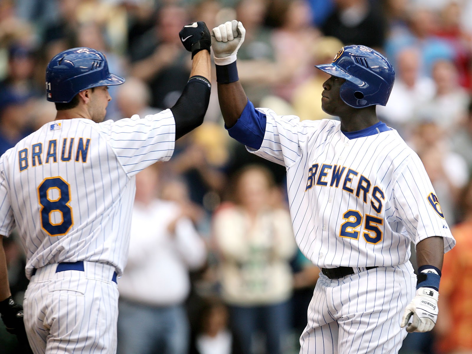
Milwaukee Brewers
The Brewers absolutely nailed their last rebrand IMO, so I didn't make any Earth-shattering changes here. Mostly just tweaks to improve on the already solid base. For my version, I also substituted the primary ball & glove logo in place of the newer baseball logo on the pinstripe jerseys, just like on their old Sunday home uniforms. The other uniforms all use the gold brick Wisconsin logo on the sleeves instead.
Furthermore, the navy blue alternate uniforms are changed to include double gold piping on the sleeves + headspoon. The cream home uniform is tweaked to have the same style sleeve stripes as the road uniform. Currently they are thicker and positioned slightly differently, which is a small but subtle difference that absolutely drives me nuts. Gotta keep things symmetrical, goddamnit!
In addition to the four primary uniforms, I included two throwback options. First set is the underrated 90's-style home uniforms, with the number font tweaked to be a more standard block font, as I hated the actual number font. Second set is an 80's-style powder blue uniform, as a nod to their (almost) World Series-winning 1982 squad. Although their current shade of navy blue works just fine - you can't NOT include that classic shade of blue somewhere.
-
4
-
-
Miami Marlins
For my iteration, I went back to their classic color scheme while also adding some new elements. Primary home jersey is teal-heavy with some black accents, while the road uniform is the opposite. Hat logo is their current primary logo re-colored, while the chest logo uses the classic-style script. Number font is modified to something that matches this style.
Additonally, all uniforms now use a subdued sun "halo" logo around the front jersey numbers, which is an idea I got from the old Florida Marlins alternate logo. This, along with the sleeve logos, helps to add a touch of color to fit the South Florida vibe of a Miami-based team. Lastly, a road throwback uniform is brought back into the mix to compliment their excellent home pinstripe throwback jerseys.
-
3
-
-
Nicely done! I like where you're going with these. Just a suggestion: drop the Ohio flag motif from the front of the jerseys, up the resolution, and you'll have a fantastic set.
-
On 5/31/2023 at 12:07 PM, Elmos World 17 said:
The numbers on the 70s alt are wrong, they should be McAuliffe
I used the BoSox font for these, it's the closest thing I could find. Honestly I don't think it looks that far off. But good looking out.-
1
-
-
On 5/21/2023 at 11:10 AM, MJD7 said:
I’ve been meaning to catch up on this series, but everything looks great! Some highlights for me so far are the Cubs cream alt, the White Sox white alt, and the Guardians’ throwbacks. The updates for the Red Sox & Rockies to each fully embrace green were both improvements.
Just a couple of nitpicks, I think the Reds’ red alt could afford to drop black entirely like the rest of their set. I also think the Rockies’ green alt should be paired with white pants, since the cap has a white front panel, and the helmet should match the cap.
I also would be interested in seeing a full Astros set inspired by the navy “City Connect” alt. Overall, I would encourage you to be willing to take more creative risks like that, as when you have so far, they’ve worked out nicely! I’m looking forward to seeing the remaining 2/3 of the league!
Thanks man, much appreciated! Great ideas as well, you were dead on about the Astros.


/cdn.vox-cdn.com/uploads/chorus_image/image/63094760/machadojersey.0.jpeg)
/cdn.vox-cdn.com/uploads/chorus_asset/file/24542853/usa_today_20201463.jpg)
MLB Concepts 2023 (Epilogue: Tampa Bay Rays v3)
in Concepts
Posted
Tampa Bay Rays
My favorite team not named the Brewers (and pound for pound, maybe the best run organization in baseball) is a team that's gotten progressively less radical with every rebranding. They went from their bold 90's uniforms with rainbow gradients, to the less radical but still funky early-2000's green & black jerseys, to the current anodyne "Rays" jerseys. Nothing offensive about these, but nothing terribly interesting, either.
Although some people hate on their current color scheme, I actually like how the navy blue & sky blue contrast with the white and gold secondary colors. I would just like to see them play up that contrast a little more. For my look, I use the same drop shadow text effect from the primary logo, and apply it to the player numbers and names. I also tweaked the number font to approximate something closer to the wordmark.
Road grey uniforms are changed to have a "Tampa Bay" wordmark in place of "Rays" and the navy blue alternates are tweaked to include the stylized sun logo like their excellent teal alternates. Furthermore, I simplified their home white "Devil Rays" throwback uniforms a bit, as I hate the double outline purple numbers they currently use. Finally, I revived a slightly tweaked version of their old forest green uniforms, which was my favorite Rays look from that era.