


aawagner011
-
Posts
3,893 -
Joined
-
Last visited
-
Days Won
5
Posts posted by aawagner011
-
-
Not sure if it’s a new thing, but the Pirates are wearing their Willy Stargell inspired BP cap paired with the home whites.
-
 1
1
-
-
I’m hoping the new EA Sports College Football Game has lots of alternates available! Would love to play a season with my Dawgs in more than just red and white jerseys. I feel confident the black jerseys will be there, but if we get the white helmets and pants the recruits wear, and maybe even some throwbacks like the 1980 look

-
4
-
-
33 minutes ago, coco1997 said:
Those look real to me. I think it would be hard to photoshop the new script and subtle pinstripes faithfully on all three models without a slip up somewhere. The jersey mostly feels like a standard alternate until you read the script. The cap feels somewhat disjointed from the rest, but as far as City Connects go, these are good. They still look like the Cards.The zig zag pins are definitely taken from the city flag.

-
1
-
-
25 minutes ago, tBBP said:
People may wanna read this part very closely:
Jus' sayin...you've been put on notice.
That messaging is confusing. He was hired to get their brand back on track and now he’s saying they will start deviating again?-
1
-
-
35 minutes ago, DCarp1231 said:
Where the hell is it, Panthers!?!?
Seeing as it never made it onto an NFL field, it’s staying in the wardrobe where it belongs.
-
6
-
 1
1
-
 1
1
-
-
When do we expect to see the kit assignments for Euro 2024? My wife and I are going to Europe this summer and were lucky enough to get tickets to see Spain and Croatia in Berlin. I’m hoping to see the classic matchup of Spain in red and blue, and Croatia in their checkers. I think it should be fine since the rest of Croatia’s kit is white, but their checkers are oversized this year with big splashes of red. I’m hoping they don’t deem it a clash and require they wear alternates.
On 5/13/2024 at 2:34 PM, andregunts said:wrong thread guys
I didn’t notice that until after I replied to the OP but it was too late at that point. -
1 hour ago, DCarp1231 said:
I wanted to check the source, and it’s straight from the Jaguars Twitter account. This would infer block numbers but I am not 100% convinced. Antonio Brown’s network showed a possible leak with the modern numerals.Now before you say “consider the source,” remember they absolutely nailed every aspect of the Broncos and Texans. I’m hoping it’s the modern numerals because those are definitely the better look. Block numbers are ok, and better than what they currently have, but still not as good.
-
8
-
-
Another Oregon teaser. The swoosh, Oregon logo, and Big 10 logo will all be chrome so that any combo can be mixed and matched. Somewhat interestingly, it looks like Oregon will keep with the same template. Usually they roll out the new style 2-3 years before everyone else.
-
1
-
-
That’s definitely a legitimate leak. It’s fine.
-
6
-
-
15 hours ago, Brave-Bird 08 said:
Mets might as well go ahead and re-retire the black jerseys. I wonder if the specific nature of the numerals with the white and orange trim just couldn't be done with this new "technology" or whatever, because I can't for the life of me see why else they would take action to remove it.
Probably to make their set more cohesive. While I agree the old black jerseys looked better, they featured design aspects from a bygone era with the drop shadow. Nothing else in their set features that anymore, so it makes sense to drop it. I’m having no issues making out the script or numbers, but the names are a bit tougher since those are two colors at a small scale.
-
1
-
-
1 hour ago, burgundy said:
Either EA leaked new uniforms for Notre Dame, or they done goofed again.
If real, I'm not sure I like it, but I'll have to see actual uniforms on the field. I have noticed an increase in the prominence of gold under Freeman, so a switch to gold sleeve logos isn't totally surprising.
There is a second version of that image which has a gold tag on the upper neck. Might be new uniforms.
-
2
-
-
9 minutes ago, Brave-Bird 08 said:
Ridiculously far.
Braves, Angels, Mariners and Astros are the only ones I like.
and the Braves isn't really that good, but I am just appreciative -- in hindsight since this program is further along -- that they look unquestionably like the Braves when they're in them. For most teams you can't even tell who you are watching.
I think we might have similar taste. I agree with you on those four, though I am not a huge fan of the slogans or nicknames on the jerseys (Space City, Brew Crew, Wrigleyville, etc).There are a couple more that I’d add into the “good” category. I really like the White Sox and they are one of the few that I don’t hate the different wordmark. But if it were a full time identity, I’d prefer the standard White Sox logo. But I love the pins on the black uniform with the matching pants, and I kinda like the number font.
The Royals is good. They play it pretty safe but it could be an every day MLB uniform. Same with the Diamondbacks.
The Marlins is a fun deviation from their normal look while still feeling very Miami. I don’t love the cap logo but appreciate its historical significance. The script is beautiful.
Lastly, I kinda like the Orioles but only when the uniform is worn how it first released, with the pops of color hidden. The all black with simple wordmark and basic cap logo make me think of a retro uniform from the 1920s or so.
The rest are trash. Burn them all.
-
1
-
-
27 minutes ago, tsizer said:
Who else feels like they stray a little too far with the city connects?
From the mothership:
Of these, I would say only half look somewhat or even vaguely like the club they are supposed to represent. And I think that’s the problem with the City Connect program. While it allows teams to explore alternate identities, too many of them stray too far from the norm and have zero relation to the team. I think a better approach would be to run a heritage program, as we have seen a bit in the NHL. It allows teams to offer variety without going too far outside their normal color palette. Heck, you could even tie it into the Cooperstown angle, as we have seen Majestic and Nike do the last decade or so with the merchandise they’ve offered.
-
2
-
-
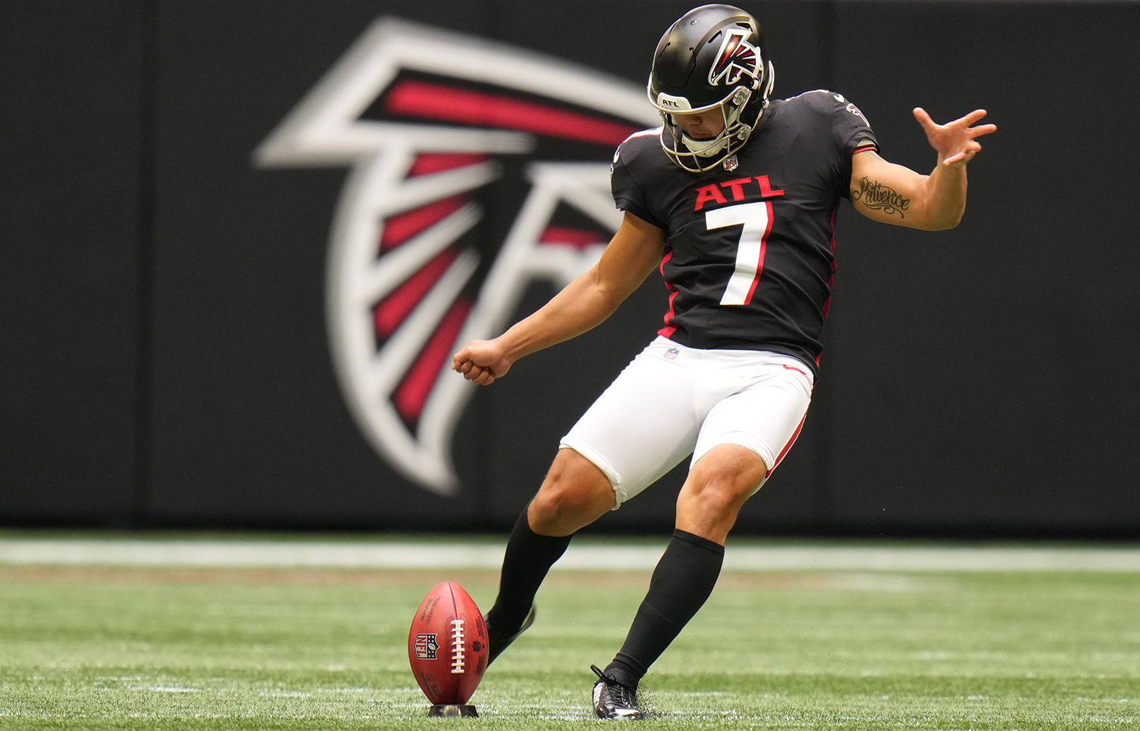
12 hours ago, WBeltz said:
His number has been taken for a bit.....
Amidst all the dog and Mike Vick jokes, if we want to get technical, Younghoe Koo has moved on from #7 to #6 to make way for Bijan Robinson.
-
1
-
 1
1
-
-
9 hours ago, officeglenn said:
Bayern Munich officially release 2024-25 home kit:
The photo isn’t loading but here are a couple. This is not a bad shirt but far from their best. I am strongly of the belief that the home shirt should use the normal crest. This is noteworthy because this makes two seasons in a row without the colored badge.
Allianz will become the new sleeve sponsor. The Bayern sleeve was unsponsored this year and displayed an anti racism message but has been sponsored in years prior. Allianz has been the arena sponsor since it opened and also the women’s sponsor. Their logo comes with a twist. It is a QR code for a campaign that refunds one out of every 100 shirts sold. There will be additional activations throughout the upcoming campaign.
The multiple tones of red make it feel like a version of their Parley shirt or the 15/16 kit (one of their absolute best).
-
I have no idea if there is validity to this, but former Falcons running back Jamal Anderson (from the 1998 run and famous for the Dirty Bird) is claiming new uniforms for 2025. Most of the context is in the video. He is an advocate for simpler uniforms but says he doesn’t know anything about the new design. Is it true? 2024 will be the fifth year in the current design, so they are eligible in 2025. Guess we’ll have to see.
-
4
-
 6
6
-
 2
2
-
-
The article is probably enough to please most baseball fans while still leaving plenty of questions for uniform nerds like us.
Passan acknowledges:
- Bigger lettering
- Mismatched grays
- Visible sweat (this would infer a material change)
- Pants construction
Does this mean they are simply going backwards to the old template? I would be very surprised if that were the case. I could see them using the new template with the old materials. But some clubs (Orioles, Braves to name a couple) modified their designs to adhere to the template. The material change has also resulted in some colors appearing a bit different this year (Braves navy blue for one, various clubs off white or cream). What happens there? Will sleeve trim still be limited to the cuff? Will the batterman logo remain below the headspoon? Speaking of the headspoon, will they keep the skinny style? Will pants retain the new loops style? Also, there is so much brand new retail product that just hit the market (and in some cases is still hitting the market for the first time). Will fan gear be modified? Could we see a situation where on field gear doesn’t match the fan gear? What about fans that have already purchased the new gear and are being told it’s already being replaced one month into the season? Passan says the changes will take place by the start of 2025 at the latest, suggesting a mid season change may be possible.
-
6
-
-
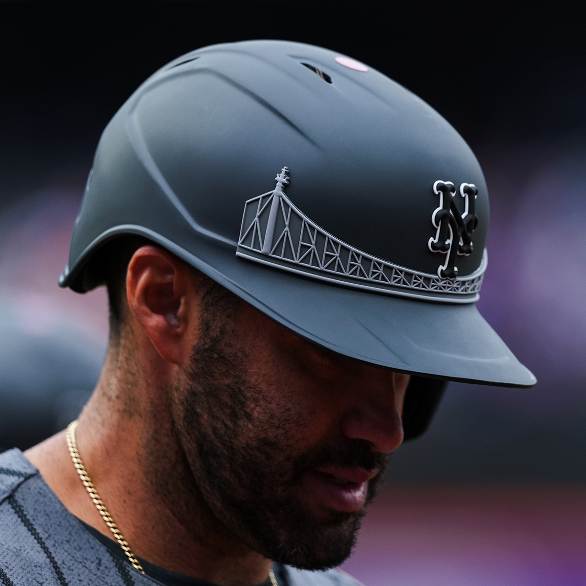
17 hours ago, NOLAPelicans23 said:
I like the Mets City Connects from the waist up. Think they definitely should have gone with gray pants with pins.That helmet needs a rework, though. The bridge has no business being that pronounced or that light in color. You can barely see it on the cap (which is probably why I like it).
-
1
-
-
These are not as wild as I anticipated. The way they described them as four unique sets made me think they’d be like the Commanders with little to no similar design principles across the set. They do have some differences but enough similarities that they feel related.
That doesn’t mean they are great. They are absolutely a downgrade from the previous set. While fairly safe, the old designs were one of the better NFL uniforms and had little to no flaws.
The new set has several issues. The number font is a step down. Some digits look ok, but others look absolutely horrible (the 2 and 3 in particular). Then there are several inconsistencies where I’d just like them to pick a style and apply it across the entire closet. The navy blue home has a two tone collar. The H Town set has a slightly different single color collar. The away and red alt do not have contrasting collars.
The home jersey looks fine, but the logos on the sleeves are boring when they used to have a flash of red there previously. The away doesn’t look bad, but it looks boring with too much navy. It’s really missing the red numbers. Also, this application of the horn looks best with the blue and red contrasting starkly against the white.
The red set is close but it’s over stimulating with too much red. My OCD is on overdrive because the numbers and pants stripe use both navy and white, while the helmet and jersey horns are strictly navy blue and red. Pop some white in there and it might be good. Also, white numbers would be a better choice, but it looks like they still contrast fairly well.
The H Town uni is its own mess. Don’t need to get into that.
Overall, I’d say a 6/10. Not horrible, but a marked step down from what they had. A few key decisions and these could have been much better.
-
11
-
-
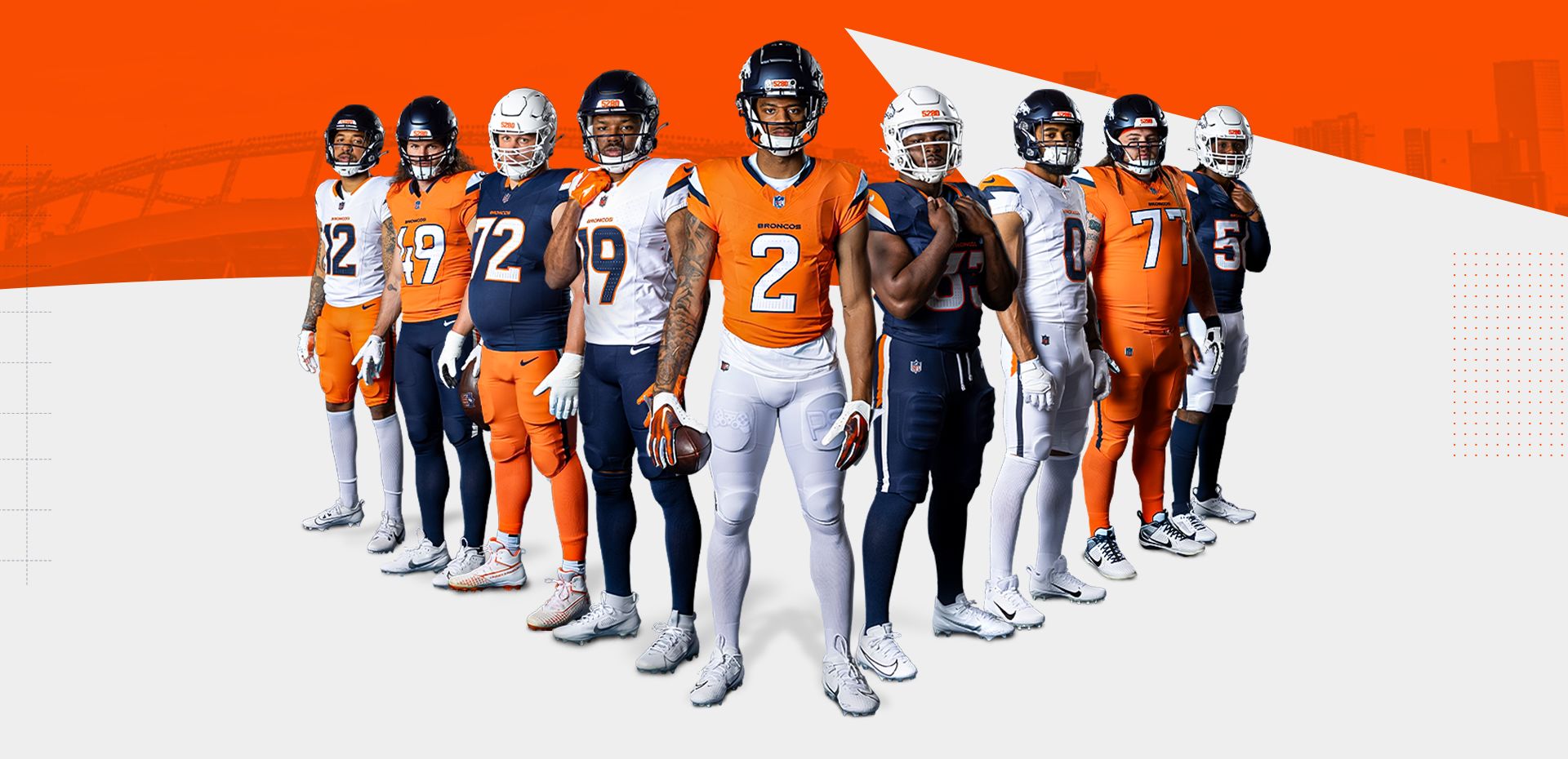
I’m not sure if I’d make this switch if it was up to me, but it makes the design feel a bit fresher. Then again, I’m 32 and navy blue is really all I remember the Broncos wearing besides the odd throwback here or there.
-
17
-
3
-
3
-
 2
2
-
-
10 minutes ago, tBBP said:
Well, if anyone wants mini-reprieve from the ongoing Denver Colorados fiasco, how about a couple heaping tablespoons of steer-seasoned salt??
Wouldn't surprise me one bit to find out she was/is the reason for the "H-Town Blue" even being a thing in the first place...
I can’t listen to this crap and closed the video. She does realize the Titans literally own the Oilers and it’s a continuation of their franchise? They are one and the same entity. How can you be upset at the Titans wearing throwbacks from their own franchise history? Whether the Tennessee fans take to the Oilers history or not, it is rightfully theirs to do with it as they please. Do you see the Milwaukee Brewers moaning and complaining about the Braves wearing their city’s uniforms?-
2
-
-
Just because you have so many possible combos does not mean you need to show off all of them!
These have a couple redeeming qualities but definitely a few too many pieces of flair. They didn’t know when to stop and just said “give me all of it.”
And we have proven yet again the biggest epidemic to NFL uniforms remains what should be the easiest fix.
-
16
-
-
^ the Jaguars current uniforms are pretty harmless considering some of the horrid looks they’ve had in the past. Not as nice as the throwbacks they are about to debut, but probably one of their better looks. But those back of the knee mini stripes have got to be one of the stupidest design features I’ve seen on a football uniform. They aren’t ugly because of how subtle they are, but I have no idea what purpose they serve.
-
8
-
-
There is nothing new here and I recognize it’s just a spring game. But from a competition perspective, does UNC not see the contrast issue? Carolina blue is a very light shade. They could have helped with all Carolina blue against all white, or used some of their navy pieces.
-
2
-


/cdn.vox-cdn.com/uploads/chorus_asset/file/25435204/New_Kit_Cover.jpg)


:no_upscale()/cdn.vox-cdn.com/uploads/chorus_asset/file/22972404/622559060.jpg)


MLB 2024 Uniform/Logo Changes
in Sports Logo News
Posted
I agree. Yankees look perfect now and the new road is beautiful. I would not change a single thing about them. I even like the satin batting helmet on the road (it kinda gives off a retro feel) while the gloss works with the pins. If they aren’t the best, they are absolutely top 3.