


aawagner011
-
Posts
3,877 -
Joined
-
Last visited
-
Days Won
5
Posts posted by aawagner011
-
-
Teams should not wear perma-memorials. If the owner passes away, sure, wear a patch for that season. But the team does not need to wear a patch 20-30 years after they have passed and ownership has changed hands. I liked how the Ricketts described their ownership of the Cubs. They described themselves as stewards of the ball club. They recognize they are in control right now, but their ownership is really just a moment in time until their time ends.
-
 5
5
-
-
41 minutes ago, upperV03 said:
Arsenal’s home shirt for next season has leaked and, much like the leaked Bayern kit, it is absolutely dreadful. The cannon is great, but the rest is garbage. This template is going to butcher a lot of teams’ looks.

With the navy blue panels and how pronounced the white panels are, it looks like a modern, crappy interpretation of this shirt from 25 heads ago.
-
3
-
-
3 hours ago, namefornamesake said:
It's missing the retro Phillies patch on the sleeve, though.
3 hours ago, BadSeed84 said:Nevermind then, that stinks.
I don’t think they had the patch last year, either. Check the time stamp. -
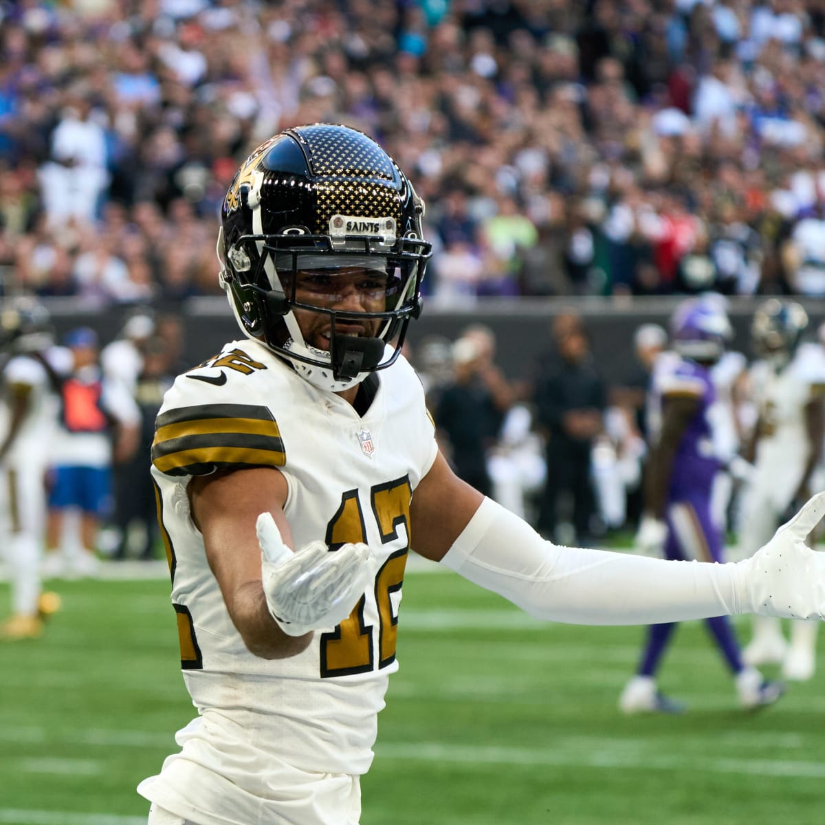
The way the rule is written makes it seem like the Saints have to revert from this nasty design:
…back to this beauty
A major win, if true. And perhaps they reclassify an all black design as Color Rush if they want to keep the black helmet, similar to what the Panthers did. I don’t see any reason the current Color Rush can’t stick around strictly as a throwback, perhaps with period appropriate black striped socks. It’s more just reshuffling the classifications than anything else.
-
6
-
-
6 hours ago, PurpleHayes said:
Yes, they used to use professionals who had good taste, something which I feel is lacking now in the Nike era, where it's all about making a splashy uniform that will generate love 'em/hate 'em vibes, because to Nike there is no such thing as bad publicity.
It also gives them an excuse to use the "we listened to the fans" explanation when they undo the changes and go back to a more traditional uniform...which begs the question as to why they didn't "listen to the fans" in the first place before adding side panels, alarm clock numbers, piping, chrome facemasks, shoulder panels, stupid number fonts, etc.
No one in their right mind would say that the fans demanded these changes.
One reason: Nike HATES fans who like traditional uniforms, because it makes it harder to roll out an all-new design every five years...they would do it every single year if the NFL let them, and every NFL team would also become like Oregon with 1,572 uniform combinations.
The blame for the rise in monochrome is squarely on the players, who in my opinion should not be put in charge of deciding what uniform to wear, or should be trusted to understand what even looks good. Every current NFL player grew up watching Any Given Sunday (or that putrid Longest Yard remake) with its' mono-black and mono-white unis, but this doesn't mean they look good on the field to the FAN.
I recommend reading Uni Watch‘s two recent Substack articles. The first interview is with a Nike employee who created Color Rush. The second explains how designing for the NFL works. I have a much different understanding of the process after reading the interviews.At the end of the day, most of these poor designs fall at the feet of the team. Nike is not allowed by the NFL to communicate with the teams. The only way they engage with the teams is through the league. So they cannot solicit any designs. The process begins only when teams submit notice to the league and even then, communication is through the league unless it’s a planned sit down meeting between Nike and the team to get input.
The designer specifically addressed your point about the alarm clock numbers. The Bucs’ ownership came to Nike asking for a more futuristic design. Nike even advised against the chrome outline because it would not withstand long term use in the wash, but ownership loved it. Same thing with the Vikings numbers. Nike threw out the different numbers just as an idea. Ownership fell so in love with the concept, that Nike even submitted several other options with more traditional numbers but the team wouldn’t hear it. Nike also has nothing to do with helmet design - that comes strictly from the NFL and has for about a decade.
At the end of the day, Nike is designing what the teams are asking for. The designer acknowledged in the interview that there are many teams who know who they are and won’t even entertain the idea of wacky redesigns or alternates. That’s how we ended up with the Packers and Giants all white Color Rush (which was a league initiative and participation required of all teams). But for those teams that want to push the envelope, Nike is designing whatever they ask for. The client dictates the design process.
-
4
-
 1
1
-
-
The various shades of red make it look like a crappier version of this beauty.
It’s a shame because this might be the last Bayern shirt Thomas Müller wears before retiring (I suppose he’ll wear the 25/26 shirt in the final game of the season, but you know what I mean).
-
2
-
-
The 24/25 Bayern home shirt has leaked and it is awful. I am on board with the various shades of red, but the tonal logos look horrible.
This makes two kits in a row without the normal badge. The current kit is a different look than normal, but I was able to look past the all red badge because red sleeves against a white body have been traditional Bayern designs in the past. This new design, is garbage, though. If this shirt had a white adidas logo and Telekom sponsor, along with the regular colored crest, it would be good.
-
1
-
-
41 minutes ago, MJWalker45 said:
MLS One Planet jerseys. Three different jersey color sets this year! They're also using the 2024 adidas template. MLS lists them as pre-match shirts instead of game jerseys though.
Our long national nightmare of hideous recycled plastic MLS jerseys have been relegated from game use to strictly prematch use! A great cause but they always looked terrible.
-
2
-
-
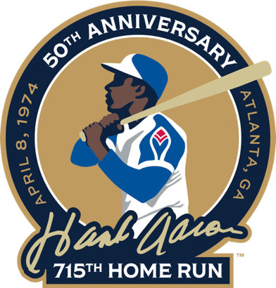
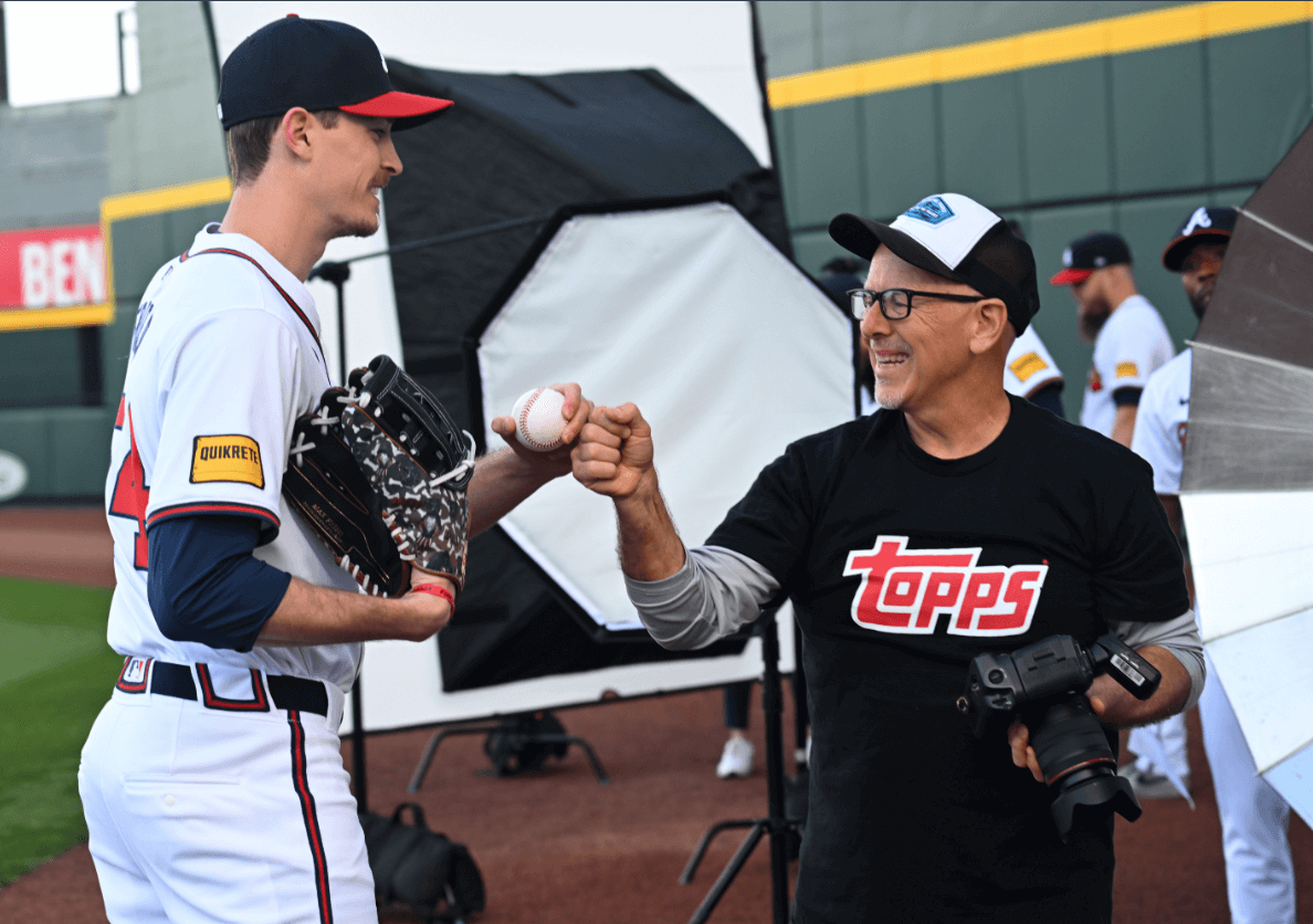
Hank Aaron 50th anniversary logo.
It’s not my favorite, but it’s decent. There’s too much going on and it would look better without the date or city/state. I think they could simplify “715th Home Run” to just 715 because it’s such an iconic moment and everyone knows what you mean by 715.
Here are past anniversary logos. These were very strong and you can see the stark difference in how simple they were compared to the new one. I like how all include his signature, though it’s interesting the first two use the same signature while the new one is a different style.
It feels appropriate to include his silhouette since this is the first milestone since his passing. I must express my displeasure that the Braves aren’t wearing it on their jerseys this year. They wore the other two patches and the 50th should absolutely be worn on field. The Braves only have an ad patch and no other patches, so there’s no reason not to. Maybe they’ll wear it on April 8, but if I recall, the other patches were worn for all 162 games. Anniversary and similar style patches are part of what makes baseball special. The history should be celebrated.
———
I’ve seen a few folks wondering what’s up with the Braves uniforms. They wore white for their first two home games when they’d typically wear red on Friday and City Connects on Saturdays. It could be a couple things. They could be delayed like other teams. Or it could be they chose to wear white since it’s their first homestand of the season. I think they’ve done that before. They definitely have the City Connects, because their auction page says they’ll be worn on the 8th for the anniversary. Maybe they’re just choosing to debut them for the 8th, which would be fitting. It’s a shame they won’t be the true 1974 throwbacks, but good to know they’re an option and not delayed like some other uniforms.
QuoteRonald Acuña Jr. MLB Authenticated, Team Issued OR Game Worn City Connect Jersey. This jersey will be worn on Monday, April 8th, 2024 to honor the legacy of Hank Aaron on the occasion of the 50th anniversary of his historic 715th home run.
-
1
-
-
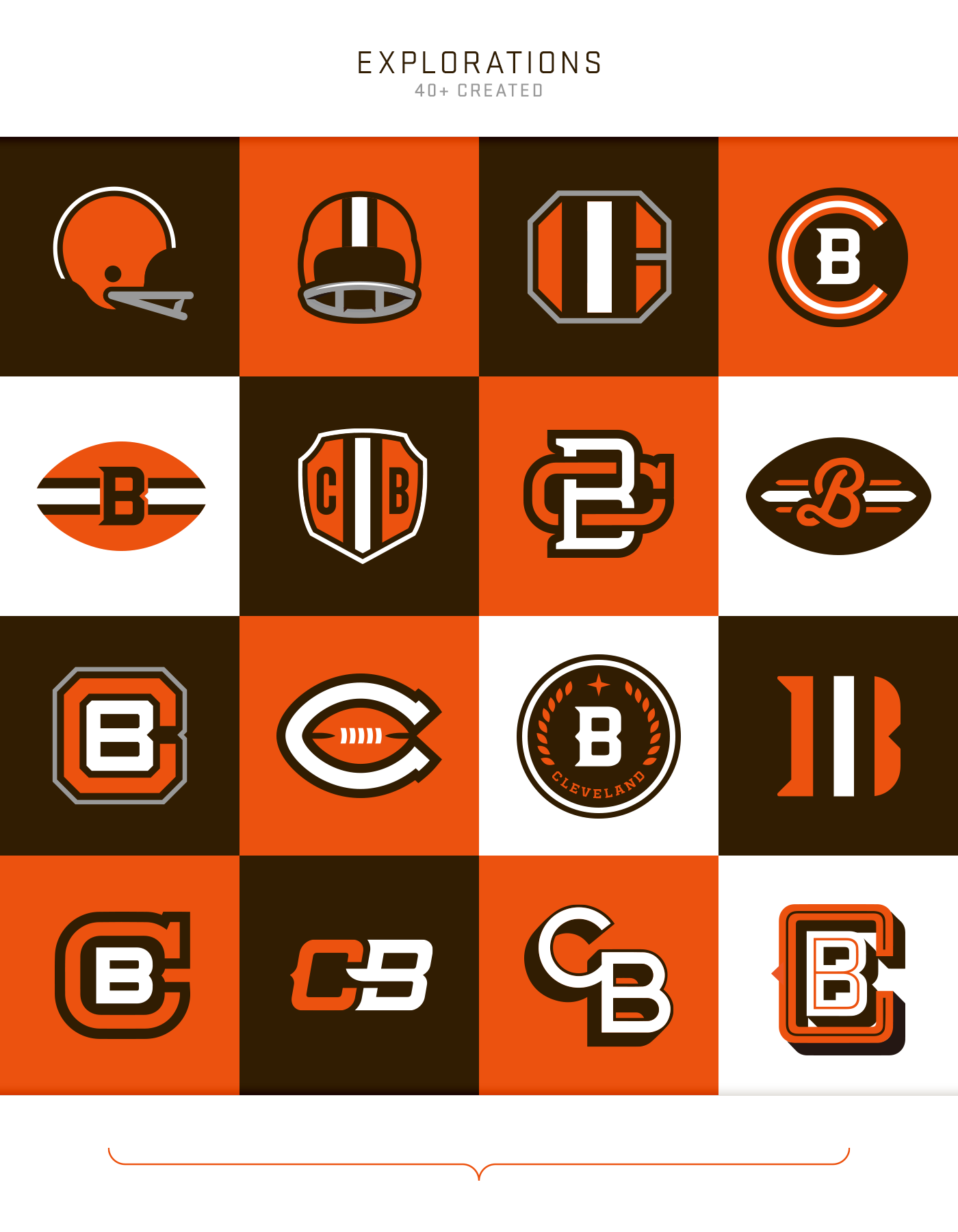
Of all the Browns concepts over the years, I think my favorites have been the two far left options in the top row here. Both timeless and could stick around forever. Not indicative of a manufacturer’s helmet style like the current logo. Fairly generic but not in a cheap way.
-
5
-
-
On 4/1/2024 at 10:05 PM, MJWalker45 said:
https://apnews.com/article/germany-jersey-44-ss-421cfb4113bd823c679640ff57133f98
Any Germany number 44 jerseys that were ordered won't be delivered. I'm guessing they may have to rework the font set, if not just the 4.
That was a quick fix. Already resolved for the women’s game.
-
5
-
 1
1
-
-
I am watching the Braves pregame festivities (it’s their home opener) and the pants situation is even more bizarre than originally believed. Please stay with me here.
We knew they had belt loop stripes on the home but not on the road.
The old pants always had the striping on the sides and on the back, but never on the front. They also had thinner loops on the front, so it made sense there wasn’t striping present there.
The pants worn in spring mostly followed the old design, except moving the side piping over slightly so that it no longer connected to the vertical pant stripe. You’ll notice in the shot of Max Fried above that there is no belt loop piping on the front loops and you also see that on Acuña here.
The pants worn on the road have not featured any belt loop piping at all.
They wore the same pants in spring.
None of this information so far is new. However…
Plot twist! The home pants they are debuting tonight have belt loop piping on the front! A new addition which does not match the design seen in ST or preseason photos.
Wtf is happening? To date, we have seen two styles of home pants, and one road pant, none of which match one another. Can they make up their mind? Atlanta had such classic designs and needs the piping.
Edit - better photos.
-
2
-
 1
1
-
-
This doesn’t read like someone who is confident about the design. More like the executives showed him the uniform and internally he’s thinking how awful they are but feels obligated to praise them. He’s an Under Armour guy, after all.
https://www.mlb.com/phillies/news/phillies-unveil-city-connect-uniforms
QuoteA year ago, Phillies executives invited Harper to look at the Nike City Connect uniforms they would wear in 2024. The group spent years working on the look and feel of them. They wanted his opinion.
Harper is the face of the franchise. His voice matters.
Harper looked at the cap and jersey in executive vice president Dave Buck’s office at BayCare Ballpark in Clearwater, Fla. He said nothing at first. His silence lasted for only a few seconds, but it felt like forever to everybody else in the room.
Well?!
“They’re dope,” Harper said.
The uniform is unlike anything the Phillies have done in the past, which was the plan from the very beginning. It explained why it took Harper a bit to say something that day in Clearwater.
“When I first saw them, I definitely didn’t think that was the vibe they were going to go with,” Harper said. “I never thought blue, yellow, that kind of thing. I never thought those were going to be the colors. I thought red or green for the Phanatic, or even black. Those were on my mind before I saw it. And then I saw it, and then I got the story behind it, and I thought it was cool. It’s way different than anything anybody could have ever imagined, but it comes together so well. The look, the story, everything.”
-
1
-
-
16 minutes ago, MCM0313 said:
I’m pretty sure a bunch of the 2013-18(?) Jaguars hated their uniforms. Or at least the helmets.
He addresses this in the Color Rush article. Apparently there was a brief period where Nike worked on a couple helmets. They stopped about a year or two into the contract when the CTE concerns and single helmet rule came into effect. That pushed Nike to essentially have zero involvement in helmet design going forward. However, there were three they worked on: the Vikings, Jaguars, and Seahawks. Supposedly the mock ups of the Jaguars featured a much more gradual fade and looked better. He said at some point in the development, the league and Riddell took over sampling with various applications and finishes to the point that the end product was totally butchered from the intended design. He said it was so bad that Nike expected they’d quickly fix it before the season began and were disappointed when it was not. That was another sticking point in the articles: while these redesign processes can take 2-3 years, he said the actually design processes are fairly quick and it’s the corporate America hoops to jump through and meetings that slow the process down to a crawl. And partially from the NFL’s own rules (ie notice of intent to redesign and five year rule preventing redesigns) that slow things down, though I can see pros and cons to both rules.-
1
-
-
9 hours ago, TrueYankee26 said:
So they’ll be like Prince or Madonna? “Where’s your ball club from?” “Oh they’re just a rag tag touring group of nomads who go by Athletics.”-
1
-
-
33 minutes ago, Brave-Bird 08 said:
I would cut off my pinky toe if the Braves could just rotate the regular home, regular grey road, bring back the "ivory" Sunday alternates, and wear the true 1974 throwbacks on a regular basis (replacing the CC slot on Saturday nights)
The fact they had to shelve either for the sake of this Nike-fied current uniform suite is depressing.
I love each of those uniforms, but this seems more like an organizational decision rather than something spearheaded by Nike. They can have 5 uniforms under the 4+1. All they’d have to do would be to shelve the red or navy (or both) and they could reintroduce either of those. But it seems like they’re content with their current alternates and feel the CC scratches that 1970s throwback itch enough to be satisfied.-
2
-
-
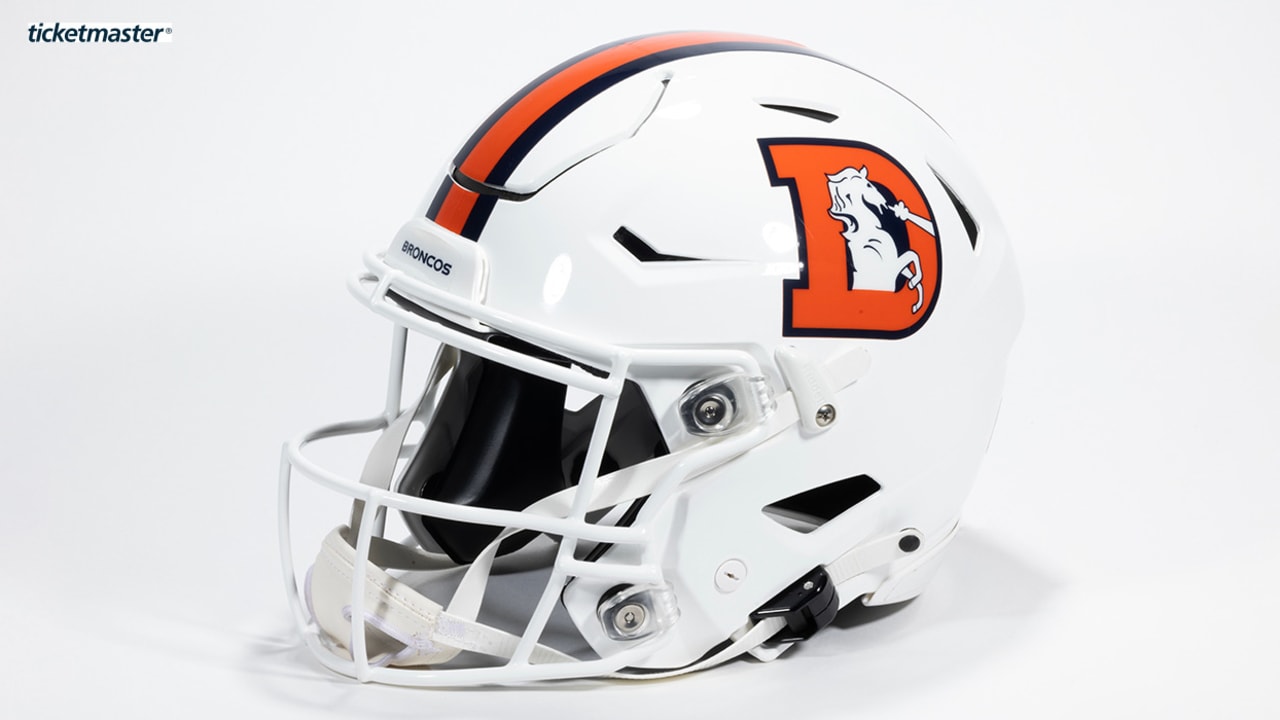
I found myself surprisingly enjoying the Broncos white helmet last year. However, that design uses the throwback logo with the orange D and navy blue outline. The current white logo will not look as nice. It was clearly designed to go on a navy helmet.
-
11
-
-
Not new for the Braves, but I thought it was note worthy given the blue alternate changed. This is the first look at red alternate on the new template and it’ll stay in the wardrobe without any changes.
It’s interesting they’ve played five games and all five have been in the road grays. Usually they tend to split usage between the grays and the navy blues.
If they keep the same schedule as the last couple years, red are worn on Friday home games while the City Connects are used for Saturdays. Home whites for weekdays and Sundays.
-
3 hours ago, bcon_731 said:
Are these the new city connect caps for the rockies?
Braves have a similarly City Connect themed variant. Probably just a fashion cap.
-
1
-
-
4 hours ago, aawagner011 said:
The Braves play in an hour and we will get an answer about the belt loop piping. It’s been modified to work on the new Nike home pants but has been inexplicably missing from the road pants. It’s weird because they should be identical, save for white vs gray. I’m hoping that’s been fixed.
No belt loop piping for the Braves road pants. That mismatch with the home will drive me absolutely nuts. Inexcusable. Hopefully it’s just for a short while and it can be fixed. The Braves belong in belt loop piping.
-
6
-
-
The Braves play in an hour and we will get an answer about the belt loop piping. It’s been modified to work on the new Nike home pants but has been inexplicably missing from the road pants. It’s weird because they should be identical, save for white vs gray. I’m hoping that’s been fixed.
-
Apparently the Royals big NOBs were only for ST and they get the small ones like everyone else. Sorry for the low res images. Best I can find are screenshot from their IG story.
From what I’ve seen so far, if a team uses a single color NOB, it looks fine to me. The ones that look bad are the teams with an outline, like the Rays below. It’s especially bad because the white outline gives the letter the appearance of being even smaller.
-
5
-
-
45 minutes ago, CC97 said:
The Dodgers blue jerseys are listed specifically as "ALTERNATE" in the style guide, whereas the Tigers and Yankees both fill their quotas with jerseys tagged "SPRING TRAINING"
Good to know! Wouldn’t mind seeing them worn. Definitely better than the City Connects.
-
1
-
-
First on- field look at the Yanks. They look fantastic. The thumbnail shows a side by side but the video does show players in-game wearing them if you’re curious.
-
3
-
 3
3
-


.jpg)
.jpg)
.jpg)


.jpg)
.jpg)


:format(webp)/cdn.vox-cdn.com/uploads/chorus_image/image/73237384/2110559085.0.jpg)
:format(webp)/cdn.vox-cdn.com/uploads/chorus_image/image/73251720/usa_today_22918637.0.jpg)
:format(webp)/cdn.vox-cdn.com/uploads/chorus_image/image/73246370/usa_today_22915482.0.jpg)
:format(webp)/cdn.vox-cdn.com/uploads/chorus_image/image/73240868/2036206447.0.jpg)


/cdn.vox-cdn.com/photo_images/7344230/20120609_jla_av3_571.jpg)


:format(webp)/cdn.vox-cdn.com/uploads/chorus_image/image/73229500/usa_today_22818285.0.jpg)
:format(webp)/cdn.vox-cdn.com/uploads/chorus_image/image/73229928/usa_today_22744746.0.jpg)


2024 International (National Team) Soccer Kits
in Sports Logo News
Posted
I didn’t realize the previous posts were club related in the international thread. Whoops!
I picked up a pair of the new Germany shorts and they are very bizarre. I love the design, but the construction is unlike any other shorts I’ve had before - and I’ve got plenty of player spec shorts! This was my first look at adidas’s new template. The waistband is my main gripe. All of the stretchiness is limited to just the front. The sides and back of the waistband have zero stretch at all. It’s very weird. Once you are wearing the shorts, they fit fine, but even pulling them on, they feel very different. Not really a fan.