


aawagner011
-
Posts
3,877 -
Joined
-
Last visited
-
Days Won
5
Posts posted by aawagner011
-
-
1 hour ago, Dynasty said:
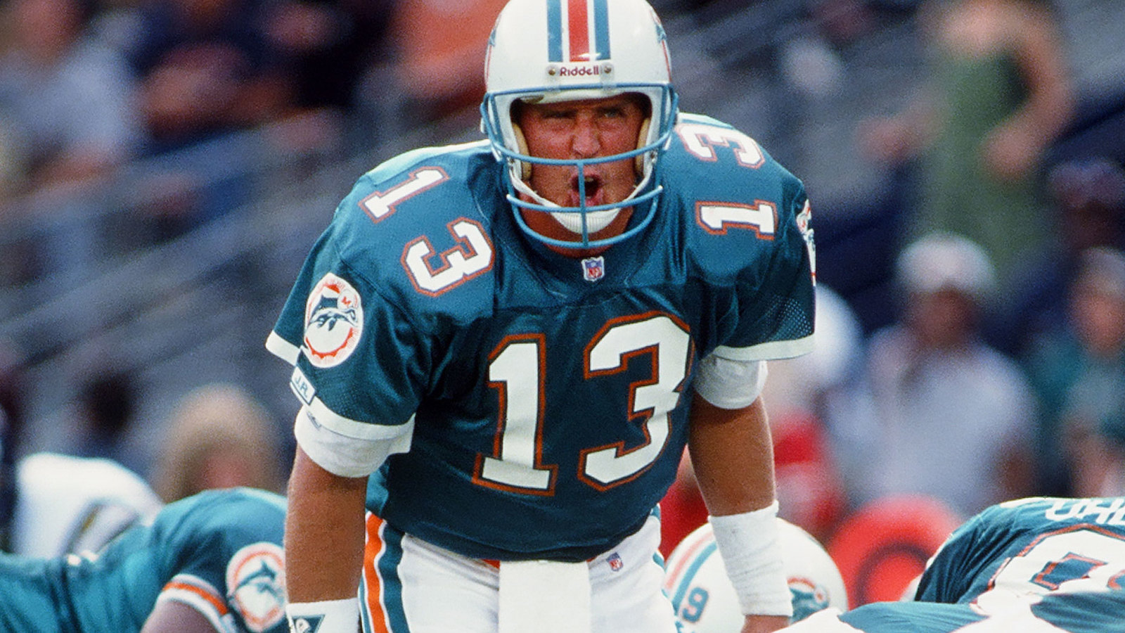
Based on his comments, it tells me that the current set will be around longer than I initially would have thought. For me, it's not as much about the uniforms as it is the logo that needs to be changed. None the less, it's a reminder that the owners opinion is above all else in these matters.
Even if they went the throwback route, it shouldn't be to the 1966 set. Over the decades, the Dolphins corrected on key issues which the inaugural unform had. They changed their facemasks to aqua when NFL uniforms established colored facemasks, they got rid of the fill-in effect from blocked numbers (as seen in that last image), and they corrected on the striping inconsistency with the helmet and pants stripe. Throwbacks can definitely be used again, but it's important to remember the concept of evolution in the case where certain areas are changed for the better.
While a new logo would be nice, I still have gripes with the current uniforms. They look like generic Dolphins uniforms if a film crew couldn’t get the licensing.
There are some positives here. I love the updated colors. I also love how they dropped the dark blue several years ago. However, I think that while aqua should be the main color (besides white), the current uniforms have too much aqua.
Look back at any Dolphins uniform, up until the 2013 rebrand. They all featured a prominent orange stripe down the middle of the helmet. Not only that, but they all featured a stripe pattern with white breaking up the colors. It just doesn’t feel right to see such a thick aqua stripe with only a little bit of orange. Dropping the navy years ago definitely fixed that a bit, but it still feels like the off brand Dolphins.
-
 15
15
-
-
Doesn’t mean much since these will never see the field, but the Yankees spring jerseys have perforated numbers. I was kinda surprised to see that.
-
2
-
-
I’m watching the Inter Miami vs Real Salt Lake match, and apparently Suarez is wearing the debut patch. Makes it even sillier. I could understand it for an academy or young player making his professional debut, but it seems stupid to see the patch on a 37 year old who has won nearly every trophy that the game offers.
-
4
-
-
28 minutes ago, FrutigerAero said:
I wish there was at least a rule that the ads have to be in a color scheme that works for the team. Royals shouldn't be wearing red.
It’s interesting to watch this play out in MLB compared to other leagues such as MLS. It doesn’t happen all the time, but generally, the vast majority of soccer shirts feature an advertisement that matches the kit’s color scheme. Take a look at the 2024 MLS designs.
Maybe that’s in exchange for larger real estate, whereas in baseball, the ad is relegated to a smaller patch. Not that it’s justified, but I could see how the brand would want their logo in full color for maximum recognition since it’s rendered at a smaller scale.
-
5
-
-
I have never liked the debut patch that we’ve now seen in MLS, MLB, and NFL. I guess it’s cool for the trading card community, but I think it’s fairly stupid for on field gear. Another example of the merchandising machine impacting the equipment space.
-
1
-
 1
1
-
 1
1
-
-
Paul mentioned this on Uni Watch today, but man, the slightly see through pants need a total rework. You can see the jersey material under the pants, including the silhouette, jock tags, and pinstripes. This is not the move, Nike!
Apparently the see through pants are not a new thing, though. Here are some images from the Majestic era (check out #70 and #63) where you can see the jocktags just as easily as the 2024 Nike pants.
-
2
-
 1
1
-
-
Hard to see, but looks like the Braves have the perforated numbers on their alternates. If you zoom in, you can see them on the bottom left part of Acuna’s “3.”
This comes after their home whites were shown without the perforations at a fan fest event.
A few other clubs have shown similar situations (such as the Mets, no perforations on their pinstripes but they have them on their blue jerseys). My guess is the ball clubs didn’t love how pronounced the white poked through against the dark numbers, but were willing to concede to Nike on alternates where they may not be as visible (for example, the Braves blue jersey bleeding through the red numbers is not very noticeable). At least this appears to be a choice and not mandated by Nike.
-
These are phenomenal from UNC
-
10
-
 1
1
-
-
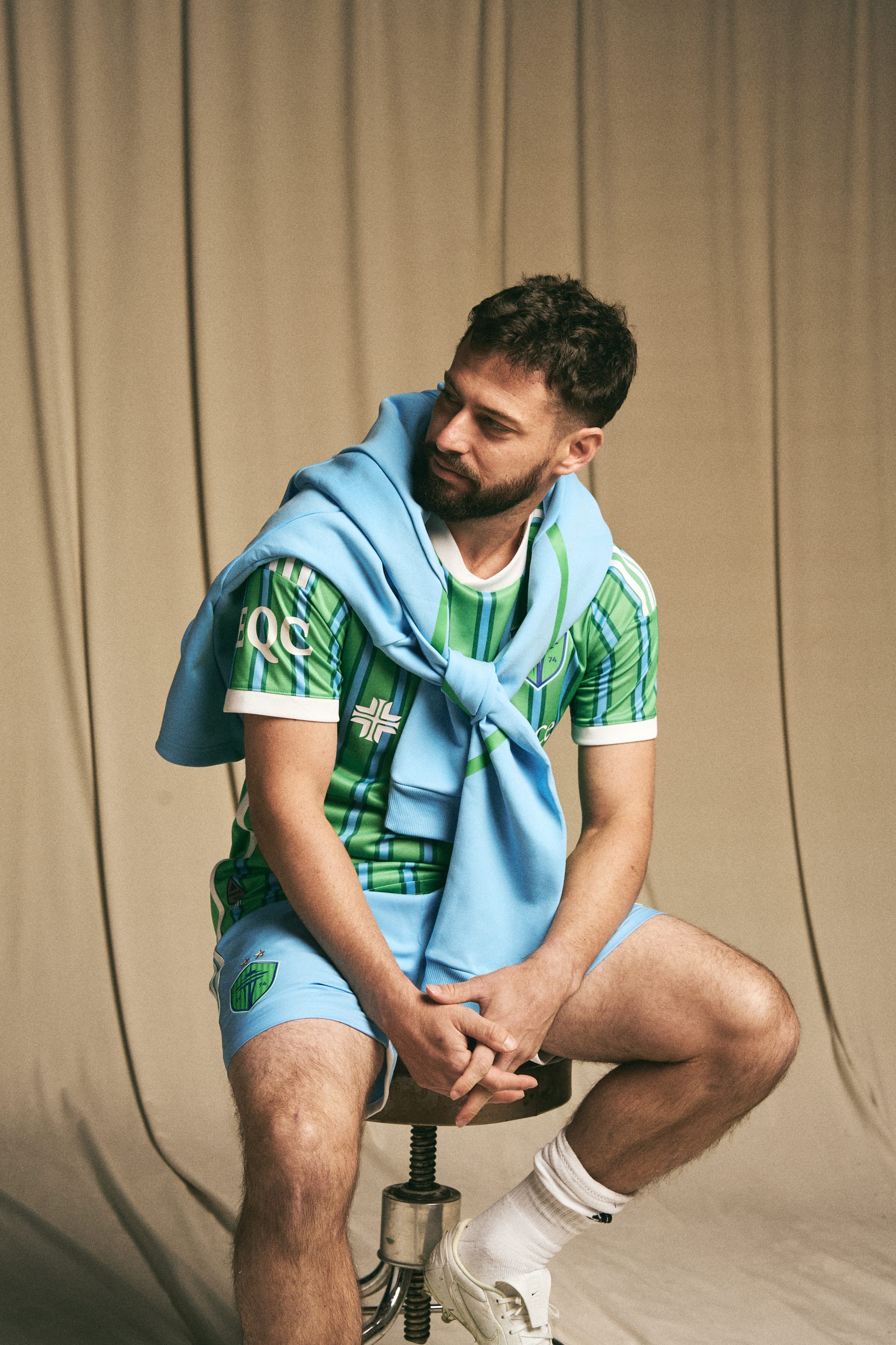
Don’t think I got my wish for royal blue shorts. Still a decent kit.
For anyone unfamiliar with the inspiration, you can see the city flag here.
-
1
-
2
-
-
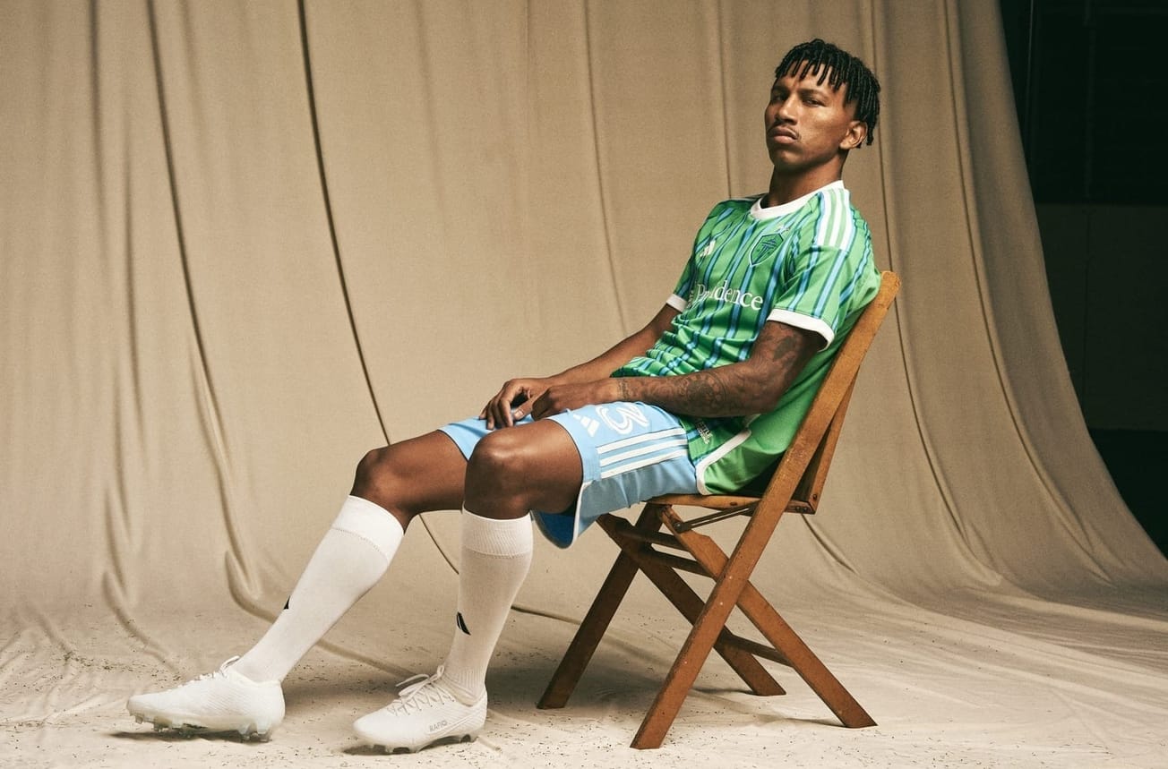
We will get more looks in a couple hours at the Atlanta reveal, but @adidasfootball posted this on Instagram. First look at the full kit. I was really hoping they’d use royal blue shorts. Hopefully there’s a second pair available.
-
2
-
-
1 hour ago, shaydre1019 said:
Is anybody else surprised that the new jerseys didn't carry over the same diagonal texture pattern from the WC template?
I was fully expecting to see that with the new releases. I guess its a slightly different template.
Last year’s MLS kits used this template and did not get the nice textured material. MLS has long used an in between material from adidas. It seems to get the cuts and templates of the fancy adidas kits with the plastic badges, but the material is closer to a lower grade replica. As someone who collects both Atlanta United and German national team shirts, the differences are interesting to see. Maybe one day adidas will treat MLS like a top flight league. I think where we are now is not bad, though. It’s a lot better than some other European teams they sponsor who basically get glorified teamwear. At least MLS gets custom graphics.5 minutes ago, seasaltvanilla said:I mean, the team is nicknamed the Loons, but it is officially named Minnesota United. The star connection doesn't seem crazy when the state motto is Star of the North. There's at least some connective tissue, although I can understand the consistency argument. Could've done a loon wing constellation.
They should do a loon wing shaped by a starry sky. 2026 kit, I’m calling it first
-
1
-
-
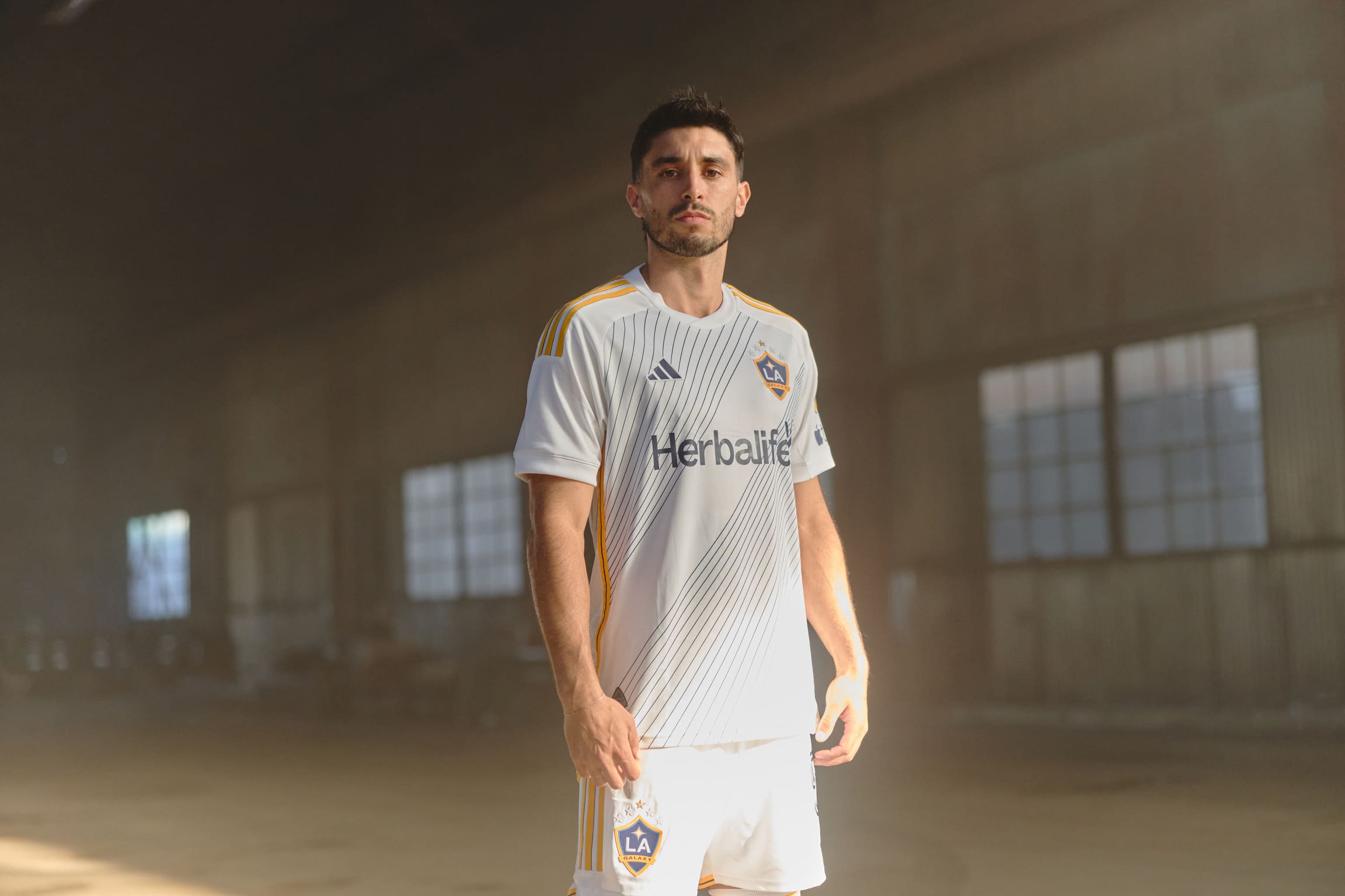
LA Galaxy. Not my favorite look of there’s, but still solid, if a bit subdued.
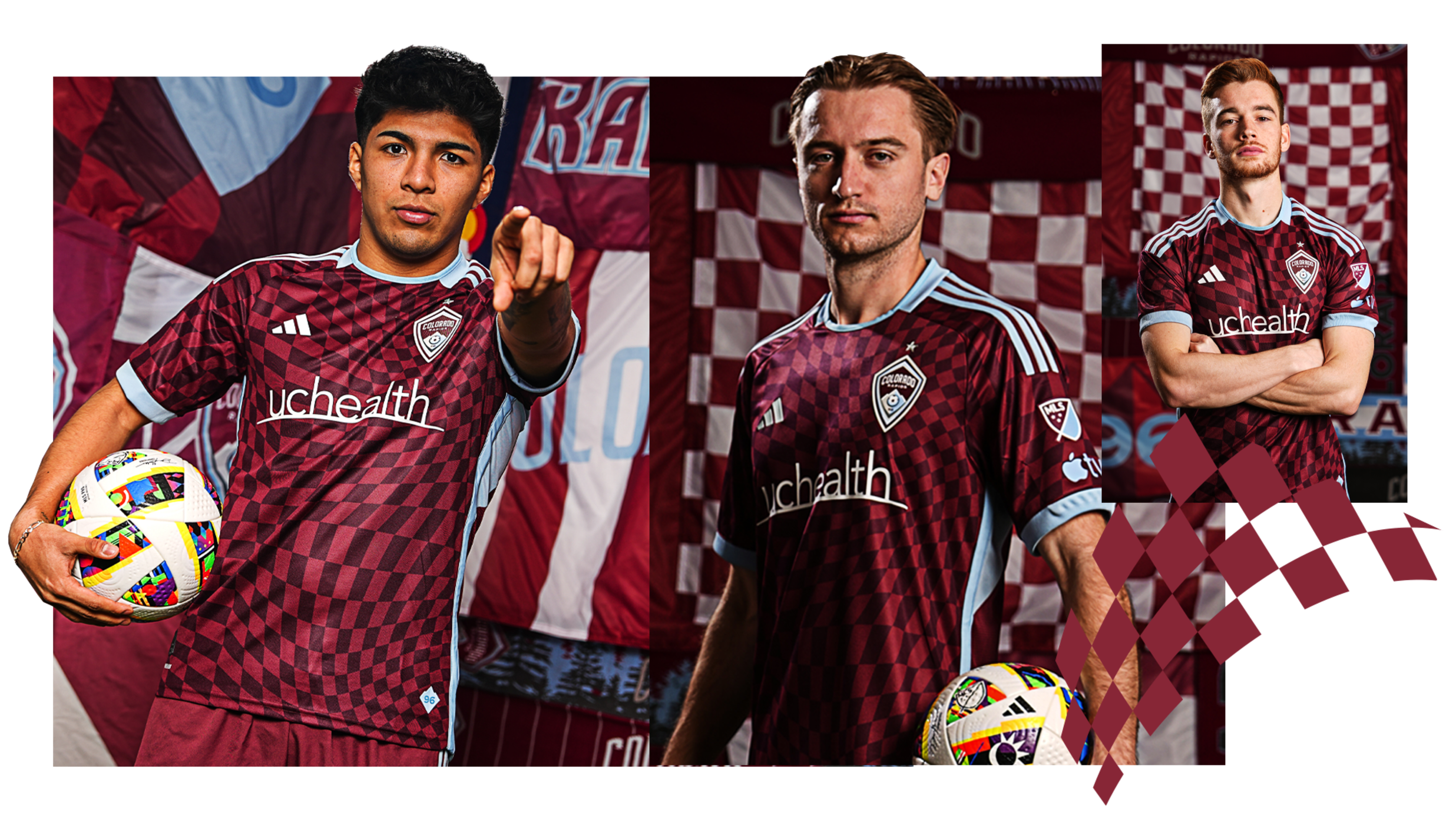
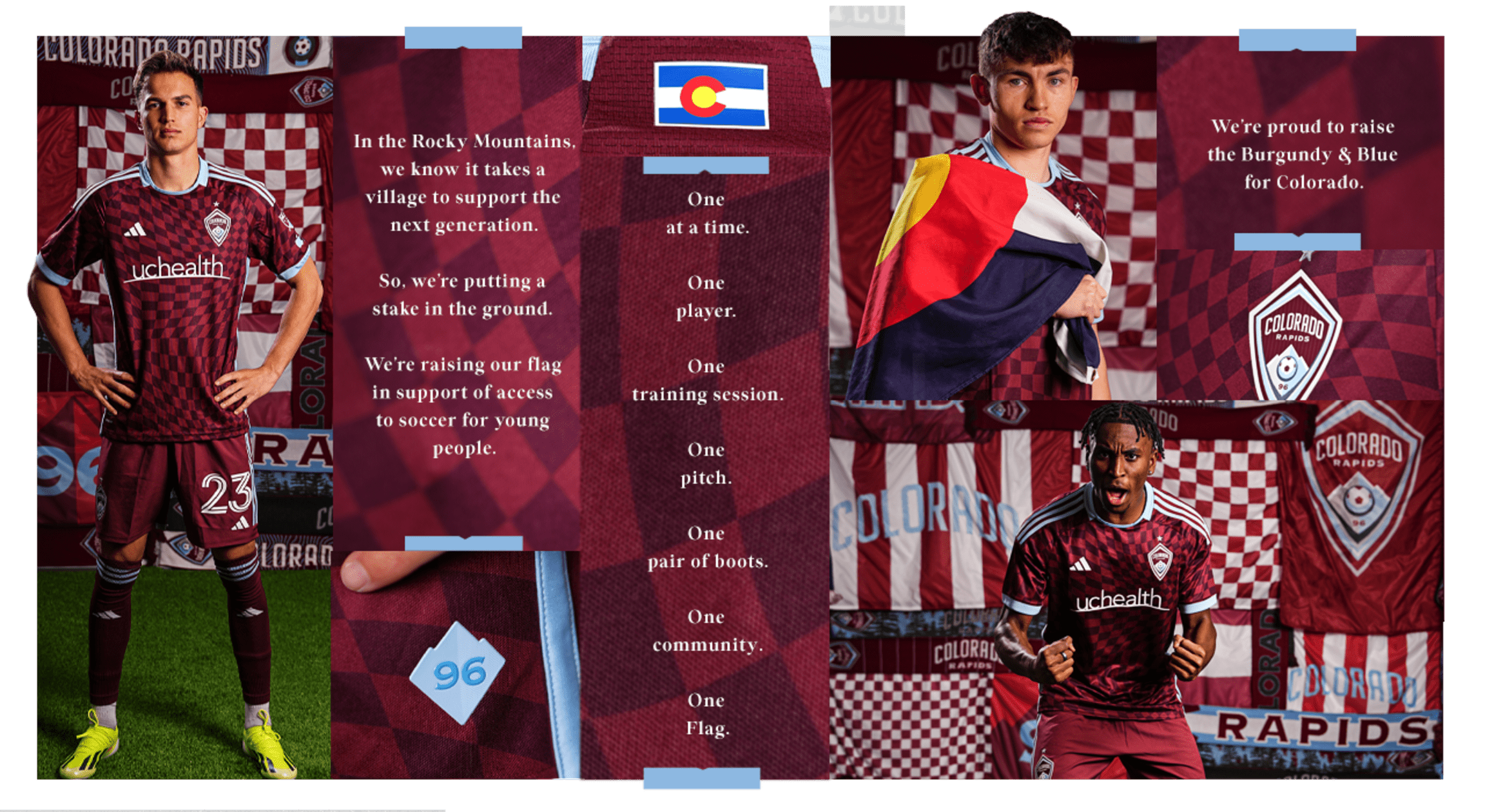
Colorado: it’s fine. I don’t mind the checkers. But I think their brand is a bit stale. Didn’t they have a kit with contrasting sleeves (either white or light blue) a while back? I think that could be a more signature look, and preferably with contrasting shorts, too.
-
3
-
-
1 hour ago, officeglenn said:
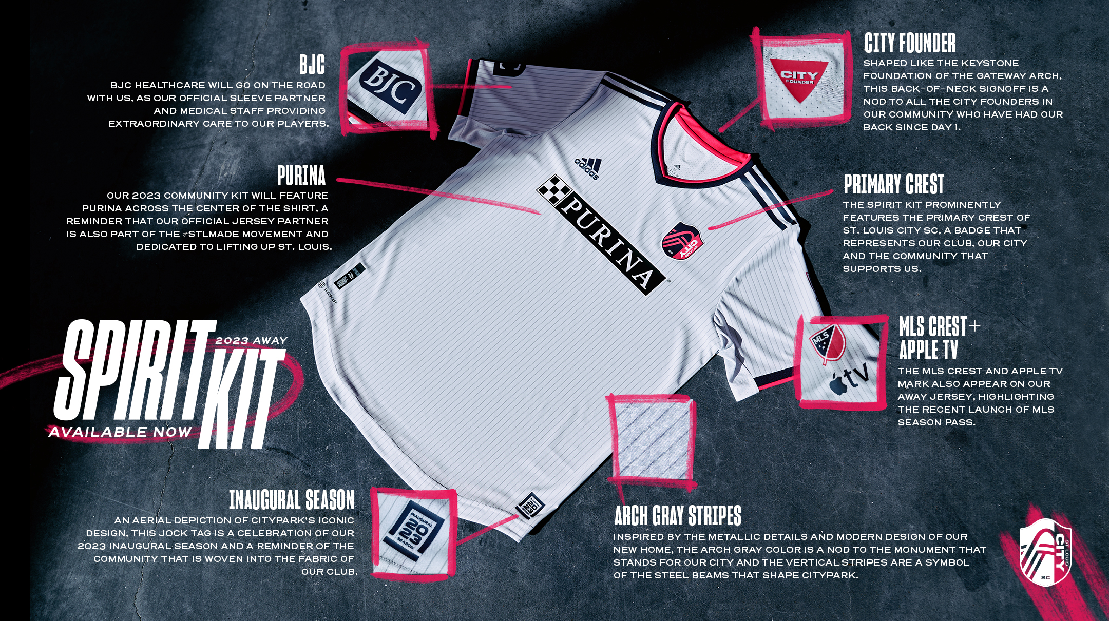
St. Louis CITY SC "Confluence" secondary kit:
So is St Louis settling in with a standard away look? It’s not much different than their previous design. Both gray with pink accents. Only main difference is the old design had the full color crest and navy touches. But it seems like they aren’t planning to introduce radically different designs for secondary kits, unlike some clubs.
-
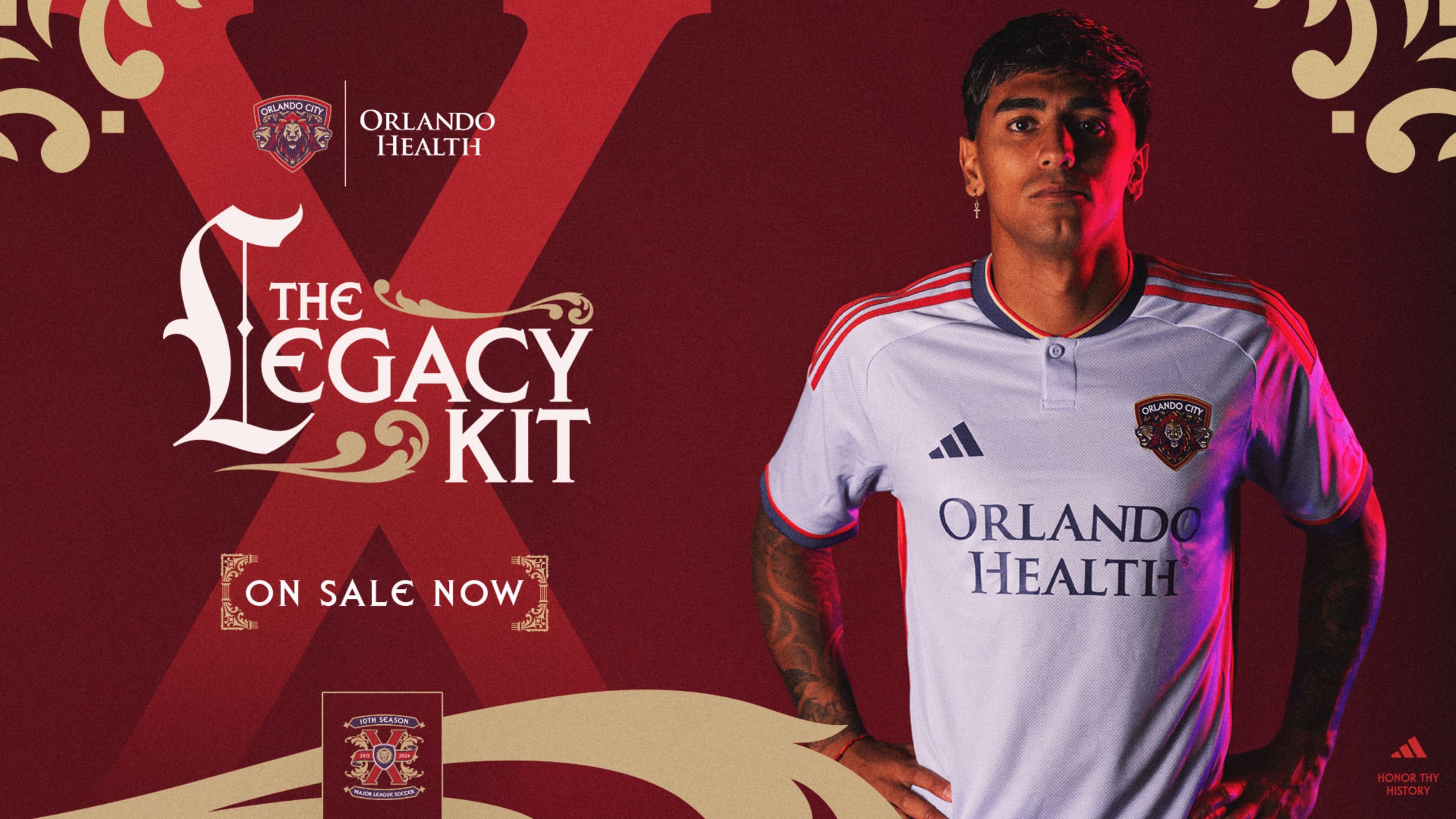
Orlando has dropped. I didn’t realize the color is lavender. I thought it was white. The tweets below have a video showing it with lavender shorts. Also a nice look at the original crest and the updated one that’s used on this shirt. I hated the original crest, but seeing the modern update, think it’s kinda nice.
-
2
-
1
-
 1
1
-
 1
1
-
-
18 minutes ago, Cujo said:
 UNPOPULAR OPINION
I'm actually OK with the smaller font for surnames a dozen letters long.
I think I agree with you.This guy’s name is not particular long. But look how much it’s intruding into the number’s space.
Heaven forbid we have someone with a true long name.
Everyone went crazy over this image because the jersey definitely looks different while on the hanger.
But seeing it actually being worn, does this look so bad? I don’t think so.I think it’s a lot of change all at once, and people just aren’t used to it after baseball has looked a certain way for so long. Don’t get me wrong, I hate some of the changes Nike’s made like the sleeve trim forcing teams to change, and tweaking pants trim (Braves), but I think the name concern is largely overblown.
Also, I realized that photo of the Cardinals players on the field confirms the chain stitched patch is gray on the road jersey. I forget who, but someone brought that up as a concern that it could be a white outline since it’s no longer direct embroidery.
-
4
-
3
-
-
Some more looks as more teams report to camp
Perforated numbers confirmed for the Fish (also I am liking how much more prominent their sleeve trim is).
Yankees in a look we’ll only see for the next month.
-
2
-
-
1 minute ago, monkeypower said:
The Angels front number has been pushed up.
Also, the inconsistent number renderings from the online store may unfortunately be correct as the front number has the drop shadow while the back numbers don't anymore.
Wow, that’s a real wtf decision if there’s ever been one. The Angels just need to start over and clean things up all around. They have some solid components to their identity, but it needs help. I’d start by making the halo gold like those anniversary caps they had sometime in the last decade.-
10
-
-
7 minutes ago, (probably)notabandwagonfan said:
I don't know if it's just me, but that shade of navy looks a bit lighter than the previous jersey.
It very well may be. When the Braves showed off the home whites at a fan fest, I saw a couple folks make the same comment about the navy blue trim.
-
Maybe it’s my color blindness, but I don’t notice the mismatch on the Seattle crest. I can tell the blue is different, but that doesn’t bother me much. The green looks very close to the shirt, maybe a shade off. It seems to be a polarizing design, that’s for sure.
-
3
-
-
The Sounders shirt was dragged through the mud before it released. I’m here to offer a different opinion. Seeing the full kit with shorts and socks, this thing is a banger. Might be kit of the year. The pastel colors look fantastic and amazingly retro. I’d even venture to label it their best ever kit. I think this is a classic example of not judging a kit just off of the shirt but the entire package with shorts and socks. It’s also one of their first kits where my eyes don’t bleed from the neon colors. Fantastic!
-
11
-
1
-
3
-
3
-
-
1 hour ago, (probably)notabandwagonfan said:
It's hard to tell, but the Braves made have tweaked their away alternate. This jersey doesn't have placket piping and the sleeve piping is red. The current(?) has silver piping.
This might be a Spring Training only jersey but it's new either way, and I thought Nike was doing away with Spring Training jerseys.
Great catch. I’d be shocked if this is a ST only jersey and fully expect it’s the new road alt. The times they had a special jersey just for ST, it used the home script. I found some better photos and it looks like they have swapped everything that was gray for red (including placket piping). I kinda liked the gray trim on the road jersey, but this looks good, too. While the gray looked good, it didn’t quite make sense since it was a single braid of trim and they wore it with their standard gray pants which have a blue/red/blue stripe. This red stripe jersey now matches the pants stripe pattern, so I call it either a push or even a slight upgrade. I will miss the contrast of the gray piping since red will be harder to see, but it’s still good.
For comparison:
-
4
-
-
1 minute ago, illini1 said:
No chainstitching on the Cardinals new jerseys either. It looks like Fanatics got rid of it.
Wrong
And Fanatics, as crappy of a company as they are, only produces what Nike tells them to make. Nothing has changed from that arrangement seeing as how Fanatics bought out Majestic years ago and Nike was using Majestic materials until now. Nike sends Fanatics the specs and all they do is manufacture the product.
-
4
-
-
So when do we expect these to drop? Need to pick up the low crown Braves cap.
Couple more teams in the new threads. If they aren’t posted below, they’ve either already been shown in this thread, haven’t posted good photos to their team’s socials, or haven’t reported to camp yet.
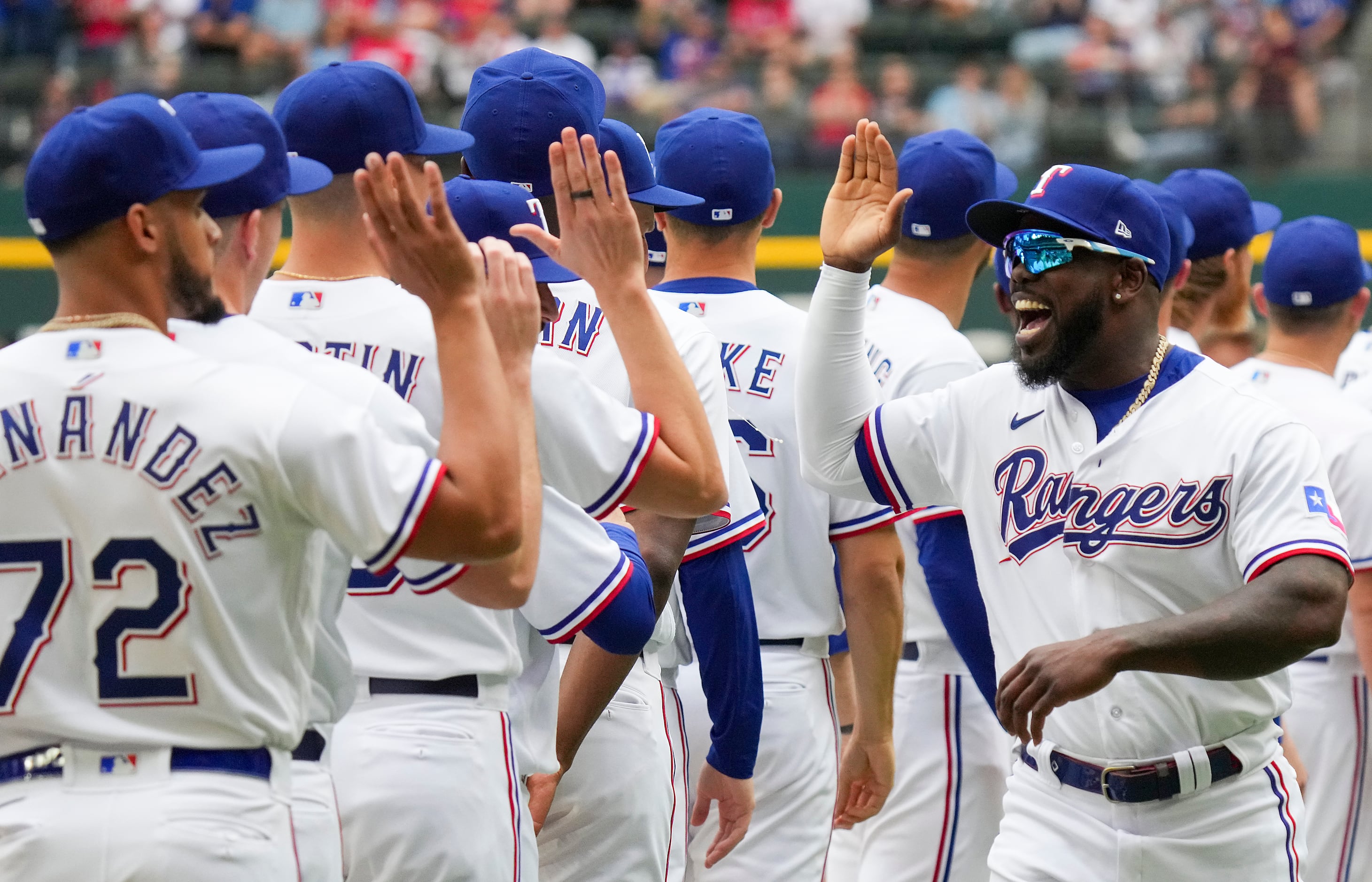
Rangers perforated numbers confirmed
Edit - looks like perforated numbers for the A’s and (very) hard to see but also for the White Sox. Cubs appear to have regular numbers.
Giants
Perforated numbers for the Brewers confirmed.
-
2
-
1
-
-
I kinda like the Houston shirt *ducks*
-
2
-


.jpg)


:format(webp)/cdn.vox-cdn.com/uploads/chorus_image/image/73138227/1963633527.0.jpg)


2024 NFL Changes
in Sports Logo News
Posted
I think that is a pretty loose rule. Maybe most teams didn’t try to push the envelope or challenge what is an “alternate” but we know it’s not strictly alternates or throwbacks because the Panthers wore their black lids with their all black set. My guess is they reclassified all black as Color Rush and it just so happens to include their standard jersey. The NFL should loosen the restrictions on the second helmet. Not because I want to see them more often, but it creates situations where you end up with the Saints ugly black helmet paired with their gorgeous Color Rush. It’s fitting a square peg into a round hole where it doesn’t always fit. Just put a limit on how many games the alternate helmet can be worn and I think that will suffice.