


aawagner011
-
Posts
3,891 -
Joined
-
Last visited
-
Days Won
5
Posts posted by aawagner011
-
-
MLB Shop has real life images of every ball club’s jersey on the new template. I figured it would be nice to compile them all in one spot. Keep in mind these are the replicas and so far, only the homes. Replicas for 2024 now get back the front numbers and sleeve patches, which have been missing from MLB replicas for many years, dating back to the Majestic years and into the early Nike years (Nike just used rebadged Majestic materials, which explains why that carried over). Authentics will have the perforated numbers.
First up, the American League.
AL East
Orioles - sleeve trim moves down to the cuffs.

Rays - no differences besides relocating the trim within the cuff. The trim looks too thick, compared to the headspoon.
Jays - about the same.
Yanks - no changes, though I believe their previous replicas did not have the raglan sleeves, so this is a nice update for them.
Red Sox - no changes.
AL Central
Twins - no changes. Perhaps the cuff trim is slightly thicker.
Tigers - no changes.
Guardians - this is one of the worst changes, for me. On the whole, it’s largely the same. However, the way they’ve applied the collar trim to the new sewn in panel gives it the appearance of a soccer jersey.
White Sox - no changes.
Royals - no changes.
AL West
Astros - no changes aside from moving the trim within the cuff.
Rangers - there was speculation that the script was altered, but I haven’t seen it confirmed.
Mariners - no changes.
Angels - collar trim goes from the edge of the collar, to set inside of a white stripe. I actually like this change a lot.
A’s - no changes.
National League up next.-
 8
8
-
 1
1
-
-
I just need Atlanta to put out a normal looking away kit at some point. It’s wild to me the club is going into its eighth season and has put out wild designs with each version. I’d love for them to put out a simple white kit with red/black/gold details. Or a variant of that (white with only black/gold or white with red/gold).
Alternate kits to date (I’ll include both away and thirds)
2017 - gray kit with pinkish red trim
2018/19 - white with peach, perhaps one of their stronger away designs
2020/21 - white with gold, fine in theory but couldn’t see any details or read the numbers on TV, could have been so much better
2021 - “Unity” third kit with maroon, orange, black
2022/23 - pale green with darker green trim
2023 - “404” third kit, black with neon blue, green, and white.
Also, all of the above kits have featured a monochrome badge. None of them have used the regular badge in the club’s standard colors. I know that’s a common design trend these days, but it seems wild they haven’t had a single alternate kit with the standard badge.
-
1 hour ago, tBBP said:
And the reason they have Aaron Judge's NOB on that jersey is...what now??
MLB has done that for years. I’m assuming it has something to do with player licensing. But they offer styles with both the name and sans name. Not a new thing.———
If you want to see some still photos of the new template, it looks like it’s making its way to college baseball this year, too.
I do not like the way the cuffs bunch up compared to how the trim was previously applied as a clean, stitched braid. Otherwise, it looks fine.
-
3
-
-
1 hour ago, monkeypower said:
Could just be a graphic issue on the shop, but the Angels might have added the drop shadow outline to the front numbers, but not the back, and the NOB is stouter than previous.
I've long been in favour of the Angels making the wordmark and number outlines/dropshadows consistent (either adding to the numbers or removing from the wordmark) on the homes and aways because I always thought it looked weird and made the numbers stick out as plain, but just doing the front number doesn't help that.
Piggy backing off of this, but a ton of new template Nike replicas hit MLB Shop today. I haven’t gone through to check, but it’s definitely most teams, if not all. Not all of the jerseys are available yet. Most offer their home jersey as well as a player jersey or two. I do not see any alternates or City Connects, and as of right now, just one road jersey. But this is the biggest collection of new template photos we’ve seen so far. If you want to get an idea of how your team will look, check this out.The main takeaway for me is that the vast majority of the jerseys look nearly identical. Sure, there are some very minor tweaks, but teams are still going to look like themselves.
Which teams had a change due to the template? I’m not including the perforated numbers or the batterman moving down. I mean more major design changes. I know of the Braves and Orioles moving the sleeve trim down to the cuff. Any others?
And I’ve said this before, but despite the couple gripes, it is very nice to see front numbers and sleeve patches return to the replicas.
-
1
-
-
4 hours ago, McCall said:
Look at the sleeve cuffs. I don't think that's actually the new template. I think they just grabbed a photo with a Nike Cubs jersey and threw it on an ad.
The Mets jersey above does not have the cuff, either. Also, you can see some sheen on the threading on the swoosh. Previously the swoosh was screen printed on the old template.
-
-
I know Colorado is supposed to get a new design. Hopefully nothing too radical because when they stick to the basics, they have one of the most underrated looks in the country.
A lot of movement across with conference realignment. Texas and Oklahoma showed us what they’ll look like in the SEC.
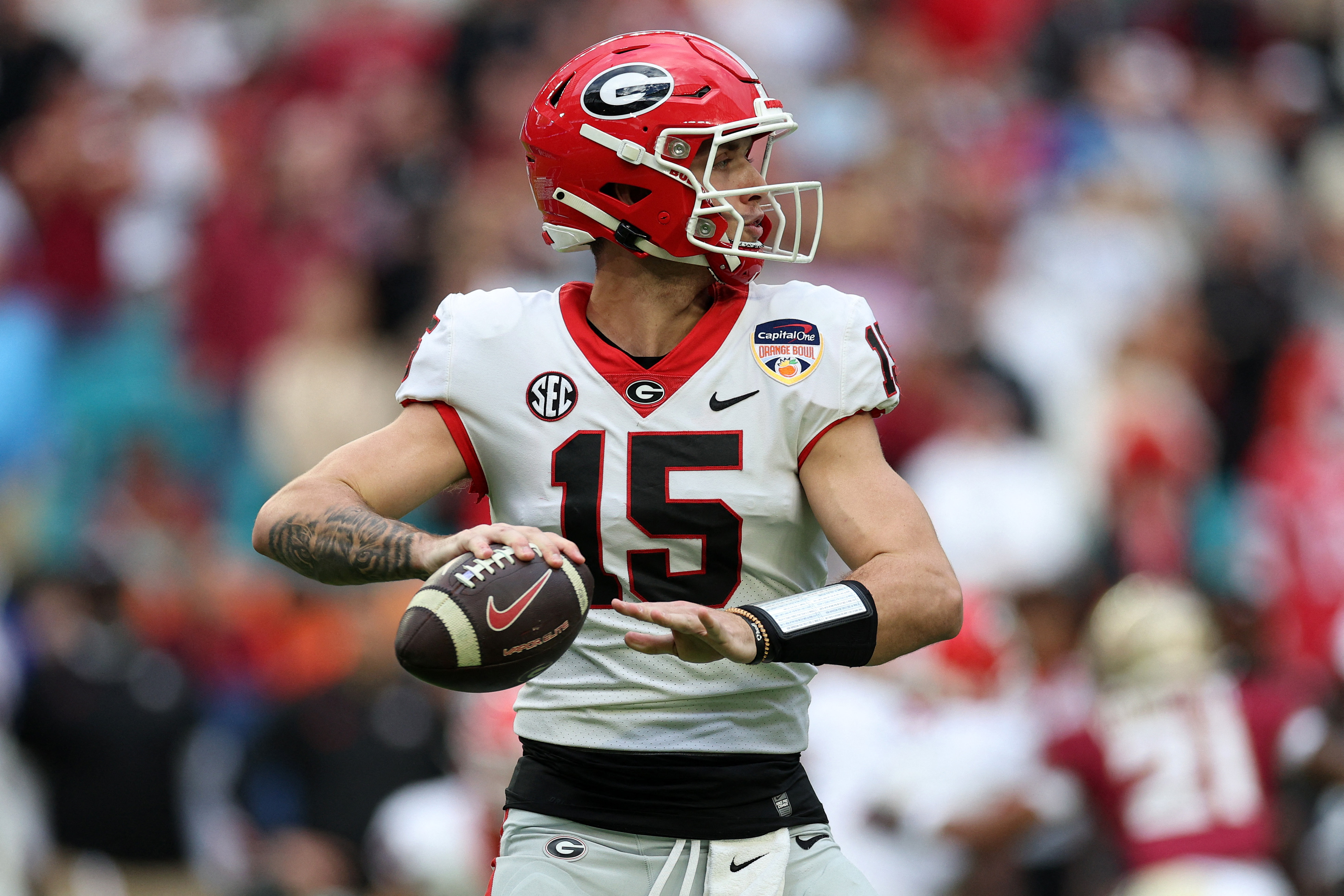
I’ll be monitoring my Dawgs to see how they handle their uniforms. They switched over to the new Nike Vapor Fuse template this season and wore the new red jersey all year. However, partway through the year, they reverted back to the Vapor Untouchable for their white jersey. I heard rumors it may have been due to the design’s red collar bleeding into the white and making it look pink, though I never confirmed that. I’ll be curious if Nike fixes the issue or they continue to wear the old design. Also hoping we finally see black jerseys beyond their use in the spring game.
-
2
-
-
On 12/30/2023 at 12:05 PM, vtgco said:
Alleged LAFC third jersey leak... Love the Aztecs fauxback design! Reminds me a bit of @upperV03's excellent MLS Reverse Retro concept series.
What is up with these alleged third kits? Reposting LAFC because the original image is no longer visible.Why would LAFC and Miami have third kids with their city script on the chest? I get they are very evocative of the cities, but why would FLEX Tools and Royal Caribbean agree to not feature their logos on game kits that they already pay to sponsor? As always, Footy Headlines is the site claiming the third shirts will feature chest scripts.
-
I’ll be curious to watch how the midfield logo holds up today. You can see the Texans logo just barely peaking through before kickoff. That leads me to believe the Texans logo is embedded into the turf permanently and they sprayed green over it.
You may recall the 2022 game in Indianapolis had the same setup. The turf looked great before kick and looked abysmal by the end of the game.
-
1
-
-
The Netherlands away leaked.
At first I thought the collar was just laying weird, but apparently it’s a design feature, because here’s France. Both look excellent, aside from the wacky collar.
I am loving the oversized crests. Nike did that about 15-20 years ago.
-
4
-
 1
1
-
-
Need Washington to save this matchup with gold pants. Not because Washington’s purple pants is a bad look on the road, but they’d clash with Michigan’s all navy. It’s weird to me that Michigan is playing for their first title in a long time and they don’t choose the classic look. Had they worn the maize pants, any pants that Washington chooses would have looked great.
-
3
-
-
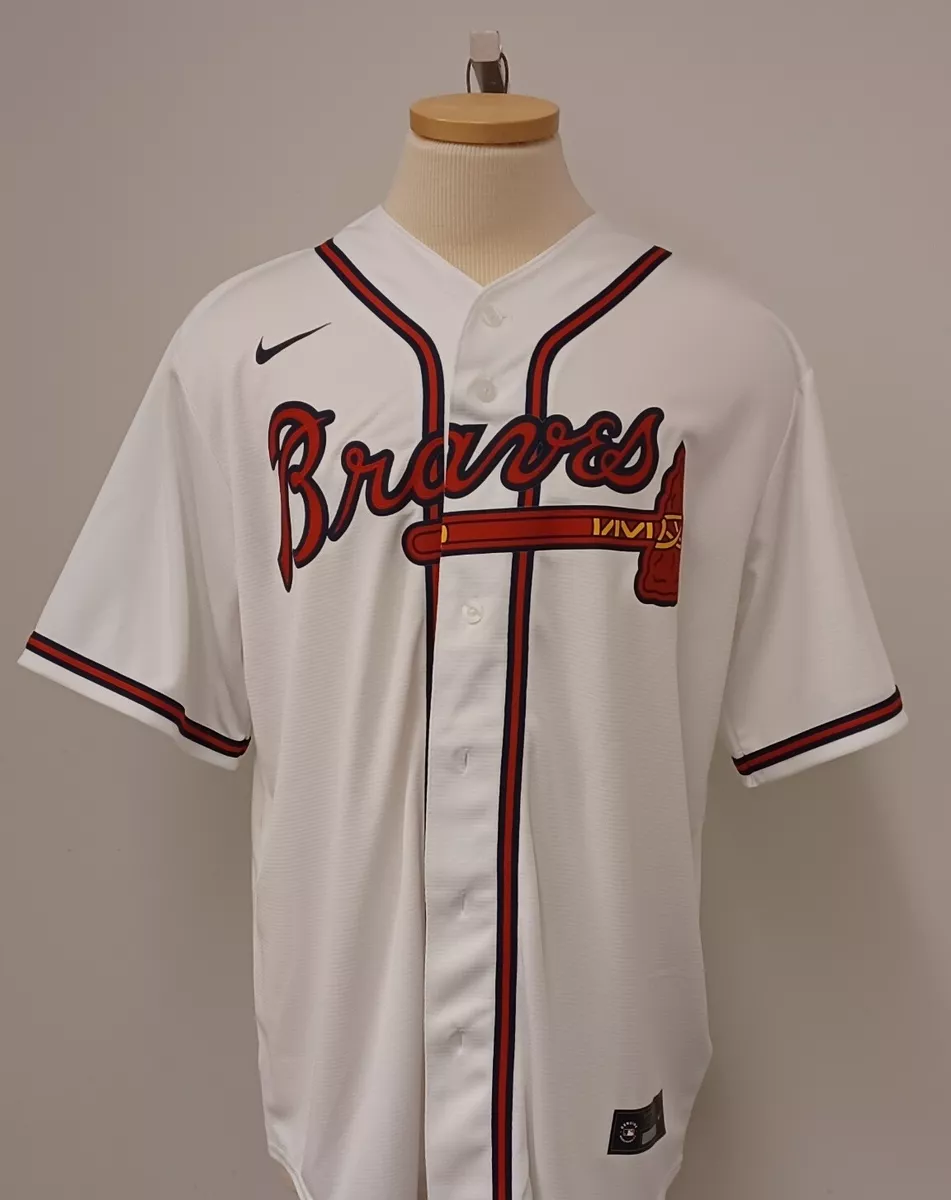
Maybe the new Braves jersey isn’t indicative of how the placket and script will co-mingle. I was concerned seeing how the lowercase “a” was badly obscured. But here’s a current Nike replica and it has the same issue. Hopefully the gamers will still have a clean, legible script.
-
JJ McCarthy is wearing last year’s Nike CFP warmup suit but with the 2024 CFP patch. This year’s gear has tonal grayscale logos and different material.
-
31 minutes ago, ltjets21 said:
I'm not sure if these are replica jerseys. Those typically have came without patches or front numbers.
They are replicas. Normal sizes instead of numbered sizes (size 40, 44, etc). Heat applied graphics. No laser cut numbers. Heat applied jock tag.-
3
-
-
Mets new Nike fan replica has been released. Looks largely the same.
While we have been ragging on a lot of the new Nike designs, I will admit getting the front numbers and sleeve patches back on the replicas is a major win. They were only available on the authentics under Majestic and then Nike continued to use rebadged Majestics product for the first few years of their partnership.
-
6
-
1
-
-
This stupid meme is the best photo I’ve found of the field so far. The black endzones have worked the last several years but will be horrible this year considering UW is purple and gold and Michigan is maize and blue.
2023 Georgia vs TCU
2022 Georgia vs Alabama
2021 Alabama vs Ohio State
Those three matchups all worked fine because most schools feature black, or in Alabama’s case it’s a neutral color that didn’t clash with their simple color palette of only crimson and white.
2020 LSU vs Clemson would have been horrible, but as far as I recall, that has been the only CFP National Championship that featured plain grass colored endzones with only the wordmarks. I believe that’s just a Superdome thing, because the Sugar Bowl seems to always go plain endzones, too. A few of the Peach Bowls have used plain endzones, but when the title game was in Atlanta in 2018 (2017 season), it did feature black endzones.
I’ll be curious to see if there are any changes for the 12 team playoff. I wish they’d go with regular team colored endzones.
-
2
-
-
The idea of going to pullovers sounds fine in theory, but there are too many teams with headspoons where it would mess with the aesthetic.
-
2
-
-
8 minutes ago, BBTV said:
Phillies don't appear to be chainstitched anymore. That fraking SUCKS. That's been a staple for decades now.
If that's what I'm seeing, then that's a goddam shame.
Where are you seeing that? To my knowledge, the only on-field authentics we have seen are the Dodgers, D Backs, and maybe one other team. Everything else we have seen has been the lower grade fan replica. I know Uni Watch said the Cardinals still plan to use chainstitching but they have to apply it to a patch and then sew it on (as opposed to direct embroidery). I believe that’s the same process the Phils currently use.
-
14 hours ago, (probably)notabandwagonfan said:
Hate how the Braves jersey looks with this template
I’m a Braves fan and hate this change. It’s fairly minor and I’m sure I’ll get used to it a few weeks into the season, but the whole reason for the change is preposterous.The Braves have worn some version of their current uniform for dang near 80 years. I know they’ve had some moments of change here or there but they keep coming back to the current design.
Milwaukee Braves
Boston Braves
And now the design will change all because the manufacturer won’t sew on an additional thin braid around the end of the sleeve? Ridiculous.
Edit - two more thoughts as I stew on the insanity of this change. I can hear the Nike marketing speak dripping as they got all of MLB on board with the move. “We can make the uniforms lighter and more seamless. There will be less distractions for the ballplayer because he won’t have an extra seam sewn across his sleeve! Instead it will be built into the cuff!!” Meanwhile, nobody cares about the ad patches.
Second thought - since everything is fair game now, have we seen the last of the box shaped trim on the Braves pants above the striping? That’s absolutely a detail that belongs on a Braves uniform and would look out of place without it. You can kinda see it in the retro photos above.
-
11
-
-
On 1/3/2024 at 2:44 PM, Berlin Wall said:
I hate it.

I kinda love the home shirt though.
I am with you. The away is very bad. Home is good though I wouldn’t go as far to say I love it. Germany has had much better shirts at tournaments over the last 20 years.The first real photo of Argentina leaked and it’s fantastic. Might be their best in a long time.
-
3
-
-
Do you think Michigan will do special shoulder graphics again or was that just a Rose Bowl special?
-
What in the heck was Washington doing at the end there? The game was won, it was over. Just run the ball 3 times and make Texas burn all their time outs. The clock would have been down to 15-20 seconds and they’d pin Texas deep. No one can get hurt on a kneel down. Not to mention the kick catch interference. Those two were coaching malpractice and UW won in spite of it. Otherwise the Huskies (and particularly Penix) looked great.
-
Super subtle detail, but I’ve noticed Nike has changed the diamond swoosh for their CFP participants.
For the longest time, it looked like this. The black outline was fairly thick and there wasn’t much definition to the diamond detail.
This year’s diamond swoosh looks like this. The outline is much thinner and the swoosh has much more texture and definition to it.
Interestingly, some of the Nike media day outfits have used a diamond swoosh like this version.
I haven’t gotten a great look at Michigan. It’s harder to tell because theirs is contrasting against dark blue so it’s less obvious. I think they are using the same diamond Jumpman they have the last couple years. The outline looks a bit thick.
-
6
-
-
1 hour ago, fouhy12 said:
That's just the Playoff patch I think. They also use it as the championship patch, but it isn't just that.
I’ve watched every single semi final and title game in the CFP era and have never seen the logo used outside of the championship. It’s nowhere on the field, sidelines, or television graphics for the semifinals.-
1
-


.jpg)
.jpg)

.jpg)
.jpg)


.jpg)


/cdn.vox-cdn.com/uploads/chorus_image/image/66086124/1198871238.jpg.0.jpg)

MLB 2024 Uniform/Logo Changes
in Sports Logo News
Posted
NL East
Braves - sleeve trim is moved to the cuff, whereas before it was offset with white visible beneath the trim like the O’s. This is one of the most disappointing changes to me, because the Braves have worn that sleeve trim dating back to the Boston days.
Phils - no changes, but need to see if the script is still chain stitched.
Marlins - no changes.
Mets - no changes.
Nats - no changes.
NL Central
Brewers - cuff stripes look thinner.
Cubs - no changes.
Reds - no changes, aside from moving the stripe inside the cuff.
Pirates - no changes.
Cardinals - no changes. I believe Uni Watch said this script will continue to be chain stitched, though it may be applied on a separate patch, rather than direct embroidery.
AL West
Dodgers - no major changes, though the on field authentic showed the script breaks differently (replica looks the same as before) and the front numbers may be a tad smaller.
D Backs - all new design.
Padres - no changes, though perhaps the trim looks slightly thicker than before.
Giants - no changes.
Rockies - no changes.