


aawagner011
-
Posts
3,893 -
Joined
-
Last visited
-
Days Won
5
Posts posted by aawagner011
-
-
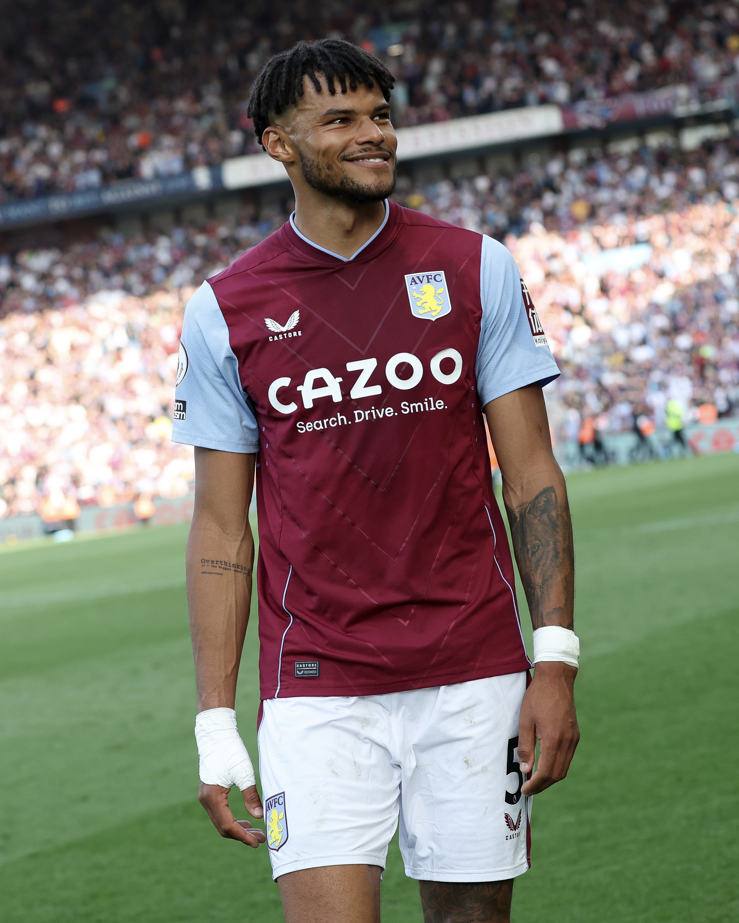
It’s not about whether they briefly used a roundel at one point in time. Their badge history has been inconsistent, anyways.

The problem is that they had a very identifiable and distinct badge (between the crest shape, colors, and abbreviation) and reverted back to the cliche roundel that feels so generic and could be any number of clubs now.
The graphic above has plenty of sources of inspiration between the shape of the shield and the stripes.
On a primarily claret shirt, the old sky blue and yellow badge gave it some much needed contrast. The details were highly visible from a distance.
The new crest loses its uniqueness and the details are lost at a distance. The colors of the badge are heavier on claret at the expense of sky blue and yellow.
Overall, it just feels so much more generic. A badge is more than how it operates as a standalone logo. It’s how it works on digital platforms and social. It’s how the badge works in the context of the shirt and I feel like the new badge fails in that regard.
-
 6
6
-
 2
2
-
-
I don’t think folks understand what the different finishes mean. Just because something is silver, doesn’t mean it is chrome.
Chrome - basically a mirror.
Gloss - the paint has a clear coat that gives it a shine, yet it lacks any metallic flake.
Metallic finish - a gloss clear coat that also has metallic flake.
Satin - the way that the light hits the paint impacts its appearance, making it look brighter and darker in spots.
Matte - similar to satin, and yet still very different. Because it is a totally flat paint, the color appears consistent across the entire helmet.
-
22
-
 3
3
-
3
-
-
6 hours ago, andregunts said:
Brazil in black
For additional context, they wore black to address racism and particularly Vinicius Jr who has been a regular target.
-
3
-
1
-
-
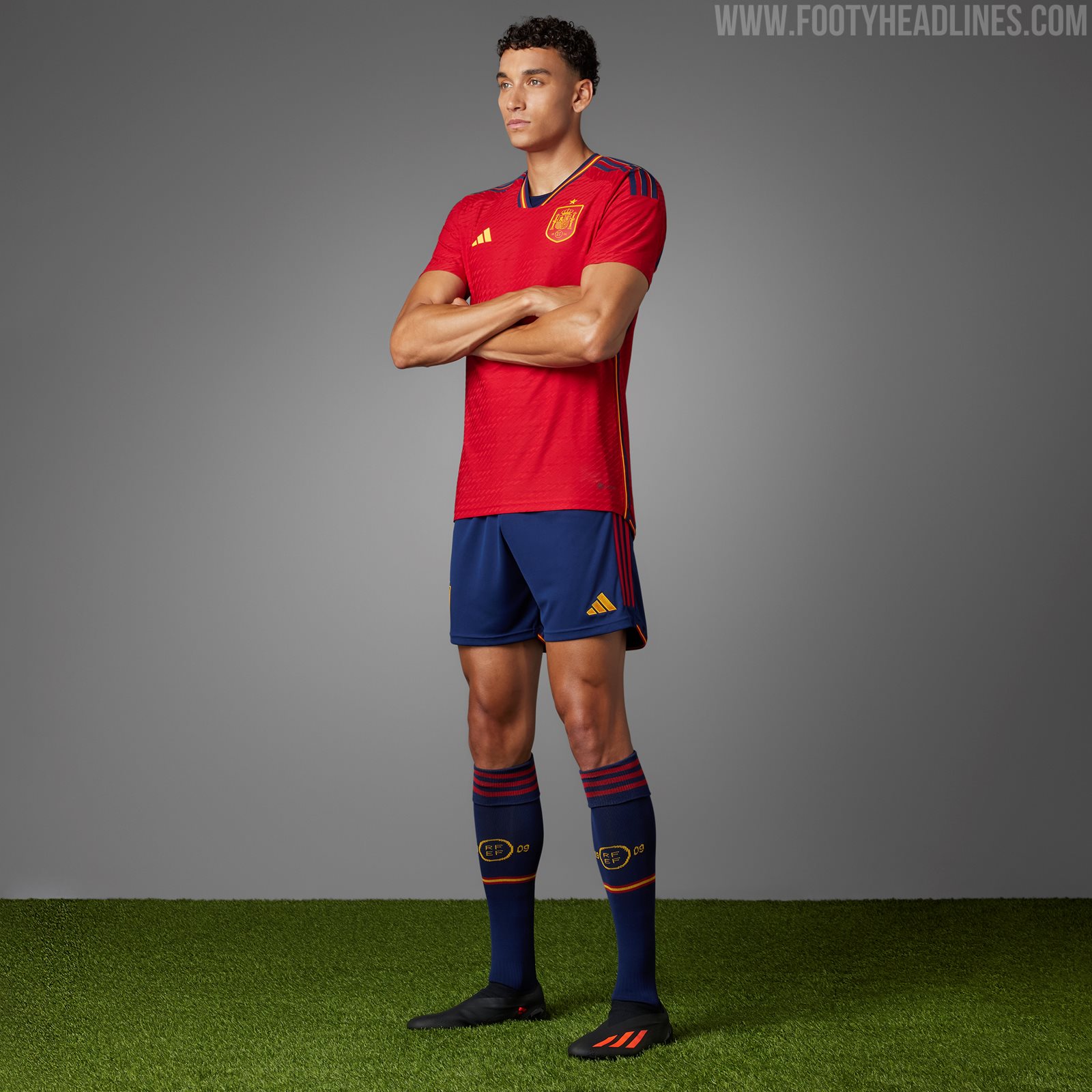
It looks like Spain finally got some proper socks to go with their all red kit.
Because adidas designed the kit with their usual navy shorts, they originally gave them navy socks. I think they used to wear black socks many years ago but the 2022 kit was supposed to have navy.
I don’t think they wore that combination at all in Qatar and instead opted for all red. This must have caught adidas off guard because the red socks they wore had the old adidas logo with the wordmark below the three stripes. I believe the socks trim was also black. Either way, it was obvious they were a late addition and not designed to go with the kit.
These are the new socks they are wearing. They match the original navy socks with the stripe design and yellow details.
-
3
-
1
-
-
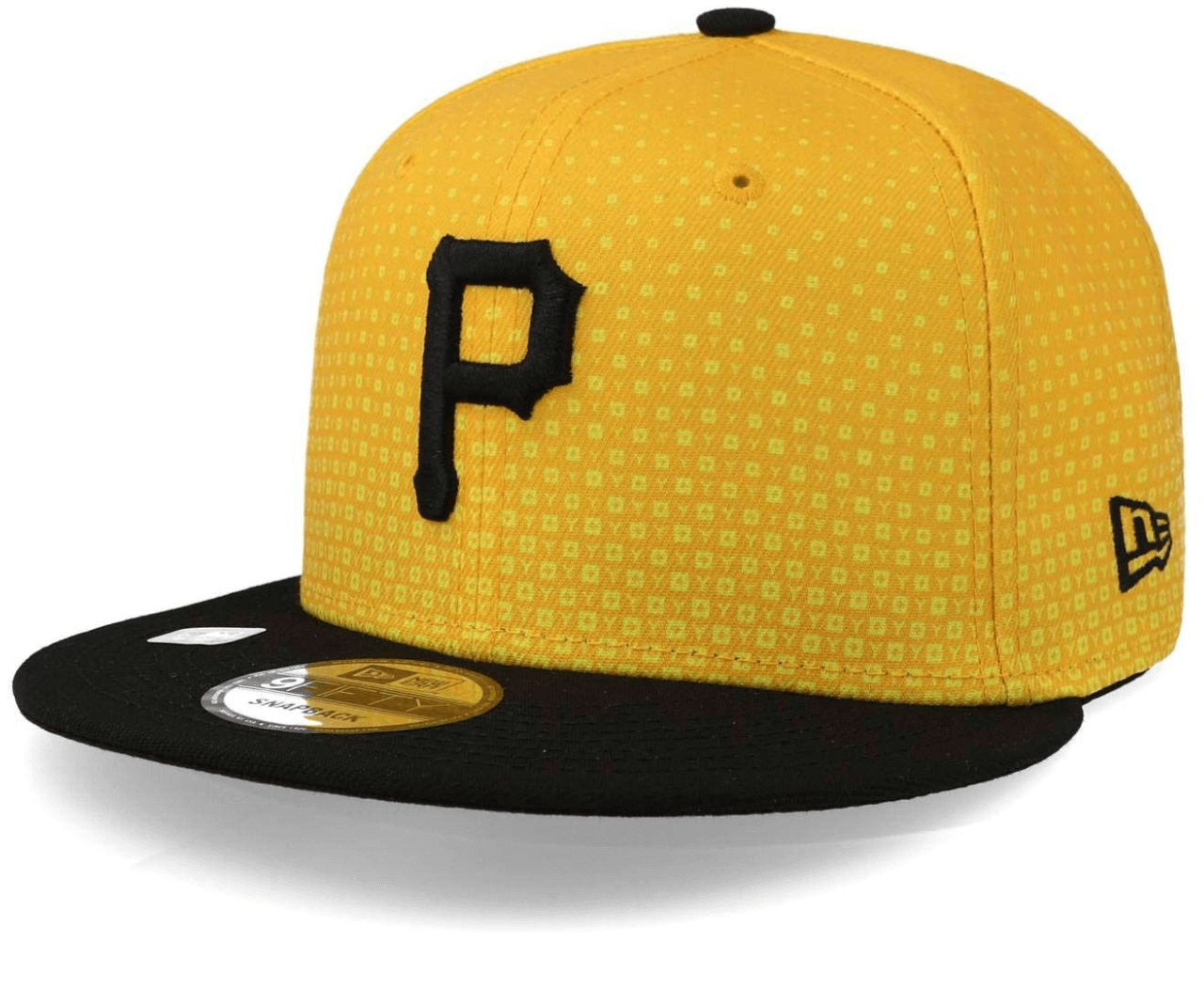
Surprised this hasn’t been posted here yet. Uni Watch leaked the Pirates CC cap.
The pattern matches the leaked socks. For me, it’s a decent looking cap but that pattern will be unnoticed at more than five feet so it’s a stupid design choice.
It’s also strange they introduced a different font for the script (though very similar), but kept the classic font for the cap.
-
2
-
 1
1
-
-
18 minutes ago, VampyrRabbit said:
The Cubbies really need to do something about their road and alternate uniforms. I'd put forward their road is the worst in the MLB, and while their alternate is okay, its not anywhere near as nice as the 1980s blue pullover.
That’s a hot take for sure. I’d say the only gripe I have with the Cubs road look is the white trim, which is totally unnecessary.Look how much cleaner the design is without the white (plus that sleeve patch!):
It’s the same complaint I have with the Yankees away set. The white against the gray muddies up the script. Their Field of Dreams design looked clean and timeless without the white.
-
5
-
-
49 minutes ago, Yac12 said:
Cubs are wearing their CC uniforms today for the first time. Don’t know if they are going to be wearing these every Friday home game like past seasons or a one time thing since they stated they are celebrating the neighborhoods of Chicago this weekend.
They said it’ll be their Friday uniform for this summer.
-
 1
1
-
-
Perhaps the thinking with the Gold Cup is that at this point, Berhalter has been out of the mix for 6 months. The tournament starts in barely a week. That’s a big ask for him to jump back on board having little to no time to game plan and get tactics in order. Whereas the current coaching staff has had time to prepare and is currently the one voice the players have been listening to. I don’t like it but I get it. It’s also a B squad. Long term, I am not opposed to Berhalter. I think he did well with what was an exceptionally young squad and they should reap benefits going forward as the group matures towards 2026. I think the main issue with how things were handled was how long and drawn out the process was. It seems to me the biggest roadblock was getting Matt Crocker in place to make the hire. Once he was on board, things started to happen fairly quickly. But now, we have lost 6 months of time.
Side note as to the Charlie Davies discussion: I loved him when he was the surging new player 14-15 years ago and his story was inspiring, but I don’t think he cuts it as an analyst. He seems to shoot from the hip too often and is hard to listen to. Maurice Edu is very polished and Clint Dempsey is a good listen. But Davies’ thoughts are all over the place.
-
2
-
-
18 minutes ago, WBeltz said:
So is this a part of that whole 100,000 units of jerseys sold or is it because Atlanta is by far and away one of the more popular MLS teams? Because it’s mind boggling to me that Portland, LAFC, Austin and other teams aren’t getting 3rd kits seeing how successful they are/the number of jerseys sold to qualify for this.
Is it really mind boggling, though? Austin’s stadium seats ~21k, LAFC 22k, and Portland 25k. Atlanta in its small configuration seats 42.5k and regularly hosts several full capacity games of 65-70k. That’s a lot more people coming through the gates who can buy more shirts.
-
Beyond whether the prototype design is good or not, would it abide by NFL rules? I thought the whole idea with throwbacks was that they had to be designs previously worn by the team. The only situation I could see it working is if they used it as color rush, which seems to blur the lines a bit and have looser regulations.
-
The red Canada shirt is absolutely atrocious. The shoulders look orange.
-
2
-
-
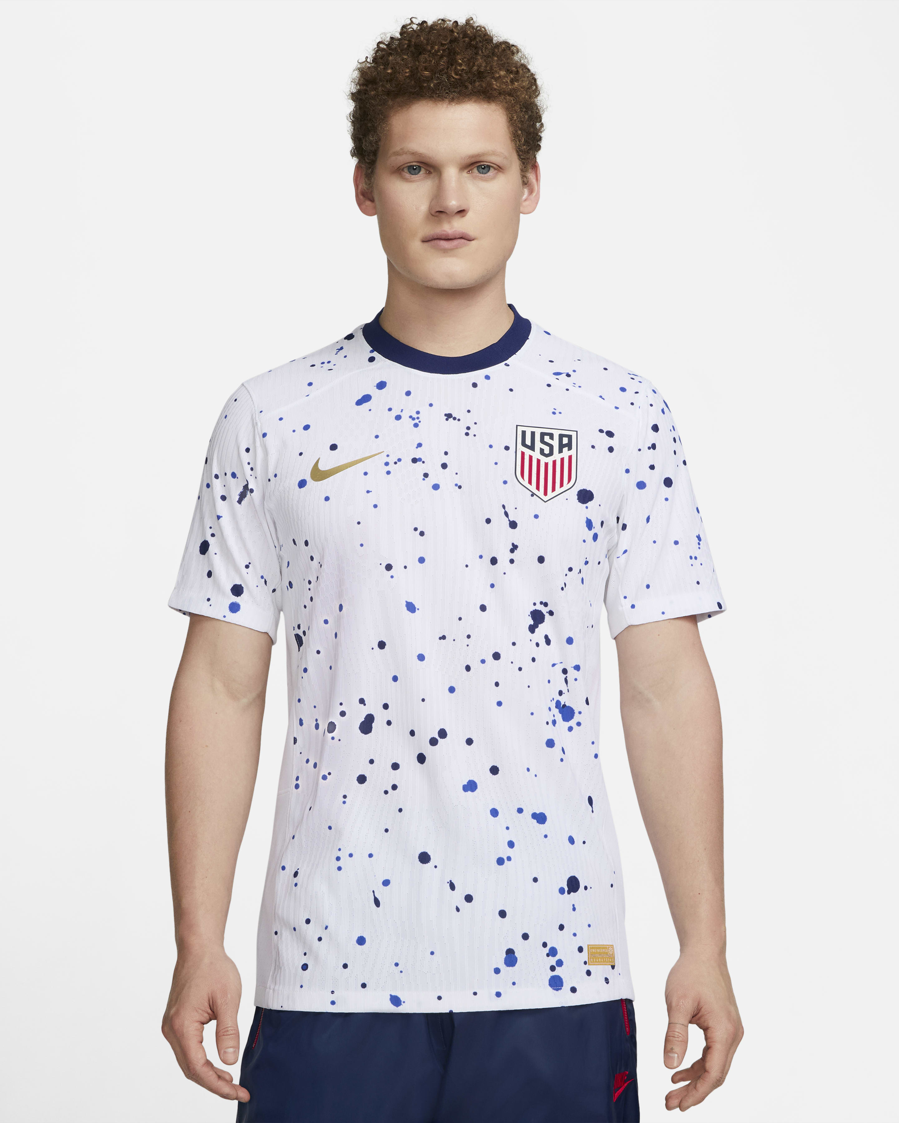
On 6/5/2023 at 12:41 AM, aawagner011 said:
Nike has relabeled that white men’s shirt from “U.S.” to “USMNT” so it would appear very likely they changed their plans and the men will wear both designs. The new kits are supposed to finally go on sale today on nike.com and ussoccer.com. We shall know soon enough.
I received my authentic white US shirt today and I am still very confused if it will be worn by the men’s team. I was sure of it when they stealth dropped the retail jerseys without the four USWNT stars above the crest. That seemed a sure sign the men would share the design. However, my jersey still includes the years the women won the World Cup in the inside collar (1991, 1999, 2015, 2019). The last women’s World Cup saw both teams get a new red design that included four stars on the back collar. The men’s version omitted that aspect and they wore it on pitch. They did not wear the white design, but they also did not release USMNT versions of that shirt, either. They did release men’s cuts for the USWNT. At this point, I have no idea whether this jersey is a fashion piece for the men or not.
-
1 hour ago, B3N said:
Ravens in the new FUSE template
Baltimore should have used this opportunity to bring back the contrasting collar. This is a classic case where a manufacturer has changed a team’s permanent look.
Their collar matches the jersey color because they realized this looked like crap on the old Nike template:
And then they dropped the Flywire but kept the same template. They could have added the contrasting collar back but probably thought the collar was still too massive (definitely):
But they didn’t take advantage of the Vapor Untouchable with a normal sized collar and stuck with their old look, nor did they fix it with the new Fuse template.
-
6
-
-
Nike has relabeled that white men’s shirt from “U.S.” to “USMNT” so it would appear very likely they changed their plans and the men will wear both designs. The new kits are supposed to finally go on sale today on nike.com and ussoccer.com. We shall know soon enough.
-
1
-
-
Great look but still needs a matching white panel cap.
-
4
-
-
Holy match inscription at the FA Cup. 6 lines of text.
-
 1
1
-
 1
1
-
-
1 hour ago, MJWalker45 said:
Not surprised that the men would possibly wear it as well. Nike also sells replicas for men without the stars on them for older kits as well. They may do what some adidas mens teams do as well and only wear it one time in support of the ladies teams.
This suggests to me that it will be worn on field by the men. I don’t recall Nike ever producing a USMNT version of the women’s kits. They certainly produce men’s cuts in support of the women’s team with the World Cup stars. But I don’t think they’ve take a women’s design and modified it at retail for the men.
-
1
-
-
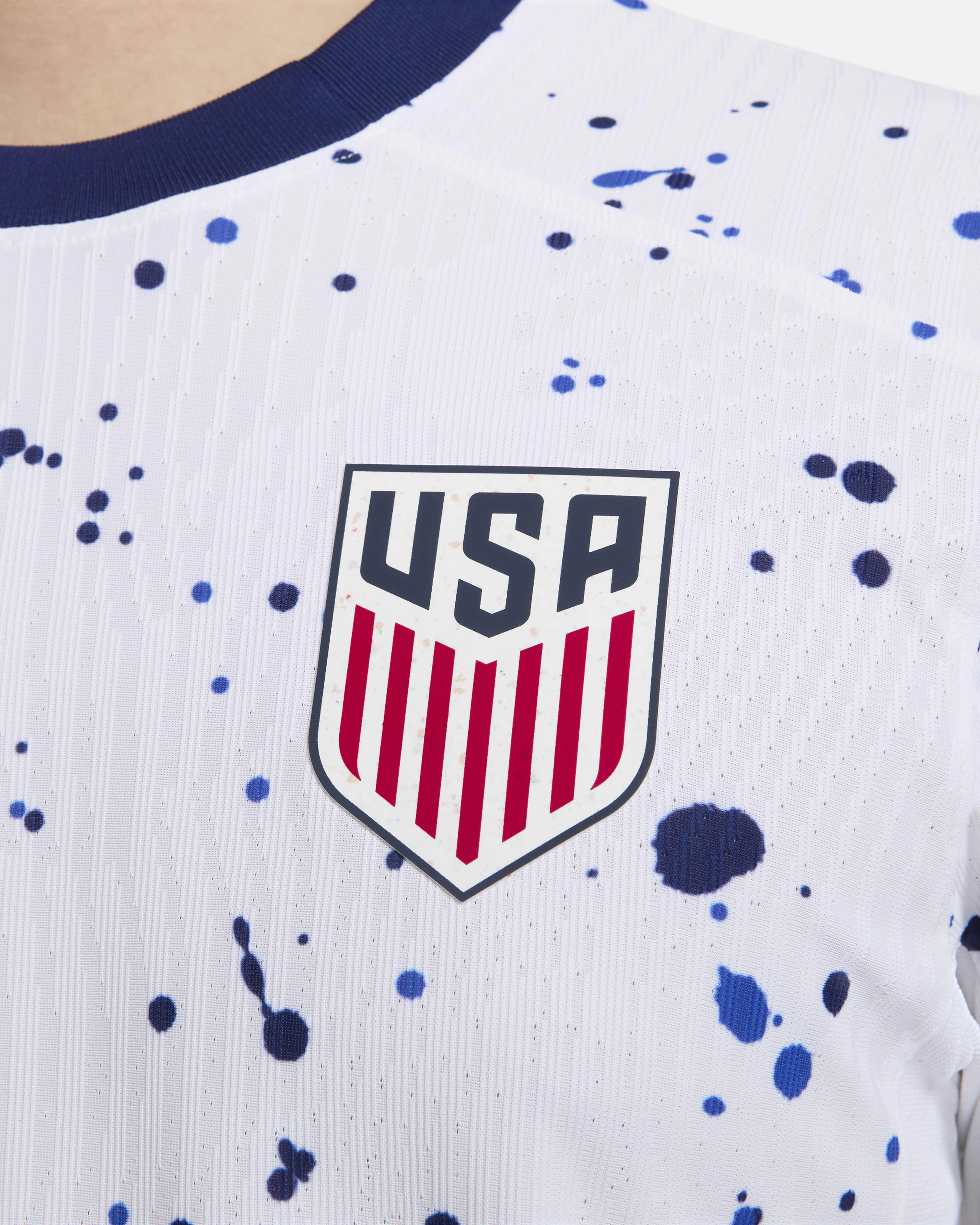
I am a bit confused with the new USA kits.
When they were revealed a couple months ago, they said the white shirt would only be worn by the women while the blue shirt would be shared by both the men and women.
However, Nike now has an authentic match issue shirt listed as “coming soon” in a men’s cut without the gold women’s stars above the crest. It looks like a men’s only design.
-
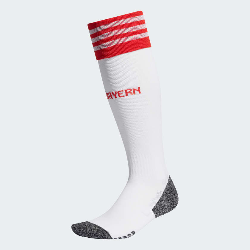
It appears Bayern’s home kit will have a change sock. This isn’t surprising considering how much white is in the new design. I wonder if they‘ll have a white short option, too.
-
I went to the Braves game last night and checked out the clubhouse store. Unfortunately the ads are on the jerseys sold at the ballpark (at least for the authentics, I don’t think they were on the replicas).
Meanwhile, I had just walked past the Quikrete sponsored jerseys while thinking to myself “man, that’s so f***ing ugly” when another customer started chatting up the sales rep about Quikrete. The rep got into the usual spiel about how they just partnered with Quikrete a couple weeks ago (he was just doing his job) and the customer was eating it up saying “oh wow, that’s so cool. I need a Quikrete jersey.” My eye roll could not have been any more obvious.
-
2
-
 4
4
-
2
-
-
I think the issue is that a majority of players have switched over to wearing compression sleeves instead of real socks. That causes problems with consistency and stripes. Take these two photos that were posted earlier:
#41 of the Rams and #88 (80?) of the Lions are both wearing compression leggings. You can tell by the seams running up the sides of the legging. Those are not socks.
Same for all the Commanders above, as well as #45 of the Bears.
Perhaps the league could go to Nike and ask if they could develop a compression legging that includes stripes sublimated into the fabric. That could solve the issues and make it enforceable and consistent from player to player. I get why the players prefer the leggings. I’m sure they are much more comfortable. But as of now, it’s a free for all and nothing is enforced.
-
13
-
-
Thankfully the CFP is expanding so we no longer have to debate whether going undefeated in the AAC and beating an Auburn team that finished with four losses justifies a national championship. With twelve teams, if you’re undefeated, you’ll be invited and it can be played out on the field.
-
3
-
-
The Texans are going to be another classic case where the team reveals “exciting” new uniforms that are somewhat popular for a year or two, and then people will realize they are kinda crappy and miss the old ones. I can already tell how this is going to go. They are one of those teams that got it right the first time and have a timeless look that could be worn for the next century.
-
7
-
-
The belt should be orange. No reason for it to stick out that much.
-
6
-


/cdn.vox-cdn.com/uploads/chorus_image/image/46994682/CMzsMjcUkAAUV2o.0.0.jpg)


/cdn.vox-cdn.com/uploads/chorus_asset/file/24672263/1491882904.jpg)


MLB 2023 Uniform/Logo Changes
in Sports Logo News
Posted
Here are some better quality photos.
Worst batting helmet in major league history? I recall we had the Mets blue and black helmet about 15-20 years ago but this is worse.