


aawagner011
-
Posts
3,893 -
Joined
-
Last visited
-
Days Won
5
Posts posted by aawagner011
-
-
On 9/2/2023 at 10:45 PM, aawagner011 said:
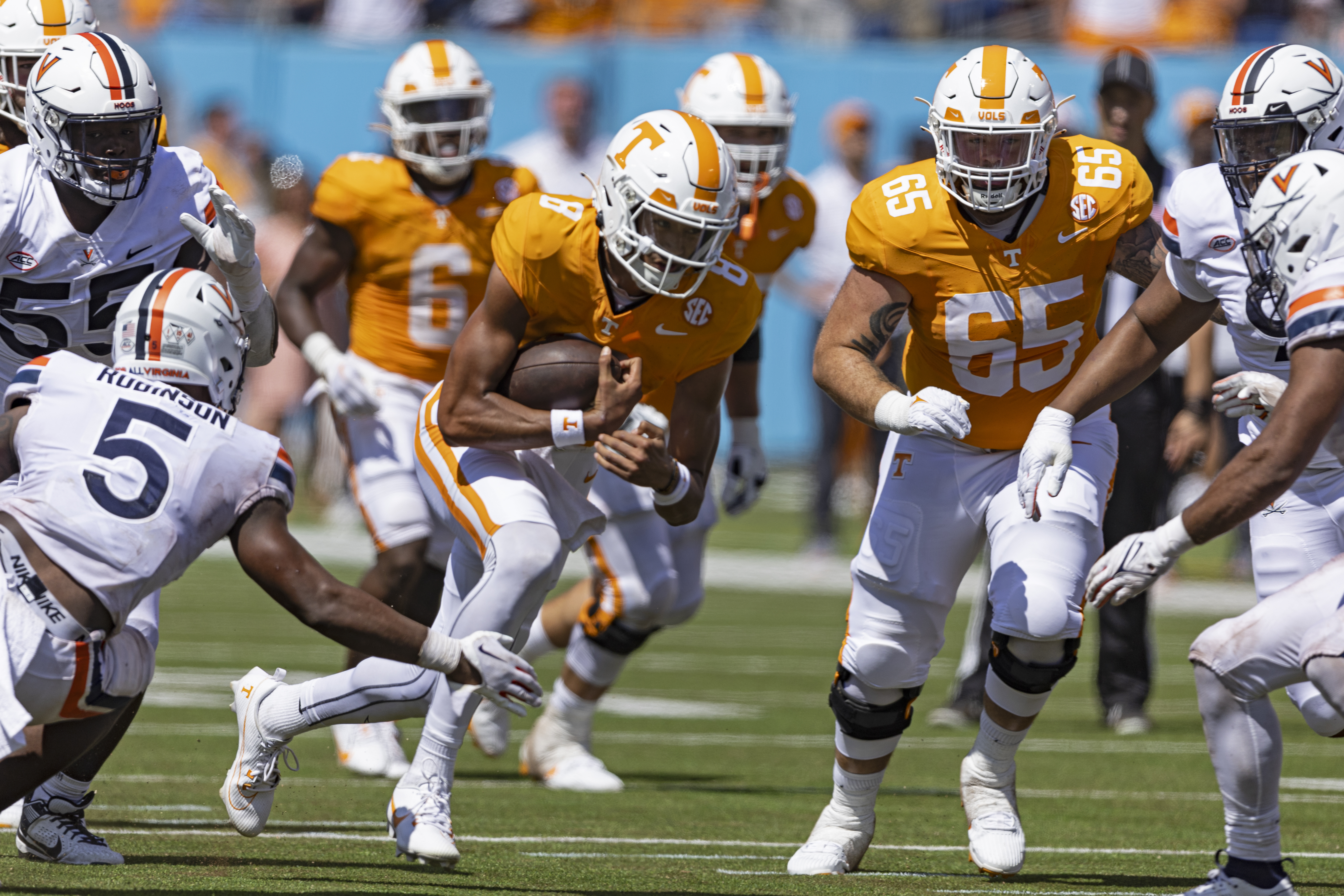
Tennessee confirmed to wear the SEC above the swoosh despite the new template (remember the only reason they relocated the SEC patch was to accommodate other patches a couple seasons ago).

The story gets stranger with Tennessee. Apparently they wore the SEC patch opposite the swoosh on both their white and gray jerseys. This lack of attention to detail is killing me.
-
 2
2
-
-
23 hours ago, the admiral said:
What's up with the Falcons' endzones? I don't remember much about the old Falcons wordmark, I think it was just Helvetica Bold Condensed or something, but what they have today looks like Arial.
23 hours ago, Old School Fool said:It's what the endzones were in the Georgia Dome.
23 hours ago, the admiral said:Right, but it looks like they got it slightly wrong.
Atlanta United had a game there 18 hours prior, which probably had an impact on how much they were able to paint. You see this kind of treatment at multipurpose venues a lot. -
This level of mix and match should be beneath Florida State. Leave it to the directional schools. You’re garnet and gold. Play around with garnet pants, white pants on the road, even the occasional all black. But this looks totally wrong.
-
5
-
 2
2
-
 1
1
-
-
The weird thing with the yoga leg sleeves is that there’s nothing stopping teams from ordering the exact same product but in their usual sock colors. There might be a couple teams with certain colors (or a couple teams with sock stripes) that would have to be specially manufactured, but I bet you could solve 80% of the yoga pants look just buy only supplying the right color instead of all this one color stuff.
-
3
-
-
2 hours ago, Brave-Bird 08 said:
I'm tired of people claiming Ole Miss has the best or "cleanest" uniforms. They look like a high school team most of the time because of how there's no agreement with striping conventions.
I mean, the red helmet they wore in Week One would have matched the jersey and pants they wore at Tulane, but they chose a game against another team wearing powder blue to add powder blue details but only in the helmet. Just nonsensical.
They were top tier when they started integrating the powder blue helmet occasionally.Then it turned into white pants for no reason and white helmets. Then it turned into multiple decals and stripe patterns. Next it was a powder blue jersey (which isn’t the same shade as the helmet) and powder blue and white camo helmet. It’s all too much. Nothing is cohesive anymore. It’s just flavor of the week.
Match the stripes and decals and eliminate a few of the pieces of the wardrobe and they could be elite again. But they have a way to go.
-
10
-
-
Florida State in all garnet tonight and looking great. While their gold pants should be the norm, I always liked their occasional garnet pants at home and on the road. This is taking me back about a decade ago when they wore this uniform and looked very clean before they added the sleeve graphics.
Tennessee looked fine in my opinion. I didn’t think I would like them but they aren’t bad as far as alternates go. They’ve made the smokey gray their own and there’s historical precedence for the contrasting shoulders so it makes sense.
I think this is our first look at Vandy’s new white jerseys. They wore the white lids and pants last week. Probably not a bad idea to go all white for what would otherwise look like a scrimmage against Wake Forest.
Not feeling the all white with powder blue trim on the helmet for Ole Miss. Feels very forced and follows a different stripe pattern than their normal helmets.
Purdue looks like a bit of a mess right now. While they brought back the Brees era throwbacks at home, they are still wearing their modern uniforms on the road. VT in all orange.
Cincinnati looks pretty clean.
-
5
-
-
Ole Miss needs to clean things up. They have too many mix and match elements. Between the navy helmet, powder helmet, white helmet with the plain red decals and single stripe, multiple other white helmets with outlined logos and triple stripe, the powder blue and white camo helmet, striped pants, stripeless pants, it’s all too much. Strip is down to a few pieces and make it cohesive. It’s a mess right now.
-
11
-
-
Super subtle observation I noticed with Georgia tonight. They are wearing the FUSE template that includes built-in thigh, hip, and butt pads (not sure what those are called, tail bone pads?) in the pants.
Even though they wore the new Nike template in the CFP, those uniforms did not include the built-in pads.
———
Tennessee confirmed to wear the SEC above the swoosh despite the new template (remember the only reason they relocated the SEC patch was to accommodate other patches a couple seasons ago).
———
Vandy still doing mix and match with their new uniforms.
———
Kentucky looks respectable again.
———
I think they’ve worn these before but I find myself liking these South Carolina alternate lids.
———
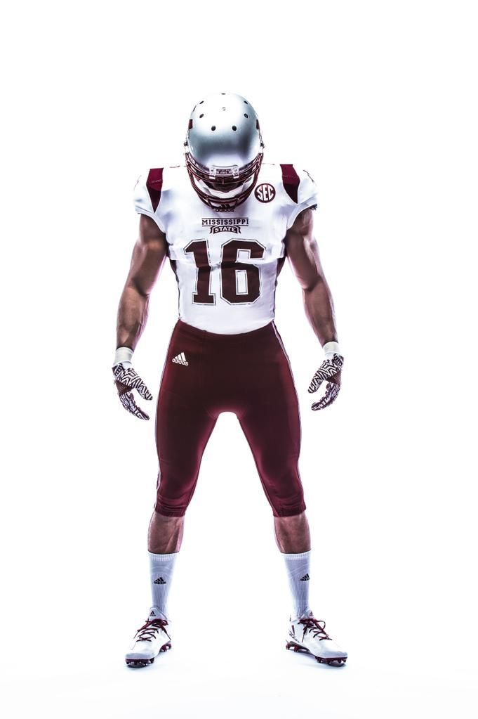
I am fine with the elimination of gray for Mississippi State and also like dropping the massive chest wordmark. I think losing the M State banner logo on the helmet is a mistake, though. The script looks like it belongs on the baseball diamond. Overall a nice look.
-
5
-
-
When I heard about new Colorado uniforms, I was anxious because their standard set is so good with the italicized numbers and wordmark. I am pleasantly surprised and like these since they follow the same template, just recolored.
-
1
-
-
3 hours ago, jerrylawless3 said:
Not an old pro team, but Arkansas mimicked the Cowboys back in 2017 for the Southwest Classic in Jerry World. Still think this is a unironically great look for the Razorbacks.
There was also that time Mississippi State wore Patriots themed uniforms because they played UMass at Gillette.-
3
-
-
10 hours ago, ruttep said:
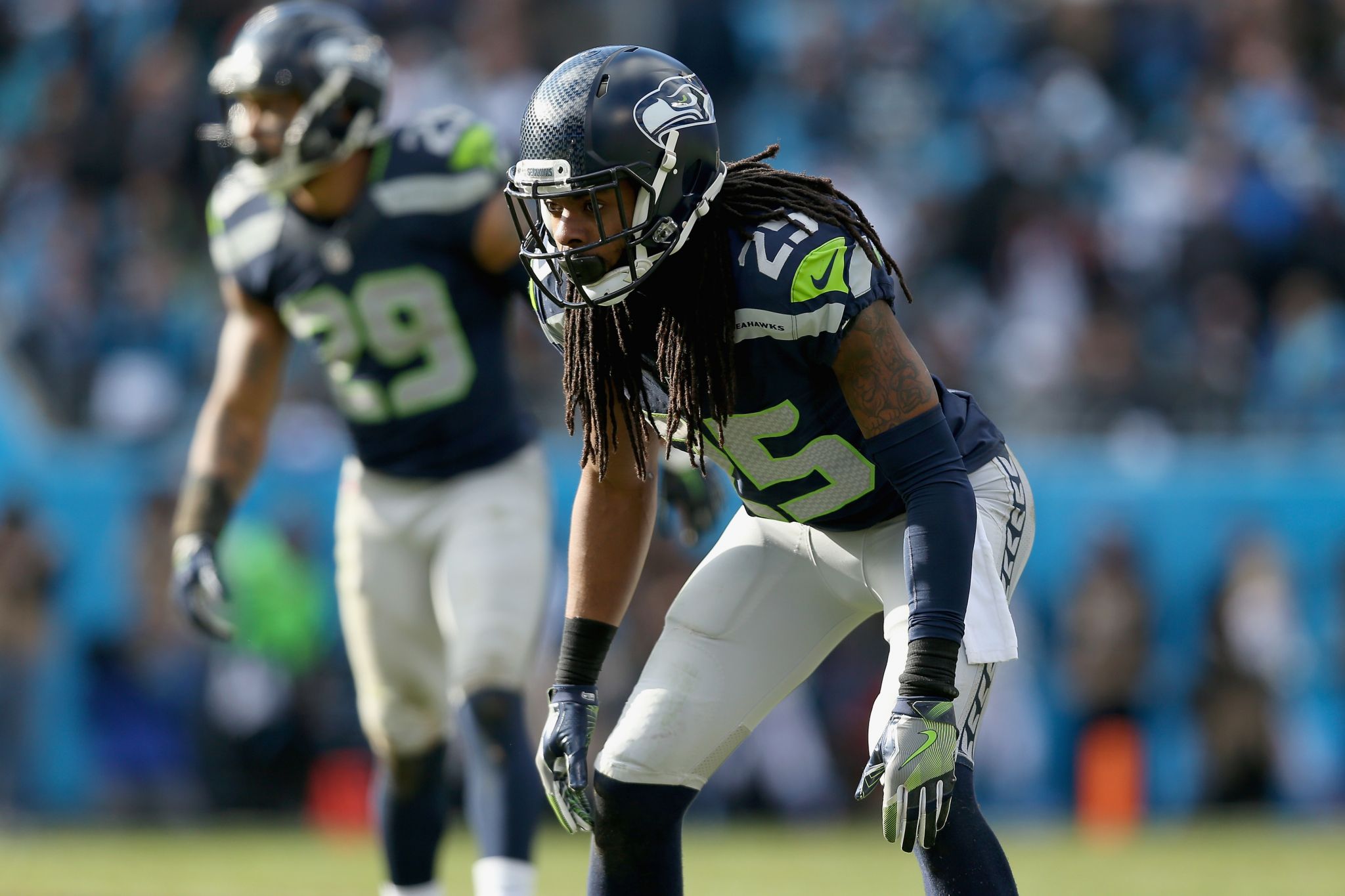
Yeah (maybe unpopular opinion) the Seahawks all blue somehow works where most other color rush-style uniforms don't. Keep this as the primary (this should be worn in primetime and the green jerseys should be burned)
and this as an alternate (wear this during sunny day games)
How often would that schedule arrangement actually have them in all navy? It would only be games played on TNF, SNF, or MNF. Otherwise most of their games are played in the day due to typically playing the 4:30 EST / 1:30 PST game since they’re on the west coast. -
USC did not show off the new template all off-season but did wear it yesterday. Their version uses the horizontal seam similar to teams with the Colts style shoulder stripes.
-
4
-
-
7 minutes ago, infrared41 said:
No they're not.
Haha. I think they are less likely. But put it this way: as college football splits further and further into the “haves” and the “have nots,” they are definitely closer to the top. Whether they can make it happen or not remains to be seen! -
1 hour ago, Gary said:
Could also mean that they're showcasing the coaches for future head coaching jobs in the future. Do you want them to go with one coach and be boring?
Michigan is one of the top programs in the country who could win the title any given year. You don’t play around with musical chairs for the head coaching role and use the program as a “showcase.” All that will do is breed instability and confusion. Who should the players listen to? They will win all of those games but it’s ridiculous. What a joke.
-
 1
1
-
-
Michigan is not a serious football program.
https://x.com/umichfootball/status/1694836460489155040?s=46&t=fJldYzp_3ZnF5iTRlBZtWQ
Since I can’t figure out how to embed tweets now, here you go. Four different head coaches for three games (including a head coaching change at half time vs UNLV!).
-
2
-
2
-
-
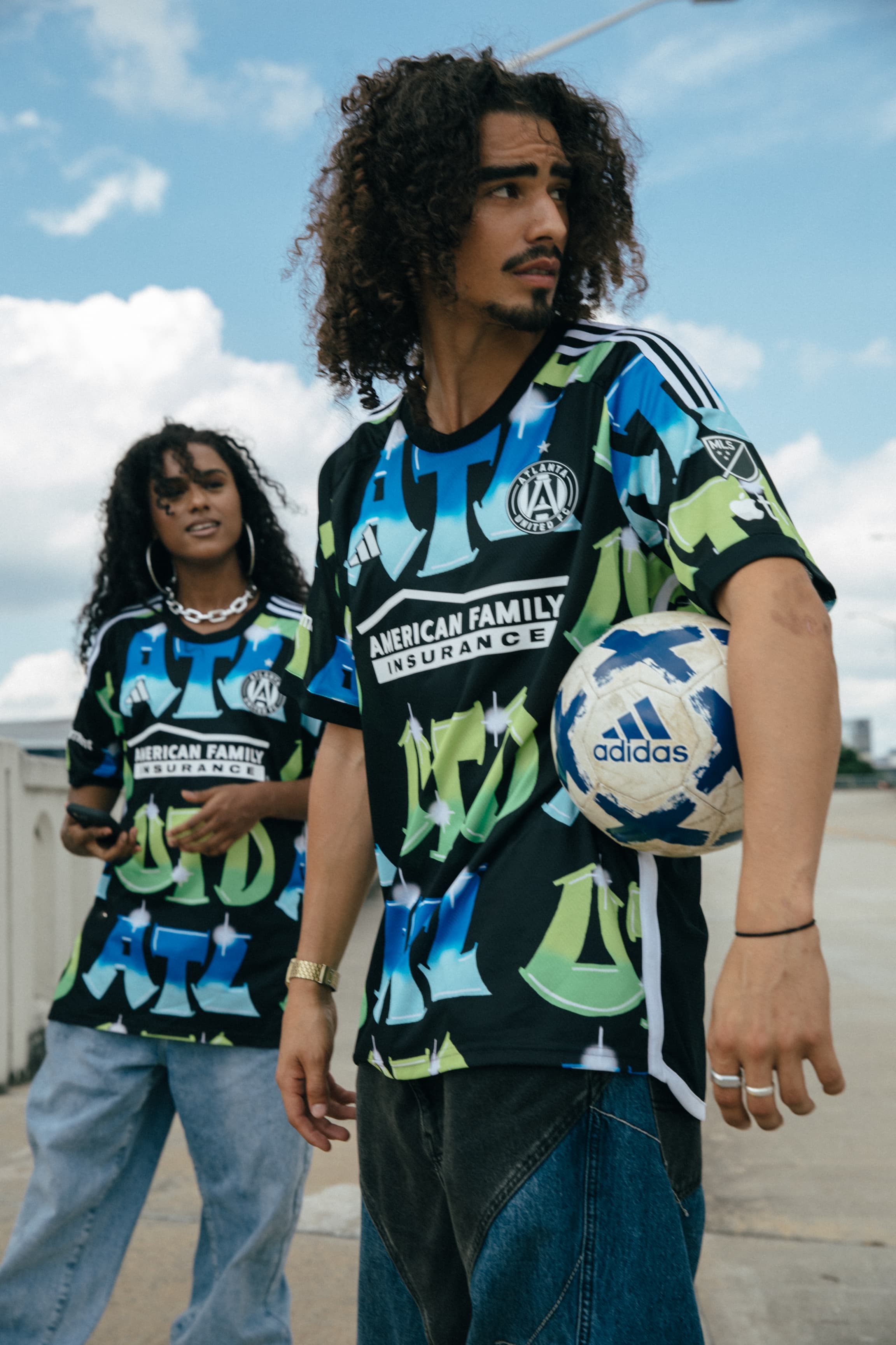
Atlanta makes the third kit official.
It includes a solid black back.
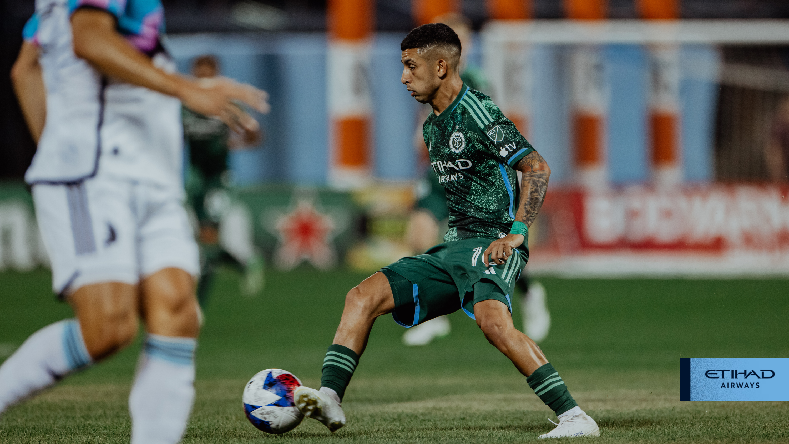
Also, here is how NYCFC’s third looked on the pitch. I really like it and think this is one of the best thirds we have seen in MLS.
One last thought: historically third kits are worn for one single season never to be seen again. Will that be the case here? I haven’t seen any mention of their lifespan. If they are for 2023 only, I have to ask, what’s the point? There’s only 9 or 10 games left in the season. These would make a lot more sense if they are introduced earlier in the campaign or worn for two years.
-
5
-
 1
1
-
-
Bayern’s home kit includes a white short and sock option, as shown by the women’s team.
-
4 hours ago, Brave-Bird 08 said:
Unnecessary. They already are wearing the throwbacks 3 times, so there will be 5 home games to either wear black-white, black-black or all-white at home. Black over white is the only combination in my opinion that looks good. The red pants have the problem of the side stripe being black, which defeats the entire purpose of the "stoop" stripe design.
Might explain why we haven't seen them. As far as I understood what happened, the red pants were photoshopped for the Nike press release but weren't ever produced.
If they would just wear black socks with the all white road uniform, I think it would help immensely. I’d like them to also wear white socks when wearing black pants on the road. They should stick with black socks when wearing all black, though, because white socks would stick out like a sore thumb in that uniform.
-
1
-
-
New WVU jersey appears to have leaked.
It looks like a yellow variant of the Country Roads design.
-
4
-
-
Not new, but a couple things on Florida and Florida State.
The way Florida has placed the Jumpman and Gator logo means they will not be able to place a bowl patch in its usual location above the swoosh. They have placed these patches much higher than other schools. More than likely, they will place a bowl patch closer to the armpit.
https://x.com/gatorsfb/status/1691117483233579008?s=46&t=fJldYzp_3ZnF5iTRlBZtWQ
https://x.com/gatorsfb/status/1693026621148590160?s=46&t=fJldYzp_3ZnF5iTRlBZtWQ
I believe these are our first looks at FSU’s new uniforms besides the models that showed them off at their spring game. I’m really looking forward to these and hope they wear mostly traditional combos. I am on board with them wearing garnet pants and white pants on the road, but they need to stop with the odd combos such as pairing white helmets with garnet jerseys. Also, the decal on their white helmet desperately needs gold instead of being rendered only in garnet and white.
https://x.com/saltystudley/status/1693410944502665375?s=46&t=fJldYzp_3ZnF5iTRlBZtWQ
———
Edit - apparently Tweets don’t embed anymore.
-
1
-
-
It looks like there’s finally a United shirt I will not be purchasing. I have every primary, secondary, and third shirt thus far (besides Parley which have mostly been ugly; only one I wanted was the super dark gray and it sold out instantly). This new shirt is just ugly. I am open to new ideas and love the idea of local culture as inspiration, but this just ain’t it.
-
Vandy looks phenomenal. Now do Mizzou.
-
2
-
 1
1
-
-
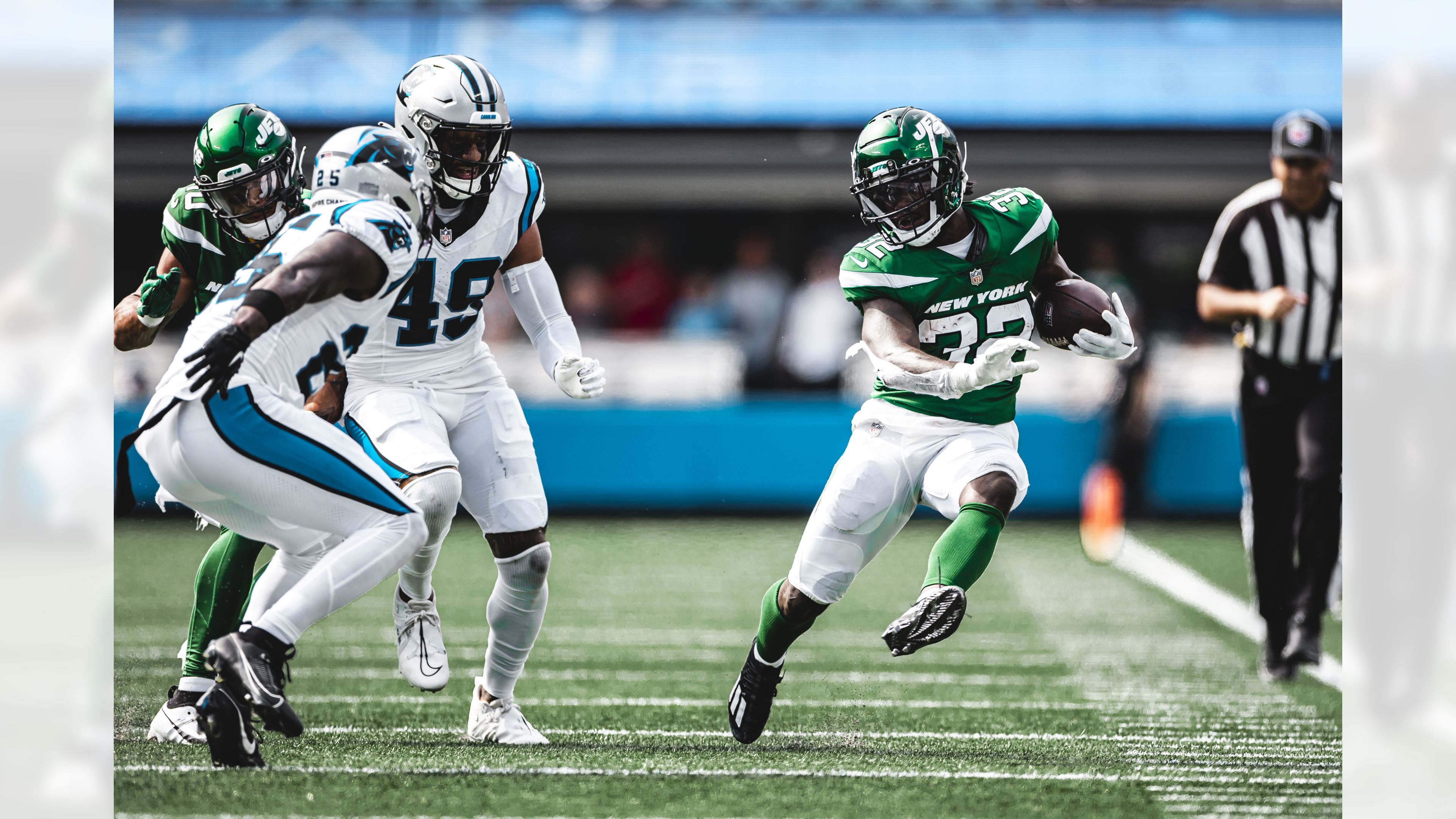
Apparently the Jets are wearing the new template for their white jerseys, but the old template for their green jerseys (I included a photo where you can see the Panthers in the new template so you know it’s from this season).
-
1
-
-
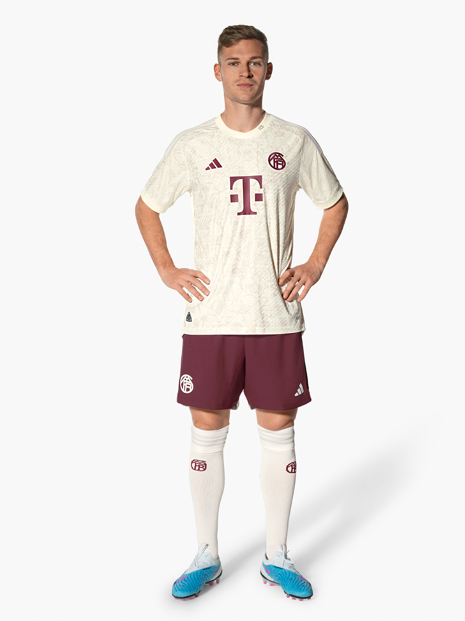
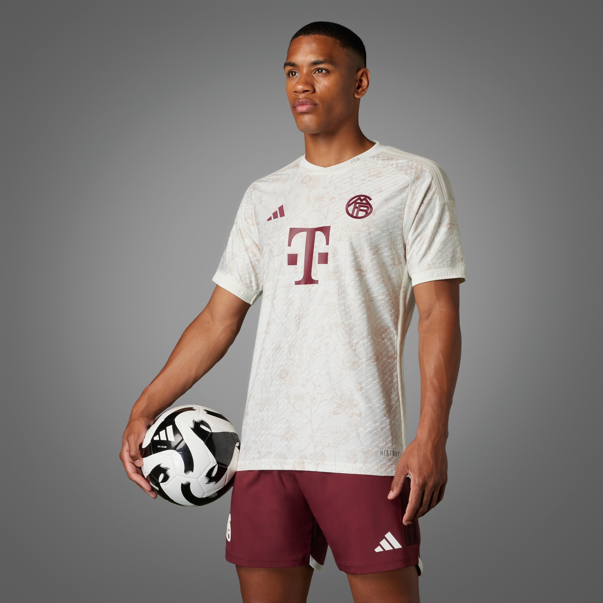
FC Bayern third kit. It was supposed to release yesterday but I assume they delayed it one day to coincide with the Harry Kane signing. The kit will debut tonight in the Super Cup. Loving the vintage color way and crest. I was uncertain about the floral pattern but it is subtle. Still think the button from the original leak would have been class but overall a top kit. Adidas rarely misses for FCB (well they certainly did with the away kit this year).
/cdn.vox-cdn.com/uploads/chorus_image/image/72656376/1685514807.0.jpg)


/cdn.vox-cdn.com/uploads/chorus_image/image/72630341/CIM_6977.0.jpg)


/cloudfront-us-east-1.images.arcpublishing.com/gray/B7IUUGWM7VD6JCC7SIA4S6INQY.jpg)


/cdn.vox-cdn.com/uploads/chorus_image/image/69829544/usa_today_15414814.0.jpg)


College Football 2023
in Sports Logo News
Posted
Apparently Vanderbilt has multiple black jerseys. Their primary black jersey has white numbers.