


jbird669
-
Posts
420 -
Joined
-
Last visited
Posts posted by jbird669
-
-
I love all of the updates and changed. Now you just need a league logo and you're set!!
-
I can get behind that Expos cap.
-
 1
1
-
-
Tampa's is very unique! And the Gray Maple Leafs one is boss, too.
-
12 hours ago, jaha32 said:
I'll get back to the finishing up the Crocodiles but for now here is the next team.
The New York Empire. I have posted an earlier version of this logo on my Behance page quite a few years ago, but I've since simplified it in a few areas in this update. It's pretty self-explanatory - New York is the Empire State and the logo features the Empire State Building. It's somewhat similar to the Knicks in that you're looking upward at the 3D block lettering.

The logo is great, the uniforms are on point. I am personally not a fan of the nickname, but everything else works well. This series is awesome!
-
On 12/26/2021 at 6:55 PM, Rygi13 said:
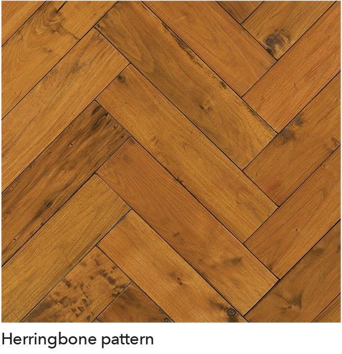
Witchita State Shockers -
Charles KochArenaThe Shockers' court takes on a vertical herringbone pattern meant to mimic the look of wheat. Wheat stalks extend from the court and run the length of the sideline.
Did the Shockers get a sponsor for the arena? Not seeing it anywhere online.
-
Barcelona was my favorite WLAF team , and I dig this update. PSG is cool, too.
-
I absolutely love the London getup - pure perfection, IMO. The Dublin uniforms are very unique and I really dig them. I am not sure what the cat has to do with Dublin. Not saying I am against it, that's just not the first thing I think of.
Also, I would imagine the NFL, all about branding as they are, would have a different league logo so you know you're talking NFL Europe. Just my $0.02.
-
Does Carolina have an abundance of Crocodiles? Wouldn't that be more appropriate for Florida?
-
3
-
-
App Chau has some of the most unique colors and unis I've ever seen. Well done!
-
Really enjoying some more NE schools! Love the color palette for River Toms.
-
They both look great, but I like #2 the best.
-
Entry 2 for Memorial Day Classic looks spectacular.
-
That's a really unique color scheme for Cape Ag! Love it!
-
Love both of the updated unis! Still not a fan of the nickname Towers.
-
I love the details of the lights on the court. Well done.
-
I really like the Renegades!
-
I'm digging the templates, and the two teams you used for them!
-
I love the way the numbers sit on Morehead's unis.
-
I love the uniform for the Rocky Mountain team, but the nickname needs changed. 14ers does not roll of the tongue or sound right. What about Colorado Hilltoppers? Or Colorado Mountaineers?
-
Portland Thorns? Portland Axemen?
-
The summer bowl is a great idea, and I love the logos for all of them.
-
I like A as a logo for the time period, with C a natural evolution to present.
-
1
-
-
The blue in the USA unis look black to me. I'd rather see the blue from Japan in our set.
-
You're doing a great job having the logos fit seamlessly on the jerseys. Tampa looks great. Keep it up!


Heavy's NFL Europe thread 32/32 **Schwäbisch Hall Unicorns** THREAD COMPLETE!
in Concepts
Posted
I love Lisbon's helmet!