


BlazerBlaze
-
Posts
798 -
Joined
-
Last visited
Posts posted by BlazerBlaze
-
-
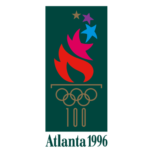
On 1/10/2022 at 1:38 PM, GriffinM6 said:
That's a pretty sweet sticker. Maybe the use of green will also entice them to use some Olympic themed colors in the kit as well...

I fully expect we'll see a "Centennial Kit" within the next 5 years. Forest Green Base, gold logo/ads, and a Pink/Blue/Purple adidas stripe would be my dream for that.
-
 1
1
-
-
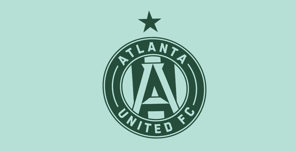
11 hours ago, Digby said:
Footy Headlines says this year's Atlanta away kit will be mint green with darker green logos/trim, which sounds like Rapids from last year reprised. Seems like an odd choice to me??
This actually makes sense and works for those of us from Atlanta. We're known as the City in the Forest which I fully expect to be the "theme" of this kit. The base might be mint, but expect the marketing and the team to focus in on the Forest Green aspect. They sent us these stickers last season as what we're all realizing was a teaser.
-
3
-
-
Oh get over yourself BBTV with that deep south BS. If you think Atlanta/Cobb County is the "deep south" then you obviously haven't left your bubble lately and seen the South. Could you project your biases and stereotypes any harder against those of us who live here?
And changing the names of the Rangers and the Nationals and Yankees? Good lord, you people are just making up ways to be insulted. None of this has anything to do with 2022 MLB uniforms. Go start a thread under General Discussion called "These names hurt my feelings" and take this hogwash over there.
-
19
-
-
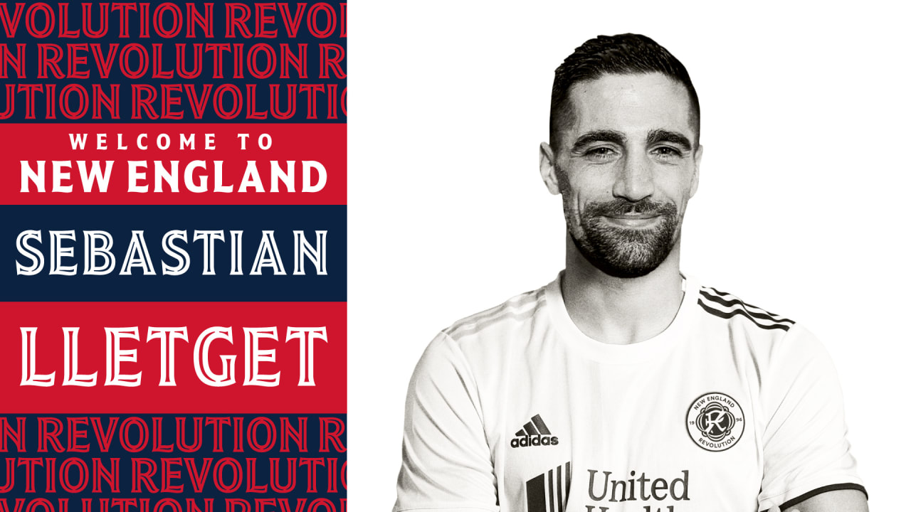
On 12/16/2021 at 7:10 PM, Digby said:
The harsh filtering means I can't tell if this is a real kit or an edited photo, but official communication from the Revolution seems to suggest they're using the roundel/team name logo on their jerseys. And probably recolored on the away. Lame!
This is such a disappointment if true. The slash R and the bunting would make the perfect stand along kit crest.
-
2
-
-
Oh that is funny. I can't believe we haven't seen another team troll like that before. I look forward to the way that social media managers are going to start faking us all out now
-
2
-
-
I LOVE the Dog Collar. So glad we finally did that.
The reds are great. The rednecks who didn't actually go to the school will :censored: about them not being silver, people here on the board will :censored: about the stripes, but overall, for what that fanbase here in Athens, these are perfect.
GO DAWGS-
5
-
-
It looks like SAC not SBC. I'll never unsee this.
Also lolz @ Ga State for only having a monocolored version-
2
-
-
Savannah Bananas uniforms in real life as well as their mascot.
-
Been waiting for this. Some more Georgia DII schools besides Armstrong, Augusta, and North GA.
Shorter
West Georgia

West Georgia

And finally the greatest DII school in ALL the Land, Valdosta State

Valdosta State
B-L-A-Z-E-R-S
GO!
BLAZERS!
GO!
Mhmm, okay, got that out of my system. =) -
The irony of it is they play in Grayson Stadium which the city of Savannah is very proud of being an old stadium experience like Wrigley.
-
1
-
-
Can we do away with the limit on likes per day?
-
6 minutes ago, Mockba said:
Ohh "lite" I read that as "life". The budget meetings have obviously fried my brain.
Edit: also I'm guessing showing only one quoted post is a lite feature. -
On a more serious note. Can we embed Twitter, Instagram, and more importantly Imgur with the new update?
-
It feels like I came home from college for summer break and mom's completely redecorated my room and took all my posters down.
-
6
-
-
The sigs are gone!!!!! Though I am going to miss some of them. Is that a "liked post" counter included in the post under the user photo?
-
Thanks!!!
-
Can anybody help me figure out what font is used for "GDNA" in this logo? Thanks!

-
I'm on Windows Phone 8 which uses Internet Explorer 10. On my phone, the site always loads the full version and I can't find an option to load the mobile one. Am I overlooking something?
Have you tried tapping the three dots at the bottom to pull up the menu > settings > Website Preference?
-
Love these
I will see you your Beale Street and raise you this...

I love the city inspired jersey trend that is taking over the NBA like these, Hornet's Mardi Gras and the Suns PHX. I dont see what there is to not love about the teams embracing the city they play in instead of just making something black.
I also love the Thrasher's home jersey (somebody please tell me why others dont like 'em?)
I love the Oiler's metal oil drop logo.
I loved the Neon Green Seahawks.
I LOVE NIKE! There I said it. The pro combat thing last year was amazing. Whats not to love about their marketing? Look what they did to TCU.
-
Just said on SC that Texas is going to Pac10 with Colorado, A&M, Tech, OK State, and Okalahoma in 2012
-
Surprised that ya'll arent all over this already but the Big XII just told Mizzu and the Huskers that they have till Friday to make up their mind if they will stay in the Big XII or not.

MLS Kits 2022
in Sports Logo News
Posted
Launching right next to the Botanical Gardens, going to be a City in the Trees Kit. Would be shocked if they went Peachtree theme since its on Piedmont and not one of the twenty something peachtree streets. Though this is setting up for a sweet Peachtree theme'd kit in a few years to marry the orange King Peach and this green City in the Trees kit.
This is going to look alot like the Hornet's Buzz City jerseys and I can't wait for the CLT fans to be salty about it.