
BJ Sands
-
Posts
3,589 -
Joined
-
Last visited
-
Days Won
6
Posts posted by BJ Sands
-
-
Outstanding.
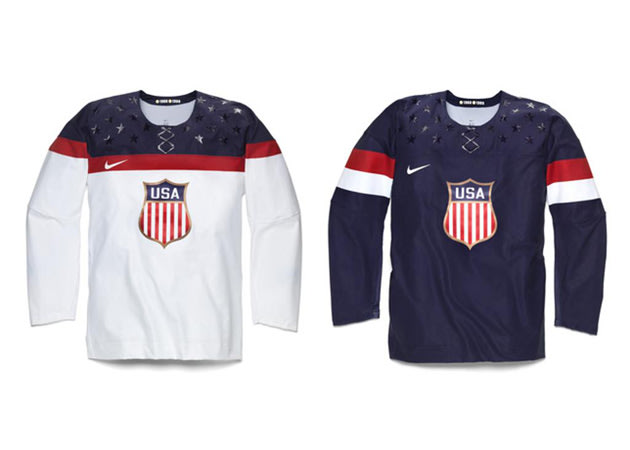
Not so bad. Clean and not overly complicated.
-
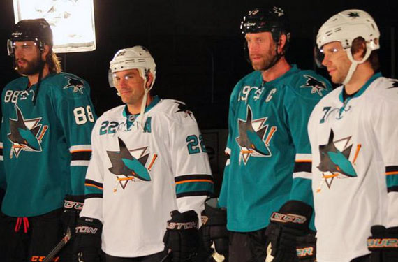
Right club, wrong kit.
-
I went to the Blackhawks game Tuesday night and I'd say the number of counterfeit jerseys was about 75 percent that of the real thing. After picking out about the 20th fake, my brother told me to cut it out.
People just don't know the damn difference. Or if they do they just don't care.
And the thing is, the fakes are so obviously crappy. Well, at least to us.
-
The 49ers' uniforms are awful. Terrible color balance, superfluous black on a modern logo that doesn't go with the set, and those dopey sleeve stripes make it a total mess of a uniform.
Seattle-Arizona was one of the best looking games of the week and will be one of the best looking games of the season.
-
 1
1
-
-
-
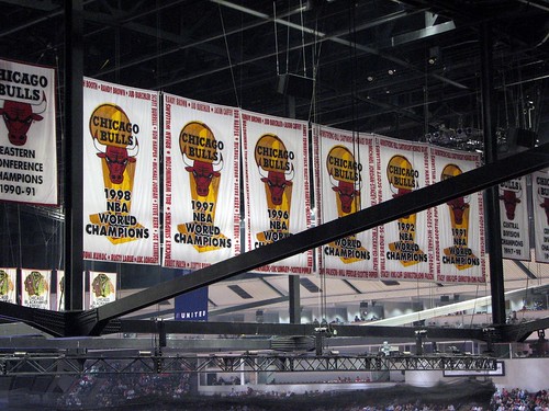
The Bulls have been doing it since they re-did their championship banners in 1994:
-
If the Bengals dropped the white piping on their dark jerseys they'd have one of the best and most-distinctive looks in the NFL.
The Seahawks have never looked better.
Same for the Lions.
The Wizards looked better in their previous set.
The Lakers' current set sucks.
The Celtics should change their main logo to the shamrock OR incorporate gold into their uniforms full-time.
The Sabres should have kept their Slug-era jerseys instead of the pseudo-retro garbage.
-
-
Most of these have probably been done somewhere in this marathon thread, so I'll keep them to links:
Cris Carter on the Eagles
Try this on for size:

-
Charles Barkley

That's the wrong uniform for anybody.
-
Patrick Ewing

Evan Eschmeyer

-
-
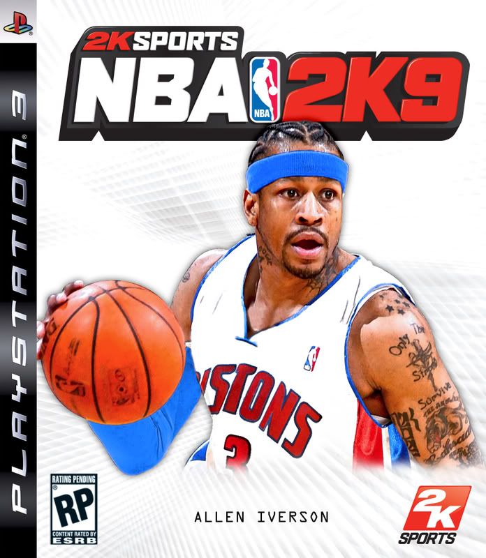
I thought of this thread the second I heard about the trade.
Why do I get the feeling the Pistons jersey will be the first (second?) of AI's many wrong uniforms?
-
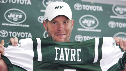
"I'm trying to smile. Geez."
-
I think this thread was created for stuff like this...

Here's how the Chicago Tribune's Phil Geib did this:
"I assembled multiple photos in Photoshop. I colored over the green existing Packers jersey. I took a #4 off of a Brian Urlacher jersey. I painted the stripes over the existing ones and added the GSH to the sleeve. Then I filled in the collar area with a dark blue and added shadow work. It took about 3 hours."
Pretty neat and gives me more appreciation for people who know how to use Photoshop.
-
Bryant Reeves in an NBA jersey...By far the worst pick in NBA history

Really?
Ever hear of Sam Bowie? LaRue Martin? Len Bias? Michael Olowokandi? Darko Milicic? Andrew Bogut?
Back on topic, here's Robert Parish with the Bulls...


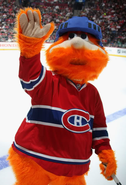


Unpopular Opinions
in Sports Logo General Discussion
Posted
The Cowboys' blue jerseys are awful. The shade is drab and depressing, the striping is muddled and the numbers are blurry and hard to read.
If anything, the blue should be based on the equally yucky but more iconic white jersey.