


JTernup
-
Posts
1,126 -
Joined
-
Last visited
Posts posted by JTernup
-
-
51 minutes ago, TalktoChuck said:
Melo was absolutely a better player than both of those guys, but he wasn't a better Nugget. Melo never embraced Denver and always felt like a rental. Both Mutumbo and Lever meant a great deal to the community. Plus, Lever accomplished just as much as Melo ever did, and Mutumbo was the centerpiece of one of the most memorable moments in the Nuggets' history.
I harbor no ill will towards Melo at all, and I wouldn't be opposed to them retiring his number. But with how he forced his way out, the fact that he doesn't lead the Nuggets in any statistical category, and Jokic taking the number, I don't think it needs to be retired.
I don't know how old you are but there is absolutely no way you are part of my generation. Kids that grew up with Melo like I did absolutely revered him and never thought he felt like a rental. It seems like revisionist history to say that Mutombo embraced Denver so much more in his time with the Nuggets than Melo did.
Wasn't the Nuggets WCF run just as memorable as the Mutombo 8-seed?
I understand that you may not view him the way I do but it's undeniable that he was incredibly influential into the history of the team. Jokic taking his number doesn't mean that he isn't deserving of being honored IMO.
-
 2
2
-
-
14 hours ago, TalktoChuck said:
The Nuggets should not retire Melo's number.
Strongly disagree. He is probably the third or fourth most influential player in Nuggets history and revived a dead in the water franchise. Melo is still 3rd in franchise history in points and 7th in games played. The Nuggets have also been generous when it comes to jersey retirements. There is really no argument that Mutombo and Lever are that much better of Nuggets than Melo was.
I understand that a lot of Nuggets fans still have hard feelings and I totally get it. I fell in love with basketball via those Melo Nuggets and was 16 when he got traded. It broke my heart as a fan. But, at this point it has become clear to me that you CAN'T tell the story of Denver Nuggets Basketball without Carmelo Anthony.
-
4
-
-
On 3/17/2023 at 10:16 AM, Indigo said:
The problem is that the number should have been retired for Allen before Giannis even got a chance to wear it. Now it's a catch-22:
If they do retire it, it 'looks" like the right thing to do, but the #34 streak will end* and Allen's time with the franchise will be more forgotten than it is now.
If they don't retire it, it "looks" as if the franchise is doing Giannis dirty.
*also, since everyone who wears #34 gets progressively better, the next guy in Milwaukee to wear it will likley become the unquestioned GOAT.
Interestingly, the Nuggets have gotten themselves in the same position with Melo and Jokic both wearing 15 on completely different uniform designs. My hope for the Nuggets at this point is to retire Jokic's 15 the season after he retires and then wait a year and retire Melo's 15. Under this circumstance I'd like the Nuggets to differentiate their different uniform eras on the retired number banners rather than the generic style they currently use. (Edit: Just noticed @SailorOfSilence102 made the same point.)

It seems like that would be the correct option for the Bucks as well, retire Giannis and then Ray.
-
2
-
-
30 minutes ago, hendocfc said:
I would definitely not call it lazy - but I'm a designer so I get semi offended by people calling shirts lazy, lol. It looks like it could make a decent Barcelona away kit in an alternate universe - which is ironic, considering they're called Real. No? I'll see myself out...
I'm a Rapids fan so I HATE RSL and am pretty biased against them... but that was their entire intention. Salt Lake had almost no soccer culture to draw off of so they purposefully called themselves Real and chose BYU and Utah U colors. From the beginning they were aware that they were using Barcelona colors but they seem to almost embrace that. It's incredibly uninspired and lame in my opinion and is truly the "original sin" that lead to such a boring and uninspired run of kits.
https://www.mlssoccer.com/news/how-real-salt-lake-got-their-name-and-colors
-
On 1/27/2023 at 3:41 PM, TBGKon said:
That large flags as well as the gray underbrim make me think this might not be real. I know the 59Fifty BP and spring training caps have the gray, but usually they on-field caps are black underbrim.
I was hopeful that these were a bad rendering at least but I saw a couple of US and PR hats at lids today and they’re legit. The flags are just as big as those renders make them look. Didn’t think to snap a picture.
-
17 hours ago, O.C.D said:
We agree on a lot. I'm not obfuscating blame from the Lakers for the design either. Someone in their organization is pushing it and without looking at the sales numbers I can't know the full story. The Hollywood night/New purple uniforms don't seem popular but the numbers could tell a different story
A little late to this discussion but I've always had a hard time blaming the suppliers. Their job is to maximize profits and get the most return on their investment into supplier contracts. Realistically they aren't responsible for maintaining the integrity of a team's identity at all.
The teams also want to maximize profit from apparel and jersey sells but they should also care about protecting their brands.
The NBA essentially let the fox into the henhouse when they allowed Nike to go wild. It's the NBA and the team's job to protect those hens and they'll get the blame from me, not the fox.
-
8
-
-
Because y’all are talking about nameplates I’ll share my pet peeve. Why do players have first initials or worse first two letters of their first names or full names on their nameplates. It’s completely unnecessary to have a tiny Q in front of your last name when there is a giant number that also differentiates you.
-
1
-
 3
3
-
-
16 hours ago, colinturner95 said:
well...
Youngstown State and BYU did this in the same week as Utah, so maybe not?
I hate those too but Youngstown is a shrunk logo away from perfection. BYU's is awful but it utilizes the team mascot and looks well done. Utah's tribute looks like an airbrushed t-shirt from a suburban mall that should've been torn down 10 years ago. It also has a helmet stripe that ends abruptly into an oversized version of the memorial logo. It's got snow or stars all over it that clashes badly with the photorealism of the players. They are wearing a uniform on the helmet that is one that Utah should wear a lot more but frequently eschews for subpar alternates while wearing a subpar all black uniform in their biggest home game of the season. And, the potentially unpopular opinion, I think it is a really weird precedent for the program to set placing people on their helmets as a memorial and selling tons of 22 forever merchandise. It makes ASU and their Pat Tillman tributes look restrained.
-
19 hours ago, lahaye7 said:
Utah wearing these helmets to honor their two fallen teammates
Wow, just seeing this. It’s a cool tribute and I know that means a lot to that program. But in a vacuum that has to be the worst helmet in the history of the sport right?
-
On 9/21/2022 at 10:40 AM, Digby said:
The insistence on bespoke fonts for every team every cycle reached NBA City-levels of "no good ideas left" long ago. I don't know if that one is worse than the print-shop-chic basic block that the USMNT is using this cycle, but they're two extremes of horrid.
It's insane to me that a basic block font could be considered the opposite extreme of that monstrosity. Block fonts are classic and beloved by the majority on this board in all other sports. Plus, I think a block font works perfect for a US shirt because of how ubiquitous block fonts are with classic American sports aesthetics compared to other countries where custom soccer fonts have been the standard in sports for decades.
-
1
-
-
1 hour ago, MJD7 said:
I’d argue the Jordan 1s are what really propelled Nike into the stratosphere, they’re still one of the most popular shoe designs Nike has to this day, and they prominently feature the Swoosh.
(This original pair worn by Jordan sold for over $600,000).
Yeah, there is no basis in reality to act like Nike didn’t get popular until they ditched the swoosh on Jordan’s. It’s an iconic logo that simplistically conveys the forward moving, quick image the brand wants to be associated with while looking great on a shoe.
The swoosh has benefited from Nike’s prominence but Nike has benefited greatly from having such a good logo.
-
2
-
 1
1
-
-
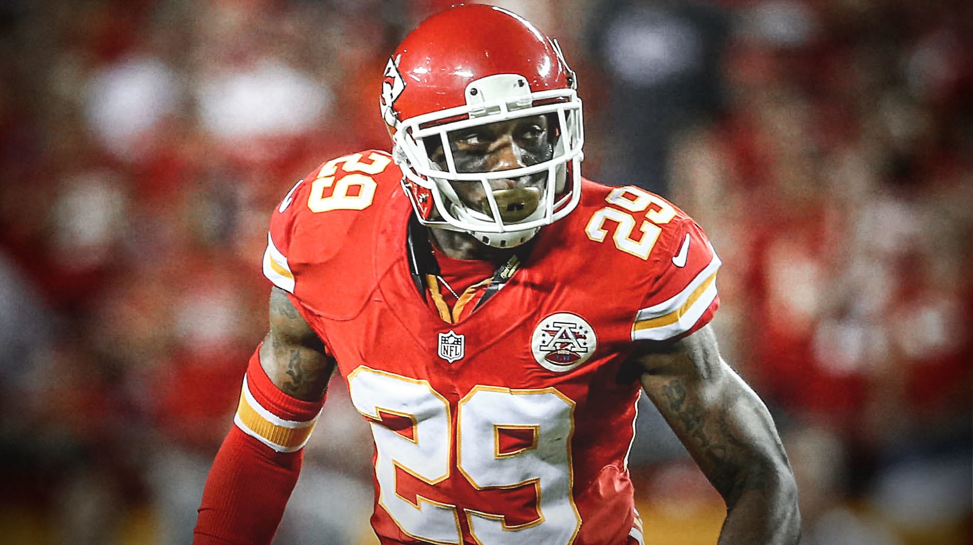
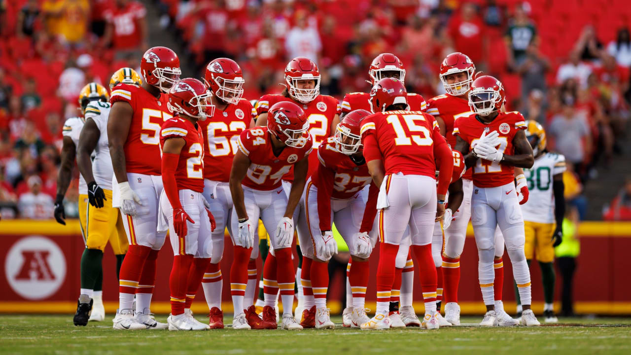
6 hours ago, PERRIN said:
This might be an unpopular opinion, but that looks substantially worse on a modern template. The TV numbers are super smushed and the cuff striping isn't emphasized enough due to its small scale. You've proposed a more egregious example of the problem with the Panthers' current set, except with an obvious fix: Just do what they do now. I've never been super fond of cuff details because they get smushed by shoulder cuts and don't give the stripes any room to breathe. The Chief's switch from cuff stripes to sleeve stripes and moving the TV numbers to the shoulders instead of sleeve caps turned their look from a forgettable old-timey set to a classic uniform that fits perfectly with modern NFL aesthetics.
(I meant to quote your sketch of the cuff striping on today's template, my bad)
Completely agree, the think Fakers ignored in their post is that we got to see that cuff stripe on a more modern template. Although it had only probably been 7 or 8 years from that Tony G picture things got bad by 2011. It was not uncommon to completely lose that stripe. Nike really saved the classic Chiefs jersey IMO.
-
14 hours ago, the admiral said:
Yeah, I love when football players are "into fashion" but it consists of cutting up socks and putting them on their forearms, something an unsupervised eight-year-old would do.
Woah, strong disagree there. I've always thought this was a great look for players that play on teams with nice striping patterns. Eric Berry started doing it in the latter portion of his career and it always looked way nicer than the plain black, white, or red sleeve he had worn in the past.
-
6
-
1
-
-
10 hours ago, Magic Dynasty said:Florida’s jersey schedule. Napier went traditional at ULL and will again here - exclusively orange helmet, no orange jersey, and only deviating from orange/blue/white and orange/white/blue three times over the course of the season.
I’m glad about the helmet, but I wish we could’ve done orange/blue/orange and orange/orange/white once this year. Plus there’s no throwback for homecoming weekend, which was a staple of the Mullen years.
Love this direction! Really emphasize the classic combos without losing our iconic orange lids. I’ve always liked the white helmet and even enjoyed seeing the blue but when you have a helmet as good and instantly recognizable as the Gators it’s a shame to wear anything else.
My only gripes would be that I wanted the homecoming throwbacks to remain, I’d like the orange jersey against a cupcake opponent, and the big game blue pants should be against LSU not USC. But those are pretty minor compared to the mix and match mess of a lot of programs.
8 hours ago, roxfan00 said:The helmets Colorado will wear Friday night against TCU in honor of Cliff Branch
Really like this look for a one off. Looks a little too much like Purdue or the Saints for me to want it more than that though.
-
1
-
-
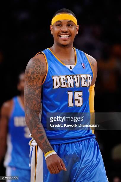
1 hour ago, Carolingian Steamroller said:
I will fight tooth and nail that this was the best version of the Nuggets. Only had it for 2-3 years (I think) but it nailed exactly how to have a gold/powder/navy aesthetic while ensuring all three chromatic dance partners hit their steps.
I've never been a fan of mismatched numbers but this was definitely the nicest color balance in the powder/navy/gold era. Unfortunately the Nuggets continue to use mismatched front numbers

-
1
-
-
Adidas knocked it out of the park this year. Really excellent designs with bespoke patterns that have clear inspiration and application. It really makes the disaster that Nike and Puma are putting out even worse.
-
5
-
-
3 hours ago, PlayGloria said:
I can't stand the aesthetics of it. But, I also realize that during a game, players are going to do what they want and what they are comfortable with. That's throughout all sports.
I criticized it a couple pages back, but my main issue was that they were doing it during the photo shoot that was created to show off the new uniforms. People worked hard on designing a new uniform for ULM. Their design and the photoshoot deserve better than to have a guy with his undershirt wrinkled and untucked for no reason. Imagine if one of the many great designers on this site got the opportunity to design a football uniform for a university, and during the photoshoot a guy had an untucked wrinkled Gildan t shirt hanging out of the bottom.
IDK... that would bother the hell out of me
Agreed, It's pretty ridiculous to come out at the start of the game or for a photo shoot with the undershirt exposed. If it happens during the game whether intentionally or unintentionally that's fine.
I think a lot of it comes from the place of players wanting to be individuals with their own unique look. Other elements where this occurs is things like gloves, sleeves, cleats, socks, custom knee pads, and helmet visors. Some of those can actually be pretty cool IMO but a giant bloused undershirt is not a good look and is only "cool" in the context that some really good players have done it in the past.
Of all these things, the socks make me the most irrationally frustrated. In this picture of the Chiefs honoring Len Dawson to start the game for example, which guy does it look like is trying to be an individual during a cool team moment?
I'm only 28 y'all but some of these things make me feel like an old fogey!
-
5
-
-
I'm a bit late on this, I was following along until about Puerto Rico but then life happened, so I just caught up. I'd just like to say that this is by far my favorite and one of the most impressive creative endeavors I've seen on this site in the 12 years I've been around. Truly excellent work, there isn't a single state that I don't like and each one would instantly be a fantastic primary or alternate plate. You've represented each state excellently and it's cool to see so much research and effort yield such great results.
I'm excited to see a potential Canada, Philippines and EU series. May I also suggest an African series? There would be all kinds of great imagery and history to pull from there!
-
2
-
 1
1
-
-
1 hour ago, Clintau24 said:
Here it is - the most comprehensive overview of every new uniform, helmet, logo, and even field design. From Power 5 schools to Division III. Enjoy!
Hadn't seen this before, but what's the deal with that blatant Padres rip-off script that FIU is using? Oof, it wasn't a great word mark for a baseball team but seems really off for a football team..
I like the gold flake though, hopefully it shows up under the lights.
-
On 8/16/2022 at 8:18 PM, BBTV said:
I'm very confused about that site. Are they licensees of the pro sports leagues and the players associations? Wouldn't that be necessary to not be a bootleg store? There's nothing that indicates they are. The fact that their 1995 NFL jerseys don't have the shield is an indicator that they're bootleg, and are stealing trademarked team logos.
Their CCM hockey jerseys - are they just making jerseys and putting a bootleg CCM logo on them? The desciptions make it sound like the modern ones ('90s and up) are legit CCM jerseys with the crests already applied, but how can that be?
Also, sizes on some things are S, M, L, when typically authentic jerseys were numbered (46, 48, 52, etc.)
Their Phillies jerseys are horrendous, with era-mismatched wordmarks and crests, incorrect NOBs, Frankenstein jerseys, etc. But a lot of other things I saw looked really good and, on the surface, legit.
Yeah, that store is a mess. I looked up a few teams I'm familiar with when it comes to authentic and replica jerseys and AT BEST it is a lot of bizarre mix and match going on. It's possible that a lot of the jerseys are legit blanks that someone came across but that seems highly unlikely. For example they've got 2010's Rockies jerseys on Majestic replicas that were retailing at like $75 for blanks listed at $195 with player name and number. The lettering looks pretty good but the pictures aren't good enough to know for sure. They have an Alex Gordon Royals on what is a double knit authentic base but it has less convincing name and number quality. Chiefs jerseys are all over the place, inaccurate number fonts, Larry Johnson Wilson authentic that he never wore, Priest Holmes Reebok Authentic that looks pretty close to the one I have in my closet. It's all really confusing and I wouldn't have any faith that I'm getting a good product based on their photos and inconsistency and they are still quite pricey.
-
I like all the space uniforms but it is getting a bit oversaturated. As far as I'm concerned, Purdue, UCF, AF, and Houston are the only programs with any claim to a space uniform. As long as we don't exceed that list I like it.
-
4
-
-
14 minutes ago, gosioux76 said:
It's not the same, but I agree with many of you that I'm getting 2004-05 vibes from this. That's not a good thing.
Totally agree. The 80’s/90’s retro craze is in full swing which is why I think the away kit works. It is disappointing for on the field WC but will look great casually. The home is the soccer kit equivalent of a giant boxy navy pinstripe suit from the early 00’s and looks off on the field and out of touch fashion wise.
-
On 8/7/2022 at 10:51 AM, Red Comet said:
The very concept of an alt helmet/uniform for the Chiefs should be burned in a dumpster aside from gray face masks and a bigger arrowhead on the helmet like they had during the Len Dawson era.
I don’t even like the red top and red pants look they have now much less any concept some Twitter artist came up with.
Completely agree. But if you forced me to pick a new helmet option I'd probably be happiest with a white helmet to be worn on the road only against teams with jerseys.
As far as jerseys go I could live with a tonal red jersey and pants that advance the all red uniform concept. I'm thinking updating the stripes to be tonal red, a red arrowhead on the helmet, red facemask, tonal red AFL patch and maybe yellow numbers. That could satisfy the NFL if we're being forced into alternates and would at least cut down on wearing the mismatched stripe red pants with the red jerseys. Don't want it but that's probably the least harm they could do to the brand. Black or yellow uniforms or helmets are a complete non-starter for me.
-
23 hours ago, ManillaToad said:
I'm not going to argue the semantics of it but it's clear how sock stripes affect the aesthetics when you compare those photos to these
Why in the world have teams not started to put stripes on the leggings? If players prefer those to normal socks just print the stripes onto them. Plus it would open up a whole new market of on-field yoga pants for them to sale.
-
4
-

/cdn.vox-cdn.com/uploads/chorus_asset/file/24369378/usa_today_19810293.jpg)


MLB 2023 Uniform/Logo Changes
in Sports Logo News
Posted
Nike sells the throwback jersey in white. I think the piping is black and the on-field is probably navy (honestly can’t tell) but it’s passable. As of a couple days ago the team store (Bay Republic) had them in men’s but they seem to be sold out. Here is the kids jersey and the website if you want to keep an eye out for a restock of the adult jersey. https://thebayrepublic.com/collections/jerseys-rays/products/rays-white-youth-devil-rays-replica-nike-jersey
FWIW I’d be shocked if we don’t get a full release this season. Now that it’s an official jersey Nike has started producing Authentic Collection Devil Rays gear.