


-Akronite-
-
Posts
1,256 -
Joined
-
Last visited
Posts posted by -Akronite-
-
-
38 minutes ago, Lights Out said:
Apparently, the Cavs' road uniforms from the first LeBron era were originally going to use the team name instead of the city name and feature more navy in the striping:

OMG I always wondered why they DIDN'T use navy in the striping... But very glad they went with "Cleveland."
-
14 hours ago, Chewbacca said:
I really respect the Dodgers for keeping it simple and classy but I just cannot understand why they don't wear this jersey during the regular season. It's beautiful, and I think that if they only wore it a few times year at the most, it would be the perfect alternate.
It's really nice but you gotta especially respect it because it prevents the slippery slope of over-wearing the alt as many teams do.
-
3 hours ago, Tigers6884 said:
Just because the current set is a trainwreck doesn't mean we have to give this uniform all the love in the world:
The colors are dull and outdated (from an era where it seemed like everyone had to tone down colors and used the blandest shade they could find).
It's like if the Anaheim Ducks made the switch from their 2007 Stanley Cup uniforms to something much more horrendous, and everyone clamoring for the old look and claiming it's the best they've ever looked.
I don't like it when teams just have logos on sleeve and the old pewter was ugly, so I agree. But I also go even further to LIKING the current look.
Other than the numbers the new set is an upgrade IMO, which I've posted before. The larger logo is awesome, all the logos are improved, and the pants stripes are cool rather than boring. Chrome facemask is pointless but facemasks are one of those details that people go nuts about that I don't care about at all (for instance, the Browns have been white, gray, and brown and I've liked them all).
I also don't mind the Jags current look. It's maybe my favorite look of theirs but they need to balance their colors better and get rid of the stupid helmet (that's the only egregious part of the look, which I totally get hating relentlessly). I wish they focused on their "teal" like many others. Also, the JAGS shield is awesome. Shields are great (ironically, not a fan of the Cavs shield, but that's because of the use of black).
-
 3
3
-
-
2 hours ago, Pharos04 said:

What's the one on the right?
1 hour ago, CS85 said:

Guess which one's Shazam and which one's Authy?
I know I know! Shazam is blue!
-
2
-
-
15 hours ago, Quillz said:
I agree. Pat Patriot is fine as a secondary logo for merchandise, but doesn't work well as an actual sports logo. However, I also think the brighter colors the Patriots used, circa 1993-1999, were better. Seems they, along with several other teams, used darker colors with the onset of the new millennium. But with some teams starting to go back to brighter colors (such as Kelly green), I wouldn't mind the Patriots do the same.


Granted, was not a fan of that era's jersey, especially with the fake pinstripes.
Side by side the navy version looks SO much better.
The only problem with the Pats identity is their messy uniforms that are really dated but also haven't changed since the franchise became immaculate. Pretty unfortunate since they have beautiful throwbacks.
-
1
-
-
On 1/1/2018 at 4:52 PM, QueenCitySwarm said:
Just adding my two cents to all of this:
MLB
The Orioles need to go back to the cartoon bird. It looks much better. As in change the primary? Because they only use the cartoon bird for caps now.
The Anaheim Angels logo is great and they should go back to that. Which one?
The Yankees logo is bad. Just switch to the NY logo. Ok.
Note to Cleveland, Detroit, Colorado, Pittsburgh, and San Diego: just letters without any sort of design looks bad as a primary. Wait what about the Yankees?
Notes above. I'm on board with a lot of your opinion actually.
-
12 hours ago, Jt0323 said:
If Yankees win, they are putting a thumbs down in it somewhere, no?
Please God don't let this happen, but the best move IMO would be to have them all fitted for thumbs.
-
26 minutes ago, jmac11281 said:
I am from the Philadelphia area and I have never really felt a connection with the Eagles. I can watch their games in a objective manner, and not care one bit if they win or lose. I agree to a certain degree about your Cubs example and how that unites a city. However, if the Eagles win a Superbowl, I just won't feel any kind of excitement. So, I think that most people would feel a sense of unity, I cannot say that I would feel the same.
The Cubs example is kind of funny though since that town has 2 baseball teams.
-
2
-
-
I value geographic loyalty over having spent some time arbitrarily rooting for some other team. If you rooted for a team because you had no local choice, it's fair for you to switch you primary fanhood to a new, local team.
If you feel you really invested in a franchise and feel a part of that fanhood, feel free to stick with the team you already had, but that kinda thing doesn't work for me.
I'm not a big hockey guy but if Cleveland got a team (again heh) I'd swap from Columbus immediately. But I'm not really invested in any sports that don't have teams in Cleveland so it's hard to really match up the situation.
I will admit that it took me a long time to start valuing identities even if I hated the team/city.
-
1
-
-
31 minutes ago, tohasbo said:
DOUBLE POST AHHHH
-
23 minutes ago, tohasbo said:
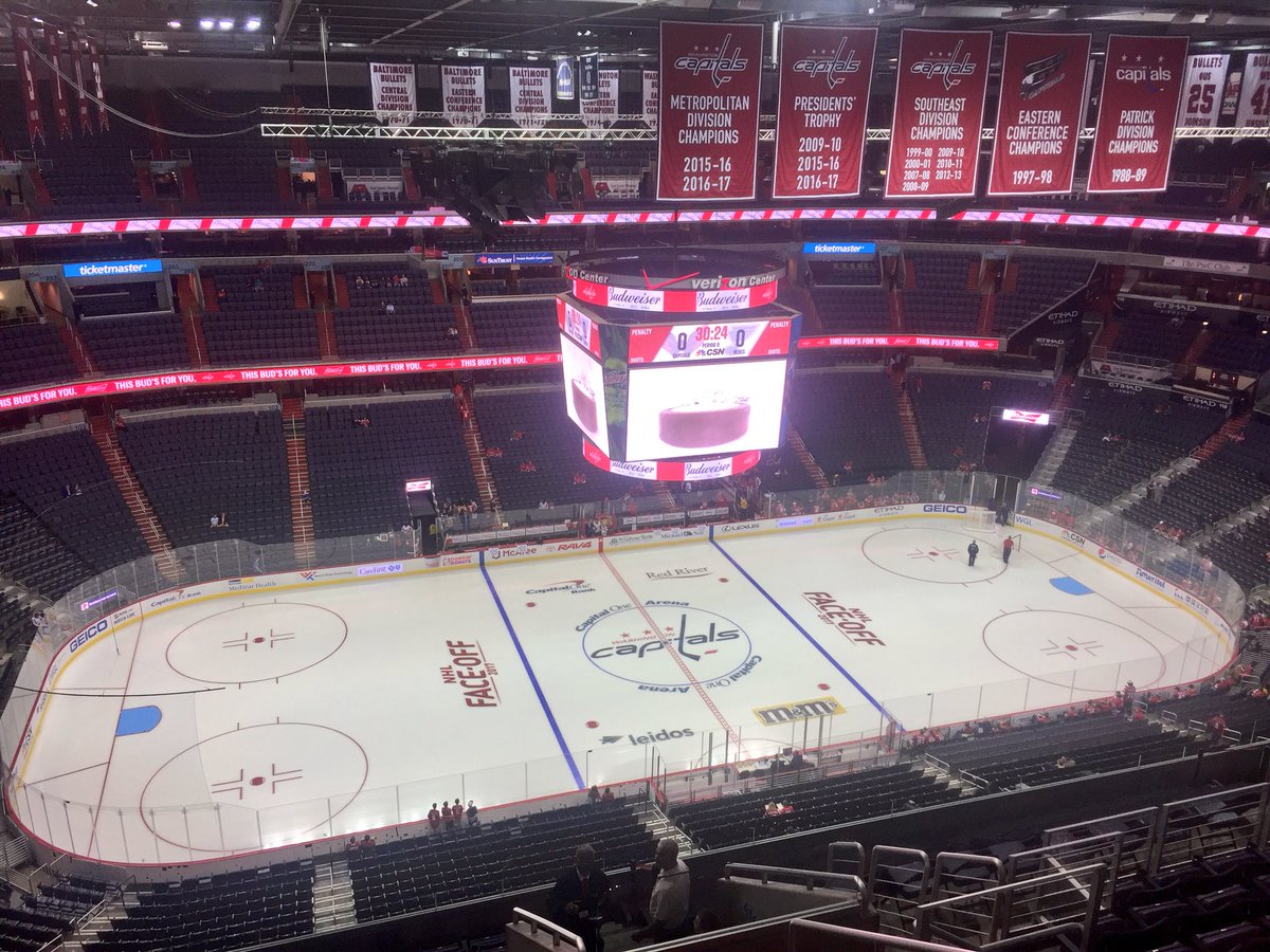
Looks like the Capitals again updated the banners but only added the years.
It'll be interesting to see what the Wizards do for their division bannerI like that. Especially if a team doesn't have a ring yet, makes sense to have a banner to list all the years you reached a certain milestone, like division titles.
-
2
-
-
Pants without some sort of stripe never works for me. Those gold pants are duds without a stripe, looks like a modern college football design.
The bright yellow version looks so much better, even though I like both color schemes.
-
19 hours ago, Ark said:
The problem though is that they once looked like this

Why use inferior uniforms?
How is this superior? Looks like the only difference is the pants and the stripeless gold is far worse than the whites IMO.
I have very little issue with the St. Louis look as long as they aren't monochrome blue.
-
3 hours ago, ScubaSteve said:
For some reason I really liked these jerseys (for N.O. that is, not to be used for Charlotte)

Sorry to play another round of "is that unpopular?" but IS THAT UNPOPULAR?
-
1
-
-
I can totally understand the argument that the Falcons uniforms are a dated mess, even though they don't bother me all that much.
The logo, however, is a clear a upgrade and proper modernization. They don't need to change it, I find it so much less dated than the old logo. I'd put anybody clinging to it in nearly the same category as anyone that prefers the old Arizona Cardinals logo.
-
9
-
-
While the Vegas logo doesn't historically represent knights very accurately, as a logo is it league's better than every single cartoony piece of garbage posted above.
Their main problem was picking boring as colors. The logo is kinda cool.
-
My only issue with the I logo is that it represents the mascot and not the city. Wouldn't mind if they replaced Wahoo with the I and started using it on home caps but kept the C on the road, though.
Not sure of the right direction for a brand new Indians logo outside of changing the name.
-
On 2/10/2017 at 11:30 AM, DC in Da House w/o a Doubt said:
Just curious, does anyone else pronounce crayon as "crown"? I do. I've gotten a lot of s for it. I've been bullied into just quietly muttering it whenever the rare occasion happens where crayons are brought up.
I guess it's kinda low brow, but it's just always what I've called them. Hah, low brow makes me think of: "oh yeah???" and "come here a minute".
Hey, happy Friday guys.
Being from Northeast Ohio (per my username), I always pronounced it like "cran." I only ever heard it as either "cran" or "cray-on." Never heard crown before, odd.
Also, the draw/drawer thing is funny. Some people, from more rural settings, might say "drawr," as in "I'm gonna drawr something," ADDING an R for no reason. But growing up we never mixed up draw and drawer because we pronounced the latter to rhyme with "roar."
Also, what's up with New Yorkers saying "on line" instead of "in line." "I'm gonna get on line for the tickets." "Next on line please." WHAT?
Oh, and a lot of people here say "soda" even though it's pronounced "pop."
-
1
-
-
Quote
Unpopular Opinion:
I think the Houston Rockets 2003 spaceship inspired logo, jerseys, and colors are perfect
I think they are certainly underrated. One issues, though it's not that big of a deal, is that they use an R in the middle instead of an H. I prefer when teams use letters representing a city rather than the nickname. The fact that the vertical lines are rockets already says rockets, so use an H. It's the same issues I have with the Bengals B logo. If they used a similar font to create a C logo it's be way cooler (plus the Bengal head is great and should be the primary anyway).
Some teams, like the A's, can get away with.
-
2
-
-
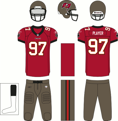
4 hours ago, VikWings said:
Also the obnoxiously large helmet logo and the fact that the pewter is no longer pewter and basically dark gray. (I do like the switch from black to red socks though.)
The Pewter used to look good and a color they owned.

Now they just look like Washington States alternates:

Maybe use an example that matches because those two helmets look nothing alike. The giant logo is my favorite part. It makes up for the lack of stripe, where most stripeless helmets bore me.
I also agree that the Bucs jerseys are not that bad. In fact, I'd say they are good with a couple changes away from great. AND a solid upgrade from the previous set. The old jersey was boring and I find the old pewter ugly. The worst part of the old set, the alternate logo on the sleeves, remains unfortunately.
-
1
-
-
On 6/30/2016 at 8:50 AM, C-Squared said:
I almost hate to create evidence of this opinion, but I caught some clips on NFL Network and love how this set looks in action:

Do you mean the whole set or this particular look?
There are lots of minor issues with the entire redesign that I hope get addressed in future tweaks (though in my heart I hope they just say :censored: it and go back to what were nearly perfect jerseys). But the orange jersey is clearly their best IMO. The stripes match the helmet and the numbers/letters are both white. Easily their best look. Not sure if I'm ready to sign off on the brown pants but it's better than their monochrome looks.
-
1
-
-
Cleveland teams cause I'm from Northeast Ohio.
Ohio State cause I'm from Ohio... And now I go there.


Unpopular Opinions
in Sports Logo General Discussion
Posted
From a distance the new look is beautiful but the white and black made the old look pop better, and I don't like the extra gray number outline or the boring striping pattern with the unnecessary wordmark. My only real issue with the previous set was the lack of silver in the primary logo, since black is a the third color. Works on the silver helmet but not on it's own.
Can people let me know if this is unpopular- While I would agree that the Brewers need to pick an identity and stick to it, this:
is still an awesome look. Fauxbacks and extra colors being thrown in are hit-or-miss at best and this isn't an upgrade over the old logo colors, but I don't blame them for trying this cause it looks sweet as hell.