

tigerslionspistonshabs
-
Posts
4,188 -
Joined
-
Last visited
-
Days Won
3
Posts posted by tigerslionspistonshabs
-
-
12 minutes ago, Survival79 said:
Utah Yetis is pretty gouda.
I like the concept of it (I'm a bigfoot believer), but I dunno....I can't get behind it as a pro sports team name.
-
 1
1
-
-
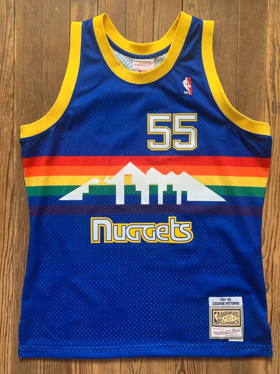
6 hours ago, Froob said:
Nuggets just need to give the people what they want

I loved the blue and gold alts they had a while back. I would have loved a full set.
-
2
-
-
1 hour ago, uniformity said:
The names. Why do they all sound like generic 90s era avalanche knock offs. Blizzard and Fury are Dairy Queen and McDonalds ice cream treats. Yetis is literally the Avalanches old shoulder patch. The team is even in the same division. All the names registered suck.
Pick two colors and white for the jersey and maybe add more for the logo. Purple and white on its own as a base would make a solid uniform.
Agreed. All so cheesy.
-
1
-
 1
1
-
-
They might just slap this bad boy on the front for year one.
-
2
-
 1
1
-
 1
1
-
 2
2
-
-
Pardon my lack of knowledge, but what's wrong with Soldier Field? Doesn't it have historical significance? I know it's old as dirt, but so is Lambeau, Wrigley, Fenway, and half the stadiums in college. If it's just a matter of modernization, couldn't some renos be done and save say, $4 billion dollars?
-
That looks EXTREMELY Chicago Bulls.
-
51 minutes ago, TBGKon said:
Mammoth is low key a sleeper in this presumptive list.
I think it sounds better plural.
-
1 minute ago, henburg said:
Outlaws isn't bad but it does feel sort of out of place for such a goody two-shoes community like Salt Lake City lol
Rattlers and Sidewinders aren't bad suggestions, but I can't see them picking something like that.
I increasingly feel like Smith may lean toward Fury. It's simple, abstract enough for multiple mascot ideas, and keeps a sort of simplistic synergy with the Jazz which I think is something that will be important to him.
Agreed. Fury is soooo bush league.
-
5 minutes ago, tBBP said:
Which underscores how good an idea it is to think beyond the box sometimes regarding hyper-localized identities. I mean shoot, Vegas just did it. There's nothing about Vegas that infers anything about knights (unless some sarcastic peazy somewhere wants to bring up the Excalibur), and that doesn't even address the irony of the Golden Knights playing in the Silver State. Yes, we all know how why the team has the Knights nickname, but the point is that sometimes fun branding is fun whether [hyper-]localized or not.
All I'm saying is if people have to go to the extreme ends of the galaxy to find some hyper-local source material for a team brand, perhaps maybe it's time to reevaluate the approach altogether. A little bit of whimsy never hurt anyone. (See Exhibit A: Kraken, Seattle for a significant example.) So, if Smitty n' em want to look beyond the state for a mascot that "works"...or find some nickname that may be, oh I don't know, "out of this world", so be it. I personally am coming around on the idea of "Yeti" just for the phonetic alliteration alone. (Wait--is "Yeti" plural in the same vein as "moose" or "deer"??? Somehow, "Yetis" doesn’t really flow right to me.)
But whatevs...we'll see how this goes.
Agreed fully. That's kind of why I believe that Jazz actually works well. It's a nice alliteration and if you think beyond the 'UTAH ISN'T KNOWN FOR JAZZ!!!!!!!!!!" sentiment, I feel it almost describes more of the flowing, upbeat movement of the game of basketball.
I feel Stingers could work (although it would sound waaaaay better with Salt Lake/City in front of it). Rattlers (there are 6 species of venomous rattlesnakes in Utah), Sidewinders (also a venomous snake native to Utah) I feel could hold some weight.
-
2
-
-
Utah is a weird/hard location to really nail down an identity. It invokes 'cold, snow covered mountain' thoughts, but in reality, the vast majority of it is rugged desert terrain. So, even though a wild-west/desert animal nickname would be realistic, it doesn't actually fit well, because no one thinks that way.
-
2
-
-
6 minutes ago, DJT said:
A hockey team logo where it’s someone skiing down a mountain. Seems fitting?
Referencing an other sport entirely lol....why not the Utah Slam Dunkers, Utah 3rd basemen or Utah Pickleballers?
-
2
-
1
-
-
1 hour ago, Sec19Row53 said:
Nah - it's a skiing thing. Playing card diamonds are red.
I understand I'm being totally pedantic with the response, but I think it would be a reach to go from Black Diamonds to Vegas/gambling.Must be just me then. My brain instantly goes to casino/vegas/gambling lol.
-
1
-
1
-
-
I understand the whole concept of Black Diamonds, but I feel it instantly invokes a gambling/cards/Vegas vibe, no?
-
1
-
-
21 minutes ago, Haz_Matt said:
Let's just call them the Diamondbacks, use purple, turquoise/light blue and copper. Take all the things Arizona from them in one shot

That would turn into a cross-stateline war with massive slingshots. Utahns would launch their extra wives and copies of the Book of Mormon. Arizonians would fire cacti and cans of Four Loko. It would be assured mutual destruction.
-
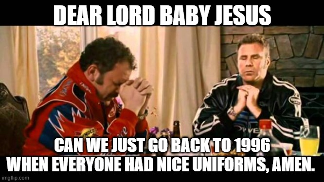
10 minutes ago, 29texan said:
"Nice" is subjective.
This was in 1996, btw:
OK maybe not everyone lol.
-
Utah Rattlers has kinda grown on me.
-
-
7
-
1
-
1
-
-
2 minutes ago, GDAWG said:
So if they tear down most of Soldier Field when the new stadium opens (if it does), what happens to the MLS Chicago Fire?
They'd probably follow the Bears to wherever they go temporarily.
-
Maybe they could play in the United Center like they did in the 1932 playoffs at Chicago Stadium.
-
10 minutes ago, spartacat_12 said:
College teams don't carry the same importance in hockey as they do in basketball. If you did a poll of NHL fans asking them if they know what the University of Denver teams are called I think most of them would draw a blank.
I actually had no idea and I'm a college hockey fan.
-
2
-
-
Perfecto.
-
Where though? Doesn't look like there's a whole lot of room left on Museum Campus. Would they demo Soldier Field and playin at U of I for a couple seasons like they did during the renos?
-
1
-
-
20 hours ago, NeauXone said:
I am no insider but I'm sensing something's changing soon in Minneapolis. Wolves kicking off the playoffs with two throwback games for 1&2 after already wearing the classic jerseys around 25 times during the regular season (by far the most out of all our jerseys), plus our playoff branding featuring bright blue and green as apposed to navy/slate blue/black like in the past. If not this upcoming season I'm feeling a color scheme shift by 2025.
I sure hope so. I love their classic set. Very simple, yes. But beautiful IMO.
-
2
-
-
19 minutes ago, Silver_Star said:
Thanks for the tip......
-
1
-
 1
1
-
9
-
1
-


2024-25 NHL Changes
in Sports Logo News
Posted