


AHcreative
-
Posts
3,048 -
Joined
-
Last visited
-
Days Won
2
Posts posted by AHcreative
-
-
On 4/6/2018 at 10:23 PM, SCalderwood said:
Along with this -
But you know what? After seeing Checkers and Rally's next to each other, this is the first time I have realized that they don't use the same font.
Same here. It bugs me now.

-
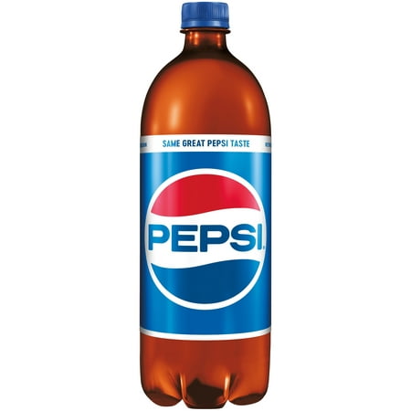
10 hours ago, TrueYankee26 said:

More on this: Anyone buy a Pepsi lately?
-
 3
3
-
-
Great idea for a thread.
Found this:

Also, a local bank:

-
6
-
-
I enjoy all of your work and that Eagle's concept is stunning.
-
Through the first two games of the NHL season, I find myself really liking the Vegas Golden Knights. Even the name. I thought it was stupid at first, but I like "Vegas" and I like "Golden Knights." It gives the team a unique and flashy identity. Perfect for the city.
-
3
-
-
Who is it that did "Habsing the NHL?" We need a "Yanking the MLB" where all teams have pinstripes. (If it hasn't already been done.)
EDIT: @bkknight95 Credit where credit is due.
-
2
-
-
The Capitals, while clever with the 13 stripes, looks more like a soccer jersey. If you're dead set on the stripes, I think the Weagle logo would work better.
Columbus looks good, I'd like to see more red in the road sweater but the home is great.
The Blues are gorgeous. I'm a fan of their current uniforms but if they had switched to these with the Adidas takeover I wouldn't be upset in the slightest.
-
Fantastic work as always, ren!
-
1
-
-
Very cool, Mings! I love the detail of the "non-painted" brick on the side of the canvas.
-
This is a really inspiring thread and now one of my favorites that I've viewed in the CCSLC over the past decade.
I've dabbled in the area of painting and doing craftsy projects, but nothing like some of the stellar work here.
I do have a few questions if anyone would be kind enough to answer:
What mediums do you guys find the easiest to paint with? Are there any brands of paint and/or brushes that make a huge difference in quality of work? Do you sketch out your designs on paper (or the canvas) beforehand, or just kinda go for it?
I'd love to get back into painting, I find it very cathartic, but I'm not sure where to begin.
@oldschoolvikings I'm floored by your work! You have such a unique style that really represents itself well on the canvas.
-
1
-
-
Blasphemy! Where's the guillotine? Off with your head!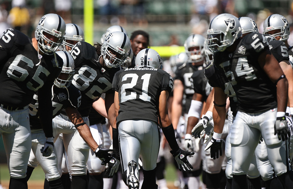

These are okay, but nowhere near as good as people claim them to be.
I actually agree. I mean, yes, the Raiders are an aesthetically pleasing team when all of the pieces come together. However, when you take the uniform apart, it's just... boring. Take the jerseys for example: it's either just plain black with silver block numbers or, even worse, a plain white jersey with black block numbers. The helmet is okay, I guess. Honestly, the logo is horribly outdated. The only reason people like it is because it's nostalgic to them and because black and silver are the "cool colors" and they go with everything (that's why you see all the high school and college guys wearing Raiders caps and shirts).
As a whole, yes, they are visually appealing and I would be happy if my team looked like the Raiders. However, there is room for improvement. At least put some sort of logo on the jersey so when fans purchase one they it doesn't feel like they're buying a $100 black or white t-shirt (and I know, don't argue with me that jersey fabrics are nothing like plain cotton t-shirts, I'm aware, I'm just saying...)
-
Chicago Blackhawks
Stole the words out of my mouth. They use about 4 too many colours and the striping is inconsistent. They're far from terrible but certainly not the "end all be all" of hockey uniforms.
Completely agree. I just don't understand the love for Chicago, and it's not because I'm biased as a Blues fan. Just as a logo and jersey enthusiast, I see the following problems with the Blackhawks' identity: the logo is too busy, outdated, and as Morgo has said, the striping pattern is inconsistent. Not to mention that the red outline totally bleeds with the black numbers on the road jersey.
-
Saw this on my facebook news feed. Pretty sure this was made by someone here on the forums in an all sports city thread. Felt I would share to make sure no one is getting ripped off on this.

Here's the link: http://www.productiontees.com/products/1edd0cbd9837d63e?fbs=6017442979132
I saw that on my Facebook newsfeed as well. I contacted the artist (Firefly, I believe) a while ago and told him about it.
-
They'd forever have been the "Pitfall" jerseys if they'd done that.
They're already pretty Pitfall-esque, IMO.
-
Best unused uniform ever? I think so.
Get rid of one of the shades of green and it becomes passable as an alternate. I'm glad they kept green is the primary shade with small black accents... at least for a while anyways.
I'll disagree with you on this Morgo. I say add one shade of green! By which I mean: change the black to a darker shade of green and you have one helluva jersey.
-
1
-
-
I like non-traditional pants stripes (Bucs, Jags) and the Bucs shoulder yoke.
There, I said it.
The pant stripes need work, but I'll agree with you on the yokes. It's an element I welcome in the NFL. It adds some distinction to certain teams, teams that don't have the tradition of such organizations as the Packers, Bears, Raiders, Colts, etc. Ya know, teams that would never drastically change their uniforms.
-
Actually, that picture is from the 2001 preseason, so they already made the switch to the current number font.
Ah, thanks for clearing that up. It makes much more sense.
-
Interesting, I have never seen those Rams uniforms before. Didn't the early designs feature block numbers, though?
-
I've said it before, and I'll say it again: the Blackhawks logo is outdated, ugly, over-colored, and altogether too busy.
Something beautiful can ever be outdated..........would anyone call the classic beauty´s in old hollywood movies outdated ? no way.
That's a completely different scenario...

Besides, anything can be outdated.
-
I've said it before, and I'll say it again: the Blackhawks logo is outdated, ugly, over-colored, and altogether too busy.
-
I'm so sorry to hear about your loss, Ren. I send my sincere condolences.
-
2
-
-
No requests from me, since I see that you already have your plate quite full, but I just wanted to send some praise your way. This thread is simply stunning. It's full of some of the greatest work I've ever seen on these boards, and I've been here quite awhile. Not only are you filling requests, but you're knocking them all out of the park in a timely fashion.
Superb work, man. Keep it up!
-
Ha. Anyone here who actually thinks this thing is coming close to an end must be really new.
The Phoenix Coyotes saga ending or L.A. getting an NFL team. What are the odds?

I'd count on the Coyotes relocating to Quebec, Seattle, Hartford and Des Moines, all in that particular order, before the NFL has a 2nd team in Los Angeles.
What about Salt Lake City, Kansas City, London (ON), London (GB), Paris, Hamilton, Markham, and ending in Chandler?
Also, fixed.
2nd team in Los Angeles? Los Angeles has already had 2 NFL teams.
I know I'm jumping into this thread way late but the 1960 L.A. Chargers shan't be forgotten about (if you're counting AFL teams as well).
-
Alright everybody, I just added a paint version of andrewharrington's ProCombat template. Hope y'all like it!
If it's not too much trouble, could I possibly get that template with a front view of the pants as well as the side view that is currently on there?
Much thanks if you can do that, but if not I totally understand.


CCSLC Board Technical Issues
in Forum Policies and Announcements
Posted
Yup. I've been having this problem for a while now. Whenever click the "insert other media" button and post the URL from imgur or even a direct URL from another website, the box turns red and nothing happens.
EDIT: It seems as though the issue has been fixed for the most part. To post from imgur, you'll need to use the click on "get share links" and copy the BBCode. Enter it directly into your post instead of using the "insert other media" option.