


Foxxtrot44
-
Posts
1,168 -
Joined
-
Last visited
-
Days Won
1
Posts posted by Foxxtrot44
-
-
1 hour ago, Germanshepherd said:
I can live with Yeti or Outlaws, but I feel like Yeti’s trying a little too hard to be cool. I also don’t know any Utahns, but I don’t believe Yeti is a huge part of local folklore like Kraken was in Seattle.
You have no idea the trauma the Yeti has caused our people
 1 hour ago, MalibuSunrise said:
I'm assuming Outlaws is on the list because of Butch Cassidy.
Yes, it's this. The Outlaw Trail runs through Utah
-
 2
2
-
 5
5
-
-
It's very disappointing that despite all the snow related names in the contest, apparently no one in the organization has the cojones to push for the Utah Gnar. Or the plural, Utah Gnar Gnar. What a bunch of clowns!
-
I don't know what you all are talking about. I just finished an icy can of Mountain Dew Utah Blast and it was terrific.
A cursory look around the internet suggests that Mammoth, Yetis, Outlaws, and Black Diamonds are going to be tough to beat.-
2
-
-
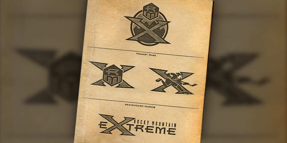
There's already a ready-made color scheme for the Black Diamonds (ignoring my earlier brilliant suggestions).
-
4
-
-
I don't know if I should post this in Concepts or not, but I finally finished creating some sweater mock-ups for the Utah Yetis.
I made sure to do Home, Away, and Reverse Retro. I'm not a wizard with Illustrator or Photoshop, but I think I nailed it.
-
4
-
 1
1
-
-
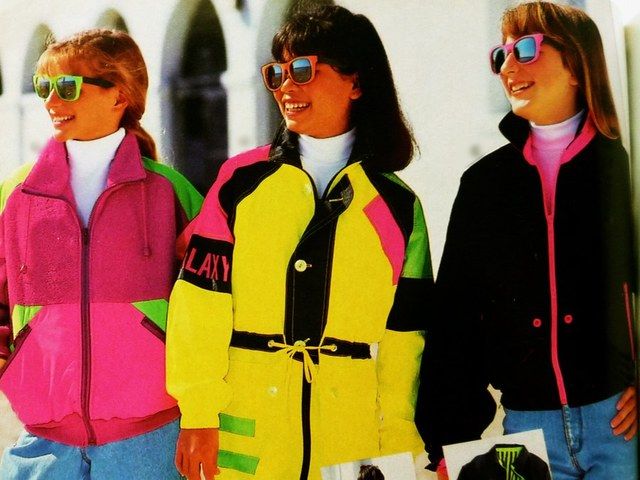
I will accept the Yeti name on the condition that the aesthetics lean into the ski/winter sports styles of the late 80's and early 90's.
That means the Yeti will need to be in a cool pair of polarized sunglassesand that the color scheme will be
Ryan Smith gets his highlighter color. Fans get a local culture connection. Kids get a silly name. Hockey purists get to choke on their tongues at the utter steeziness of it all. Win-Win-Win-Win.
I am not a crackpot.
-
3
-
 3
3
-
2
-
6
-
-
With today's trademarks, we have a pretty clear vision of the bracket
Yetis
Outlaws
Fury
Venom
HC
Blizzard
Ice
Mammoth
Talking to people it seems like this is a horse race between Yetis, Outlaws, and "Why isn't Raptors an option?"
Odd that of all the fossil choices available in Utah, they would go with Mammoth. I mean, we have a lot of them, but they aren't the iconic Woolly Mammoth.
I tend to think we have enough "yee-haw" imagery and history to pull from to make Outlaws really stand out. But also I don't care that we're all a bunch of squares. -
21 minutes ago, MiK said:
Not to mention the state bird is the California Gull. California being famously not Utah.
Even worse, our state insect is the European Honey Bee. Utah is in AMERICA.!!! Not europe . I am very smart.
1 hour ago, DJT said:Ryan Smith said on the Pat McAfee show they will do a bracket to choose the name. Pat and other people on the show booed.
In the interview it sounds like Doubleday is involved with the bracket. I wonder if this means we'll get brand specs as part of the contest. Probably not, but would make this much less lame.
-
1
-
-
Sounds like there's no timeline on a name. Smith says they'll likely start the season wearing generic "Utah" uniforms. Probably no nickname until year 2. Colors should be announced soon.
Doubleday and Cartwright is the firm working on the brand.
-
 1
1
-
 3
3
-
 1
1
-
-
Those names are terrible. Hoping for the best, but it's Smith, so my expectations are rock bottom.
Venom: Utah doesn't have a particularly large presence of poisonous animals, I suppose the imagery could draw on spiders, scorpions, or rattlesnakes though (assuming Gila monsters are out).
Blizzard: Please God no.The others: I don't even know what you do with these. The Hockey Club options feel particularly tragic.
-
1
-
-
What are people feeling for colors?
Green and yellow like the Eagles? Will this annoy the Minnesotans??Something purple to tie it to the Jazz? Seems we'd be the only purple squad.
I've always felt green and orange was an underused "Utah" color scheme, but I understand how it could be more polarizing.
-
1
-
-
1 hour ago, spartacat_12 said:
Everything Smith has put out publicly about wanting an NHL team has specifically referenced bringing a team to "Utah". I think he sees it as a team for the whole state, so it makes sense from a branding perspective to not just go with Salt Lake.
Regardless of what the team ends up being called, we should inevitably be getting one of the more scenic outdoor games in league history.
This shot might help with future sight of a Winter Classic.
-
5
-
3
-
-
Time to make a few quick calls to Colorado and get this thing done!
-
2
-
1
-
-
Given that the name has to be Utah ____, I hope they don't try to force the 'Y' sound alliteration. Yetis and 'Yotes all ring a little hollow to me. (if they pick Unicorns, though.....)
It would be interesting to see them try to alliterate the 'Aw' sound instead. Foxes, Pronghorns, Tomatoes, etc...
That said, this is also a chance to exercise one of the long-running name candidates in Utah sports history. Utah State University tried it in the 70's, Real Salt Lake almost went for it in the aughts...is it finally time for the Utah Highlanders?
Thank you for reading. -
On 4/10/2024 at 4:43 PM, Mingjai said:
If they’re not going use heritage names like Grizzlies or Golden Eagles or keep the Coyotes name, which works for Utah too, then my vote is Cutthroats, named after the state fish.
Hey, we've got a color scheme and logo all picked out and ready to go too........
-
1
-
1
-
-
The league has heard so many complaints about load management that they are going out of their way to ensure players sitting are actually injured.
-
1
-
10
-
 2
2
-
-
As a host of the purple mind virus, I'll chime in that while I like the city uni, I absolutely would not want it as the core of a rebrand.
That said, seeing the associated court has really brought me around to the idea of the jazz as a dark purple/lavender team. Pretty unique color scheme that would actually feel like an outgrowth of the team's history and location. Throw in a sky blue or copper to balance the whole thing out. I guess keep the black because management can't not.-
1
-
-
Back when the Jazz were polling fans on new colors, I suggested that Ryan Smith had the hubris to ignore fans and fight to keep the black and yellow.
So it begins...
https://www.sltrib.com/sports/jazz/2023/10/25/purple-or-black-utah-jazz-owner/-
1
-
 1
1
-
4
-
-
19 hours ago, SFGiants58 said:
The “merch” style of flag very much misunderstands the historical circumstances behind the DC/Chicago/Southwestern flags, leading to an artificial sameness.
Aww look, those two flags got together and made a baby!
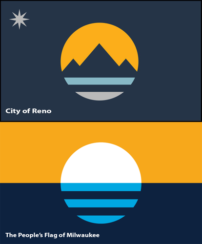
That's the winner of the Ogden city flag do-over.
Here's what it beat. One of these is genuinely great and I cant believe it didn't win.
https://www.ogdencity.com/DocumentCenter/View/23741/02-07-23-WS-Flag-Design-
1
-
-
I'm confused as this is the first I'm ever hearing of the Sacramento crown referencing the mountains.
Is this actually a thing or are people just misreading the overlapping crown elements ? -
I like how this image has been posted twice now (on a forum for logos, no less) by people so obviously tickled by the "SL,UT" moniker that they completely failed to notice Jerry West capping the Salt Lake temple.
-
1
-
 1
1
-
-
On 2/8/2023 at 8:15 PM, PERRIN said:
Love those patterns and the color scheme is gorgeous, but the logo and pictograms don't fit the rest of the identity at all. It seems like each section of the identity was designed by a different team. It's disjointed and messy; a far cry from Tokyo 2020's gorgeous identity. I also don't get the logo at all, it feels more like an overpriced small-town hair salon logo than the flagship symbol of an Olympic brand. Even the typeface feels off. Why is the I in Paris lowercase when the rest of the letters are uppercase? You'd think a city like Paris, with its strong visual identity and bustling art and design scenes, could scrape together something better than this. Quite disappointed in the whole package, patterns and colors notwithstanding. Looks to me like the worst Olympic brand since London 2012.
While I'm sure this isn't the rationale, you pointing out the lowercase i reminded me of this little design quirk from Paris. It's a funny symmetry, but like I said, probably not the reason it was done.
-
1
-
-
17 hours ago, tBBP said:
I'm right there with you. Setting aside the fact that the Euro-conventioned "Internacionale" is utterly superfluous and completely unnecessary--and the fact that Inter Miami doesn't roll off the tongue anywhere near as well as Inter Milan--that is, in fact, quite the nice remix of the parent club's badge. (That said, when is CF Miami--can I call them that, instead?--going to do something about that pale shade of pink??)
I'm gonna guess that this go-round yellow is the new black in MLS??
It would be fitting that RSL fans, who have been asking for a new yellow kit for a decade, would only get one because Adidas had a league-wide aesthetic shift.
-
1
-
-
Ha. I knew someone would start a thread for this...choice.
Here's a better look at the new logo.
To FC's point about Intermountain being rife with imagery...I recall the logo that predated the green/blue one as just being a family outline standing in a triangle (it literally looked like a street sign). So apparently IHC may disagree with the assertion that their name conjures anything at all.
-
1
-


2024-25 NHL Changes
in Sports Logo News
Posted
They don't.
This is the live local news poll that's running alongside the vote.
It probably hews pretty close to what the actual percentages are.
https://strawpoll.com/7MZ0AeEPmyo