


Foxxtrot44
-
Posts
1,169 -
Joined
-
Last visited
-
Days Won
1
Posts posted by Foxxtrot44
-
-
After last night, Utah has now worn two different throwback uni's this year in addition to their other 3 (bleak) regular uni's.

-
 3
3
-
-
On 12/15/2022 at 7:51 AM, MJWalker45 said:
That one looks way better. Is it possible one will be for films and the other for books and other media? This would make more sense for the comic books.
The all-blue logo is the 2019 Warner Bros brand update. The gold logo is the new Warner Bros Discovery rebrand.
Probably safe to assume that the latter will be used for everything going forward (until WB is sold again).
Personally, I didn't like the all-blue logo, so I prefer the update.
-
1
-
-
Early comments out of the Jazz Uni survey suggest that there are two color palettes being compared against each other.
Black, white, and yellow vs Purple, black, white, and sky blue.
Ryan Smith's ego is truly resilient.
-
5
-
 3
3
-
 1
1
-
 2
2
-
-
Alright, who is going to do reconnaissance for us?
https://www.sltrib.com/sports/jazz/2022/12/02/utah-jazz-polling-fans-future/-
5
-
-
-
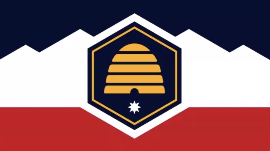
New flag for the state of Utah to be voted on during the next legislative session
picked from these options
https://ksltv.com/510923/new-utah-state-flag-options-narrowed-to-top-5/
-
6
-
-
I would be supportive of a new wizard focused alt logo for Washington. Karate wizard, particularly recolored, has always felt very off to me.
-
4
-
1
-
-
13 hours ago, MackAttack said:
watchin the Jazz v. Rockets game, honestly really like the black jerseys at home with the black court for Utah. I know it's a tank year but It would look amazing with the crowd either wearing black shirts or yellow shirts with the take note slogan in the playoffs.
The last thing we need is to see that many people wearing *THAT* shade of yellow. You'll cause permanent burn marks on people's TVs.
-
2
-
-
the LA logo kind of looks like it should be a fragrance brand. Which definitely fits the recent trend of athletics logo meets lifestyle brand that we've seen bigger clubs (attempt to) utilize.
-
1
-
-
1 hour ago, NH4 said:
“Stealth Black” I mean Jet Black is right there
I'd like to believe that this was on the table until some member of the design team, a nebbish CCSLC poster, wheezed at length about how Jet is a type of gemstone and doesn't actually relate to aviation and the name should tie back to that.
Something like this...
-
2
-
-
18 hours ago, TrueYankee26 said:
Yeah... The more I see those Jazz jerseys the more I think they are bland, wack, and leave much to be desired.
It's a small relief that the team is apparently going to be dog :censored: for the next few years, so no one will actually be forced to see these jerseys.
-
3
-
1
-
-
On 6/27/2022 at 12:37 PM, Bruhammydude said:
Jazz need purple, green, and yellow. Simple as.
Sorry, that color scheme apparently belongs to a city where *checks notes* no team actively wears it.
-
6
-
-
Get your fresh damage control!
Hot out of the oven damage control!-
1
-
1
-
 1
1
-
1
-
-
5 minutes ago, JuicedSportsNow said:
Jazz rebrand already being trashed in their own newspaper haha
Andy Larsen: The Utah Jazz’s new jerseys are awful — and clearly, the team knows that
-
1
-
3
-
-
14 minutes ago, FinsUp1214 said:
I won’t speak for every Jazz fan, but I will say that 1) I grew up with these uniforms, so I’m extremely nostalgic for them and know many other Jazz fans my age who are too, 2) when they wore it a couple of years ago, I saw just as much mountain gear worn around Utah as redrock gear (which was a lot), and 3) it’s thier “glory years” uniform, so there’s a lot of fond memories with it.Granted, there are a few fans out there who don’t like it, but from what I observe, it’s a pretty popular uniform. Especially with my age group (late 20’s/early 30’s).
Adding on to this, purple seems to be broadly popular.
During the double blue era, the 80's green and purple throwbacks were *very* popular. Easily contributed to the revival of the J-Note.
We're now 10 years+ down the road and playing to a different nostalgia base. So the purple is interpreted through the 90's lens now.
In 10 years will Jazz fans be clamoring for baby blue throwbacks? Certainly if we can't get the brand nailed down.
The solution seems so patently obvious (just combine the J-Note with the 90's colors, maybe tweak the sky blue to line up with the 00's) that I'm honestly surprised it's been veered around so much at this point.
-
5
-
 1
1
-
-
Imagine if they could have read the writing on the wall months ago and managed to drop the yellow in favor of copper or sky blue...this would almost seem like a coherent, deliberate rebrand. Almost.
But as others have said, advertising purple uni's 3 years out basically announces that there will be another brand tweak coming.
Also they're almost certainly running out the Mountain jersey for a third go around because they have a stack of them left over from the COVID season.
-
3
-
-
The brand is Purple!!!! By the way, here's your 1 purple and 3 yellow uni's this year....
-
9
-
3
-
-
Well now there's a ring of mountains on the J-Note statue
-
5
-
-
49 minutes ago, FinsUp1214 said:
The only theory I have is this: black/yellow leaks were so unpopular that they felt like they needed to overhype the supposed purple city edition as a peace offering of sorts during the rebrand reveal. The black/yellow stuff is likely going to get blasted, so maybe they figure they can soften the blow this way.
Again, that’s just theory, but I don’t know why else you’d prominently feature a color at the arena that isn’t even a primary color of your new rebrand.
Better pic. It's an interesting shade of purple. Trends towards the 90's rebrand purple rather than the redder 80s purple.
-
4
-
-
I mean, I'd imagine Jazz merch being discarded at a Ross Dress for Less strengthens the theory that the rebrand has been scrapped.
Somebody go dig through some of those clothing pallets that get sent to the 3rd world to confirm.
-
5
-
-
-
4 hours ago, kimball said:
Logically that makes sense, but the fact that SLC is 200-250 miles from anything remotely red rock is the problem.
I mean, to be perfectly pedantic, we *do* have Echo Canyon near SLC
-
I spent Easter with a highly credible person who casually mentioned that the FO has been incredibly disappointed with the response to the recolor and the jersey leaks. Like, they genuinely believed this would be a hit.
No mention of the potential impact, just that no one was happy.
-
10
-
1
-
6
-
1
-
-
17 hours ago, habsfan1 said:
They're changing colors schemes so often that I've lost track of all their changes. I missed an earlier one.
I tried to make it easier for everyone....
-
4
-
4
-


:format(webp):no_upscale()/cdn.vox-cdn.com/uploads/chorus_asset/file/19934673/80959873.jpg.jpg)
:format(webp):no_upscale()/cdn.vox-cdn.com/uploads/chorus_asset/file/19947518/76122669.jpg.jpg)
Intermountain Health Care Rebrand
in General Design
Posted
Ha. I knew someone would start a thread for this...choice.
Here's a better look at the new logo.
To FC's point about Intermountain being rife with imagery...I recall the logo that predated the green/blue one as just being a family outline standing in a triangle (it literally looked like a street sign). So apparently IHC may disagree with the assertion that their name conjures anything at all.