


Ark
-
Posts
2,153 -
Joined
-
Last visited
Posts posted by Ark
-
-
I like how some NHL teams have and had in the past home and road uniforms that don't match. Apparantly I'm one of the few.
They add more character to the team.
That's why they have Alternate uniforms.
And?
The early 2000s Ottawa Senators distinctly stand out to me because half the time they wore the 3D logo and half the time they wore the 2D logo. The Habs are another great example because their uniforms are so historic.
-
I like how some NHL teams have and had in the past home and road uniforms that don't match. Apparantly I'm one of the few.
They add more character to the team.
-
We don't need the all black uniform with the Capitol Building logo on the front, no thanks. (And ps, I'd wear the white jerseys at home)
Why not?

I love this look too.
I actually really like the Capitals' Edge jerseys as well. Modern uniforms done right.
I much prefer this to the eagle, but wouldnt mind them returning to their 2000-2007 set
(from nhluniforms.com)
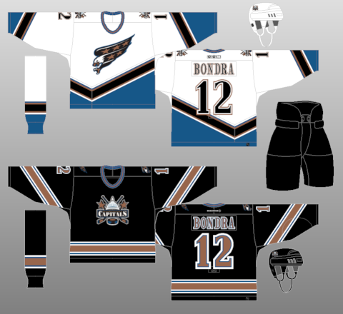
blah blah blah two different logos jersey designs it looks good together
A good thing about this set is that they got rid of CAPITALS on the diagonal stripe.
-
We don't need the all black uniform with the Capitol Building logo on the front, no thanks. (And ps, I'd wear the white jerseys at home)
Why not?
I love this look too.
I actually really like the Capitals' Edge jerseys as well. Modern uniforms done right.
-
 1
1
-
-
Cleveland's uniform looks great...
I knew someone would say this, and I agree 100%
-
The Celtics primary logo is a joke. All they need is a shamrock, like the alternate logo from 98
And all the Blackhawks need is a few feathers.
The Celtics logo is a classic. This is a perfect example because you know exactly what it is representing.

-
The way I see it, if an 8yr old can't draw your NHL logo, it's a bad NHL logo.
I hate this idea. I hate it so very, very much.
Same.
By this logic, the Blackhawks logo is one of the worst in sports.
No, the Blackhawks logo wasn't that hard to draw, even for an artistic challenged person like me. The ones that always gave me fits was the Buffalo Sabres...and all the wordmark logos...
Okay, then what about the Wild logo? Or the Boston Celtics?
-
The way I see it, if an 8yr old can't draw your NHL logo, it's a bad NHL logo.
I hate this idea. I hate it so very, very much.
Same.
By this logic, the Blackhawks logo is one of the worst in sports.
-
I HATE colored pants for ANY NFL team.
The away team should be in all white or very light grey/silver.
This:

is much nicer than this:

But then look at this

And this
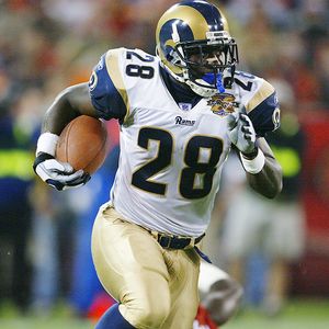
Rams should be wearing gold pants.
-
These are three of my favorite alt jerseys of all time, even if they may be BFBS:


Blackhawks alts weren't BFBS
-
I love when home and away uniforms are completely different designs.
The Wild have done this well.
-
The bottom stripe doesn' really go with the rest of it. Where do the arrows come from? And if you look at an actual pic of it, it is really bulky.

And it has ugly stitching on the side.

-
Look closer at that Robin Yount card. The spaces between the glove fingers are definitely white.
-
New Era has it wrong too. On the card, webbing between all the fingers is white, and it matches the ball in the glove.
On the New Era hat, only the webbing between the thumb and the index finger is white, and it looks off.
-
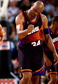
I love the 90's NBA trend of putting a vertical stripe on only one side of the uniform, and I really like these too:

Very sleek.
The problem with this jersey is that it even has a vertical stripe in the first place. The pre-edge jersey with a horizontal stripe was infinitely better
The pre-edge one is too busy and the Edge one looks better without the extra bulk.
The side stripes on the edge jersey match the arm stripe and look good imo. Although I would like to see the edge jersey with the side striping only on one side.
-
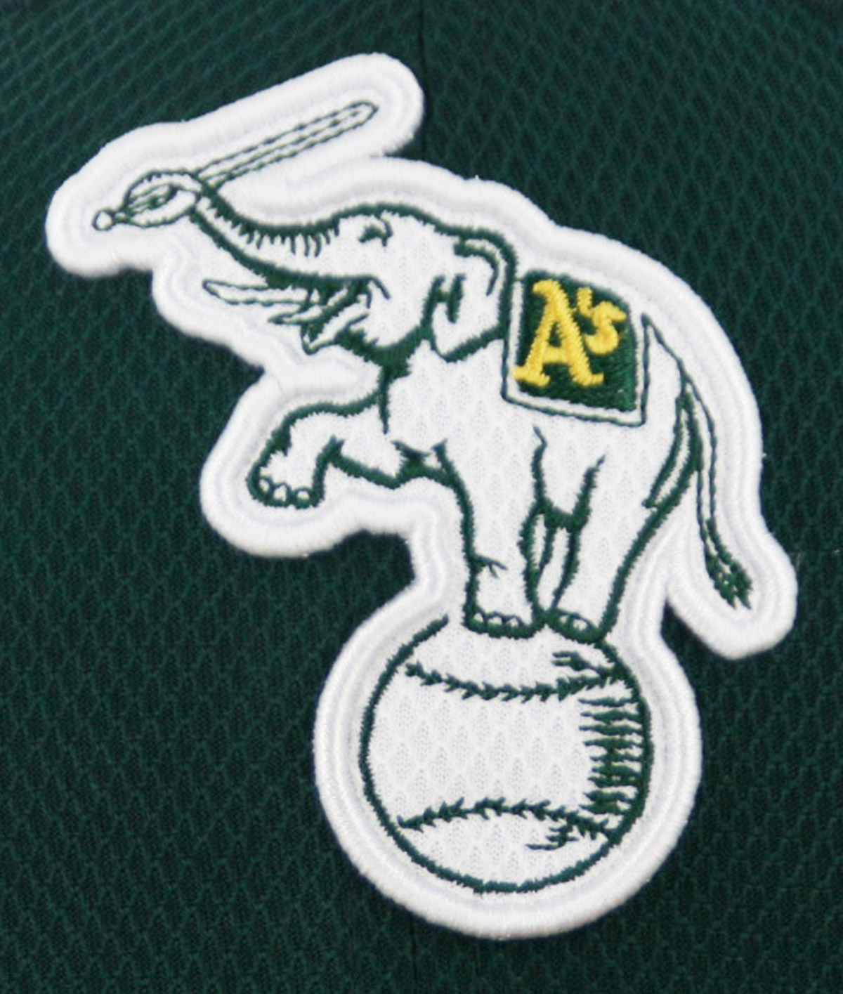
The A's white elephant on their BP caps.
-
I love the 90's NBA trend of putting a vertical stripe on only one side of the uniform, and I really like these too:
Very sleek.
-
I don't mind the Rams collars at all, because they look like ram horns and match their gold shoulder stripes.
They need gold pants badly though.
-
This is one of the best sports logos out there.

It looks so noble.
-
1
-
-
Tuxedo look?
All black, with little striping/bright colors to break it.
A good example is the original Ottawa Senators blacks, since the red is dark and blends in with the black. The low quality video definitely helps the look too.
-
Here's another one apparently.
The tuxedo look on hockey uniforms is great.
-
This is better than the blue version of the home/away.

-
Chief Wahoo is a terribly designed logo, regardless of whether or not it's a racist caricature:
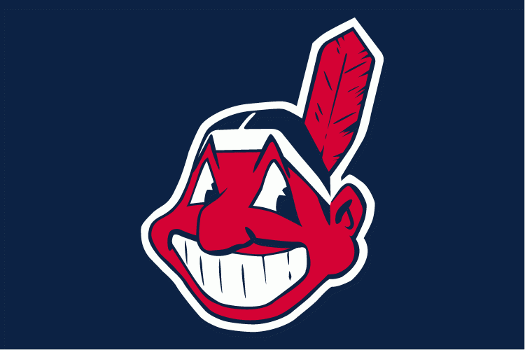
Just look at it. The terrible line weights in the teeth (which don't even connect fully) and the other really bad attempts at detailing in the feather and the eyes make for a horrendous logo. It may be that some details didn't translate well when the logo was originally digitized in the 90's, but come on. If they had to keep him (which I hope they don't), at least modernize him.
It was first used in 1951, for that reason alone it is wonderfully designed.
Find another character logo that old that looks as good.
-
1
-
-
These are really good uniforms.


Unpopular Opinions
in Sports Logo General Discussion
Posted
I love these.