


Ark
-
Posts
2,153 -
Joined
-
Last visited
Posts posted by Ark
-
-
I love when hockey teams wear a different home and away (not just a color swap). Examples of this are Montreal, the Wild (they are starting to have a history of doing this), the Penguins in the 90s, Washington in the early 00s.
It gives the team a more dynamic look and fans will buy more jerseys. It's a win-win.
-
Repost, but this is relevant now. This is the Penguins best logo easily:

-
 2
2
-
-
Pullovers looking great.


-
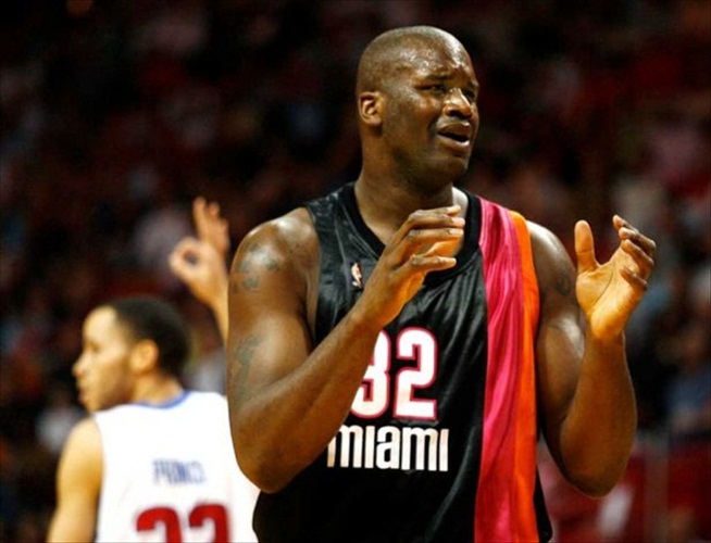
This is not as bad as some people say it is:

Granted, it's no masterpiece (the poor attempt to duplicate the gradient version of the logo, the full-body side stripe on only one side, the Forum-era Lakers number font, and the miniature "Miami" on the shorts), but the real collar, the striping pattern, and the red wordmark are all fairly nice. The originally Heat look was OK. Decent, but some tweaks and it could be made into something unique and lovely. The current Heat look is also great, but a balance between the two could be struck nicely.
I really like the pink and orange trim. I never noticed that before. IMO these are the best Heat uniforms.

-
I love these.

My favorite 90s experimental jerseys.
-
1
-
-
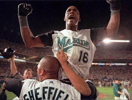
This is the single best uniform in Marlins history, by far.
-
2
-
-
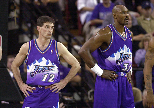
The NBA should require players to wear short shorts. I don't really have a reason for this, I guess that I liked the NBA back when everyone wore short shorts. Also for the same reason that baggy uniforms shoud be banned from baseball.
-
Does Phantom think that basketball players should have to wear John Stockton shorts?
I totally agree with that.
-
Stirrups should be an option to wear if they aren't already.
If I played in the major leagues I would wear stirrups (and a tight uniform).
-
Luis Gonzalez winning the WS is such an iconic image. The D-Backs are so dumb for changing those uniforms.
-
-
So you basically want the TATC uniforms to come true?
As throwbacks, no?Phantom is that you?
But seriously, the pirates and whitesox have a pullover as an alt, are you talking about as a primary?
Guess what you could try doing with a pullover - Put a logo in the middle of the jersey. Like this.


Sure, but with better designs. (though a couple of the TATC were actually really good)
-
Phantom is that you?
But seriously, the pirates and whitesox have a pullover as an alt, are you talking about as a primary?
As throwbacks, no?
Guess what you could try doing with a pullover - Put a logo in the middle of the jersey. Like this.
-
Some MLB team needs to bring back the pullover jersey.
-

I actually kind of like these. They remind me of what the Raptors wear.
I wish it had a waist stripe though.
-
There shouldn't be piping on the back though. Clearly the Gateway Arch thing is just a coincidence, although it is cool.
-
Get rid of the shoulder stripes and I agree.
-
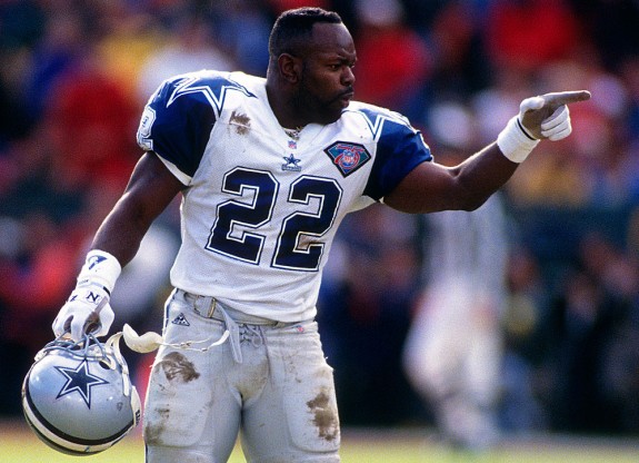
The Cowboys white jersey is actually one of the ugliest, most non-sensical uniforms I've ever seen. Different blue on the helmet, different blue on the pants, and a different blue on the jersey. Stupid striping on the sleeves with a random and completely unnneccesary black stroke. The color of the pants looks horrible with the light blue, switch it to the navy and you're already a billion times better.
Everyone on here thinks this.
I like them though.
That's great to hear. In contrast, their navy uniform is absolutely beautiful.
These are beautiful.

-
The Cowboys white jersey is actually one of the ugliest, most non-sensical uniforms I've ever seen. Different blue on the helmet, different blue on the pants, and a different blue on the jersey. Stupid striping on the sleeves with a random and completely unnneccesary black stroke. The color of the pants looks horrible with the light blue, switch it to the navy and you're already a billion times better.
Everyone on here thinks this.
I like them though.
-
I really like Dallas' silver/green/blue pants.
I'm not sure why people want them to wear bland grey pants.
-
I think the Browns should scrap the white pants. And go with the brown jerseys/orange pants (1975-83, 2003) at home, and wear the white jerseys/brown pants (2009) on the road. BTW: Add a orange/white/orange stripe on their brown pants it would look a whole lot better.To piggy back that post, I really prefer the Browns with the orange pants.
Unpopular opinion- I hate the orange pants so, so much.
I thought white on brown was > white on orange until I saw a concept on here.
Browns just need orange pants.
-
Is this unpopular? They should have kept these.
-
I guess it counts as an unpopular opinion... I really like the Rams navy and gold.
-
Goes all the way back to the North Stars days, they dropped this after their unlikely cup run in 1981
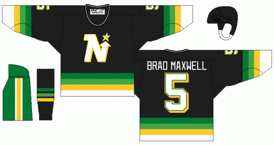
So nice.
-
1
-

Unpopular Opinions
in Sports Logo General Discussion
Posted
The actual uniforms are better than what they wear now.