


gosioux76
-
Posts
4,865 -
Joined
-
Last visited
-
Days Won
13
Posts posted by gosioux76
-
-
4 minutes ago, Carolingian Steamroller said:
When it comes evaluating a uniform change, think of it this way.
You turn on the TV. Team X is wearing the new uniforms. You flip the channel and when you flip back the team is wearing the previous uniforms.Are you happy or sad?
I'd be confused. I'd also wonder why, of all uses for a time machine, this is what we've chosen.

-
 2
2
-
 7
7
-
-
On 4/22/2024 at 8:28 AM, Webhamster said:
I could get on board with the Utah Screaming Eagles.
Just change the M to a U and see if Craig T. Nelson is available to coach.

-
2
-
-
6 minutes ago, bowld said:
Saw this on their website-
UPDATED DEEP STEEL BLUE COLOR MATCHES ORIGINAL DEEP STEEL BLUE UNVEILED IN 2000
This looks good, but I guess I don't understand why you'd go with the horn-striping for the white and red jerseys, but not the home navy. That would have kept these jerseys relatively simple but without the repetition of reusing the helmet logo on the sleeves.
-
8
-
-
2 hours ago, spartacat_12 said:
The Thrashers relocation got announced almost a month later than this one, and the Jets still managed to have their logo & jerseys ready in the summer. I understand wanting to get the brand right, but being a generic NHL team for a year feels like a terrible way to make a good first impression on a new market, especially when they're already going to be playing in an arena that wasn't designed for hockey.
Or they'll be the Oklahoma City Thunder of the NHL and be stuck with whatever they pick for the next 20 years.
-
1
-
-
19 hours ago, TaylorMade said:No idea if it's related to Smith or the NHL, but the following were recently registered with the USPTO for the purpose of ice hockey exhibitions:
- Utah Venom
- Utah Blizzard
- Utah Fury
- Utah Hockey Club
- Utah HC
This could just be speculators filing trademarks in hopes of a payday in the event one of these names is eventually chosen.
The trademark applications are registered to a company called Uyte LLC, which only registered as a company in Deleware on April 2, 2024. The address and phone number listed on the application belong to the law firm, and attorney, that filed the application.
Smells like opportunists.
-
33 minutes ago, PurpleHayes said:
As ugly as that is, why can't the Saints at least use that shade of gold?
The only instance when that color looks good is when it's slathered on a hot dog.
-
3
-
2
-
-
1 hour ago, BBTV said:
This is not a real person's name right? This has to be a porn name.
His own child had to modify his name just to avoid the embarrassment.

-
1
-
 1
1
-
5
-
-
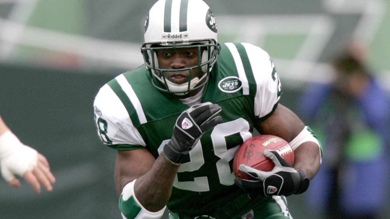
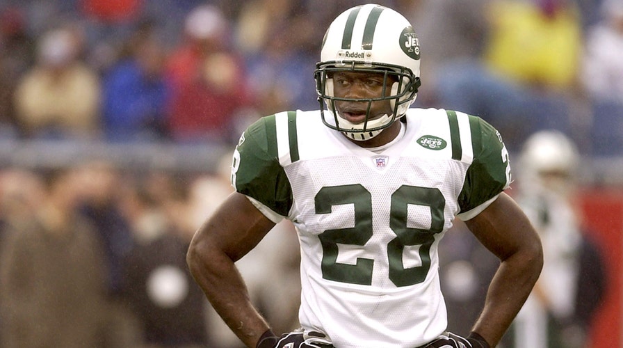
23 minutes ago, thisguyphelps said:
This brownie sucks because he isn't holding the ball right. A fumble is imminent. The timeless classic brownie should be the only alternate.
Some might say the fumble-prone Brownie is perfect symbol. Ernest Byner might take umbrage, though.
-
1
-
5
-
 3
3
-
-
1 minute ago, DCarp1231 said:
Give us Brownie playing a mean guitar solo on top of the bridge with Lake Erie in the distance
Yes! And in a style that makes him look like he's an adjunct member of the Burger King Kids' Club!
Or just bring back this guy ...
-
2
-
 2
2
-
-
7 minutes ago, Cujo said:
Laziest fxxxing team ever -- It's 2024. GET A REAL LOGO ALREADY

The only thing wrong with the Browns logo is that it uses a facemask style from the late '80s that was never attractive to begin with.This was discussed about a dozen pages ago in this thread, but the Browns need to go with a classically retro helmet style — two-bar facemask is my preference — positioned in a more two-dimensional side view than what is shown here. A logo like that will stand the test of time.
-
3
-
1
-
 1
1
-
 1
1
-
-
8 hours ago, bowld said:
I wouldn't mind them wearing colors like this. In fact, Utah Phoenix has a nice ring to it
 -
-
Maybe a dark forest green instead of Navy?
"We not only want your hockey team, but we also insist on taking the name of your biggest city."
-
1
-
-
8 minutes ago, DrunkKidCatholic said:
What's wrong with these? Lighter green was all they needed.
While these are a little better than the versions in the Nike-cut jerseys, this still looks like a 1960s-era uniform squeezed into a modern template. It's fixable, but it still doesn't look quite right. The biggest issue is that inner green stripe, which was originally a hoop that continued under the armpit.
-
1
-
1
-
-
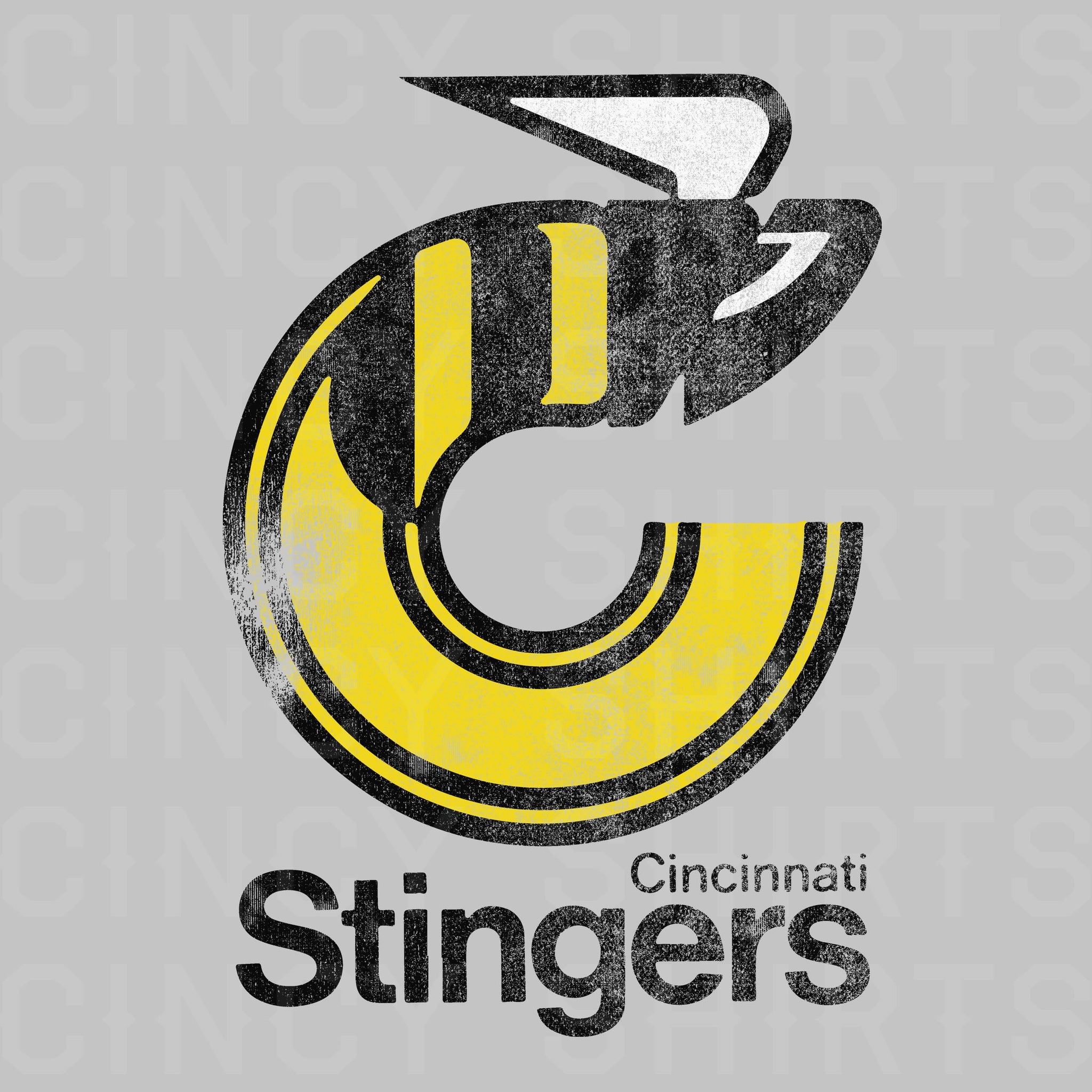
I'd love to see what this incredible, ahead-of-its-time WHL logo would look like if turned into a "U" for the Utah Stingers. Not saying it would be good, but I love this old logo so much that I'm curious to see if it could be brought back to life in some form.
-
4
-
1
-
-
19 minutes ago, oldschoolvikings said:
For the record, I couldn’t agree more with this last sentence. The side panel Viking uniform was an abomination.
And also, I don’t dislike the current Vikings uniforms at all. Easily one of the best of the new designs since Nike took over. If I made a list in my head, it would probably be top ten. Probably.
But I also think modern uniform designs… even the best of them… just aren’t really meant to be “forever” uniforms. The Raiders, the Colts, the Bears, the 49ers, (like the Yankees, Dodgers, Celtics, Canadians) have uniforms that they can wear forever. If you had a future viewing machine, and saw those teams wearing basically the same thing 50 years from now, you wouldn’t be surprised. But the current Vikings? As nice as it is overall, it just doesn’t feel built to last to me. Quirky asymmetrical stripes, high concept number font. I honestly don’t think it’s an insult to say it’s not a “forever” uniform. And as a huge Viking fan, and crazy uniform fanatic, I want the Vikings to be in one of those classic untouchable uniforms.
It’s sort of like the argument I used to make about the Padres all those years when they fought against going back to brown. It really doesn’t even matter if it looks better. It’s just how they’re supposed to look. IMO the Vikings throwback is how they’re supposed to look. Period. Of course, as my good friend @infrared41 used to say, your mileage may vary.
That's a fair take and I agree with all of it.
I think most of the "they should go back to this" posts are built on the premise that the current uniforms are awful. I read yours the same way, rather than the more nuanced take that it was.
-
3
-
-
5 minutes ago, oldschoolvikings said:
I disagree. You would only replace a uniform if it's terrible? That seems like a weird stance.
No, what I'm saying is making this hard turn back to an old-school throwback as a full-time uniform is usually done as a course correction away from something justifiably terrible. It's like admitting you made a mistake and you had it good before.
The Vikings uniforms -- in what appears to be a widely shared view, yourself excluded -- aren't anywhere near the level where a course correction would be necessary.
In fact, I'd argue the current uniforms were that course correction from the abhorrent 2006-2012 uniforms, and they nailed it.
-
1
-
-
13 minutes ago, oldschoolvikings said:
And...
I'd never suggest these uniforms aren't fantastic -- they are. But I think a move like this only works if the uniforms it would be replacing are terrible. I can't say that about the current Vikings look. I don't care for the current facemask color, but that's about the only issue I have with them. They're otherwise a perfect modernization of a classic look.
-
11
-
-
3 hours ago, zubazpirate said:
Salt Lake City seems like a weird landing pad for the NHL. It's a pretty small market (smaller than Calgary and Edmonton from a population standpoint, although I'm sure their GDP is a fair bit higher), and it already has a significant competitor in the form of an established NBA team. Usually the NHL only goes for smaller markets when it's clearly the biggest game in town (Columbus, Raleigh, most Canadian cities).
Maybe they'll be able to make it work, but it seems odd to me that they'd choose a small, relatively crowded market as opposed to a huge city like Houston. Even a place like San Diego is significantly bigger and without direct competition (the NBA and NHL teams up the road in LA/OC don't really count).
I think small markets are actually the way to go for the NHL. I don’t see the league getting more popular as time goes on. I think moving into markets where it’s No. 1 or 2 in the local sports hierarchy is the most logical move.
Even with competent leadership, I’d bet a franchise would still suffer in sports-saturated Phoenix. Atlanta was (and could be again) a similar circumstance. Houston, too, for that matter. It doesn’t really matter if there’s a “hockey culture” there if the team gets lost in all the noise.
Places like SLC, Quebec City, or maybe even Omaha, stand a better chance at success.
The league will always have the cornerstones of NewYork, LA, Boston and Chicago to offer the reach necessary for big TV contracts.
-
5
-
-
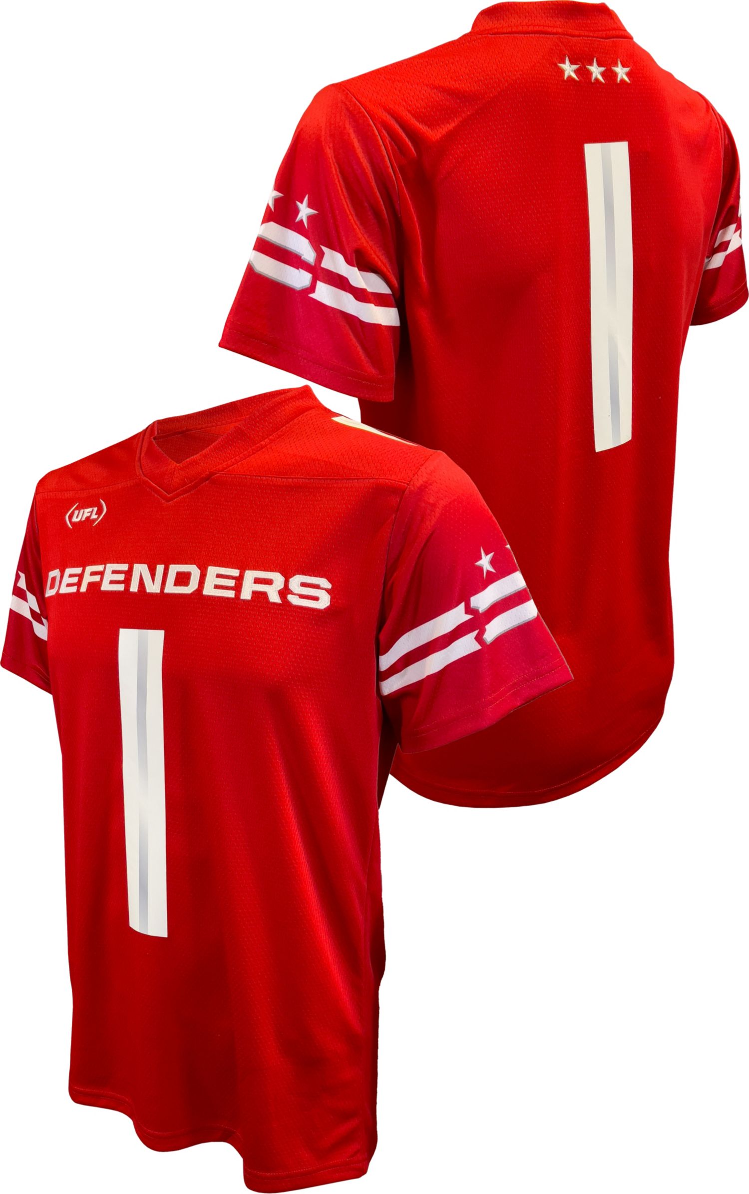
3 hours ago, MJWalker45 said:
They do have Defenders jerseys with the right sleeve stripes, but with oversized wordmarks. Granted that's the case for all of the teams.
This is interesting. It reminds me of the NFL replica jerseys made by Rawlings in the late '70s/early '80s that they used to sell at places like Sears or JCPenney. I own this Tommy Kramer jersey as part of a small collection I've bought from eBay sellers that includes a Houston Oilers Ken Stabler and Chargers Dan Fouts.
-
1
-
-
I don't have as big of a collection as you, yet I still get some joy out of just pulling my jerseys from the closet now and then just to look them. As I get older, I lose the sentimentality for some of them, and find it easier to give them away to people who appreciate them more. And this goes for more than just jerseys. I've collected soccer scarves from throughout the years, but a college friend began scarve swapping, trading scarves of his local club with friends in other parts of the country. He sent me one, I shipped him back three of mine, figuring he'll get more joy out of them than I will.
-
1
-
-
16 hours ago, Krona said:
Make this weirdo helmet happen. I was endlessly intrigued by these coaches jackets when I was a kid.
It's a wonder why the Suburban Dad Sideline Collection never took off.
-
1
-
1
-
-
12 hours ago, BBTV said:
horsedick-jacked. I've been here a long time, and this is a first.
Yet, at the same time, not at all surprising.
-
11 hours ago, GhostOfNormMacdonald said:
I'll say it. I love the Twins' new M logo. It's all I wear now. Maybe it's because I'm an outstater that loves faux-backs, but it's fantastic. Completely grown on me. Love that we have it in the rotation.
These current Twins unis are the best they've ever had
Yes! I do the same. I actually have two of them: One I wear while doing yard work because my dog tried to destroy it, and the pristine replacement I bought as a result of my dog.
I was born and raised in central Minnesota, so maybe that's part of it. But I also think fans of a certain age, like me, who still cling to the championship years, like the idea of having an "M" hat back in the rotation. Having both an "M" and the "TC" is the best of both worlds made even better by being part of a cohesive design collection. It's almost enough to overcome the team's embarrassingly weak hitting.
-
2
-
-
23 hours ago, SFGiants58 said:
That and it’s a gimmicky “old timey” font that you’d find on Creative Market for $20. It’s also one of Brandiose’s first baseball projects and purging Brandiose is always preferred.I agree. I've never liked that font. It's trying too hard to be "old timey." And for type that's meant to invoke the past, it seems to have lived past its prime. Novelty fonts like that feel like a relic of the early 2000s or 2010s.
I'd like to see the Reds follow the path of the Brewers and Twins and find ways to modernize their classic '70s look without turning it into a novelty.
-
5
-
-
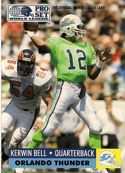
13 hours ago, oldschoolvikings said:
This should not have worked. But aside from the terrible logo, I still think these uniforms are fantastic. I don't know how you go with neon green as your primary color and not look obnoxious, but the Thunder pulled it off.
-
7
-


:no_upscale()/cdn.vox-cdn.com/uploads/chorus_asset/file/20014042/80812464.jpg.jpg)
24-25 NBA changes
in Sports Logo News
Posted
I hope you're right. I love the updated throwback look this year. It also appears that they have sold out of those uniforms, or at least I assume they have, since I can't seem to find them for sale anywhere. Watching the playoff game on TV Saturday night, the original '89 logo seemed to be everywhere in the crowd.
I would love for this to be a New York Jets situation and have them introduce the blue version of that as part of full-time changeover next year.