


gosioux76
-
Posts
4,869 -
Joined
-
Last visited
-
Days Won
13
Posts posted by gosioux76
-
-
11 hours ago, GhostOfNormMacdonald said:
I'll say it. I love the Twins' new M logo. It's all I wear now. Maybe it's because I'm an outstater that loves faux-backs, but it's fantastic. Completely grown on me. Love that we have it in the rotation.
These current Twins unis are the best they've ever had
Yes! I do the same. I actually have two of them: One I wear while doing yard work because my dog tried to destroy it, and the pristine replacement I bought as a result of my dog.
I was born and raised in central Minnesota, so maybe that's part of it. But I also think fans of a certain age, like me, who still cling to the championship years, like the idea of having an "M" hat back in the rotation. Having both an "M" and the "TC" is the best of both worlds made even better by being part of a cohesive design collection. It's almost enough to overcome the team's embarrassingly weak hitting.
-
 2
2
-
-
23 hours ago, SFGiants58 said:
That and it’s a gimmicky “old timey” font that you’d find on Creative Market for $20. It’s also one of Brandiose’s first baseball projects and purging Brandiose is always preferred.I agree. I've never liked that font. It's trying too hard to be "old timey." And for type that's meant to invoke the past, it seems to have lived past its prime. Novelty fonts like that feel like a relic of the early 2000s or 2010s.
I'd like to see the Reds follow the path of the Brewers and Twins and find ways to modernize their classic '70s look without turning it into a novelty.
-
5
-
-
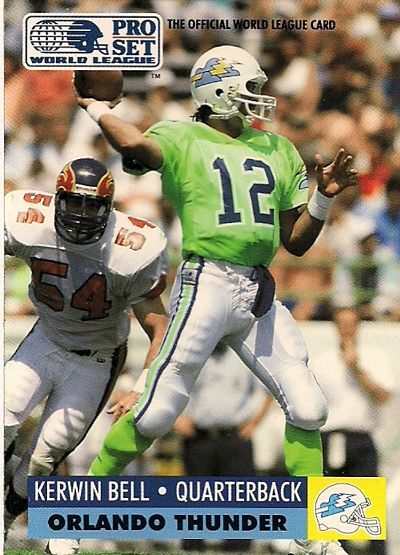
13 hours ago, oldschoolvikings said:

This should not have worked. But aside from the terrible logo, I still think these uniforms are fantastic. I don't know how you go with neon green as your primary color and not look obnoxious, but the Thunder pulled it off.
-
7
-
-
13 hours ago, MDGP said:
It looks like another logo redesign is up for the Lindenwood Lions, so only one team again today.
This is another school you might ask, "who even is Lindenwood?" Thankfully, I have all the information you need. Lindenwood is a school in Missouri and I know a guy who won a national championship in Rugby. The women's team is also in the CHA. Sorry if you were looking for any useful information.
More specifically, Lindenwood is in the St. Louis suburb of St. Charles, Missouri. They play at the Centene Community Ice Center, which is the practice facility of the St. Louis Blues and next week is hosting an NCAA Frozen Four regional round.
On a separate note, if and when you get to North Dakota, I'd like to advocate for a concept that rebrands the team using its existing "NODAK" throwback/alternate, which I'm seeing more and more of in retail inventory.
(FWIW, as an alum, I voted for NODAKS among the finalists when they were seeking input on a replacement for Fighting Sioux. The powers-that-be went with the blandest, if safest, route.)
-
1 hour ago, Sec19Row53 said:
They're watching the game, often with binoculars. Their spotter is certainly watching it that way, and it's his job to provide the number of the tackler, among other things. Whether or not the feed is in real time is also subject to the various setups.
From up in Row 53, I frequently use the tv numbers. To each his own.Maybe all that exposure to the Packers has just made you blind.


-
1
-
 7
7
-
-
19 minutes ago, Dynasty said:
The M Star is a cool logo. Although, it's important to have one cohesive logo used for both home and away caps because it helps the team have something that defines them and gives them an identifiable mark. With that... I don't think the Twins should use it interchangeably with the TC monogram, but it can be a good option as an alternate.
I’d agree with that point if the primary logo was completely overlooked in the road uniform. But it’s right there on the sleeve of the Twins road uniform, and it’s prominent in the vast majority of team branding.
The idea that putting an alternate logo on a hat somehow diminishes the effect of the primary mark just doesn’t work in this instance. It’s a manufactured concern for a problem that doesn’t exist.
-
1
-
-
4 minutes ago, MJD7 said:
Even though I love the new “M” cap personally, I have a feeling it might be dropped within the next few years, due to the surprising amount of distaste I have seen of it on social media. I’d be fine with them going with the “TC” for the road grays, but I would keep the M cap for the navy alternate, since the TC already appears on the sleeve patch.
Yet it seems like all I see at Twins games is the new M hat being worn everywhere. I was just in Fort Myers to catch some Spring Training games and it was all over the place. I don't think that logo's going anywhere anytime soon.
-
4
-
-
19 hours ago, FiddySicks said:
They currently play in a stadium that feels like a planetarium dome with the house lights on.I just wanted to give some much-deserved applause to this absolutely perfect description of Tropicana Field. Bravo!

-
3
-
3
-
-
5 minutes ago, dont care said:
did I say anything about the Seahawks? Clearly that was used to display the Nike logo. I don’t see it with the other examples, where there is no design element 3 inches in any direction of the logos.
I guess we all misread your post disputing the idea of creating space to "frame" a sponsor logo, in response an original post that used the Seahawks as one of the examples.
My bad.
-
1
-
-
58 minutes ago, dont care said:
Don’t know how putting a logo in a blank space is “framing” the logo when it isn’t being bordered by anything else but ok. They put it where every other manufacturer has put their logo as dictated by the NFL
That Seahawks example is a perfect illustration of a design element that serves no other purpose than to allow the Swoosh to stand out more than it would otherwise.
It's worse, in my opinion, to have the logo be front-and-center on the chest, like it is with most college programs. But it's hard to deny that Nike has used the opportunity to create designs on the shortened sleeve caps that allow the Swoosh stand out even more. That's why you see it applied in contrasting team colors rather than sticking to an otherwise innocuous white logo.
In a perfect world, the manufacturer's mark should be visible, but not an attraction unto itself. It's like a photo credit in a publication. But in these cases, it isn't so much an additional team logo, as @BBTV suggest, as it is a forced design element. The intent is clear -- to make the Nike logo a part of the design rather than a functional addendum to it.
-
1
-
-
3 minutes ago, rfraser85 said:
One other problem. We've seen countless posts on sites like this complaining about players doing something non-standard with their uniforms. While this may serve a function, it also risks opening Pandora's box for other changes.
I don't follow. Instituting a league-wide rule requiring punters and kickers to wear different-colored uniforms isn't anything like players pushing the limits of accessorizing. I can't imagine how one would lead to the other.
-
1
-
-
1 minute ago, rfraser85 said:
Out of curiosity, how would you change the K's and P's uniforms? I could see a gray version of the white jersey, but I don't know what you would do for the color jersey(s).
I'm not sure that's a good idea, though. I know goalies in soccer have a separate jersey, but goalies in hockey don't. Also, Nike is having enough trouble making good jerseys already. I feel like this would make it worse.
I think @BBTV suggested making them more like soccer goalies: a standard design in a non-team color. I wouldn't have any issue with that. In addition to benefiting the issue of number circulation, it has an on-field function. They are fundamentally a different type of player than everyone else on the field, and there's never more than one of them on the field at a time.
-
22 hours ago, rfraser85 said:
Second, I would limit the sub-20 numbers to the "non-contact" positions (QB, P, K). Since those players have special protection, they should have their own set.
I also want to applaud @HOOVER's number set. But I'd suggest taking @rfraser85's idea here a step further: QBs should be allowed 1-19 but punters and kickers should be limited to single digits. There are fewer of them on a team so they should have the narrowest range of choices. (I'm also intrigued by @BBTV's notion that K's and P's don't need numbers at all, or should be outfitted differently. Makes a ton of sense. )
Regardless, and I've said this before, but keeping position-restricted jersey numbers is a necessity. It gives position groups an identity and adds order to chaos. Allowing a jersey number free-for-all is an assault on the visual history of the NFL. Allow the exceptions over time -- John Hadl, Jim Jensen, etc. -- to remain quirky anomalies..
-
1
-
-
9 minutes ago, Digby said:
Hope they didn't sell too many of those pine needle jerseys yet! Absolutely wild to go from the same sponsor for 12 years to the same sponsor for 1 match.
I would suspect that they will either offer refunds or jersey swaps to anyone who wants to rid themselves of the Dabella jersey.
-
1
-
-
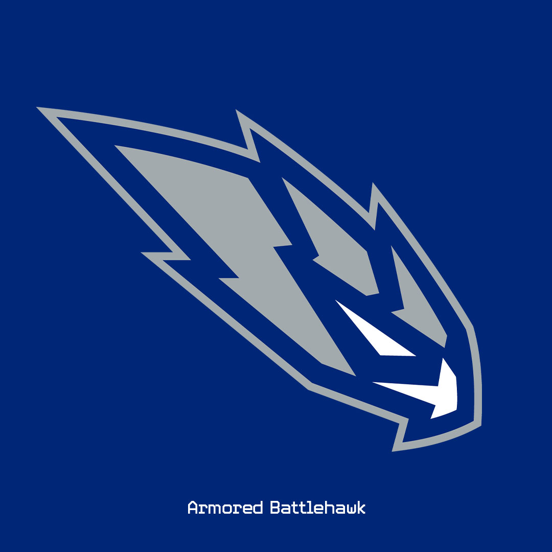
I just do not get the appeal of this Battlehawks secondary. It's a largely unrecognizable shape that barely, if at all, registers to me as a bird.
It's telling to me that this logo appears to have no application on the uniforms themselves. I have no idea if it's used at all.
-
4
-
-
13 hours ago, unisRus said:
Hoping Wolves get a re-brand. Something along the lines of their 75th anniversary mixtape city jersey. need something that feels like minnesota or timberwolves, not that corporate boring look
This might just be me looking through nostalgia-tinted glasses, but I'd love it if they kept the Classic edition jerseys full time. Even the logo. Watching them play in that set, on that court, just feels right. I also like the updates to the colors they used on the classics. To me, they're a perfect basketball uniform.
They've also seemingly sold out of all the apparel related to the Classic edition. Either that or was an intentionally limited supply. The jerseys seemed to have been online for a day or two before they were gone.
I'm hoping that's an indication of high demand.
-
4
-
-
14 minutes ago, Digby said:
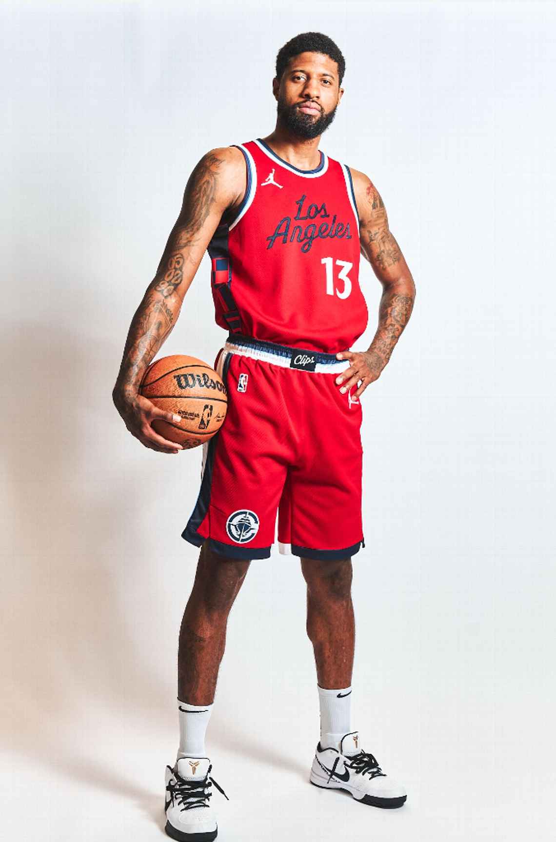
That would be a sharp look too, the light blue they're using is more saturated and green-ish than the powder that Memphis uses/was generally more in vogue during the double-blue-everything era of the league. But with the only team currently pairing navy and red being the Wizards and their very specific design language, I don't think what the Clips chose here is necessarily an issue either. (But it is very Twinsy.) Plenty of options for alternates that aren't as unhinged as the usual City looks.
The Pacific Blue is a gorgeous color, but it's used way too minimally for my likes. The details here are nice, but it feels like a missed opportunity.
-
12
-
-
54 minutes ago, Lights Out said:
I disagree. The Wizards are primarily red, the Clippers are primarily navy, and the uniform designs are so radically different that I doubt anyone will confuse them. The current Wizards uniforms overlapped with the Hawks' navy and red era and nobody confused those either.
I'm not suggesting there would be any confusion. But they would have been better off leaning into a color scheme that was unique, leading with aqua, than one that closely resembles the color palette of another team in the league.
So no, I wouldn't confuse these two, but it's clear that, colorwise, they're painting with similar brushes, so to speak.
-
2
-
 1
1
-
-
41 minutes ago, Lights Out said:
This is really nice. My only complaint is not bringing back the San Diego colors. I know there's a touch of powder blue here and there but it doesn't stand out enough.
This was my first thought, too.
Not only do I think of the Twins when I see this, which is fine, but I also think of the Washington Wizards, which was easily avoidable.
I think the mix of colors in the rebrand is great, they’re just leading with the wrong blue.
This should be an aqua and red team with navy accents.
-
4 hours ago, BottomlessPitt said:
It's funny how these articles never mention about tickets being expensive.
Even more annoying is that the story didn't attempt to address the question of "why," whether it be related to cost or something else. It could easily lead you to believe that the people of Winnipeg just don't care about the Jets anymore.
Comparing Jets attendance to the Blue Bombers attendance is just as misleading. A cursory look at ticket prices show the lowest-priced tickets for a Jets game at $80, nearly 67% higher than a Blue Bombers ticket, which can be had for $48.
-
9 hours ago, Old School Fool said:
That's what I don't understand about this Brady2024 thing. Paul is clearly a good guy and I respect his work but what the hell is he doing here? This is such a longshot that I don't even know if it was worth it. It's almost like Paul figured since he was one foot out the door he might as well just screw around.
I'm more interested in understanding what type of person gets joy out of duping people. I'm going to assume, if this leaker is indeed not legitimate, that they read these boards religiously and will see this. So if that's the case, here's my question: What do you get out of it? What sort of fuel does this give you when you log off and walk back into the world? I'm asking because I genuinely can't imagine it.
-
5
-
-
4 minutes ago, MJD7 said:
If anything, I’ve always felt that buttons & belts are what’s most cumbersome and intrusive against player performance (particularly when sliding/diving). I’m surprised Nike didn’t push harder to get rid of those elements (or maybe they did, who knows).
BRING.
THEM. BACK! 
-
4
-
3
-
 1
1
-
-
Fabric weight seems to be an underlying theme with every apparel innovation Nike introduces into the organized sports world. And I can see how that has made a difference in American football and maybe even soccer.
But was this ever a complaint in baseball? Were players actively saying, "man, I'd play so much better if we could only get rid of all this embroidery." It's the same in the NBA. I don't think polyester and tackle twill ever held a player back from greatness.
All of these uniform innovations feel like solutions in search of a problem.
-
10
-
-
21 hours ago, upperV03 said:
Not only that, but the “Heritage Aqua” is really just a Carolina blue and doesn’t match the aqua in the crest at all. There’s a massive disconnect between the kit and the badge, both stylistically and in terms of the color palette. The badge is very vibrant and modern, yet it’s slapped on a kit that attempts to be overly retro-for-retro’s sake. It seems like a classic case where the kit design was done without consideration being given to the new crest and brand colors. On their own, I really like the shorts and socks. But they look like they’re screaming out for a white shirt similar to their Heritage white kits from 2017/18. And then the stripes? I just don’t get those at all, and I don’t think the two shades of green PLUS light blue PLUS white makes for an appealing shirt at all.
As always, I’m a Timbers fan so my viewpoint on anything Sounders-related is clouded by a puff of fish-scented air.
I agree with this. On its own, as an idea, I like the stripes. But my biggest issue with this kit is how much the stripes overshadow and drown out the new crest. I'd think that in a year in which you unveil a new brand you'd want a kit that celebrates it. This kit's too noisy for that purpose.
-
2
-


:format(webp):no_upscale()/cdn.vox-cdn.com/uploads/chorus_asset/file/24367913/1446524643.jpg)


2024 NFL Changes
in Sports Logo News
Posted
Yet, at the same time, not at all surprising.