


eRay
-
Posts
2,351 -
Joined
-
Last visited
Posts posted by eRay
-
-
I remember rumors around the time of the reveal of the Bucks' new branding that blue was really being added because of the Greek flag and they wanted to keep Giannis around. I still don't see them doing much to tie in blue with the Greek flag on merch or anything so maybe there was nothing to this.
-
 3
3
-
-
2 hours ago, tBBP said:
Just dropping in to say there's still room yet for independent designers in this space--though I'm sure he still had to adhere to a pretty strictly set design brief (unless the Twins/MLB also allowed him to contribute to said brief):
From Sports Illustrated online.
The guy who did the Vermont Green FC branding, LAFC crest, Chicago Fire crest, One Knoxville SC crest, and countless other crests. Very cool, I love his work and you can see his style shining through in this. Very clean and classic and considered.
-
1
-
-
I enjoy the overall visual vibe, but some of the details bother me. Namely, why build an entire font off your old script to be used for "MINNESOTA", the M logo, and jerseys numbers, then change that script?
-
4
-
-
I love coming here to see people argue their opinions, but I feel it only works when you don't state your opinion as fact.
"I've never heard of it, therefore it is dumb" is being stated as if it's a fact. It isn't.
How do you learn about things if your mind is so closed to hearing other points of view? It's totally cool to say "Yeah, I guess it IS iconic and unique to that city, I never knew about that, I still think it's ugly." I don't understand why someone wouldn't accept that it means something to someone else and that matters, whether it's a flag or carpet or toilet or national anthem.
-
10
-
-
1 hour ago, gosioux76 said:
This is going to sound weird, but I believe i've seen a version of this helmet in, of all places, the Oregon Zoo.
It's been several years since I lived in Oregon, but we used to go to the zoo all the time when my kids were small. And one exhibit -- can't recall the exact species of animal -- had a helmet like this on display as some sort of an illustration of how the animal attacked with its head, I believe. I could be wrong on that detail, but I definitely recall seeing a black and orange helmet with a logo like this. (And no, it wasn't an OSU Beavers helmet.)
This one? Looks a little bit different, but pretty close!

-
2
-
-
Before they mentioned flags I read it as an abstractly rebellious logo, especially for how simple it is. I knew they were in Dallas previously and probably wanted to stay there but it was made near-impossible, so I read the mark as a way to cross out the 'D' for Dallas while also forming an 'A' and 'R' for their new name. Argue on their choices for sure, I'm just saying they didn't really need to mention flags to get to a rebellious explanation for the mark.
-
2
-
-
-
16 hours ago, Captain Invader said:
You can actually see the center circle on the Cavs new court design.
Is this some sort of new directive by the league?
Some teams do this with very thin lines, some with thick lines, some don't at all. Seems to have been that way for a while, even with one-off courts. New designs have had no line, older have had a line. I'd bet it's not a new league directive just a design choice the Cavs made, especially since the new Jazz court does not show these lines.
-
4
-
-
Pacers are wearing City Edition vs White and Red. I'm still thinking this is going to be navy.
Kings wearing City Edition vs White, Pink, and Red. I thought gray, but it might not contrast well enough with pink unless it's a dark gray that's almost black.
Hornets wearing City Edition vs White, Red, and Yellow. Still think this is going to be black.
I think everything else has been leaked at this point.
-
Bummer, Lockervision no longer shows each uniform with game-specific shoe/compression gear combos. It used to allow for mixing and matching by changing parts of the URL but now each edition has just one single image, as far as I can tell.
-
 1
1
-
-
2 hours ago, VDizzle12 said:
My first thought was a chainlink fence. But that's probably because the jersey is hanging on a chainlink fence and my mind just went there. The wordmark has a tattoo feel so maybe some type of urban/street lifestyle theme? I honestly have no idea what direction this is going.
I thought for sure they were doing something about magic lounges/nightclubs/magic castle or even Disney at night or something but I'm starting to worry you're onto something and they're going for a Hart & Huntington/tattoo culture theme. Weird.
-
1 hour ago, ThunderCeltic said:
Shouldn't be too long before lockervision adds all the uniforms to the schedule on their site.
Missing City sets:
Sacramento
Indiana
Detroit
Charlotte
Orlando (leaked, appears to black/dark Navy honoring Disney again)
Minnesota (leaked, will be White honoring Bob Dylan)
Utah (pulling a 2019-20 Memphis and using Classic edition as the City)
Houston retaining the 75th Anniversary from last season.
Are we certain Utah is giving their throwback the City designation or is that a rumor still?
Based on @Conrad.'s posts a while back the math worked out that Utah would also have a city jersey. On their team store they are selling "Remix Icon", "Remix Association", "Remix Statement", and "Hardwood Classic" jerseys only.
-
Those Sixers jerseys are great, along with the court, but....
is that why it's called "the key"? How did I never know this?
-
4
-
 3
3
-
 13
13
-
-
It seems the Hornets just figured out the proper visual hierarchy for their uniforms. White with teal outlines for the important bits. Go as busy with the side panel patterns as you want; if you just go teal on purple it won't distract the eye. Tuck away the Jumpman logo in teal, sponsor logo with no white, done.
-
2
-
-
I'm in love with those. I don't see the green, and I hope it's just the lighting. If it's indeed green for some reason then I'm out. Give me a more funky wordmark on the chest and a better number font and let's make these the basis of the new uniforms, today. There's a lot going on but they feel polished.
-
3
-
-
Not sure what it is, but I really enjoy the valley gradient on the PHX trim. I don't think it's enough to make this particular jersey good, but in the right usage a gradient trim could be really nice.
-
5
-
-
6 hours ago, Sec19Row53 said:
You were saying?
These are statement jerseys, I was talking about city jerseys.
-
1
-
-
-
1 hour ago, ThunderCeltic said:
Cavs court does look like 03-04 reboot.
So missing city editions not released yet:
Minnesota White (Bob Dylan inspired)
Sacramento Red (Webber era fauxback design)
Detroit Black (Bad Boys inspired)
Indiana Royal Blue (Market Square Arena Inspired)
Charlotte White (Jim Crockett Promotions Inspired)
Orlando Orange version of 75th Anniversary Remix
Anyone else getting new "Statements"
There are no red or orange city editions this year, and Detroit isn't going black. Detroit will be green, I am thinking Sacramento is gray, and Orlando has leaked in Black/Dark Gray. The remaining unreleased colors are all navy, black, white, or gray with the exception of Detroit.
-
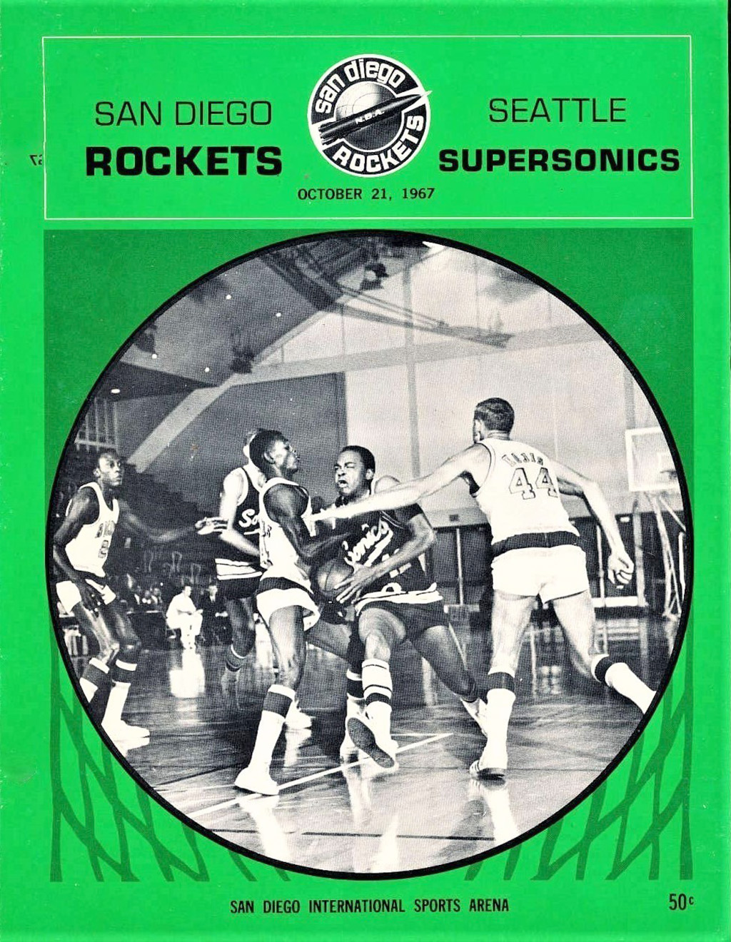
Only photo I can find of the Rockets wearing these shorts is against the Sonics. Is it possible they were wearing the Sonics shorts for some weird reason?
-
5
-
 1
1
-
-
1 hour ago, kimball said:
It's gonna happen.
I can't wait until every jersey is eventually a throwback, complete with huge fans on twitter posting "
 "
"
-
2
-
 1
1
-
 1
1
-
-
Do we think this is jersey related? Could just be schedule release stuff, but it's a jersey and there's a lot of teal around it.
EDIT: It's just about the schedule dropping.
-
1
-
-
33 minutes ago, TheRealPepman said:
Warriors' new Statements are now official.
I won't lie and say it LOOKS bad, but the lack of explanation of design decisions past "we changed our name to Golden State this many years ago" makes me wonder why it exists.
-
3
-
-
12 hours ago, fortunat1 said:
Detroit must account for the green city jersey you mentioned some time back, right? I thought Charlotte might tap into their city flag this year, but it'd make sense for a St. Cecilia's Gym jersey to be green. After all, the padding on the wall appears to be dark green.
That makes sense, we had Charlotte, Detroit, Houston, Indiana, Minnesota, Orlando, Sacramento, and Utah un-leaked, with @Conrad. telling us 1 green, 1 gray, 2 navy, 2 white, and 2 black. Once Utah dropped green and Minnesota leaked as white, that made the green harder to predict.
-
3
-


2022-23 NBA Logo & Jersey Changes
in Sports Logo News
Posted
The issue seems to be that almost any way the Jazz go people will say they're stepping on toes. Purple/Teal/Copper looks to be the only scheme they can outright own and their fan base has shown they want to support.
Purple/Yellow- Lakers
Purple/Black- Kings, Suns, and Lakers (I think this is where they'll land, but with multiple shades of purple like in their 2024 jersey)
Black/Purple/Red Rock gradient- Suns
Current Black/White/Highlighter- Nets, Heat, and Spurs
Purple/Light Blue- Lakers/Kings (they could probably get away with this)