


VancouverFan69
-
Posts
1,031 -
Joined
-
Last visited
Posts posted by VancouverFan69
-
-
On 12/17/2021 at 10:46 AM, Survival79 said:
Yup!

Another one of the bad 90's trends in NHL uniforms besides the BFBS movement was the removal of pants stripes. Those Penguins pants should have kept the previous V-stripes or have straight white-gold-white stripes on the new pants.
-
 2
2
-
-
8 minutes ago, SFGiants58 said:
Exactly. However, the Reverse Retros look 100% better.
Never cared for the gradient. If the green on the torso were below the white stripe like if the burgundy were below the silver stripe in the original third, that would be a very beautiful jersey, regardless of the crest.
-
1 hour ago, AFirestormToPurify said:
Pantone 281C is almost navy blue. It's certainly not as vibrant as the bright royal blue the Rangers use or even as light as the royal blue the Islanders, Sabres and Blues use. I would definitely call them a dark blue team
And of course it's arbitrary. I only said I thought there were too many dark blue teams in the league. You're also arbitrarily not counting dark royal blue as dark blue. I only stated my opinion that a rare matchup with both teams in bright red looked good. No need to be pedantic and reply with a "uhm, akshully" post about navy blue jerseys which I've never mentioned in the first place
The Canucks are a royal blue team, not a navy one. That's a mistake. Their royal blue shade is lighter than the Maple Leafs' shade.
-
On 10/19/2021 at 4:49 PM, nash61 said:
So, how are we feeling?
So much nicer than what's worn in Vancouver. It's a look the NHL Canucks can own. It would be a Top 10 NHL uniform.


-
On 10/13/2021 at 5:41 PM, M4One said:
Canucks have TD as their new helmet sponsor.
On 10/13/2021 at 6:46 PM, Friedrich Stuart Macbeth said:And they couldn't remove the green block in this logo.
Seriously?
The Canucks and the Penguins have the worst helmet ads. Too big. The Bruins who also have the same helmet sponsor as the Canucks did theirs right....not too big. Just narrowed across the top. The Leafs and Flames also did theirs right.
-
2 hours ago, habsfan1 said:
The puck in the crest is black. There's a bit of black.
The Blackhawks have orange, yellow and green in Chief Black Hawk's feathers and the Senators' centurion has gold. The original Sharks' logo had an orange stick. None of those colours are/were part of main colour schemes of those respective teams.
The Avalanche's uniforms looked rushed after the move from Quebec City. The Avs should have just focused on burgundy as the primary dark colour with just silver and steel blue.
-
1
-
-
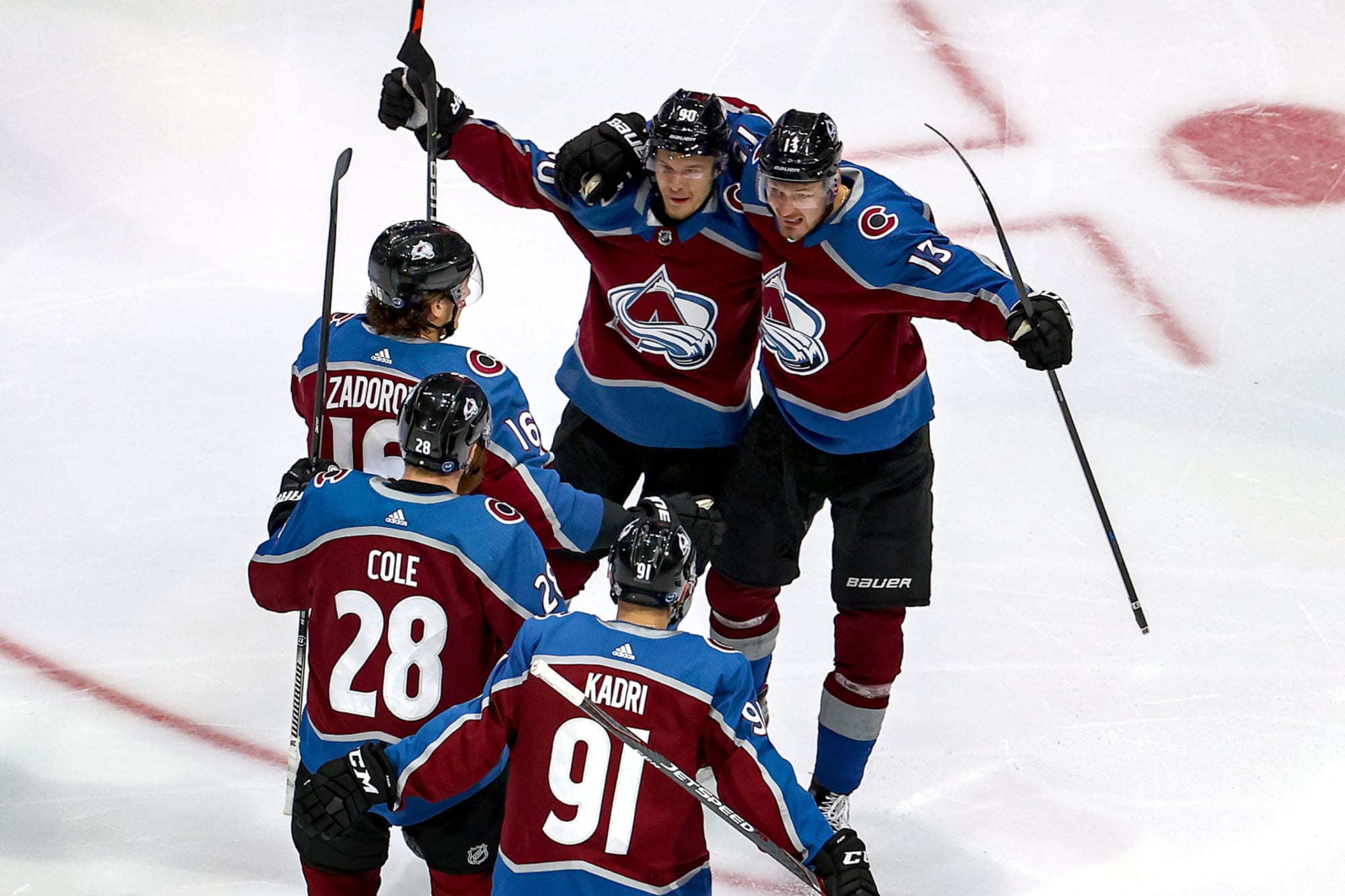
22 hours ago, CreamSoda said:
Blue numbers confirmed for the Avs!
When it comes to uniform improvements, the Avs are late bloomers. Better late than never. The blue numbers on the whites are a massive improvement.
-
2
-
-
8 hours ago, CreamSoda said:
Chicago would look a lot better with a white outline between the red and black on their numbers.
Disagree, sorry. The white spacing on Montreal's away number font is bad enough. Thank goodness Edmonton got rid of theirs.
-
1
-
-
On 8/24/2021 at 7:06 AM, gosioux76 said:
I'm with you. I grew up with the North Stars and badly miss having that logo in the league. But I find it mildly painful to see the Wild cash in on that nostalgia, knowing they'll never adopt those colors and that logo will remain in the archives for perpetuity.
I think I'd appreciate it more creatively if the Wild designed a fauxback meant to look as if the team existed 40 years ago. That seems more in line with the spirit of this program anyway. If your hockey roots are too new, then imagine what it would look like if you'd been around since the dawn of the league.
Like the overwhelming majority, I love and still mourn the loss of one of pro sports' most beautiful brands. However, if today's Minnesota franchise didn't settle for the ridiculous "Wild" name and brought back green and yellow-gold with a far suitable name besides "North Stars" v.2, the North Stars name and N☆ crest wouldn't be as missed as it is today. It would still be missed and cherished but not like it is today.
-
2
-
-
 Corporate greed is now official in the NHL.
-
6
-
-
5 hours ago, ManillaToad said:
We will never see the Kraken's uniforms without corporate advertising
It would be nice to see the Kraken's awesome S crest on their helmets, white & deep sea blue.
-
3 hours ago, JW83 said:
I just wish the Leafs would go back to their classic three-stripe socks and double stripe pattern at the bottom of their jerseys. Then the current set would be "set".
Definitely throw in the blue shoulder yoke on the road whites too.
110%.
-
1
-
-
That's great that Utica is keeping the Comets name. The Comets are to Utica like what the Americans are to Rochester. Great fan support through and through.
The recoloured logo looks great. Going to miss their beautiful alternate green uniforms though.
-
On 5/11/2021 at 7:47 PM, Cujo said:
Need the Avs to abort the blue helmets and jorts, go back to BFBSish
On 5/12/2021 at 8:10 AM, CreamSoda said:Nope, no way. The blue looks so much better.
Burgundy helmets and burgundy pants would be perfect. It would create a much better balance with the blue trim. Because the Avs have a burgundy mountain hemline on their whites, I would stick with the blue pants with the whites and add a blue number font as well.
-
1
-
-
4 hours ago, TaylorMade said:
If I had to guess, I'd say the alternate jersey will be that "ice blue," possibly with the secondary anchor logo on the front.
44 minutes ago, CaliforniaGlowin said:I love that ice blue!!! I want all my gear in that color. THAT'S the way to stand out from the league!
Btw, that is not the final jersey, that was a placeholder when the branding launched. So that's something to look forward to.
An ice blue alternate for the Kraken would look amazing. I'd even make the helmets ice blue while sticking with the dark navy pants. A uniform matchup vs a team in royal blue or green(Wild) would be a can't-miss.
-
4
-
-
St. Louis Spirits SC would have made the most sense. The crest with the St. Louis Arch looks sharp, though.
-
3
-
-
16 hours ago, kw11333 said:
It's about time and they look great. Now, let's correct the font and they're perfect. The Canucks have always used the traditional and timeless Athletic block font before the Aquilini ownership took over. The current Agency font is one of the worst fonts in sports.
-
5 hours ago, dont care said:
No, the city does not own the team, the owner does and he has every right to do with his team what he pleases. Fans aren’t entitled to a teams identity no matter how connected they feel.
Well, I'm going to strongly disagree with you. Maybe, if your hometown team moved because of the owner's greed for
greener pastures, you might say different.
-
5 hours ago, jn8 said:
Not from Houston and not a fan of either the Texans or the Titans, so take my opinion for what you will, but I'd be against this type of a move.
For starters, I think the Texans have a solid identity the way they are, the only real changes I'd make would be to make the red jerseys the primary homes and to wear red socks when they wear the blue pants. The Texans have established themselves for closing in on 20 years, there's no need to mess with them now. If the team had a bad logo and had several different jersey redesigns throughout their history, then it could be a different discussion. As is, they've had the same (good) uniform set since day one, errr whenever they decided to ditch the white helmet.
Secondly, we don't need to make things any more confusing, historically speaking. I don't want another Browns/Ravens or Hornets/Bobcats/Pelicans situation where for some reason Deshaun Watson is being credited with passing Warren Moon on the franchise's all time passing yards list or something even though the franchise Moon played for is in Tennessee and Watson's team was founded in 2002. They're different teams. The Oilers are in Tennessee and are called the Titans now. They're gone and never coming back.
Of course, all of this is meaningless because the Oilers nickname is still owned by the Adams family and the NFL has decided that the name is retired, preventing any team from using it again, including both the Titans and Texans.
I understand where you're coming from. For me personally, when a longtime franchise that has had many years of support and is suddenly yanked from that particular city because of typical pro sports capitalism, the name and history should remain in that city. I include the clubs that you listed. However, if a city gets "their team back" via relocation of another franchise, the original record book stays with the original club that moved - ie. NHL Jets 1.0/Coyotes & Thrashers/Jets 2.0. If the Wild(worst name in sports), decided to rebrand as "North Stars 2.0", then they should own the '67-'93 North Stars 1.0 history because they started off in Minnesota. That's why I hope the SuperSonics 2.0 come via expansion than relocation(unless OKC decided to move back home).
As for the Texans, it's a sharp brand. The red jerseys with the navy helmets would distinguish that team from other teams.
-
2
-
-
On 2/11/2019 at 5:17 PM, IceBurgs70 said:
The GOAT unis...

Would Houston fans object to the Texans rebranding themselves as the Oilers 2.0? I wouldn't object. The original Oilers are the Titans after all.
I can never get over the beauty of sky blue, white and red.
-
3
-
-
57 minutes ago, Ferdinand Cesarano said:
Neon colours are ridiculous.
But there is a way to use bright and bold colours in an attractive way.That shade of yellow with dark green or any dark colour is acceptable.
**Not a fan of orange mixed in with both yellow and green. With green and white or with yellow and black(80's Canucks) is fine though.
-
2
-
-
The original Colorado Avalanche uniform, Dallas Stars' big ☆ uniforms from late 90's early 2000's and the current New England Patriots' Super Bowl dynasty uniforms.
-
Those look awesome. I would try the WHL Johnny Canuck on a Millionaires maroon jersey. I would also use black highlights instead of navy for JC's outline.
-
1
-
-
NHL: Vancouver Canucks - My home team. Proudly bleed the Blue & Green and the Black, Yellow & Red. Hoping the corporately-inspired orca logo is ditched ASAP followed by the first Stanley Cup win. Gotta have faith.
CFL: BC Lions - My home team. Once a new and committed ownership is found to take over from current owner David Braley, the club will be able to "roar" once again.
NFL: 1. Seattle Seahawks - Closest team to Vancouver. Cheered for the 'Hawks during their Kingdome years.
2. & 3. New York Giants & Jets - Used to live in New York City during my teens.
MLS: Vancouver Whitecaps - My home team. Been a huge fan since the NASL version's Soccer Bowl '79 season.
European "Football": Werder Bremen - The green and white(grün und weiß) underdogs from my m♡m's home city.
MLB: 1. Seattle Mariners - Closest team to Vancouver.
2. Toronto Blue Jays - Canada's team. Cheered for them before the choke job vs KC in '85. Cheered for the Expos as well for the obvious same reasons.
3. New York Mets - Lived in NYC and they were the lovable losers who played second fiddle to the Yankees.
NWL: Vancouver Canadians - My home team. Beautiful big league logo and uniforms. First class organization that plays at the prettiest little ballpark in North America, aka. Scotiabank Field at Nat Bailey Stadium.
NBA: Underdog teams and teams that have never won championships with the exception of Oklahoma City Thunder and Memphis Grizzlies - Enough said.


2021-2022 NHL Jersey Changes
in Sports Logo News
Posted
The Robo/stationary Penguin was actually a very nice crest. The main problem was ditching the Hockey-playing Penguin. It was not only timeless in its own right but the Penguins had just won back-to-back Stanley Cups. If it's not broken, don't fix it. I would have just added the 90's Penguin as a 3rd. If the majority of fans preferred it over the classic Penguin, then by all means, make the switch. I would've kept the 80's/early 90's template though.