

habsfan1
-
Posts
18,478 -
Joined
-
Last visited
-
Days Won
1
Posts posted by habsfan1
-
-
I prefer Vegas Gold Pittsburgh Penguins over Yellow Pittsburgh Penguins.
-
 1
1
-
-
THIS is the best uni in Sharks history imo:
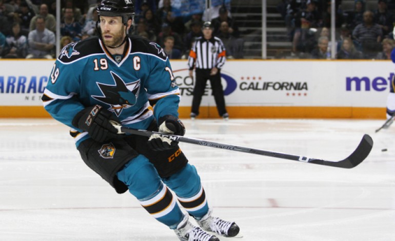
I'd put them up for consideration if they had no front numbers.
-
I prefer the current Washington Capitals jerseys 50 times more than their throwbacks. They use unconventional modern striping, but it just works. I would be happy if they lasted another 5-7 years.
These are beautiful uniform matchups, even for non-Original 6 teams wearing non-throwbacks...


-
1
-
-
Wow, Flyers fans have taken it far...
-
I think the Ducks webbed D logo makes for a great primary logo for the orange and bronze color scheme...
I also used to think the script logo was a great fit on their original new uniforms...
-
Added an alt for the Coyotes... plus changed some shoulder patches.
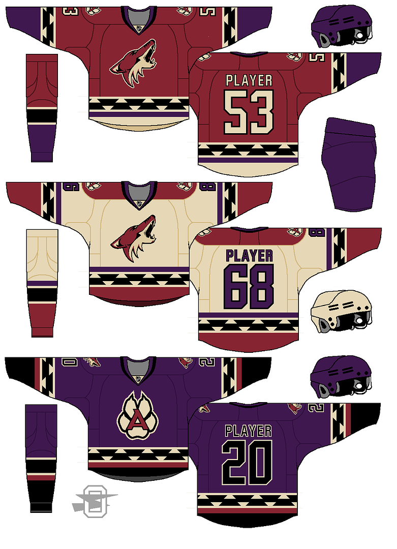
That color combo of purple, sand, maroon, and black works well on the alternate jersey.
-
1
-
-
If you're going for a very old-time throwback look with the striping, adding laces would be a nice touch.
-
1
-
-
I'm getting a bit of a U of Miami vibe from the Ducks concept. But it is nice. Nice job.
-
The double-shaded bolt isn't bad. It could work better in different colors, but this is a good first concept.
-
Is there a close-up view of the new Coyotes kachina pattern from the hanger effect?
-
This may be the most lopsided unpopular opinion,but:
I like the Thunder logo.
I still have trouble comprehending how the logo lasted this long. Unlike with the Buffaslug, you don't hear protests at every corner.
-
I know I keep posting here haha, but I keep thinking of more!
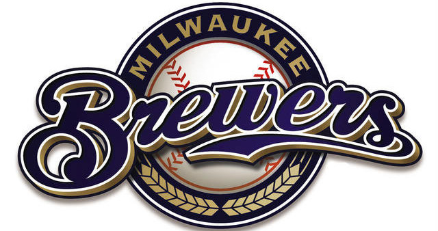
Honestly, I feel the Brewers look the best they've ever looked right now. I absolutely love the concept behind the branding, as I think it's much stronger and has more thought to it than many give it credit for. Every mark looks to me like it could easily pass for branding on a beer label or can, and it helps matters too that I feel navy and that shade of gold just look beautiful together.
I feel the quite the same.
The Brewers script uses same style as many old school beer labels. I don't know if many current beer products still use that style. But for what the logo is...it's very tough to beat no doubt...


-
2
-
-
The Calgary Flames' recent uniform set, to me (except the red alternated = they need a black one!), is the best set of all uniforms they have donned since its inception. They're original and cool.
I find the '04 sets plain and typical.
That is an unpopular opinion!
I like the pants striping, that's about it.
-
I have zero desire for black to return to the Lightning's look on a full-time basis (I don't even want its current status as an alternate), and I like their standard sweaters just fine.
Their sweaters are fine. I know they're blue & white like the Maple Leafs, but I won't let that deny me from admitting that it's a clean, sleak look. I understand the Original 6 dress-up argument...somewhat, and I strongly understand the grand theft identity argument. But if the Leafs weren't around or had a different color palette, I don't think there would be as many complaints.
I do think there should be a touch of black somewhere in their identity though, just for team tradition sake. But no black trim on the jersey stripes. That would look incredibly minor league-ish. How about the collar? Oh yeah, but then on top of ripping off the Leafs and Kings, they'll be ripping off the Canes now as well. Idk where you could add black and at the same time have it truly work well.
-
Here's one I'm sure few people will agree with...
I love fauxbacks. The more vintage white, the merrier. I don't even care if it's a 2015 expansion team from a city who are just now getting into hockey.
-
I really dislike some Montreal's road uniform. As I hate the team I have respect for the red uniform (I also think that they should add lace ups to it) but the white one is just lacking.
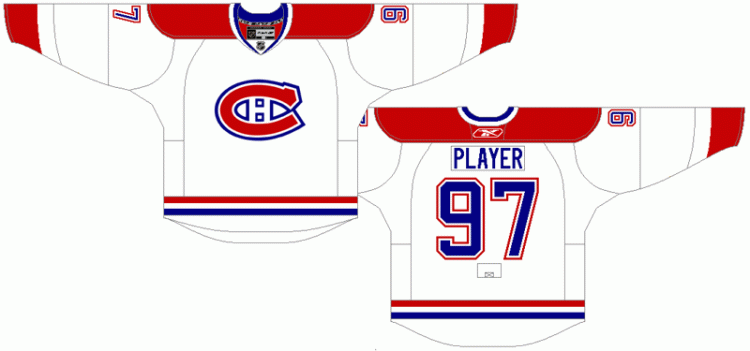
To me I think they should go back to this:

I like it when the regular uniforms match
The problem is that the white uniform was just an experiment used for only 3 years, until it they ditched it in favour of what they were previously wearing. It failed to catch on then, and I think it would fail to catch on today as well. And it wouldn't be possible for the team to lower it down on the hierarchy scale or to completely dismiss it, considering it was the mark of so many Stanley Cup winning teams.
But even if we remove the historic purposes, that jersey would get tiresome very fast. The crest doesn't stand out as much on that darker blue background like it does on white, the red stripes lose a lot of vibrance against the blue, and from a distance the jersey is essentially white with blue blobs and a couple of little elements here and there which are given too little importance.
Edit: When you said you hate the team, I was surprised when I saw your profile location.

-
1
-
-
I don't know exactly how unpopular this opinion really is, but the McFarlane jersey is my favorite Oilers look of all-time...

I'm not saying the classic Oilers is bad. I just have a fondness for that particular uniform. It was a cool design, kind of how the Oilers would look if they were a 2000s expansion team.
-
2
-
-
Anyone got the Arizona Coyotes retro jersey template from this year?
front page, hockey, first phoenix one
No I meant the one with the Reebok template, with the updated collar and such. That jersey, but with the RBK cut.
-
Anyone got the Arizona Coyotes retro jersey template from this year?
-
We're now at 7,700 season ticket deposits for Las Vegas, which means we're about 6 weeks away from the NHL buying up the remainder and calling the trial balloon a complete success.
Fun thing I learned from Chris Johnston's Vegas update on SportsNet: The ownership recruited 75 Vegas whales to each buy and resell 60 deposits. That's 4,500 total. Which means, in terms of real people who have expressed interest in going to hockey games, the Vegas bid has attracted 3,200 deposits. This is all starting to feel rather Oakland Seals-y.
Can't hold a candle to the Winnipeg Jets.
-
Its because Scott Gomez is back where he belongs with the Devils.
You can keep him.
-
Scott Gomez returns to the Bell Center tonight.
Regardless of how Canadiens fans respond when he touches the puck, I'm giving him an early Masterton nomination. He went from being the league's laughingstock, to becoming a rent-a-player for years, to going back to respectable form. This year, he has a good record, his best in the last 5 years or so. He may still have a few more years of hockey left.
-
More Brodeur

He almost spent his entire NHL playing career with the New Jersey Devils. I thought that would be the case, but those 2 or 3 games with the Blues ruined that statistic.
-
I really dislike the reverse laces on teams like the Wild. It just looks ugly for some reason.

Ask A Moderator
in Forum Policies and Announcements
Posted
As it is right now comparing the old with the new, the old board was so much more convinient on all levels. To be honest, I'm having difficulty coming up with something I like more about the new one.