

habsfan1
-
Posts
18,475 -
Joined
-
Last visited
-
Days Won
1
Posts posted by habsfan1
-
-
The first page of this thread should be updated because it doesn't have any of the newer ones.
-
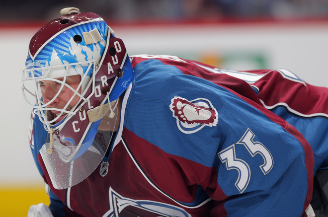
I want to know the font name of the Colorado part on his mask. Please help.
-
Don't know if this is a popular or unpopurlar opinion, but I think the Hawks need to bring back their black fauxback as a 3rd again.
-
I love the vintage white on all of the fauxbacks that have been released within the last 5 years. They all look amazing with vintage white.
-
On the current Flyers jerseys, I don't like how the numbers are surrounded with a thick black outline while the rest of the jersey pattern is basically just white with orange patches, or vice versa on the home. It just seems like something's missing everytime I look at them. It's like if the rest of the uniform needs to be outlined in black as well.
-
This jersey is growing on me and I think it's not that bad...

It might be in the bottom 10 when it comes to ranking current NHL jerseys, but it sure is better than the whole Marlins rebrand. At least it's just an alternate.
I'm going to give it a chance.
-
Can someone let me know when the new 2011-12 NHL jersey templates will be made?
-
These are the best uniforms the Vikings have ever worn:

I feel that way also. I just wish they would update the Viking head primary logo just like they updated everything else.
-
I support vintage white. Vintage white is awesome!
There, I said it.
-
i know this kind of gets mixed reviews from people but i think these are awesome.

Agreed, that logo is absolutely brillant! I didn't notice that he's using his amputated leg as a hockey stick until someone pointed it out. Everything about the logo is top notch!
-
For the most part, I feel that that's really stupid, but then I look at the roster of the Montreal Canadiens and I see names like Spacek, Plakanec, Markov, Kostitsyn, and something doesn't feel right.
Why not add Brian Gionta? He is the team captain and he's an American. Just give me someone who can aim at the net and score some goals and I'll be perfectly happy.
-
I think pro sports teams should reflect their hometowns. The Pittsburgh Pirates should be from Pittsburgh. The New York Yankees should be from New York.
What if no player in the MLB resides in Pittsburgh?
-
I really love the Jets double arm striped road jersey.
-
I think this

is a great logo
It shows you the nickname, an islander, and is still the only representation of what an islander is: a badass fisherman
It doesn't represent the city well, but that happens with a lot of good logos.
It represents the sport, with a hockey stick and net
It looks cool.
Put that on a normal-looking jersey for an Islanders minor league affiliate, and it would be a huge hit. Now it's far too tainted by those wave jerseys and the backlash
+1
-
This logo...

is much better suited for the club's primary logo than this...

The 35 point leaf is a nice alternate logo and I'm glad it stayed that way when the alternate was used. Maybe if the script wasn't off center and the lines were sleaker, my opinion would be different.
-
I think this look that the Islanders previously had was amazing.

It suited the team very well. The extra amount of orange used on those made the jerseys less boring in comparisson to their 1998-2007 look. Not taking anything away from their current look though. For some reason, I think both looks are equally good.
-
Is Nashville's new template going to be up anytime soon?
-
**Likes**

Alot of people wanted something more resemblant to the Hartford Whalers. But this is the minor leagues, save the Whalers logo for when they return to the NHL. This is a great logo for the team. As for being too cartoonish, I'm not going to fuss over that. Half the league has a cartoonish primary logo, many of which were more poorly designed than this one.
-
I think I'm in love...


-
A thing of beauty...

-
One of top 5 color combos in the NHL. The colors are fantastic...

-
-
^Nice Sig^
-Dan
Thanks. It shows that the Red Wings aren't despised in just one place.
-
Here's one...


Paint Users Paradise 2.0
in Concepts
Posted
+1