


mjd77
-
Posts
1,874 -
Joined
-
Last visited
-
Days Won
1
Posts posted by mjd77
-
-
1 hour ago, hormone said:
$44 for a single color 2D trucker hat (I looked at pirates and rays on lids) is unfathomable. My streak of hat collecting may be over. Fanatics buying lids and crushing their MiLB selection was strike 1 in breaking my addiction. This is easily strike 2.
Then you probably don't want to hear that Fanatics is buying Mitchell and Ness too.
-
 2
2
-
-
6 hours ago, NicDB said:
I wish they'd get rid of it. It adds nothing to their brand,
It may not be great, but at least they aren't forced to always use the BiG for everything.
-
39 minutes ago, Foxxtrot44 said:
During the Olympics, America First Credit Union has been shilling their "redesigned" Jazz debit card and it is black and yellow with a shiny J-Note. So count me skeptical that the ASG logo is indicating a wider color palette for our awful, new identity.
It's kinda sad that we already know this new look is more than likely to be garbage.
-
30 minutes ago, GriffinM6 said:
Am I crazy, or does there appear to be some sort of 'Ice Blue' in this logo (specifically on the jazz note)? If so, I think black and yellow with a hint of ice blue could be a really good looking color scheme that fits the beehive motif as well as the snowy mountains of Utah.
I noticed that too and was wondering if that was supposed to be an ice blue or a really light gray or silver color.
-
3
-
-
Nice to see the Brewers using the barley ball logo on theirs.
-
9 hours ago, CitizenTino said:
First look at next year’s All-Star logo
So I'm guessing the note/mountain combo is either their new primary or secondary logo.
-
22 minutes ago, Moseph said:
Huge downgrade across the board. Here's to hoping that they wake up in 5 years and bring back the classic Football Team uniforms.
Its a shame that they got rid of the unique two stripe sleeve pattern and ripped off the Chiefs sleeve stripes on the burgundy jerseys. And why can't teams just use a traditional block font right? That would help this set out a lot. What a way to celebrate 90 years of this franchise.
That's the real kicker...a franchise that's been around for 90 years resorting to garbage like this.
-
17
-
-
55 minutes ago, Cujo said:
Instead of all that BFBS BS.. Opportunity missed!


As far as the jerseys go, it really should have been this easy.
-
9
-
-
6 minutes ago, DCarp1231 said:
Three different jersey styles.
Two different roundel logos.
Unnecessarily heavy inclusion of black.
What a mess.
I didn't really expect anything different. A more traditional looking matching set is pretty much out of the question these days.
-
Ugh...that white jersey reminds me of the D-Backs gradient crap. Just awful.
-
8
-
-
10 hours ago, Brian E said:
some of the dugout jackets for 2022 are visible on MLB shop. noteworthy things, i guess, would be 1) the blue jays' is navy, 2) they're longer, 3) the price is hilarious:
https://www.mlbshop.com/?query=dugout performance full-zip jacket&_ref=p-PDP:m-SEARCH
There must be 2 versions this year...trench coat and regular. On the Brewers site they have the trench coat and a regular looking one, which I know is different from last years version since the sleeves are yellow this time. The jacket was solid navy last season.
-
1
-
-
On 1/24/2022 at 10:03 PM, burgundy said:
Why The Titans Uniforms Are A Dumpster Fire [Abridged]
- Their shoulders are giant swords.
- The alternate logo that the shoulder swords are based on is no longer anywhere to be found on the uniforms.
- The swords add two shades of gray to an already crowded color palette on the jersey.
- There's more gray on the primary jerseys than Columbia blue.
- The Columbia blue pit stains look like an afterthought.
- The numbers are the bastard lovechild of the Bucs' alarm clock numbers and West Virginia's pickaxe numbers.
- The already overly-outlined logo was made worse by putting it on a blue helmet, requiring yet another outline.
- The only use of red on the jersey is to highlight the NIKE logo.
- Their.
- Shoulders.
- Are.
- Giant.
- Swords.
If they insisted on changing, a slight refresh of the old set would have been fine. It was much better than this.
-
On 12/25/2021 at 4:09 PM, LA Fakers+ LA Snippers said:
If they fix the collar, the Bucks should make this jersey their primary.
I'd prefer an entire look based off of the earned set from last season.
-
16
-
-
22 hours ago, Digby said:
I've always thought "the valley" was meant to at least vaguely hint at the sunburst motif, with the slanted text/chest band, gradients, off-centered number. Of course this new set is yet another different take on the sunburst motif. It is interesting that they have two very strong traditional looks, "Sunburst" vs "Arched text". I'm always Team Sunburst personally.
If they insisted on moving away from the sunburst, I was always a fan of the old western font stuff. I probably wouldn't mind a new take on that.
-
3
-
-
12 hours ago, ScubaSteve said:
Does it feel like the Suns switch they're set pretty frequently now? This would make it 3 sets in about 10 years. Just seems like they don't know exactly what they want to stick with.
This just proves they should have never gotten rid of the sunburst set to begin with. When you get it right, you stick with it. Everything since has been a downgrade. Sticking with the sunburst set and tweaking or evolving it over time would have been the better move. If those leaks are real, maybe that's what the original set would have evolved into over the last 25 years or so.
-
5
-
-
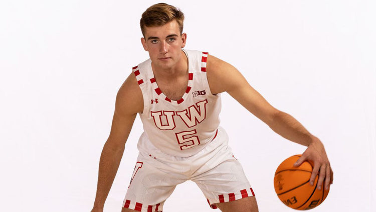
This years "by the players" uniform for Wisconsin.
-
1
-
-
On 8/27/2021 at 7:52 AM, gosioux76 said:
I'll endorse this statement, especially if you're a fan of comfortable hats with unique, low-key designs.
I'll buy a New Era if it's an on-field MLB or MiLB cap. But for anything else, I find their offerings to be either too basic or too gimmicky. I was looking for a Vikings cap recently. I wanted something unique, maybe a bit retro, but not overdone with excess striping or patches. Found this one and, being a fan of the old two-bar face mask, loved it. Super comfortable low-profile hat, too. (At the time, they were doing a buy-one, get-one deal online and snagged a powder-blue Twins hat with the classic Minnie & Paul shaking hands logo.)
EDIT: I almost forgot this, too. A couple years ago, I lost my beloved Twins "M" cap. I wanted to buy a replacement immediately, but New Era at the time had taken them out of circulation. The '47 Brand, however, had a fitted one. It replaced the MLB logo on the back with the road "MINNESOTA" script from the team's World Series years. While it wasn't an on-field authentic, you'd never be able to tell from the quality.
And no, I don't work for '47 Brand. I've just grown to be a fan of their products and prices.
")
I wish '47 would have something close to New Era's 3930s...structured, but low profile, and stretch fit.
-
1
-
-
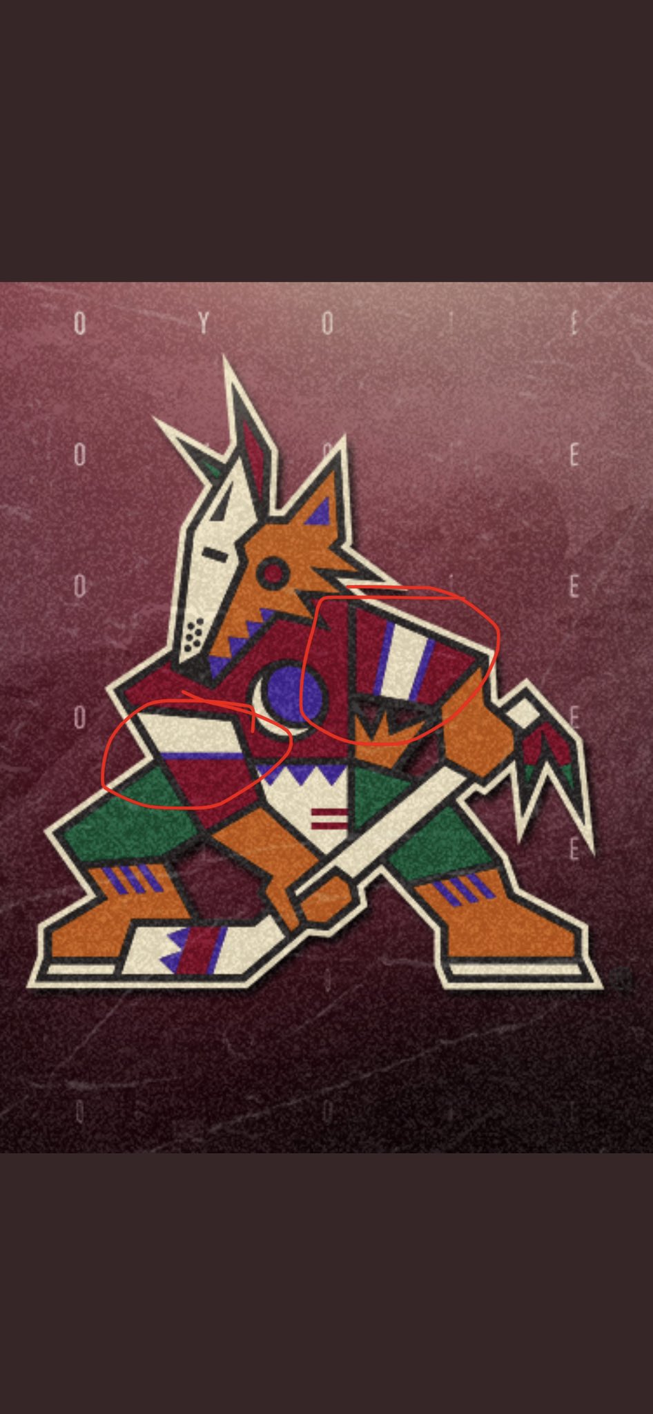
On 8/26/2021 at 12:46 PM, TheRealPepman said:
What bothers me is the Coyotes are actually using the wrong logo. Check the second picture on the tweet above, the pattern of the right arm goes Black/Beige/Purple when really it should be Purple/Beige/Purple as seen on the other arm. Like this:
And the Yotes are using the wrong logo on their Twitter icon and banner as well. I'm surprised nobody on the team notices that. Talk about inconsistency on the arm stripes SMH.
One more thing: The logo isn't outlined well too as the tail and right leg don't have the Beige outline.
While I was a huge fan of this logo in the '90s, they should have left it there. ...it is not a good full time logo for 2021. It's too busy and uses too many colors. If they were smart, they should have figured out a way to evolve it and simplify it over time.
-
2
-
-
9 hours ago, VDizzle12 said:
Packers vs Browns throwbacks on Christmas seems like a no brainer. All white vs all green? Sign me up.
No such luck...Oct 24th against Washington is the 1 game we will see the throwbacks.
-
2
-
-
1 hour ago, Gothamite said:
“50s Classic” might be overselling it a bit.
They should have lightened the green up a bit for a better reflection of the '50s set...but overall, I like this way better than any of the navy crap they've had.
-
7
-
-
They should do a Texans throwback like they did for the AFL 60th anniversary. Shouldn't even need the two helmet rule thing since it's just a decal swap. They're even playing Dallas again this year
That would be a nice looking game.
-
2
-
-
2 hours ago, Sec19Row53 said:
I'd ask for no more alt, but I appear to be in the minority on that, and I know there's money to be made.
Agreed with 'no more navy'I'm not getting my hopes up, but I'd prefer they go the kelly green route this time.
-
1
-
-
7 hours ago, Sec19Row53 said:
Packer alt revealed August 19.
Please no more navy / yellow.
-
5
-
-
5 hours ago, ldconcepts said:
While the Coyotes' draft hat makes me doubt that anything but a black and white Kachina set will be worn in the fall, I like the sound of this.
I'm sure I'm in the minority, but I wish they'd get rid of the Kachina (too '90s for me) and the howler and completely start over.
-
3
-


2022-23 NBA Logo & Jersey Changes
in Sports Logo News
Posted
Interesting side panel on those Bucks jerseys