


jlog3000
-
Posts
456 -
Joined
-
Last visited
Posts posted by jlog3000
-
-
NC State- Speedway
Thanks. I believe that was the best font for NC State basketball (and it should be for NC State football, especially on its Atlanta Falcons-style jerseys in 2004 & 2005.
How about these numerals on the old Cincinnati Bearcats uniforms back in their old C-USA days?
a.) as of 2000

b.) as of 1999

c.) as of 2003
 or
or
d.) as of 2001
 or
or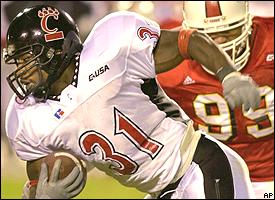
-
I'm guessing from scratch.
Aww, that sucks. But anyways, is that font also part of Conrad's font collection? Oh, by the way, anyone can guess this type of font on the early 2000's N.C. State basketball jersey?

-
it's an adidas font
Only JUST an Adidas font? Like it doesn't have a specific name nor any font similar to it?
-
Was anyone able to figure out the second "WINDSOR" font yet? (5 posts before this)
Not yet, and I swear that I seen that font before by that 'W' on then 2nd pic with Windsor, one of those CZW poster promo videos, which I'll try to find a pic and screencap it. Anyways, anyone know any font that's similar to the following photos?:


Would appreciate it.
-
4th and inches is the "Windsor" font. It's free at dafont.com
Yup, that's definitelt 4th and Inches (a.k.a. the Georgia Tech athletics font) on the left pic. But mgdmhl also stated the type of font on the right pic as well.
-
Go to page 10 of this PDF.
http://grfx.cstv.com/photos/schools/smis/genrel/auto_pdf/smis-style-guide.pdf
I sent it to Conrad a few months ago. I don't know if he is still working on it or didn't see it.
Speaking of the Southern Miss fonts (like you mentioned which they are on pages 9 & 10), what are the official names of the primary & secondary fonts & its numbers? And is there any other fonts that close to them?
-
Prior to the California Golden Bears new wordmark/typeface re-branding in 2012 (mostly on football); which font(s) are close to a.) the letters and b.) the numbers of UCal's previous font (as of 2004)?

It would be much appreciated.
-
I don't believe Nike created a font, just the 'State' logo. Could be wrong, but I don't recall any kind of overall branding with it. I know the football program used the word mark briefly, but that was ditched early. It wasn't until the new redesign that they got more unified.
I can respect on what you're saying. But even so, is there a font that's similar to the writings of the 'State' wordmark logo? That's all I ask.
-
Number font is Compacta, probably Bold.
Wordmark is custom, I believe.
For the numbers, thanks. But for the wordmark letters, there's no font similar or close to this custom typeface? I see.
-
Can anyone tell me which letter font was used on the "State" script wordmark; as well as the number font on the numerals?

Thanks.
-
USF is farther West, so I'd send them.
Sounds fair enough to me.
-
However, if you were the AAC commissioner, how would you realign the East and West sub-conferences within the AAC?
I would keep what you have, except I would put one of the Florida teams in the west and send Memphis to the east so each conference only has to travel to one outlier in their division. I would also make a clause that guaranteed the Florida teams would play each other in cross-divisional play.
Sounds fair. But would that Florida school be either UCF or USF?
-
The schools within the East and West are pretty close to each other, but the East and West are pretty far apart on their own. Houston, SMU, and Tulane compared to UMass, UCONN, and Army are half the country apart. Trips like that aren't something a school wants to make on a routine basis, especially the non-revenue sports.AAC (16)
AAC East: UConn, East Carolina, South Florida, Temple, Central Florida, Army, Navy, UMass
AAC West: Houston, Memphis, SMU, Tulane, Tulsa, UAB, Southern Miss, Rice
Ok. You have your points and I respect that. However, if you were the AAC commissioner, how would you realign the East and West sub-conferences within the AAC?
-
I actually kind of like this. There's nothing here that I'd be against seeing. The AAC would probably be better off splitting into an east and west conference on their own, though.
Thanks sir. Although it's for pointless reasons, in reality it might never happen as I predicted, since Rutgers & Maryland are in the Big TEN, while Mizzou still remains in the SEC. But about your thought of the AAC being split into 2 conferences, could you explain why? Sorry for the late response though.
-
I know that the numbers are from the FSU Glades Bold font, like on this sample pic:

But is there a font similar to those from the FSU Glades Bold numbers? And what about that unique script font on the world "Seminoles"? Is there a font similar to that one too?
-
What would happen if Maryland hadn't decided to join the Big TEN (B1G) and chose to stay in the ACC? Would Rutgers, Louisville, West Virginia, Cincinnati and UConn followed the footsteps like Pitt and Syracuse did to join?
-
Any of you guys a fan of NCAA Division II stuff? Anyways, I was wondering if you guys have heard about this new conference called the Great American Conference (a league within the West South Central U.S., specifically Oklahoma and Arkansas). Currently, this 3-year league consists of the following member schools (with the school year that school joined the league in parenthesis):
GAC - East Division
Arkansas Tech University (2011)
University of Arkansas at Monticello (2011)
Harding University (2011)
Henderson State University (2011)
Ouachita Baptist University (2011)
Southern Arkansas University (2011)
GAC - West Division
East Central University (2011)
Northwestern Oklahoma State University (2012)
Southeastern Oklahoma State University (2011)
Southern Nazarene University (2012)
Southwestern Oklahoma State University (2011)
Oklahoma Baptist University (2015, from the NAIA)
I was wondering if the GAC would add fellow Oklahoma schools like these following:
University of Central Oklahoma (from the Mid-America Intercollegiate Athletic Association or MIAA)
Northeastern State University (from the Mid-America Intercollegiate Athletic Association or MIAA)
Your thoughts guys?
-
I know this was the number font of the Minnesota Timberwolves from the late 90's to the mid-2000's, but which font is similar to this one?:

Looks pretty unique to me. Any ideas?
There is a similar font called "Walshes" available here: http://www.1001fonts.com/walshes-font.html
There's also a font that someone has created that is also very similar to Walshes:
Thanks. I tried that. However, it only matches the letters, but not the numbers. And what was that other custom font that's similar to Walshes? It has a name?
-
I know this was the number font of the Minnesota Timberwolves from the late 90's to the mid-2000's, but which font is similar to this one?:
Looks pretty unique to me. Any ideas?
-
That is agency I believe.
I see. Does exactly looks like it, despite a variation of bold or thickness within. I thank you for this.
-
I wonder if there's a font similar or exactly like the following pic I've posted.

P.S.: This would have been legit for the Blue Jays if there was a white home and alternate navy blue jerseys as well.
-
Greetings everyone. I was wondering. I just created my "dream conference" style of "super-conferences". For instance:
ACC (16)
ACC North: Boston College, Syracuse, Pittsburgh, Rutgers, Louisville, Maryland, Virginia, Virginia Tech
ACC South: Duke, North Carolina, North Carolina St., Wake Forest, Clemson, Georgia Tech, Florida St., Miami
B1G (16)
B1G East: Penn St., Ohio St., Michigan, Michigan St., Indiana, Purdue, Illinois, Northwestern
B1G West: Wisconsin, Minnesota, Iowa, Nebraska, Kansas, Kansas St., Iowa St., Missouri
SEC (16)
SEC East: Florida, Georgia, Kentucky, Tennessee, Vanderbilt, South Carolina, West Virginia, Cincinnati
SEC West: Alabama, Auburn, LSU, Ole Miss, Mississippi St., Arkansas, Texas A&M, Baylor
Pac-16 (16)
Pac-16 Northwest: Washington, Washington St., Oregon, Oregon St., California, Stanford, UCLA, USC
Pac-16 Southeast: Arizona, Arizona St., Colorado, Utah, Texas, Texas Tech, Oklahoma, Oklahoma St.
AAC (16)
AAC East: UConn, East Carolina, South Florida, Temple, Central Florida, Army, Navy, UMass
AAC West: Houston, Memphis, SMU, Tulane, Tulsa, UAB, Southern Miss, Rice
MAC (16)
MAC East: Buffalo, Akron, Kent St., Ohio, Miami (Oh.), Marshall, Old Dominion, UNC-Charlotte
MAC West: Toledo, Ball St., Northern Illinois, Central Michigan, Eastern Michigan, Western Michigan, Bowling Green, Western Kentucky
C-USA (16)
C-USA East: FAU, FIU, Middle Tennessee, Appalachian St., Georgia Southern, Georgia St., Arkansas St.
C-USA West: Louisiana Tech, North Texas, UTSA, ULL, ULM, Texas St., Troy, South Alabama
MW (16)
MW East: UTEP, New Mexico, New Mexico St., Air Force, Colorado St., Wyoming, Utah St., BYU
MW West: Idaho, Boise St., Nevada, UNLV, Fresno St., San Diego St., San Jose St., Hawaii.
Your thoughts guys?
-
UA Tiffany might be close from Conrad's site.
Looks close, but not quite. But UA Tiffany reminds me of the early 2000's Kansas Jayhawks men's basketball font.
-
This pic is from one of the topics within the "Concepts" sub-forum:
May anyone guess the closest type of letter/number font of this?
You're looking for Kirsty
No way! Really? Damn! Looks almost to 100% exactly close. Thanks though wyopokes
Oh, maybe you could help me classify on one of my previous post. Here's the link: http://boards.sportslogos.net/topic/21954-name-that-font/?p=2268554
Name That Font!
in General Design
Posted
Can anyone figure out what's the font of those numbers of the old C-USA times Cincinnati jerseys? And how about these ones from the Colorado Buffaloes' non-football sports?
a.)
b.)