


Nordiks_19
-
Posts
567 -
Joined
-
Last visited
Posts posted by Nordiks_19
-
-
14 hours ago, CreamSoda said:
Damn the Kings look good with their white throwbacks using white helmets and black gloves.
It just felt natural to watch
-
On 3/23/2024 at 1:21 AM, Kevin W. said:
The Adidas red jersey is miles ahead of the pre-Edge or Edge reds and if they'd just used a matching white version, the Hurricanes would've had their best set by far with the caveat that they should've changed the font. A non-italic version of the original font would be best.

I remember seeing this concept on the nhluniforms Facebook page and was really hoping it would be that instead of the lame and ugly one they ended up with
-
 3
3
-
 2
2
-
-
As long as the jerseys fit... But it's the Canes so of course they'll :censored: it up
-
19 hours ago, spartacat_12 said:
- Aside from Boston returning to their pre-centennial uniforms, there's no mention of any other teams changing their primary look
Good thing. It was their best look ever (except the black socks, yellow socks > black socks)
-
2
-
9 hours ago, Morgan33 said:
It's been 4 seasons and I still absolutely loathe the Avalanche in blue equipment. Championship or not, it still looks awful.
The original uniforms were designed for Blue to be the secondary colour and for blue and burgundy to never touch... Yet this idiotic decision breaks both of those rules. It looks the worst at home where the blue completely overpowers the burgundy base.
It's time for the Avalanche to bring back the uniforms that hoisted the cup in 2001... The colours were properly balanced, the numbers were more legible, the mountain striping looked better and the footprint shoulder patches actually matched the art style of the primary logo. Everything about that set is superior to the dogs dinner they have now. Bring back the original set, keep the navy alternate and don't change anything again.
Blue equipment was the best move the team has done since going back to the mountain design. The font, lack of blue stripe on the road jersey and the boring C on the shoulders are what need to be fixed. At least now the striping and socks match on the home uni
-
8
-
 1
1
-
-
Speaking of the Stadium Series, i wonder what kind of atrocities they have in store for the Jackets next year.
-
1 hour ago, PlayGloria said:
That would be epic.
I assume you're talking about this one. If so, I would buy one the second they are available.
I've read some other things that happened around this era. Apparently there are drawings indicating that Blues management wanted the team to skate onto the ice out of a large trumpet, much like the Sharks skate out of the shark head.
I have also always thought a jersey designed around the 90s trumpet logo as the crest could be really great.
This atrocity should never see the light of day. Ever.
As previously mentionned, the 80s look would be an automatic win-
2
-
-
49 minutes ago, ruttep said:
Not even the best uniform matchup featuring the North Stars throwback. Let's throw some blue into that:
(The Rangers' and Flames' away jerseys are also my two favorite away jerseys in the league)
I didn't see that the Wild wore their North Starts look against the Rangers, i agree that some blue adds a beautiful touch.
This is why i'm torn apart by the Wild's North stars look. On one hand they should let the North stars rest in peace but on the other hand, this look is way better than their current set. And a matchup like this one confirms it imo-
2
-
-
14 hours ago, ruttep said:
My vote for best uniform matchup of the season
Too much red. Nothing will beat this one :
-
5
-
 1
1
-
 1
1
-
-
4 hours ago, ruttep said:
For the Blackhawks, they've just about ran out of throwback looks to use. I wonder if they create a fauxback look for this one.
The only one i can think of is their 1940's black barber pole jersey :
After that, yeah they'll pretty much have run out of jerseys
-
https://theathletic.com/5254698/2024/02/06/blackhawks-winter-classic-wrigley-field/
Oh great, more Blackhawks in the Winter classic.. I'd see the Blues dust off their late 80s - early 90s look
-
1
-
1
-
-
If the stadium series had proposed at least one good looking jersey, maybe i'd be taken seriously. But so far, not one single jersey can be considered good looking ( Yes i know the Flyers use their more recent one as an alternate, but it doesn't mean it looks good)
-
The Devils just teased a Stadium Series uniform unveiling
Why do i feel another chrome :censored: coming ?
-
I was at the Islanders-Kings game in december where Los angeles wore their alternate with chrome helmet.
My god, these are even worse in real life -
Fans have been calling for the Ducks to return to those colors for like 15 years now. There is only 3 explanations as to why it never happened :
1 : The Samuellis are too stubborn to consider it2 : The marketing team are complete morons to acknowledge the money value in those jerseys
3 : The Samuellis don't give an F of what the fans want.
-
56 minutes ago, Morgan33 said:
Is any All Star Game jersey really revered as a classic? Minnesota's get a lot of praise but I don't think anyone would call either of them a classic design. Maybe the Orange and Black ones from the early 90's?The late 90's ones as well since last year's were universally acclaimed. Otherwise i don't think so
-
-
Or the simple solution for the Kings would to copy the Gatineau Olympiques look (who actually based their previous look on the Kings as well)
-
1
-
-
Considering how much they push their alternate jersey, wouldn't be surprised to see a matching black.
Hopefully they won't have an awful chrome helmet and will have black gloves as well-
2
-
-
2 hours ago, chcarlson23 said:
It sounds like there’s many talented artists swapping from Adidas to Fanatics, and we’ll probably see some decent new sweaters, (and some duds too, but everyone has had both.) So from a what’s-on-the-ice stand point, I less worried about Fanatics.
But of course buying any new jerseys, or any other retail item from them is going to be awful.

As long as they dn't bring in the awful collars
-
Anyone knows if jerseys with ads sold well last year ?
-
16 minutes ago, M4One said:
The Vegas Golden Knights are All Elite. Winter Classic leaked by AEW?
The PPV is gonna be good, unlike those Vegas jerseys...
-
1
-
-
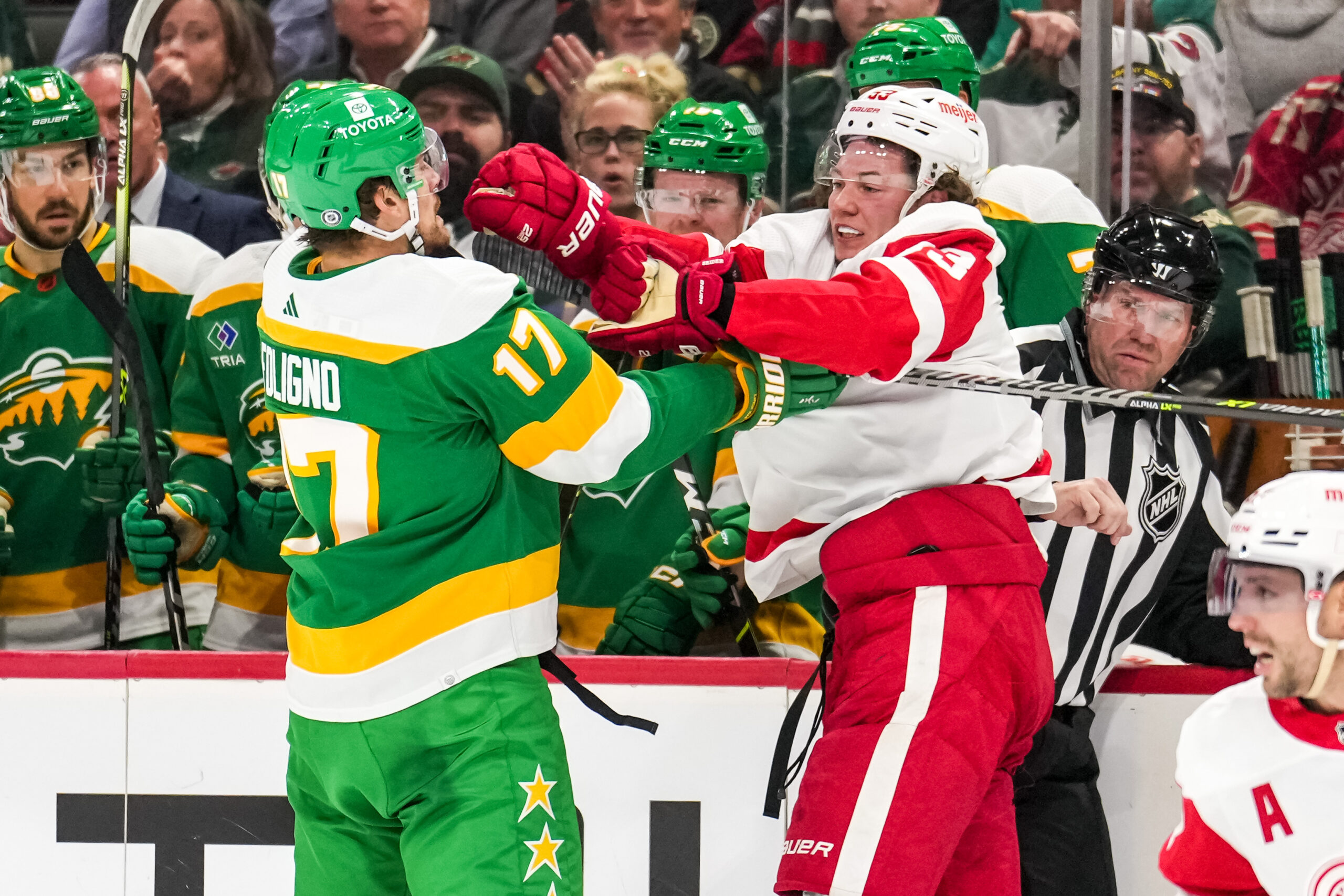
16 hours ago, ruttep said:
Watch the Canes ruin these white Whalers jerseys by wearing green helmets because reasons.
It's to be the cool and edgy team
-
I was at the Kings-Penguins game last thursday and i realised that they were pushing their alternate jersey a lot. Everytime a celebrity came on the screen to cheer them or the interviewers themselves were all wearing the white alternate. Seems like a good indication it might soon become their permanent look, along with a matching black one


2024-25 NHL Changes
in Sports Logo News
Posted
The last thing this league needs in term of aesthetic is yet another red & black team