-
Posts
567 -
Joined
-
Last visited
Posts posted by Nordiks_19
-
-
2 minutes ago, tBBP said:
They were trimmed with silver to mark their 25th season (Silver anniversary). It was only a one season thing
-
 10
10
-
-
1 hour ago, PlayGloria said:
I will never understand how the Caps still have that damn piping. Especially with the jerseys that they have from their history to choose from. They continue to wear literally the worst jersey of their history.
And their Reverse Retro only helped to solidify that point. They would be in the top 10 also of they used it and made a matching white with it.
-
 2
2
-
-
11 hours ago, mjd77 said:
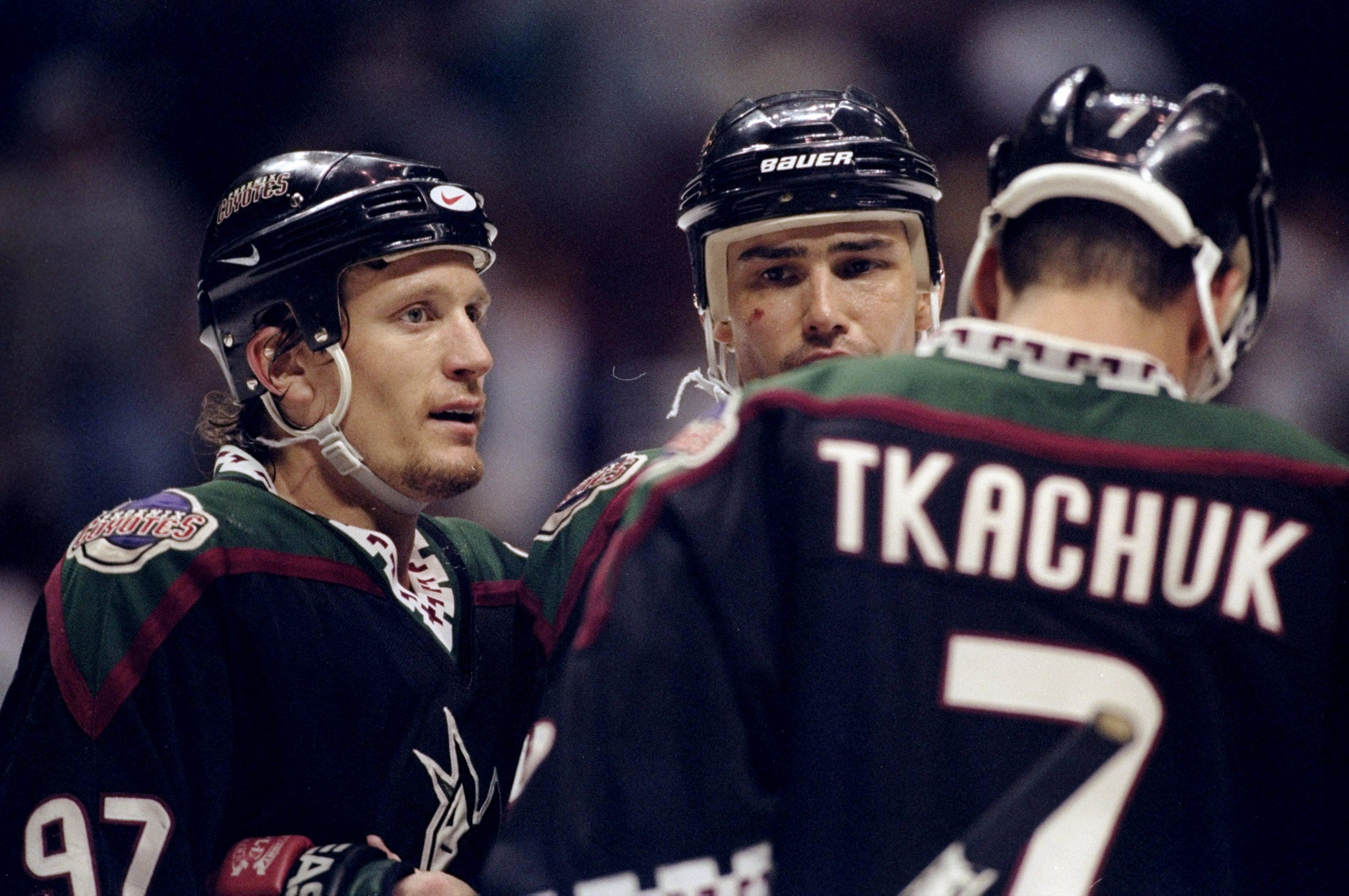
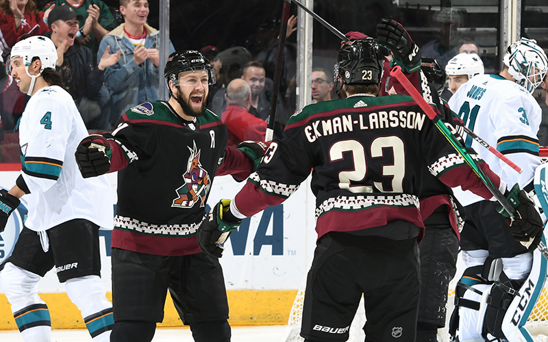
I'm sure I'm in the minority, but I wish they'd get rid of the Kachina (too '90s for me) and the howler and completely start over.
And move them here in Quebec, we'll gladly take them !
-
 2
2
-
-
39 minutes ago, NYRFan said:
Another look at what is sure to be an instant classic.
It's been mentionned, but the only thing to fix would be by adding a thin ice blue line in the collar, like the Oilers or Devils did
-
 7
7
-
-
2 hours ago, Ridleylash said:
Black Kachina is actually their official home sweater since last season so the howling coyote was pretty much dead at this point
-
On 7/13/2021 at 11:08 AM, spartacat_12 said:
Also, the Coyotes change has been known for a long time by anyone paying attention. They already presented their new head coach with a Kachina jersey at his introduction, and we've seen plenty of marketing material using the logo.
The black Kachina is actually their official home sweater since last season. Weird that it passed under the radar here.
On 7/13/2021 at 3:17 PM, squamfan said:in the first 4-5 minutes of this video he says it.
@2:50
Never heard of this guy, is he at all legit ? Or ishe just another guy telling his opinion or what he thinks might happen ?
-

The Oilers should copy that and there you go, one of the best set in the league.
How can't they figure that out but their AHL team can ?
-
 7
7
-
-
On the helme, it's not "so" bad, we'll have to get used to it.
When it's gonna start being added to jerseys, it's gonna be another level..
-
 4
4
-
-
5 hours ago, Patchey13 said:
I don't care what anyone says. The Bruins set is perfect aside from the yellow socks and should never be changed. It's a modern classic and probably one of the best jerseys of all time across any sport.
It was the best new design to come out when the Reebok edge templates arrived back in 07-08, almost every other teams took a step back, or stayed the same.
I still think that with yellow socks, it's their best look ever
-
 4
4
-
-
As long as it fixes the horrendous collars
-
 7
7
-
-
38 minutes ago, Ridleylash said:
I'd prefer if it were one of these;
The double-blue just works so well for Pens alternates. None of the Pens' gold-dominant jerseys have ever looked good; the double-blue gives them a nice alternate option that's entirely unique from the rest of their lineup, and it's I think the only design the Pens haven't thrown back to yet besides the RoboPen jersey.
I always tought they bring this one back for their next Winter Classic
-
43 minutes ago, Mr. Krabs said:
Per their Instagram, the Penguins are confirmed to be wearing their gold alternate uniforms this postseason.
Because why wear one of the best set in the league when you can wear your ugly alternate ?
-
 5
5
-
-
Imo, the Bruins set is perfect as it is, in fact i think it's their best set ever (except the black socks). Shame that they think about dropping it.
-
 12
12
-
-
11 hours ago, AFirestormToPurify said:
Tick one of the following boxes
□ Yes
□ Also yes
□ All of the above
Nope, they finally made the right move. The only thing they need to do now is add a blue line on the road jersey, and make the numbers blue
-
 7
7
-
-
Hopefully the Sharks will keep their much, much, much better Throwback jerseys around and make a full switch within 2 or 3 years. But after reading the Jersey watch, looks like i'm wrong..
-
 8
8
-


2021-2022 NHL Jersey Changes
in Sports Logo News
Posted
Not sure about burgundy names, i think it would be better in blue, for television and all, but maybe i'm wrong. I'll wait to see it in action before making a judgment. But it's still a more than welcome change