


Nordiks_19
-
Posts
567 -
Joined
-
Last visited
Posts posted by Nordiks_19
-
-
All right i've checked their stock and realised my cousin has a vintage jersey made by them.
Holy :censored:, *i'd like to retract my previous comment.
-
1 minute ago, Ridleylash said:
Well, already not off to a great start.
Well, i was hot expecting them to win that contract. It's weird but who knows they might knock it out of the park.
-
 2
2
-
-
I guess i see now why they didn't go with any of those. You can hardly distinguish the black and the green, especially on the second prototype. Maybe if the added a brighter green, or switch the green and black it would look way better
-
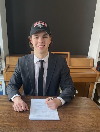
The Ducks used their original logo on their hat when they announced the signing of a new player.

Goes along with the rumored rebrand coming in for their 30th anniversary next season
-
 1
1
-
-
11 hours ago, adsarebad said:
When the new uniform supplier takes over, i hope the first thing they do is removing the :censored:in laces that serve no purpose
(sorry to hawks fans, myself included, for this vomit inducing photo)
-
-
second on list, the diaper tail, and the hem stripes that also follow the diaper shape, like a wave

-
Also the enormous/double toned collars, been ugly since day 1.
-
4
-
-
I think it's the first time the Ducks use this kind of hat, instead of the webbed D.
Not sure if it means anything but it keeps going with the rumored rebranding.
-
They said that last time, they'll probably do another batch in a year or 2.
Hopefully though
-
 1
1
-
-
12 hours ago, 63Bulldogs63 said:
Anniversary logo. They unveiled it some time during tonites Eye5 matchup and it was posted on their socials around 745 ish.
I doubt it'll be just that. An anniversary logo to start then around the draft or after, teasing of a rebranding maybe
-
The Ducks posted this on Facebook. I feel a rebranding announcement. Kinda odd in the middle of the season however
-
 1
1
-
-
32 minutes ago, _RH_ said:
Carolina going rwrw tonight. I don't think I'd seen it before, but I must be out of the loop because a google search shows them using this combo previously:
IMO it's a fine look, but not great against a team like the Caps with so much red in their color scheme. What are the rules about both teams wearing colored helmets? The other times I can remember white jerseys with colored helmets in NHL are Buffalo and Detroit reverse retro.
Carolina has also recently gone brbr:
Have we seen bwbw, bwrw, or rwbw?
They've done that a couple times this season. Hopefully it won't last. They also went with black pants with their road unis. Again, hopefully it won't last
-
1
-
-
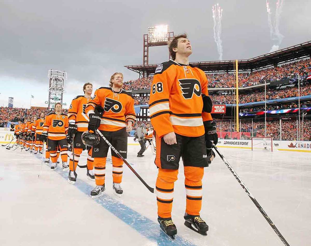
Damn, once again, the Stadium Series jersey are horrible
-
 2
2
-
-
Amazing. I wonder how they'll manage to do a 4 division matchup however. Like, what happens if both finalists are the Western division ?
But it's still amazing
-
43 minutes ago, DTConcepts said:
I mean… Wouldn’t be the worst alternate in the league. *cough* dallas *cough*
* New Jersey has entered the chat *
-
1
-
-
Maybe something based on their 2012's winter classic look, but with white and no contrasting nameplate ? They didn't mention it was a " brand new " design so who knows ?
-
 1
1
-
-
Sure is an improvement over their current alt jersey
-
25 minutes ago, DTConcepts said:
-
2
-
-
1 hour ago, HopewellJones said:
Add me to the list of people who want the Capitals to return to black/blue/bronze. It looks so much better.
And it feels more unique. No other teams in the league has these colors. As their current color scheme is just a reverse of the Blue Jackets, with red more predominant instead of navy blue.
Count me in as well in that list. I wouldn't care the 90's throwback with this one as an alternate or the other way around. But i feel like they'll go with the We won a cup in that look road and keep their current look
-
1
-
-
Yesterday's game between Minnesota and Detroit was one of the best looking game in recent memory
-
4
-
1
-
-
Pittsburgh vs Nashville and Pittsburgh vs San Jose can also go in the forgotten SCF category
-
3
-
1
-
1
-
-
15 hours ago, TaylorMade said:
Their 30th anniversary is next season, so i wouldn't be surprised if they rebranded as soon as next year
-
I like the white C on a black jersey, but they should definately add a red line in the middle
-
4
-
-
On 11/26/2022 at 9:08 PM, DTConcepts said:
Good lord, these are gorgeous.
Now there's no more reason they can't add a blue line.
Also, that font needs to come back
-
2
-
-
On 11/12/2022 at 9:50 AM, maz said:
The idea that the Rangers somehow own the idea of putting your name diagonally on a jersey always has and will be ridiculous to me. (And I say that not as a Pens fan, but as a fan of the look. I loved when Colorado did it, for example).
Having that been said, IIRC, original Pens jersey in 1967 featured this because their first coach was a long time Rangers player and coach, and he liked the look of it, so he asked if the Pens could do it. So there is a modicum of truth to the idea coming from the Rangers.
Agreed on the fact that a diagonal script isnt "owned" by the Rangers, but i think it's the same way as when the Wild unveiled their green jersey in 2017. First thing people said is that it was a Habs ripoff, even if a large stripe in the middle of the jersey isn't owned by the Habs.
-
 2
2
-
-


:no_upscale()/cdn.vox-cdn.com/uploads/chorus_image/image/71865130/1454677052.0.jpg)
/cdn.vox-cdn.com/uploads/chorus_asset/file/24357904/1450188235.jpg)


2023-24 NHL Jersey Changes
in Sports Logo News
Posted
Pretty sure they'll rebrand after Ovi retires, since they'll want to associate this look with the greatest goal scorer of this generation. The only thing they won't be able to change is that Ovechkin scored his 802nd goal wearing their RR. Otherwise, their current look will forever be associated with Ovechkin, and they'll want you to remember that, no matter how bad it is