


Nordiks_19
-
Posts
567 -
Joined
-
Last visited
Posts posted by Nordiks_19
-
-
17 hours ago, henburg said:
The matte helmets are sweet, really complements the look. I hope that NHL teams continue to play with helmet finishes and color combos, its such an otherwise ignored part of the uniform in most sets and now even moreso in many cases due to team branding being subbed out for a random corporate logo.
I'd take matte helmets over chrome anythime
-
21 hours ago, Ridleylash said:
If they wanted to keep that jersey around, they could've made that their alternate this year instead of their former home red, like Minnesota did with their RR 2.0; but they didn't, so clearly it wasn't popular enough to bring back.
The anniversary reds, though, were apparently popular enough and sold so well as to really make the Canes look at it and the white counterpart for use as a major part of their future uniform lineup. That, to me, suggests it's far more likely any new red Canes jersey would have a strong resemblance to that original red Canes jersey.
Probably yes, but i feel like they took the easy road for an introduction of these for an eventual switch to those full time (everyone was expecting a black version of their original red, wich would've sold like crazy) but since it didn't sell well they backed out at the last minute.... for now
-
We keep talking about the 'Canes going back to red full time or how they need a matching uniform but let's not forget that these are still lurking in the shadows

-
 1
1
-
 1
1
-
-
Something like the Moosehead's jerseys would work perfectly for Minnesota.
-
 6
6
-
-
10 hours ago, chcarlson23 said:
(And geez, how many times is this discussion going to keep coming back up?)
Don't worry, in a year or two when they inevitably switch to the North stars look full time, this discussion will be put to rest for good
-
2 hours ago, Sport said:
It's a great color scheme that they should readopt full-time. My only issue with this alternate is it's close enough to the originals that it begs the question why not just wear the originals?
Why ? Here's why :
-
1
-
 1
1
-
-
Switch the logo with the original Mighty duck that's a 10/10
-
5
-
-
13 hours ago, YELDARBfield said:
When's the last time there was an NHL regular season game with both teams wearing dark helmets? I'm getting flashbacks to my days working in the SPHL, where every team had just one set of buckets, and most likely black or blue.
Any game last year when the Hurricanes had their red helmet on the road
-
1
-
1
-
-
Not a fan of the C patch (and pretty sure the A patch as well). But overall smart move, only a matter of time before the switch to North Stars look is done
-
2
-
 1
1
-
 1
1
-
-
Flames and Jets went on color vs color for their Rookies game. Really eye pleasing to see
-
6
-
-
3 hours ago, ruttep said:
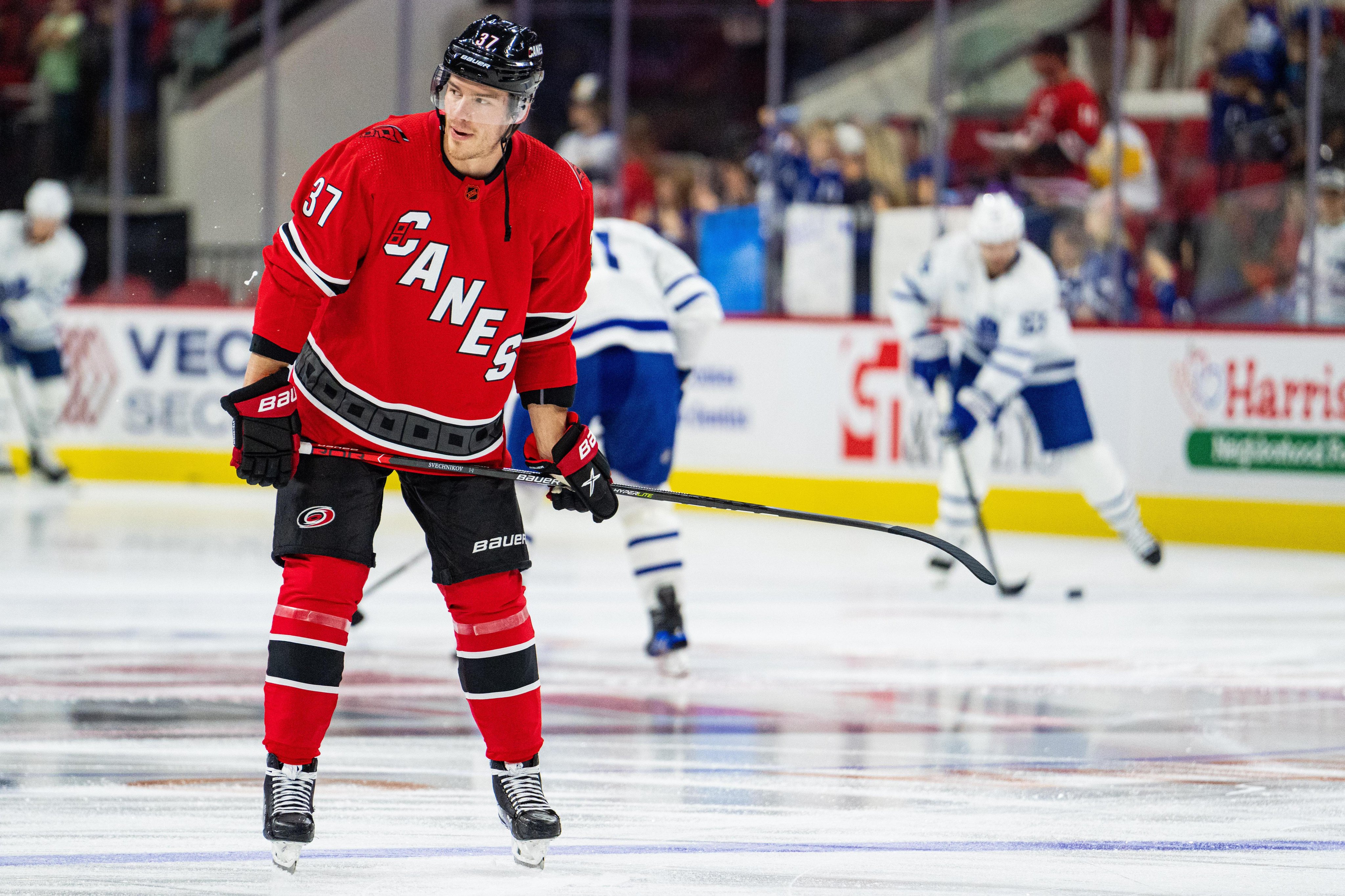
Also, the Canes announced that they're bringing back the 2017-2022 red jerseys instead of keeping the throwbacks. Huge mistake imo.
https://www.nhl.com/hurricanes/news/canes-announce-2023-24-uniform-schedule
Probably a matter of time before their original look comes back full time given the popularity it had. But good move to bring back the 2017-22 red. I know it's not a popular opinion, but i always tought it was their best looking jersey ever.
Anything but their black one actually
-
1
-
1
-
-
On 7/26/2023 at 4:17 PM, M4One said:
Panthers anniversary logo.
Now bring this panther as their official logo instead of the boring one they have, bring back their first Rever retro and a matching white, and call it a day
-
5
-
-
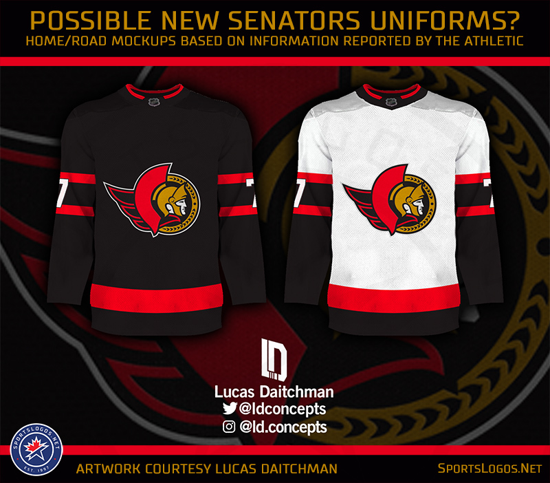
On 7/23/2023 at 12:22 AM, Morgan33 said:
According to Icethetics: the Rangers and Wild could be seeing the return of their Reverse Retro 2.0 jerseys as alternates.
Correction : Icethtics didn't specify wich of the RR for those teams. But i remember seeing that the Wild would indeed bring back the green one. Not sure about the Rangers however
-
I know it's only a tribute to the Nuggets, but i wouldn't mind seeing an alternate logo/jersey with these colors, i like how the yellow pops without being too agressive.
-
4
-
 1
1
-
10
-
 1
1
-
-
-
13 hours ago, mcj882000 said:
I thought that was Jon Moxley?
Not bleeding enough
-
 1
1
-
-
Carolina vs Dallas would probably be one of the most visually pleasing Stanley cup final ever
-
2
-
3
-
-
Why are people upset about the Flyers ? It's a subtle change, no big deal.
-
1
-
-
15 hours ago, chcarlson23 said:
Looking at those photos the Devils old white sweater is actually a little disappointing. It feels like way to much black, when it should be a little more red heavy. I guess that’s why I like the wider stripes on the new set, but the lack of tail stripes is awful. They look like freaking nightshirts on the players…
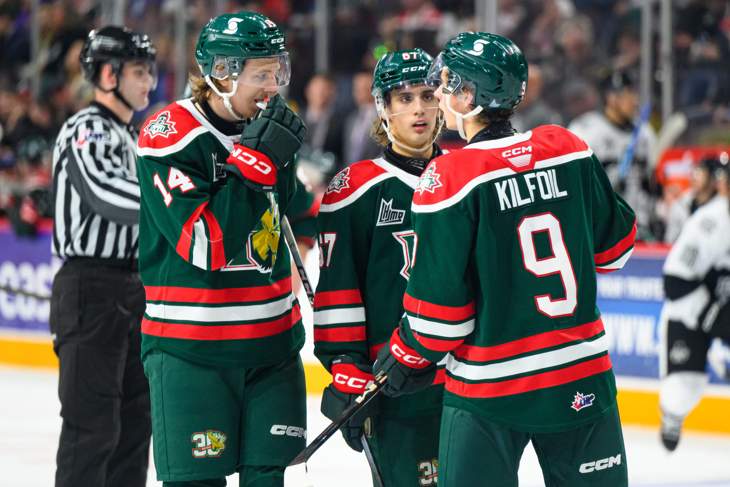
The Quebec Remparts really managed to perfectly balance the red and black on their white jersey, wich is clearly inspired by the Devils old look.
-
9 hours ago, CreamSoda said:
One of the biggest misses of late has been the Devils new sweaters.
it just looks so bad without the hem stripes and the super huge arm stripes.
what a downgrade from their classic uniform.
Say what you want about Lou, but he knows what a clean, classic and untouchable look should be like. And i feel like they'll stick with this look for their Hughes-Hischier era
-
15 hours ago, BuckDancer said:
Something like this, but with a different font?
I was really hoping they'd go that way for their Reverse Retro 2.0. Hopefully, IF there's a 3rd round, they'll go that road.
-
1
-
-
15 hours ago, KittSmith_95 said:
The Wild should bring these back or at least do the green as a throwback jersey. Everything they've done since shedding this identity has always had issues with colour management. I even liked the updated Edge variant of the whites!Switching to Red full time at home was a huge mistake. Pretty sure they'll dust it off when they'll get a Winter classic match (2025 maybe)
-
23 hours ago, spartacat_12 said:
I liked the updated 2D when they unveiled it, and have a St. Patricks Day hat with the logo on it. Most of the fanbase however, seemed to never fall in love with it. When discussions about the logo were happening leading up to the rebrand, anytime I'd see someone suggesting they use the updated 2D instead of the original they'd quickly be shot down by the majority, so I can see why the team went the safe route and brought back the old one relatively unchanged.
I think the ideal logo is something in between the two. I like the cleaner, bolder lines of the updated version, but it also felt like it was missing something without the coming from the back. Something similar to the logo on this concept/mockup would be great.
They really missed the opporunity by not adding black on the arms like this one. But it's still years ahead of their Edge look
-
3
-
-
They had one job, get rid of the awful contrasting nameplates that no one like, and of course they failed to it
-
2
-


2023-24 NHL Jersey Changes
in Sports Logo News
Posted
I'll never understand why the went with white pants... Ruined the look