


-kj
-
Posts
14,791 -
Joined
-
Last visited
-
Days Won
10
Posts posted by -kj
-
-
Strange highlighting.
-
How is the Astro's new logo not the epitome of Lazy? It's the Padres logo with orange and a generic star in place of generic interlocking letters. I'm sure many long days and sleepless nights were put into that peice of artistic genious. If they wanted to look like every other team in the MLB, why not go all the way and replace orange with red? Personally I think every MLB team should be required to use those colours with a roundel as a primary logo.
its a well executed idea with an aesthetic that fits traditional baseball and includes some of their past visual equity. its appropriate, timeless, well built, will look great and be consistent across all applications and gives them a modern identity that replaces a sloppy, overly complex, turn of the century identity. the new colors help separate them from almost every other MLB team giving them something that is really unique and memorable.
You're good with spin, no doubt.
I'm failing to see that star as "well-executed".
-
I'm not sure how it's unbalanced. To me, it's *very* balanced:
White helmet
Navy shoulders
Columbia body
Navy pants
White socks (with stripes, yes)
Good bracketing.
But, yeah, lose the navy-topped socks with the navy pants. Leotard look is dumb.
-
Eh, close... the navy pants are much better with those, except they'd need all-white socks to complete the look.
(I know you're not supposed to argue things in here, but I'm pretty sure most everyone else hates the navy pants.)
-
Neither the amended home nor the new away kit were used in the 2003-04, and in 2004 the club relocated to Milton Keynes, and rebranded to the Milton Keynes Dons.
...and out of the ashes of Franchise FC was born AFC Wimbledon.
-
I don't get the love for those jerseys; they were basically equivalent to the Oilers' ghost stripes, minus the apron strings.
The big star jerseys were fantastic.
-
It's totally the right look for the Stars. Beauty.
-
I'd say that Cal Ripken Jr. looked most appropriate in a Rays uniform. I've seen a few pictures of him in an Orioles uniform and it's just weird.
Um...... what?
-
I don't want to quote a huge pic but I really like that Patriots uniform. If you replaced the royal blue with navy and used the current font I think it would be a winner.
I dislike the Navy. The Patriots should be RED, WHITE and BLUE, not burgundy, white and navy. I can see not liking the italics/drop shadow numbers.
...except, of course, that the official blue in the US flag is what we would generally call "navy".[citation]
-
The Devils' black and red is head, shoulders, and some ribs above the red and green.
-
I guess I'm not sure which one's the unpopular opinion, because I thought I was the only one that absolutely hates that "Twins" script.
I know I'm one of the few that misses the road pins.
-
Damn, that's still a gorgeous uniform.
-
Not sure why Robitaille in a Kings jersey would be wrong.
-
Those Nike uniforms are miles better than any Adidas kit they've ever worn
At least they're blue. The new Quakes seem to think they're DC United or something.
-
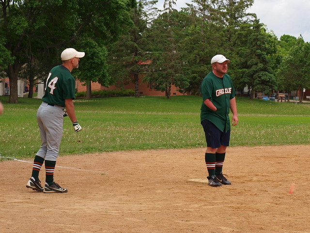
For the sake of curiosity, is it the angle of the picture or is he missing his right hand? If so, does he bat with a prosthetic and how effective is that for him? I have always been amazed by those that compete with them. I was at a Dunhams sports a few weeks back and met an Iraq War veteran that lost both legs just above the knee and both arms above the elbow and he was fitted with the blade prosthetic (the upside down question mark) for a marathon he was competing for. Just wondering.
He is. He doesn't wear a prosthetic for softball; he bats one-handed and transfers his glove off his hand to throw the ball. I don't know if he has one he uses elsewise, but I've never seen him with one. He's a pretty good player for our level.
-
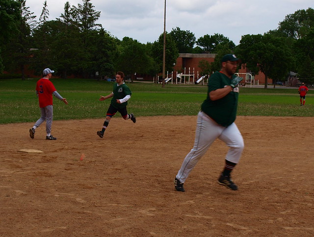
In "competitive" softball leagues, pants are pretty much a requirement, due to the enforcement of sliding rules and the need to slide. In rec or co-ed leagues, I find that it doesn't really matter since people don't always go all-out and slide unless it's 100% necessary.
I don't slide much (and it's hilarious when I do), but there have been times in the past I've tripped or other such shenanigans and have gotten cut up a bit on what passes for dirt on our infields. Even with the pants it's still possible; yesterday, the third baseman on one of the teams we played ripped the knee of his tracksuit pants (or whatever they're called) trying to play a grounder.
-
Also, I found playing in longer pants to be more comfortable.
I definitely feel the opposite. I wear pants for softball (yeah, yeah, it's overkill... but our fields are also a bit rough) and I definitely feel more comfortable with the cuffs up. I bought a pair last year that doesn't have elastic in the cuffs--I couldn't find what I wanted with the elastic--and they're always drooping on me. Meh.
Oh, and I like to show off our custom stirrups. Even guys who wear shorts like wearing them.
(Yeah, the fat guy is me. Run, fatboy, run!)
-
Here's another unpopular opinion: I hate the knickered baseball pants look. Wear your pants to your shoes like an adult male. I don't like the dumb baggy pants look either, but this
I don't know that your opinion is so unpopular these days, except maybe on here. Of course, I can't agree with you, because...


It's about color balance, I think. I find that more aesthetically interesting than the white pants all the way down.
-
The "Picasso" logo was the best part. I could have done without the green shoulders (plain shoulders would work just fine since the rest is a bit busy), and they needed a better name/number font. But that trim pattern was fantastic.
-
The pre-Edge version of that jersey was way better.
That's not exactly a high compliment.
The original Thrasher jerseys with the "wing sleeves" were fantastic.
-
My opinion on these wavered over the years, I'll admit, but in a "don't know what's there 'till it's gone" epiphany...
I think these were some of the neatest uniforms in the NHL.

I think if Atlanta were to have made a white roadie in that design to match and/or emphasized powder a little more, it'd have been a much more solid identity.
Oh, no. No no no no no. The one-armed monsters were flying-V bad.
-
I suppose enforcing the existing rules would help. The type of stuff that passes as "checking" in the NHL is amazingly terrible, especially checking with the hands/forearms/elbows. Then again, it's been taught that way through all levels for years and years. Having been a USA Hockey ref, the amount of stuff I watch NHL players get away with is amazing.
-
As we all know, that didn't hurt at all.
-
Yellowknife Rangers in 2048!

Unpopular Opinions
in Sports Logo General Discussion
Posted
I swear the above post was not made by a dupe account of mine... even though I agree with nearly all of that.