


Sport
-
Posts
19,478 -
Joined
-
Last visited
-
Days Won
159
Posts posted by Sport
-
-
The Simpsons did two golden age episodes on inherently flawed urban renewal schemes and we didn't heed either one.
Marge vs. The Monorail and what was the other one?
$pringfield
Of course. Duh.

Every time I drive by the new, big, ugly, down-town casino in Cincinnati I think about that episode.
-
Fat Lindros in a Flyers jersey he never wore at a charity alumni game.
 .
.Christ! More like "Players in the wrong weight class".
When was this? He look pretty fit at the winter classic alumni game last January.
You're right. It could be a bad angle in that picture.
Here's him about a year ago

-
The Simpsons did two golden age episodes on inherently flawed urban renewal schemes and we didn't heed either one.
Marge vs. The Monorail and what was the other one?
-
I think we can add Phil Anschutz to the list of "NHL Owners No Longer Interested In Owning The Phoenix Coyotes". I know the Kings are internet-cheeky, and I understand the disclaimer at the top of the post, but holy crap, this is on the official website of an NHL team.
Holy crap, those were just awful. All the new Coyote templates are the same to begin with. The Seattle one is so much of a Starbucks ripoff, there's no way a pro team would be allowed to play in Vegas, the Quebec one looks eerie similar to the New Orleans Fleur-de-lis, and all the work for the Toronto one is just putting a blue maple leaf in the picture (possible trademark violation).
Woooooosh. The point wasn't that the concepts were bad. The point was that the Los Angeles Kings official website used them to mock the NHL's league owned franchise. You expect to see that on fan blogs and hockey writers, but not on one of the league's franchise's websites.
The Kings also mocked a Columbus Blue Jackets charity event for pediatric cancer a couple weeks back so I don't think whoever runs their social media division is afraid of touching on anything. And it looks like the organization is okay with letting it happen. In a way it's funny and refreshing to see that kind of open thinking from a professional sports organization when most of these operations are buttoned down and follow the PR handbook, but I think targeting kids with cancer is beyond the pale. The Coyotes being the subject of their derision, I have no problem with.
-
Surely the new Seattle arena will be hockey compatible, right? They're not going to make the same Key Arena/Barclays Center type facility designed to squeeze hockey out?
No, they're making it hockey friendly. So they won't have another Key on their hands. You can kind of make out where the rink would sit by that image. One interesting aspect though is it appears sideline seats on the glass for hockey will all belong to those lower level mini suites. Definitely a new and somewhat disturbing direction for hockey to go in (not that it's not disturbing for basketball too).
That's good news.
Those lower level suites sort of look like what Quicken Loans arena has, though the plans for Seattle looks like they'll be even closer than they have them in Cleveland.
Here's a picture of the basketball and hockey setup.

That'll look weird in Seattle when the hockey glass is that close to those box seats.
-
Surely the new Seattle arena will be hockey compatible, right? They're not going to make the same Key Arena/Barclays Center type facility designed to squeeze hockey out?
-
Phoenix to QC really isn't that big of a problem in terms of realignment. QC takes Detroit's place in the East, Detroit moves back to the Western Conference and they take Colorado's spot in that divison, Colorado takes Phoenix's spot in that division.
-
15,000 reported for last nights Coyotes-Blue Jackets tilt. Yeah right. That place was dead.
BTW, are any of you like me and you pronounce Coyotes as Kai-yotes in a silly, old-timey prospector sort of way? This silly organization deserves a silly pronounciation.
-
I went to bed when the Jackets went down 2-1, but yeah you could tell there was a concerted effort not to show the crowd. The only time you could really see how empty it was was if the puck went into one of the near corners and the camera guy got a little too much headroom with his shot.
Every time they came back from a commercial or needed to show sponsors or something they used shots of the westgate mall (also empty) or some fountain where normally they'd use an overhead shot of the ice and crowd.
-
Shame they chose the homeplate logo to forever be on their first cup rings.
I would've gone with a big crown surrounding the cup, all studded out. They are technically the Kings of the NHL right now. Wear the crown for real.
-
I like how the Buccaneers look when they wear their white pants. They don't look better than their pewter pants, but I think it still works as an alternative, especially when they go all white.


-
Joey Votto on rehab with the Dayton Dragons

black and kelly green is a really good, really underused color combination at the highest levels of professional sports.
-
I don't fault Kansas City for not rushing to the arena for these games. They're two neutral teams and it's preseason. I turn down preseason tickets every season and I have a rooting interest.
Would Kansas City be a better market than Phoenix? Without a doubt.
-
Could the numbers from this era look any cheaper? The Champion number font has to be one of the worst ever.
Segueing nicely into an unpopular opinion of mine: I like the Champion number font. It's legible and classic without looking too "blocky".
I love it, too. Should all teams use it? No. Did it look cheap when they made Emmitt Smith replica jerseys in that font? Absolutely. That doesn't mean it's not great for some teams. To me, a kid growing up in the '90s, that font IS the Buffalo Bills. Their jerseys really lost something with Logo Athletic took over and gave them standard block. I wished the new Bills jerseys used that font.
I like Champion font too.
I don't know if this is also champion font, but the Bengals used to wear this font and I love it.
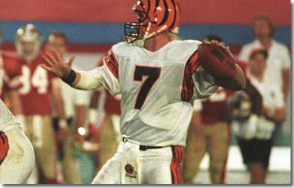
That is, even if it's impossible to find an accurate Boomer throwback.
-
Only fitting that I get to post this.


It's not entirely his fault, but

He was supposed to play his entire career here. The franchise was supposed to build a dominant team around him and he was gonna get a statue outside Nationwide Arena. Doug Maclean, and Scott Howson, combined with Nash's never quite living up to his expectations (partly due to never having capable teammates) led us to this point and it's unfortunate. I came to terms with him leaving months ago, but actually seeing it is hard.
On the plus side, looks like I made the correct choice a couple years ago with my Nash-Umberger jersey dilemma.
-
Ichiro actually looks really good as a Yankee
Unless you're name is David Wells, so does everybody else.
-
I wish they would drop the white paneled cap. That, and the white paneled batting helmets they caused, look ridiculous. Even if it has historical significance, that is a dumb looking hat. The all black hat looks great.
-
I absolute love the now "old" Charlotte Bobcats uniforms. Especially that shade of blue. One of the best looks in the league IMO.


An orange alternate with this set would look great.
Yeah that was a good look and they owned it. Now they look like 4 different teams at the same time.
-
Not sure how unpopular this is, but these unis are perfect. IMO these were the best unis in the NBA in the early '00s.


They were so close to being perfect. For starters, once that black uniform was introduced they wore it all the time. It felt like they never wore the far superior blue uniforms. Two, I would've made the wolf head bigger on the shorts, and I would've had the tree trim on both legs of the shorts. Three, there wasn't enough blue on the white uniform.
-

Greatest Hawks uniform of all time. I don't understand why anyone would want to bring back the McDonalds color scheme or the outdated Dominique era jerseys (Face it the tilted numbers/team name sucks.
Love the design, hate the bland, cliche color scheme. Those uniforms would look sharp in red, black, and yellow.

I love this, but I'd go with red names and numbers outlined in yellow on the white uniforms.
-
The Devils are like the Penguins. Their current color scheme makes so much sense for their nickname that you can't believe they ever ever wore anything else.
-
Scott Rolen with the Louisville Bats. Like all minor leaguers in the Reds organization, he even wore his pants high.

-
How about Jim Edmonds in Brewers throwbacks?

-
I really think the NHL needs to go down to just two conferences and that's it. Put each team in either the East or West and be done with it. As for teams going bye-bye everyone could argue that until blue in the face. Ever since Bettman has been in charge a lot of teams have came into the league that shouldn't have been (or moved to places they shouldn't have). The NHL is overpopulated as it is with 30 teams. There really should only be 24 teams at most. Teams like the NY Islanders, Columbus Blue Jackets (I live an hour south of Columbus, but honestly they are a joke), Florida Panthers, Anaheim Ducks, and Phoenix Coyotes have no place in pro hockey. Not saying that because some are in places where it's hot 85 percent of the year/ doesn't really matter Stanley Cup is always played in June when it's hot everywhere. You go to anywhere in Columbus and all you see is scarlet and grey. Heck most sports stores don't even carry Blue Jackets merchandise.... but point being, the NHL should be fixed, sooner than later. Just like baseball, it was better when there were less divisions and better rivalries. Do cities in the "Sun Belt" deserve hockey? Some have proven that they do i.e. Tampa, Raleigh. There shouldn't be two teams in LA, nor should there be three teams in the NYC metro area/send the Islanders packing. As the saying goes we can wish in one hand and crap in the other. But as long as Buttman is in charge just think the most rediculous thing and it will probably happen.
Completely untrue.

NHL Anti-Thread: Bad Business Decision Aggregator
in Sports In General
Posted
The Indianapolis 500 is actually the biggest single day sporting event in the world. In terms of attendance. Crazy, huh?