


DCarp1231
-
Posts
9,452 -
Joined
-
Last visited
-
Days Won
142
Posts posted by DCarp1231
-
-
12 minutes ago, ruttep said:

I see those and see the potential of these-
So close to greatness.
-
 6
6
-
-
Just now, ruttep said:
Disagree on that. Alternate pants/socks from a mono-color look should stay with said mono-color look.
I don't need the Packers to take a page out of the New York Jets' book.
I was going for a Browns-esque look.
-
3 hours ago, ruttep said:
I agree that all the yellow isn't great and this objectively isn't a good looking matchup, but I still have no real problems with it -- they gave us the best case scenario matchup for these two franchises, and that's all we could ask for.
I’ll be honest, I would’ve like to have seen Green Bay go white over green (from the throwback) for this game. More-so than color rush whites. Minimize the yellow.
-
 1
1
-
-
Would red/cr blue/red/blue be too jarring for Houston?
-
1 hour ago, ruttep said:
The white pants are the one thing that the previous uniforms were better at.
They could easily revert to those pants and there’d be zero issues
-
3
-
-
The Bengals (very minor) problems would be solved if they just used one pair of white pants with both orange and black striping
-
4
-
 3
3
-
-
I’m from Maryland and I gotta be honest…
I don’t know what the :censored: a “whipsnake” is.
Also, that tertiary logo is literally just a recolored Orioles sleeve logo
-
2
-
 1
1
-
-
Overall some pretty decent stuff this week. As a reminder- Just because two uniforms are traditional and “stand the test of time” it doesn’t mean they’re an automatic nod for Best. Especially when two of those teams share a color and both use darker primary colors.
Best
Browns @ Ravens
Purple and Orange work so well together. Props to Baltimore for not going all black below the jersey.
49ers @ Jaguars
Wow, Teal and Gold working off each other on perfect harmony. Weird, right?
Commanders @ Seahawks
Two very progressively modern uniforms putting out the ideal matchup. I was afraid Washington would go all white and Seattle all blue. They saved themselves.
Honorable Mention
Packers @ Steelers
“But two classic teams in classic uniforms!!” Blah blah blah. There’s too much yellow for me. Sorry about it.
Worst
Panthers @ Bears
I dig the orange jerseys and socks. Indifferent on the helmet. Carolina’s insistence on all black below the jersey can kick rocks.
Lions @ Chargers
Too much light blue and white. Not enough yellow and silver. Shame.
Saints @ Vikings
The mono-pants/socks combos are the killers here.
Wild Card
Jets @ Raiders
Not bad, but not great. Would’ve been a great opportunity for some New York throwbacks or at least green socks. Could’ve, should’ve, would’ve been an ALL TIMER.
Have at it folks!
-
2
-
-
Sam Howell is a damn good quarterback. It’s a shame Washington’s defense is becoming notorious for costing games.
-
1
-
-
I thought Commanders-Seahawks was a pleasantly surprising matchup between two very progressively modern uniforms

-
7
-
-
-
Huh, interesting.
-
Gosh, I just love BC’s uniforms. The black over grey is incredible stuff.
-
4
-
-
12 hours ago, BBTV said:
Yes, that's better than a truncated sholder-hoop, but I'd either drop the numbers, or experiment with extending the stripes all the way and going with blue-outlined white numbers to see if they're legible (not that it matters anymore.)
A redundant horseshoe could also easily fit there.
I suppose one could make the argument for the Titans. I wish the sword didn’t widen towards the sleeve end. There’s many things wrong with the current set, but the striping isn’t one of the them.
-
51 minutes ago, BBTV said:
Disagree on the first part.
Many NFL teams would look better if they dropped their TV numbers and pivoted their striping by 90 degrees so that more of it could be seen. Steelers, among others, could get away with this:
That’s fair and I do agree.
It wasn’t to this extent, but the Colts new alt (just the jersey itself) did a fine job. It was a happy medium.
-
1
-
-
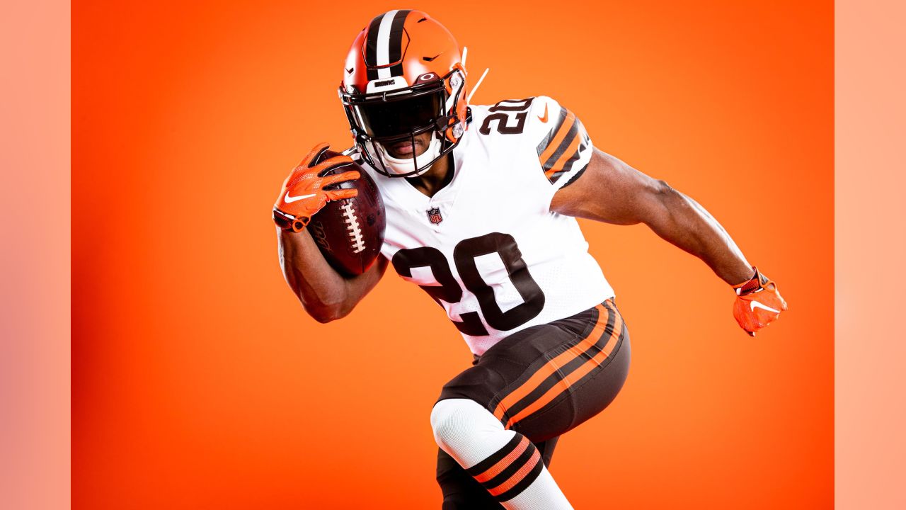
Listen, I don’t hate this, but what’s killing me is how whoever or whatever made this, they/it went through the trouble of giving all the background players the correct socks, but not the main focus player
-
2
-
 1
1
-
1
-
 1
1
-
 1
1
-
-
I have a feeling Washington goes all white against Seattle
-
9 hours ago, ruttep said:
Which teams, in your opinion, are fine as is?
Patriots
Chargers
Raiders
Browns
Bengals
Colts
49ers
Rams
Cardinals
Buccaneers
Panthers
-
1
-
-
Most NFL teams would benefit from UCLA style striping or just solid color uniforms.
-
Top tier stuff. Block font supremacy.
-
7
-
-
1 hour ago, Lights Out said:
They're just as bad as the Brady uniforms. They're the kind of uniforms you'd expect from Robert Morris or Samford, not the #2 NFL team on the Forbes list.
Whatever floats your boat. Saying this set that actually looks like a very traditional uniform is just as bad as the piping train wreck of the Brady-era duds is absolutely egregious.
-
4
-
2
-
-
20 hours ago, ruttep said:
That was kind of the point.
Fair. The Patriots are just completely embarrassing themselves with their current uniforms.
I’d rather have these-
Over the jumbled up mess of the Brady-era set
-
10
-
 1
1
-
2
-
-
8 minutes ago, oldschoolvikings said:
Incorrect.
Pre-2023 correct*
-
Ohio State suffering from Detroit Lions syndrome. Wearing an all grey uniform that is no where close to the shade of the helmet.
-
7
-
1
-
/cdn.vox-cdn.com/uploads/chorus_image/image/71456365/1243674183.0.jpg)


/cdn.vox-cdn.com/uploads/chorus_image/image/72414494/1503438445.0.jpg)


/cdn.vox-cdn.com/uploads/chorus_image/image/72860428/1789788786.0.jpg)


/cdn.vox-cdn.com/uploads/chorus_image/image/72859300/1790539133.0.jpg)
/cdn.vox-cdn.com/uploads/chorus_image/image/72859237/1790286174.0.jpg)


/cdn.vox-cdn.com/uploads/chorus_image/image/72468535/F1fErEBagAIewSx.0.jpg)


/cdn.vox-cdn.com/uploads/chorus_image/image/72835630/usa_today_21827102.0.jpg)


/cdn.vox-cdn.com/uploads/chorus_asset/file/11708351/usa_today_10481768.jpg)
DCarp1231’s Best & Worst Matchups of NFL Week 10
in Sports Logo General Discussion
Posted
The only times they’ve dabbled in monocolor were the CR all whites and those throwbacks. The all whites were done because they had to do it. Throwbacks are throwbacks. It’s not much of a reason to believe an uber-traditional team such as Green Bay would fall for the leggings gag.