


DCarp1231
-
Posts
9,452 -
Joined
-
Last visited
-
Days Won
142
Posts posted by DCarp1231
-
-
Tampa Bay’s all pewter is one of the best alternate uniforms in the NFL

-
 1
1
-
 3
3
-
-
Seahawks wearing the throwbacks against a heavy blue team like the Cowboys is a travesty.
Missed opportunity on Thanksgiving against San Francisco. Could easily wear them against Pittsburgh on New Years Eve.
”Wearing alternates against the wrong teams” allegations continue to run hot.
-
4
-
-
4 hours ago, Cujo said:
Chargers uniform is 100000000x better with white pants.
Give me powder blue pants and royal blue socks. Triple blue in full action.
-
I love every single one of the Chargers uniforms. Pure nirvana across the board.
If I absolutely had to pick the weakest one, it would be white-on-white.
-
1
-
 1
1
-
 5
5
-
-
While Colorado did indeed “improve” from last season, there’s just something poetic about the team :censored:ting the bed and losing 8 out the last 9 games after starting 3-0.
-
3
-
-
The Seahawks are probably the only team in the league who can pull off a grey away uniform right now
-
1
-
-
I wanna see this fauxback jersey worn with the regular blue-ish pants. Just for :censored:s and giggles.
-
 1
1
-
-
17 hours ago, Chawls said:
I know we’re not the biggest fans of Washington’s sleeve stripes, but if they’re gonna stick with them, then why not replicate those same stripes on their pants? The white jersey’s stripes can be on the white pants, and the burgundy jersey’s stripes can be on the burgundy pants.
The problem is they’d have to wear them in monochrome fashion. Neither striping would match up with the opposite jersey.
The simplest and most effective change would be a singular gold stripe on the burgundy pants and a singular burgundy stripe on the white pants.
-
2 hours ago, Carolingian Steamroller said:
Yep, this is most probable.
Interestingly, in the early 60's, when the Cowboys were wearing those white helmets and contrasting sleeves, the Washington football team wore some gold pants on the road.
Props to @HailGoldPants for this-
I honestly think it would work well. The attention moves away from the black accents and focuses on burgundy and gold.
-
7
-
-
5 minutes ago, ruttep said:
I'd put it on all-white -- they're facing the Cowboys in their Thanksgiving throwbacks
Ah shoot. That’s right. I forgot about their throwbacks. I’m hoping Washington wears burgundy pants at least. Best case scenario is they bust out the mythical gold pants.
-
4
-
-
I’d put money on Washington in all burgundy tomorrow
-
 1
1
-
-
These helmets would’ve looked better with white numbers
-
7
-
-
17 minutes ago, Discrim said:
Honestly, I think I'd like to see the Saints roll out a gold road jersey instead of white. Much like I think the Seahawks should've kept the gray jerseys and dumped their whites.
You lost me in the first half, but gained my attention in the second half.
-
This can stay in the vault
-
6
-
1
-
-
4 minutes ago, Carolingian Steamroller said:
Wasn't my favorite but I did think there was a place for this:
Orange socks are needed and it’s an average look
-
1
-
-
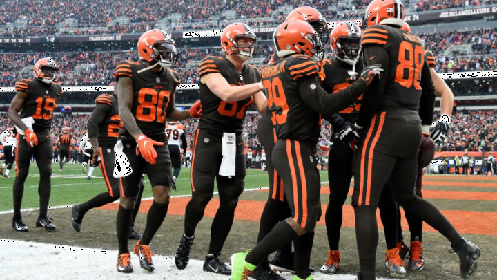
No more turd cosplay from the Browns? Hell yeah
-
2
-
-
Not a huge fan of any of the identities. Denver probably the strongest and Carolina the weakest.
-
15 hours ago, ruttep said:
A bonus of repurposing the WFT look is that it would remove black from the uniforms, undoing the loophole that allows them to wear one of the worst uniforms of all time
I’m actually surprised they’re not as adventurous as the Jets with their black uniform elements…. and I kind of want them to be? Not because I’d think it would look good. I’m just curious to know how bad it would look.
Might as well try out black socks with white jersey and burgundy pants. While they’re at it, swap the burgundy facemask for the black one. -
5 hours ago, DustDevil61 said:
The Washington Commanders/Football Team/[Redacted] uniforms should never have changed, as has been said above. Goes to show that, even when he’s out of the picture, Dan Snyder’s stench is still found on the organization.
(BTW, has there been any more news about the new franchise ownership group looking to move away from the Commanders name?)
Nothing more than low level betting sites putting out name prediction odds.
Even if new ownership wanted to change the uniforms, we’re still looking at at least 2 more years of the current set. Sure the 5 year rule resets, but the process takes 18-24 months. This is even if they’ve already had internal branding conversations.
-
1
-
-
36 minutes ago, CaliforniaGlowin said:
I just realized the main Commanders color looks almost brown compared to the uniform.
I yearn for this shade again-
-
10
-
1
-
 1
1
-
-
5 minutes ago, MJD7 said:
Potential hot take incoming:
I’m not sure if people would consider this “monochrome,” but if so, I think this is a much better way to go about it:
Teal socks would throw off the balance completely, but this looks just fine as an occasional combo. If the jersey matches the pants, then the helmet should match the socks and (ideally) be a different color. Buffalo pulled this off on Monday with white/blue/blue/white, & I could see the Ravens, for example, doing something similar with black/purple/purple/black.
To tie this point in with the Texans news, I actually really like that look, but it would be even better with red socks to match the helmet.
I love this look for Jacksonville, but I’d also say their teal/white/teal combo is great as well.
-
4
-
-
Y’all when it comes to Houston using a smidge of light blue in any application-
-
1
-
6
-
 1
1
-
-
Day
 of waiting for Jack Del Rio to get canned and thrown into the Potomac.
-
1
-
-
32 minutes ago, NYCdog said:
Needs red socks but this is FYAH
Also note admin got the Color Rush pants mixed up with the Road Blue pants (see striping) lol
This makes me wonder if this a preview of their rebranded look next season to test the waters on a red helmet, blue jersey home look.
Hmm, needs red socks.
The more I look at the red helmet, the more I just do not like the Texans logo. The white outline isn’t enough to stop the blending of the reds. Same goes for the regular blue helmets. I’m also not a huge fan of the initial white helmets that so many clamor for.
I think the issue lies within the logo. It not good and never has been.


/cdn.vox-cdn.com/uploads/chorus_asset/file/23406608/1348156112.jpg)


2023 NFL Regular Season Through Super Bowl LVIII
in Sports In General
Posted
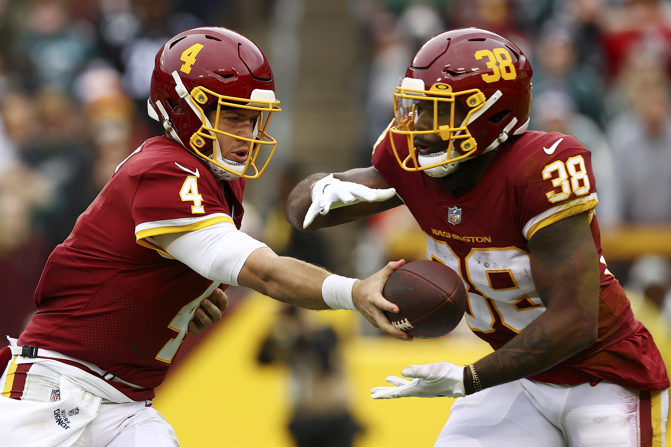
I don’t understand the Washington fans who are foaming at the mouth for a new QB in the off season. Sam Howell is the best this team has had since Cousins and even pre-injury Alex Smith.
He is statistically one of the best in league (including 1st in passing yards) and is 100% not the reason the Mandies lose their games. It’s the horrendously coached and played defense constantly giving up big plays.
Get the hell out of here with this “Tank for Caleb Williams” horse :censored:. Get Howell the protection he is in dire need of.