


Ben in LA
-
Posts
864 -
Joined
-
Last visited
Posts posted by Ben in LA
-
-
1 hour ago, AndrewMLind said:
*when the Rams introduce...Yup they’re definitely introducing new threads...hopefully soon.
-
 2
2
-
-
2 hours ago, BBTV said:
Gold helmets and white pants is not a good look. I dig the jerseys though - especially the red version.
To be fair - and I can be wrong since I’m about to type something before researching it - but weren’t the original 1950s jerseys worn with a silver helmet?
EDIT: MY BAD

-
3
-
-
20 minutes ago, Sec19Row53 said:
Not to mention 'angry mascot logo' is played out.
I actually like that. I’d make him aqua though
-
On 6/23/2020 at 2:02 PM, WSU151 said:
I watched MLB Network's replay of an 1985 playoff game between the Cardinals and the Dodgers at Busch II; I think the white outline around the Dodgers' wordmark always looked really good on the road grays; I liked the cuffs too. The Yankees still have the outline and cuff, and it doesn't look terrible either. Probably won't get many likes, but this isn't the thread for that lol...
I'd be okay if they kept the current Los Angeles roads but added the white outlines to the road alternate.
edit: inserted a photo from 1988 as the old 1985 jersey photo I originally had expired
They tried that already
-
On 6/27/2020 at 4:44 AM, the admiral said:
Is this another one of those intrastate rivalries where the University of ____ denigrates _____ State as a humble agricultural college for hopeless rubes who were too stupid for the real flagship, and then jangles their keys at them to signify that all they'll ever amount to is parking other people's cars, even though all these Division I universities are well-funded, highly sophisticated, and heavily administrated institutions that have abandoned their public missions and turned aside their own residents in order to get fat on retail-price tuition from the children of Chinese bureaucrats and Gulf State oil barons? If so, cool, I hope the farmers get one back on those stuffed shirts, I hate that lousy dean.
That’s how I’ve seen people who attend University of California clown Cal State schools, even though Cal State technically came first. UC has more prestige.
-
Should’ve never changed from Anaheim Angels IMHO. California Angels was fine as well. I’ve yet to meet any Angels fans call them the Los Angeles Angels...and I live in the metro area. I’ve yet to meet anyone in said metro area call the Los Angeles Angels.
It’s FAR from being “nowhere”; it’s literally the largest city in the county and one of its most important (besides county seat Santa Ana).
-
3
-
-
On 10/5/2019 at 11:24 PM, ZapRowsdower8 said:
I'm sure I have posted this before a couple of hundred posts ago, but the current Brewers look (before they changed the pants) is the best they've ever had. The wheat hat is soooooo much better then BiG could ever hope to be.
I wouldn't mind a return to royal and yellow though. This logo could still work in those colors!
I swear Hat Club has a hat like that
EDIT: Not quite, but close
-
I like cream jerseys...not only in baseball, but other sports as well. Helps break up the monotony of white jerseys without being dark. If the Lakers white jersey was a light cream I’d be SUPER happy. And I still pray for the day of a cream Dodgers jersey with the fatter numbers, NNOB, and no shoulder patches.
-
7
-
-
On 7/13/2019 at 8:14 PM, BellaSpurs said:
That’s not that bad though, it’s fake, but it wouldn’t be a bad look for them to take imo
Make it cream and it would be a cool fauxback/Sunday jersey
-
12 minutes ago, Atomic said:
Ok - so I think we've had enough of the Phila A's discussion here. Let's get this back on to the woeful Angels and their upcoming stadium disaster-rama.
I feel you...but I will say Dodgers and Lakers fans DO care about players from the past.
As for the Angels? That spot in Long Beach looks nice, but it would be a traffic nightmare. AND it’s on landfill, which means if/when an earthquake occurs...just ask San Francisco residents about the Marina District back in 1989.
-
5 hours ago, Magic Dynasty said:
I hate when teams put wordmarks on the front that aren’t the city or team name. You’re not “Buzz City”, you’re the Charlotte Hornets. You’re not “North”, you’re the Toronto Raptors. Even nicknames like “Cavs” irk me, but I’ll let that slide.
I’d LOVE to see a jersey with TRAILBLAZERS or KNICKERBOCKERS on it.
-
8
-
-
8 hours ago, insert name said:
God, seeing these names retired are making me feel old.
Yup. I still remember Duncan’s last college game. Against Stanford; they kept hacking him and Wake Forest lost.
-
On 10/5/2018 at 7:46 PM, TrueYankee26 said:
What he couldn’t find a 35 jersey?
-
4
-
-
That Bucks Jersey is nice
-
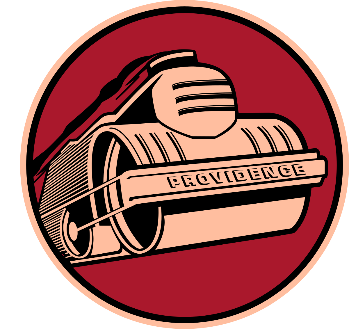
Someone NEEDS to resurrect that Providence Steamrollers logo. It’s too good to be dormant.
-
5
-
-
2 hours ago, ElwoodCuse said:
Should have been the Killer Bees because Wu Tang Clan ain't nothin to F with
Shaolin Monks
-
13 hours ago, Ben in LA said:
I like Milwaukee’s old logo in the new colors and will probably be purchasing that cap soon.

And I did.
-
I like Milwaukee’s old logo in the new colors and will probably be purchasing that cap soon.
-
1
-
-
18 hours ago, -Akronite- said:
It's really nice but you gotta especially respect it because it prevents the slippery slope of over-wearing the alt as many teams do.
They already over-wear the road alt (I prefer the Los Angeles script). They could wear the blue jerseys during Think Blue Week...like they did back in 1998 or 99.
-
1
-
-
On 3/12/2018 at 11:43 AM, FinsUp1214 said:
This one-and-done is the best individual uniform the Reds have ever had:

Don't you mean Redlegs haha?
Seriously though, I like these as well.
-
1
-
-
-
I like plain uniforms. The Padres uni would be even better if they replaced the navy with BROWN.
I like cream jerseys.
-
2
-
-
1 hour ago, QueenCitySwarm said:
The Steelers need a rebrand. It's classic, sure, but the logo has nothing to do with steel or Pittsburgh.
“The Steelers logo is based on the Steelmark logo belonging to the American Iron and Steel Institute (AISI). ... The logo's meaning was later amended to represent the three materials used to produce steel: yellow for coal; orange for iron ore; and blue for steelscrap.”

-
5
-
-
Might as well add this...


:format(jpeg)/cdn.vox-cdn.com/uploads/chorus_image/image/18045039/kirk-gibson-1988-getty.0.jpg)


NFL Changes 2021
in Sports Logo News
Posted
Wait until that “Sol” jersey and the white jersey and pants are introduced
