-
Posts
325 -
Joined
-
Last visited
Posts posted by NeauXone
-
-
Over the years I've thought Orlando's brand has started to get stale. I thought their current primary was sleek at first but now I find it pretty boring. On the other hand, I understood the need to streamline their 2000's logo, but nowadays I feel like their 2000's script would help fill a massive void in today's NBA. So I started this rebrand project from there, returning to the 2000's logo with some changes.


Logo
To start, I tweaked the shade of blue and silver to be brighter than they previously were. Additionally, the shooting star logo is blue now and has some details removed. Overall I think the logo pops more than the original 2000s version.
Uniforms
100% my favorite part of this concept and probably the best uniforms I've ever designed. A combination of everything people loved about the Magic's uniforms at different points:
-Pinstripes
-Star Pattern, relegated to the side panels
-2000's wordmark
-Braisher stripes that the Magic have leaned on in recent years


Courts
The courts aren't too different from the floors Orlando has typically played on (except for no parquet, whoops lol). The biggest addition would be the star pattern on the apron which I really liked. The statement court is just a flip of the logos to match the Statement jersey.


Lastly, I made a mock starting lineup graphic to experiment with the social media style that I used to make these slides, and I liked how it came out:

Been sitting on a mountain of concepts that I've been posting to Instagram, so there will be more teams to come soon.
-
 9
9
-
 1
1
-
-
30 minutes ago, bbush24 said:
The 14 year olds on Twitter think it’s fire. The NBA’s target audience.From someone active on Twitter: I can promise you they do not.
-
 1
1
-
-
On 8/1/2023 at 12:12 PM, NeauXone said:
Alright so we have pretty significant rumors coming out that the Wolves are getting a Hardwood Classic.


-
 1
1
-
-
And there we have it. Less than an hour:
-
On 8/10/2023 at 11:34 PM, Conrad. said:

So the original source said the classic jerseys would be white but now I've got somebody else that's saying they'll be black. For context this person also privately leaked Anthony Edwards and Kyle Anderson swapping #1 and #5 all the way back in May.
Also all the Wolves reporters are saying that it's the city jerseys being revealed today but all I've heard regarding that conversation has been about throwbacks lol.
Guess we'll find out sometime today.
-
On 4/7/2023 at 11:25 PM, NeauXone said:
Alright so we have pretty significant rumors coming out that the Wolves are getting a Hardwood Classic. And according to the source it'll be white, so we're either looking at the trees,
or these:

Or possibly even the Muskies throwback again:

-
4 minutes ago, simtek34 said:
YES! YES!
I've waited so long for this day

-
 6
6
-
 1
1
-
-
I'll take piping and panels over a uniform set that doesn't match. Nothing I hate more than that in sports
-
 1
1
-
 1
1
-
-
why did they do that on the home uniforms lol I give up
-
 3
3
-
-
23 minutes ago, the admiral said:
I forgot all about how they changed the trees from green to grey. Dumb, dumb, dumb.
I still think the jerseys should say T-Wolves instead of Wolves since that's their actual nickname. Do people say "Wolves" now? Did they ever? I don't remember it.
Not a single person from Minnesota likes the "T-Wolves" nickname. I hope they don't
-
 5
5
-
-
42 minutes ago, tBBP said:
Now, with all that said: I'd like to see them try a...bluer...version of their current lighter blue along with the navy, and a richer bright green with a tadbit more blue in it. And as far as the 90s scripts go, that outer keyline should probably be eliminated; that'd help "clean it up" a bit. Oh and it goes without saying that the tree trim absolutely has to stay.
Sounds like a good time to plug my concept lol. Pretty much exactly what you're asking for:


I made another concept that was dedicated to trying to utilize the current color scheme but ideally this is what I want us to look like.
-
 14
14
-
 1
1
-
-
3 hours ago, WSU151 said:
Minnesota really needs a rebrand. The association and icon unis are meh, and the navy court is just lifeless (of course, the lower corner placement of the baseline wordmarks for all teams is just stupid). Late 90s blue, lime green, and black would work in their statement style; or home/road mixtape unis would be fine with me.
About the wordmark placement, about halfway through this season I started to wonder exactly why every team was doing that. Sure it was for ads, but in the seasons before this one when there were national TV games, that space would get covered by the full wordmark (or another wordmark which was something I didn't really like). Now it's just an empty space. That's when I came up with the theory that that space might be saved for postseason logos, like such:

(This is part of a concept I made that kinda goes along with what you were asking for.)
Unfortunately so far this hasn't happened during the play-in but I'm holding out hope that this happens during the playoffs or the Finals. Allegedly the finals/playoffs decals were slippery which is why they stopped using them but this would be a great compromise.
-
 9
9
-
-
1 hour ago, Conrad. said:
sadly, i do not
as for 2023/24 info, here's a nibble...3 teams are getting new main uniforms, 2 teams updating Statements, and 4 teams will have Classic unis.
PleasePleasePleasePleasePleasePleasePleasePleasePleasePleasePlease

-
 12
12
-
-

Work in progress, but I'm already on top of it (placeholder 3D logos because I don't feel like beveling them atm)
Also, definitely going to need help identifying the font if it's not an in house FOX font.
-
 3
3
-
 1
1
-
-
That leaked one was obviously fake lol. I'm really liking this one though
-
 2
2
-
-
21 minutes ago, Captain Invader said:
You can actually see the center circle on the Cavs new court design.
Is this some sort of new directive by the league?
Pretty sure that this has always been a thing if you look close enough, but I could be wrong.
-
1 hour ago, Digby said:
This is just a concept, not a real thing. Thankfully.Was gonna be very disappointed if it was real. All the beautiful city jerseys we've had and now we decided to make a court to accompany the worst uniform we've ever had.
-
On 10/19/2022 at 8:15 AM, BBTV said:
that’s a good question. I noticed that with the Celtics too. Perhaps it’s only when they get a new physical floor, and not simply change the center logo? According to google searching (I know), physical floors are replaced around every 10 years, though one team (didn’t say who) has received waivers and has had the same primary physical floor for 19.
I’m sure Conrad or AH would know more.
Might not be a rule at all. The Orlando Magic have switched back to a two toned paint after years with only one color + no college lines.
Hoping this starts a trend honestly
-
 6
6
-
-
17 hours ago, hhooter said:
what font(s) did you use for this? im working on the final score display. having a hard time on fonts lol
Adobe Industry.
-
6 hours ago, BBTV said:
that’s exactly what it is. I recall years ago that the league said that any new court designs couldn’t have the college lines. But just new ones. I am surprised it applies to throwback designs but I guess it does.Was this before or after 2017? Timberwolves got a new court that year with college/HS lines.
EDIT: Celtics new court design also has those markings.
-
10 minutes ago, Bathysphere said:
Jalen Ramsey is one of the most notorious uni-tamperers.Wasn't just him, was a bunch of defensive players as well
-
Rams are wearing white socks
Edit: turns out it might just be the DBs.
-
 1
1
-
-
2 hours ago, Bathysphere said:
I can understand not wanting to rehash memories of a super bowl where they got trounced, but against the Lions for the third time since throwbacks even became a thing? That’s :censored:ing ridiculous. I’ll never understand what it is about these teams picking the same teams to wear alts against over and over, especially uncommon nonconference opponents. Wonder if the Lions will counter with their throwbacks for a THIRD TIME.
It's been like 12 years since the last time it happened though
-
 2
2
-
-
3 hours ago, tohasbo said:
I 1000% miss this look for Houston. They should have never ditched this look
I've grown to not like looks like these, usually when the socks are a color that doesn't match the jersey or helmet (would prefer white/striped socks or even same color socks) but because the numbers are the same color as the socks it works.
-
 2
2
-


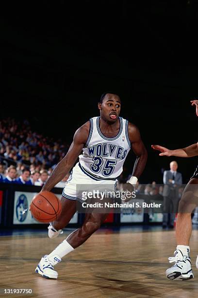
/cdn.vox-cdn.com/uploads/chorus_asset/file/19923592/kevin_love_and_kevin_garnett.jpg)


24-25 NBA changes
in Sports Logo News
Posted
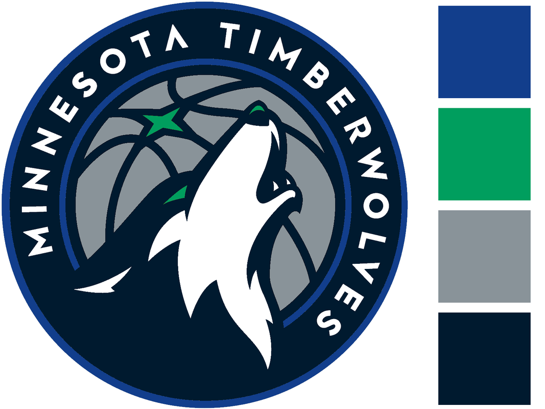
I am no insider but I'm sensing something's changing soon in Minneapolis. Wolves kicking off the playoffs with two throwback games for 1&2 after already wearing the classic jerseys around 25 times during the regular season (by far the most out of all our jerseys), plus our playoff branding featuring bright blue and green as apposed to navy/slate blue/black like in the past. If not this upcoming season I'm feeling a color scheme shift by 2025.