


NeauXone
-
Posts
325 -
Joined
-
Last visited
Posts posted by NeauXone
-
-
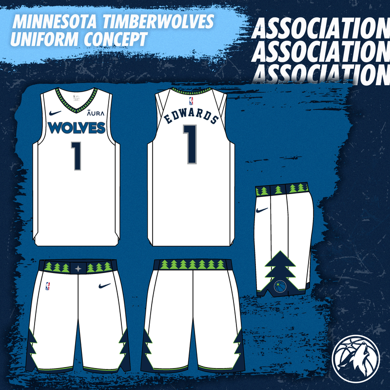
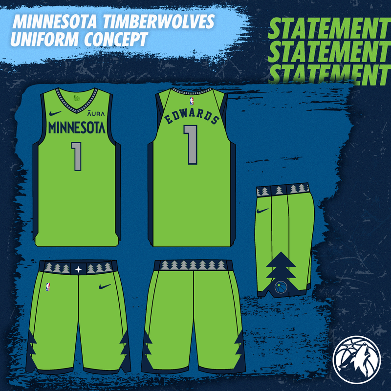
Trying my hand at fixing my favorite team's uniforms/court. They have good colors but don't use them all, and on top of that, the jersey design isn't exactly good. So I tried to make a concept utilizing all colors in an effective way with a better uniform design. The background is based on the team's social media format, which I replicated to the best of my ability.
Primary Uniforms

The two primary uniforms. Green trees on the waist and collar, navy blue tree lined with green as the main shorts design, gray North Star on the middle of the shorts.
Statement uniform is Aurora Green, with Navy striping and gray trees (Gives off the effect of trees covered in snow). North Star is changed to white instead of gray.
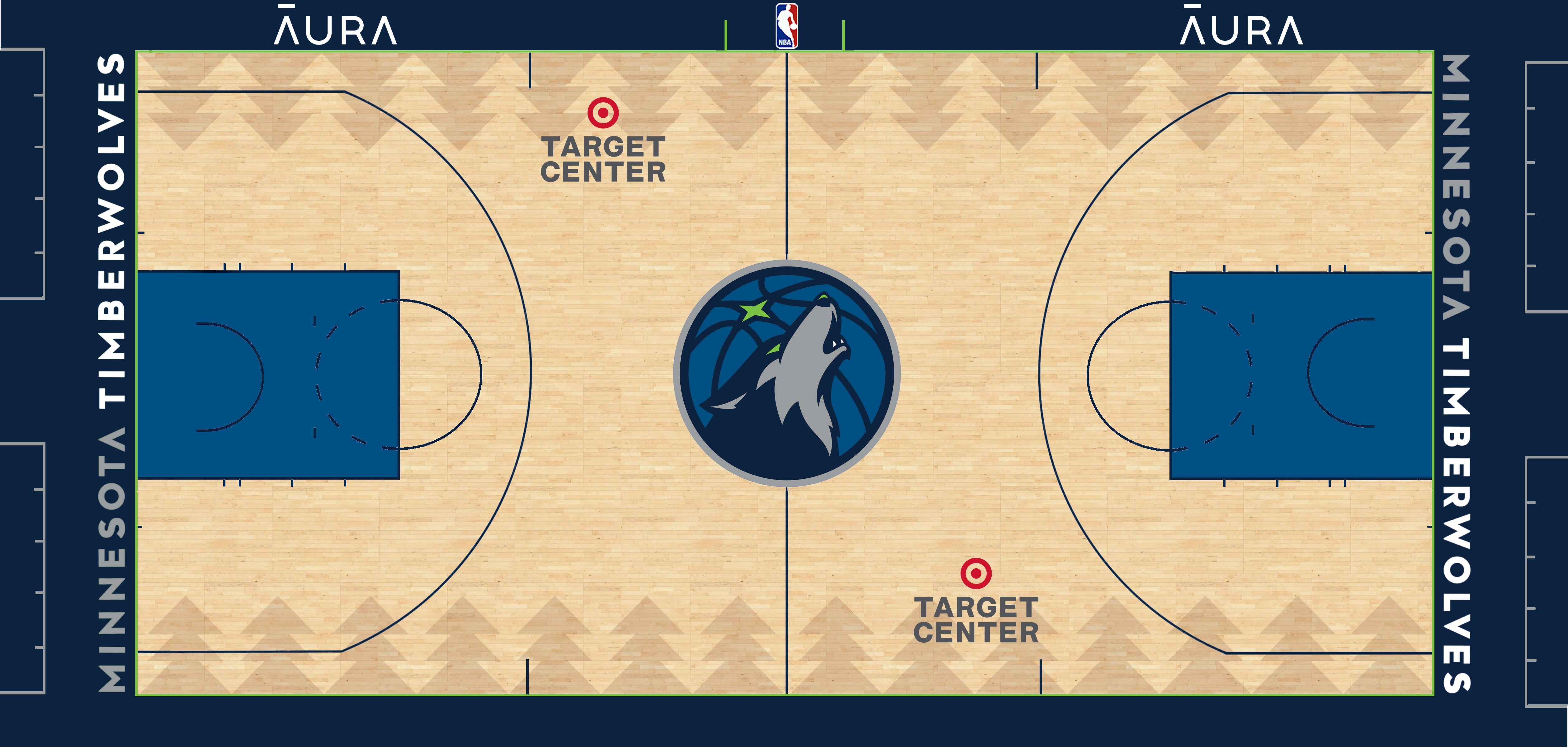
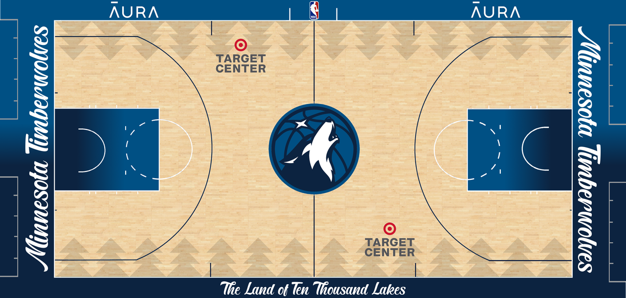
Court
Decided to give the Wolves a court that wasn't just one color. I like the new wolf head at mid court so I left it alone, added the full wordmark to the baseline, and put sublimated trees on the court itself instead of the sideline.
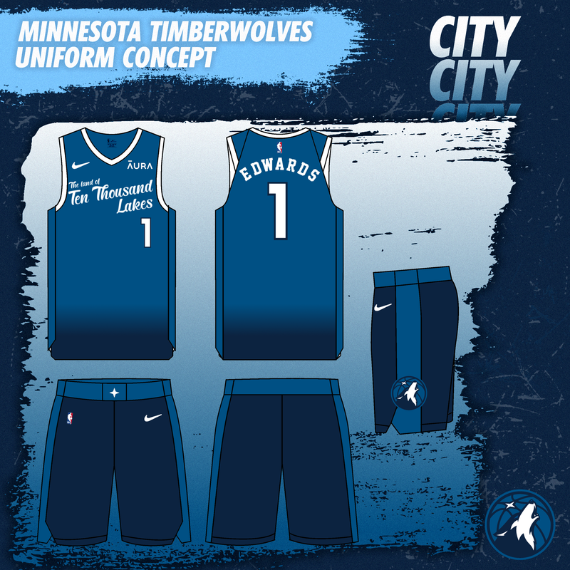
City Uniform - Land of Ten Thousand Lakes
Inspired by Minnesota's nickname, the uniform features a Lake Blue to navy blue gradient to represent the water. The north star remains on the waist and the trees have been removed in favor of simple color blocking.
City Court
Wolves have never had a city court before when they really should have in the past. So I decided to give them one to match the jerseys, featuring the script font from the jerseys and a gradient in the paint + apron.
Earned Jersey - 2000s Throwback
I have no idea if this is still a thing, but I made an earned jersey based off the Icon edition jerseys. It's a color swap that replicates the KG-era black alternate uniforms from the 2000s. Personally these are my favorites out of the whole set. I didn't make a court based on these because I don't think teams ever made courts specifically for Earned jerseys.
-
 8
8
-
-
I'm probably the only person who would be fine with the Cardinals owning the mid 2000s look for the foreseeable future lol. I don't even think the uniform is necessarily decent but something about it just doesn't bother me at all
-
 1
1
-
 2
2
-
-
19 minutes ago, Chawls said:
Can someone Photoshop the 49ers’ tint of gold onto the Saints’ uniforms? I need to see something.
\
Rough photoshop but this is about how it looks
-
6
-
 6
6
-
-
On 5/28/2022 at 3:58 PM, CLEFAN94 said:
I’d love to see how the playoffs progress, and more of the GSL moving forward. Are there any links to like a website?
https://www.gridiron-uniforms.com/GSL/controller/controller.php?action=main
-
1
-
-
1 hour ago, pitt6pack said:
Amazing work with the 3D logos. Did you have to do a lot of that by hand, or are there some preset tool functions in whatever editor you use?
Bevel effects in my editing software. Took a while to get it set up, and even after that I had to go in and make changes to the final product. I'm still learning how to use it properly.
That was just for CBS though, for Fox I just used basic perspective tools. Not exactly my best work.
-
Got more work to post. A lot, actually.
CBS First on the Field graphic - Still need to work on the correct lighting for the 3D logos but everything else is as accurate as possible.
FOX game open graphic - Again, need to work on 3D logos but that's not really my strong suit.
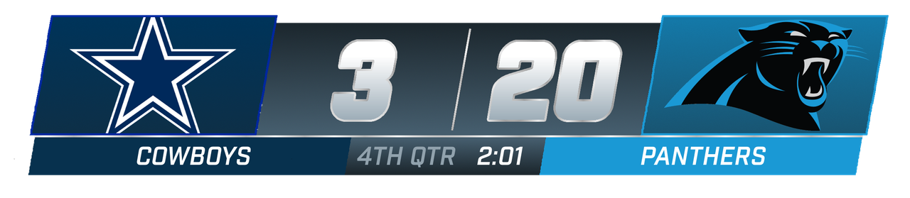
CBS Scorebug Update: Got the actual font used for it and adjusted it based on changes CBS made after the super bowl. Might need to adjust the slight gradient to make it less visible.
-
9
-
-
Figured this was way overdue since I originally created it two years ago and it was in desperate need of an update. Currently working on an updated 2006 NFL on FOX template.
Old (2019)
New (2021)
-
I noticed something when going back to the eagles game against the 49ers. The field is actually different this year, and it's a combination of the 2017-2020 field and the 2000s-2016 field. The wordmark isn't blown up like past years but the endzones are still green.
Here's the best pictures I could find:
-
Personally I really like the font, but I feel like one issue that could arise is the silver shadow not showing up on the white jersey. This could work for a team like the Bucs that has multiple colors dark enough to be used as a drop shadow, but for the Raiders I think it works better with a single color number.
-
1
-
-
Again, it's been a while, but I've been working on stuff for this thread in the meantime.
I think my favorite recreation I've done so far has to be this. Sunday Night Football's pregame flyover package:
Still don't have the Ringside font that packerfan identified, but other than that this is definitely my favorite. I made this for a GSL-related project but I have a template that I can insert NFL teams into as well.
-
11
-
-
On 5/21/2021 at 8:09 AM, Cozybatman101 said:
Hey I just have a question, which font did you use for the new CBS scoreboard used in the Super Bowl Chiefs vs Buccaneers? Would love to know, because I have been trying to make some myself and couldn't find the font. That one looks really close and good!
Sorry, never got a notification for this. The font is Circular Black if I remember correctly.
-
I feel like I'm the only one who would like to see the Vikings go with a white facemask.
-
5
-
-
Sigh.
I would say it took no more than 10 minutes to make this. I'm aware that the font isn't correct, I figured I could be as lazy as the design of the whole thing.
-
6
-
-
The TD animation is okay. Best part of the package so far.
-
4
-
-
Looking at it more I actually really don't like this font. Sheesh.
-
Boring. I thought the font would be better when we saw the lower quality picture but instead it's terribly generic. And the font is the only remotely interesting thing in the whole package so far.
-
Back to this project again. This time, I did a something a little bit different:
I need a better reference image to make sure I recreated it accurately, but this is what I got to start. For those who don't know what this is, this is the current score display for the NFL on Fox's Game Break updates.
-
4
-
-
29 minutes ago, insert name said:
I swear, ESPN did something like this before.
...Monday Night Football, Week 1 of last season. They had to change the indicator from yellow to white at halftime.
-
7
-
-
On 12/14/2020 at 3:45 AM, farrellriza said:
Hey, may I know what font do you use for that scoreboard?
The font is Industry:
https://fonts.adobe.com/fonts/industry -
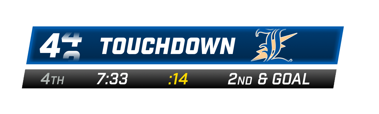
Also, I've been thinking of ways to tone down FOX's overdone TD animation, so I whipped up one real quick just now.
Instead of a giant pop-up from the bottom of the screen, the scoreboard stays mostly intact. One team box slides over, expands, and replaces the other, and the score number rotates in, like ESPN used to do a while back.
-
5
-
-
Got bored so I decided to come back to this. Here's a WIP:
Getting the correct angles for the 3D logos was a pain. Still not exactly correct but I can fix that.
-
1
-
-
7 hours ago, GridironUniform said:
Well Jacksonville had to get creative to cover up the Florida-Georgia field graphics... Jags logo on a teal rectangle at midfield and larger NFL shields on the sideline 25 yard lines to cover the SEC conference logo and of course the greened-out college hash marks...
I was wondering exactly what they were trying to do with this field art, until I remembered what took place the day before.
-
On 9/23/2020 at 4:29 PM, ChiCity95 said:
Are you going to try recreating much older score bugs (late 90s/early 2000s)?
They're much more simplistic than the others so I wanted to save them for last, since they'd be so easy.
-
2 hours ago, pitt6pack said:
I keep them on my hard drive (and my backup hard drive, don't want to lose 6 years of work when my computer finally eats it).
The full sized images are far too large to upload to any image hosting website, and we tried uploading them to the GUD servers once, but that filled the disk space rather quickly.
I get it. I asked because I know kodrinsky hosts the 4k versions of his NBA courts on flickr and was wondering if you did the same.


 \
\


Minnesota Timberwolves Refresh - Concept
in Concepts
Posted
Didn't use the number because I don't think that's allowed in the NBA (76ers only use 'Sixers' on the front of the jersey as example)