


NeauXone
-
Posts
325 -
Joined
-
Last visited
Posts posted by NeauXone
-
-
20 hours ago, packerfan21396 said:
For SNF, they use Ringside, not Arial. Good work on the rest of it, though.
You're on top of it when it comes to fonts. I was wondering what font was used and thought Arial looked close enough, but not exactly "it".
-
Completely forgot about this one I was working on a month ago. The original TNF scorebug, from 2006:

-
 2
2
-
-
Not sure I'm liking how this came out, but here's Sunday Night Football:
I might continue to make adjustments to this one, I feel like I can do better.
EDIT: Forgot the timeout indicators, I'll have those edited in soon.
-
16 minutes ago, ChiCity95 said:
Your version of the current Fox bug is better than the actual one. You don't think you can take a crack at remaking their 2010 one, could you?
I have a WIP on my computer of that exact one, but it's in early stages + it took forever to get to that point. So I can try and work at it again but it'll probably be the hardest one so far.
-
Here's another WIP...
This should be pretty easy to guess.
-
4
-
-
Finished the FOX scoreboard, came out a lot better than I initially thought:
-
8
-
-
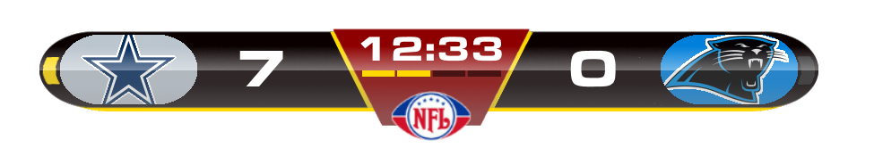
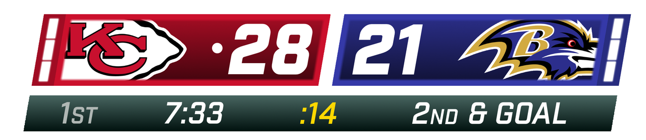
Someone made a similar thread years ago about this same subject, so that inspired me to have a crack at it myself. Below are some NFL scorebugs from past and present that I've recreated to the best of my ability:
FOX 2006 - 2009:
Made this game from last season look like it was from 2006.
Regular quality version
Bonus - Touchdown graphic:
FOX 2017 - 2019:
Sorry to all the Saints fans out there.
Bonus - Touchdown graphic:
WIP: CBS 2016 - Present
This one should be easy to finish, I'll get to it eventually.
WIP: FOX 2020 - Present
Started this one today and it's going well, I just need the correct font in order to finish it.
I do these pretty often so expect me to add onto this thread in the future.
-
17
-
-
Is the site shifting up and down for anyone else? Anytime I look at a thread and stop scrolling, the screen starts shifting up and down for about 15 seconds.
-
1
-
-
I'll say it now: While I like the new Chargers logo, I think the old bolt had a better shape, and the double blue made the powder blue pop a lot more. Without the navy in the logo, it feels...empty.
-
1
-
-
These animations are...ambitious.
-
1
-
-
Alright yeah I like this. It's off-putting at first but so much less boring than the previous one. But this caught me all the way off guard at first.
-
1 minute ago, simtek34 said:
Oh my god, it’s the 2006/2007 ESPN Monday Night Football Graphics...
Ya happy Admiral?
Alright now that I'm settling in, it's not too bad...I just don't like the fact that it's segmented.
-
Nevermind what the hell is this?
-
4
-
-
3D effects are back? Design is already great.
-
On 1/29/2020 at 5:28 PM, TrueYankee26 said:
-
2
-
-
I've never loved a feature more than this one.
-
Do you have a full size version of the "NFL CHAMPIONSHIP" logo?
-
18 hours ago, oldschoolvikings said:
Believe me, I know.

-
1
-
-
20 hours ago, dmmdoublem said:
2. Monochromatic NFL uniforms aren't that bad, at least not inherently so. There are some bad ones out there, but the majority look good. The Seahawks' home uniforms are a good example of monochromatic set working well.
This right here. The only time a monochrome set looks bad is when it's head to toe one color. Sure, it's most likely worse than the team's usual getup, but some people here act like monochrome is the spawn of satan. Other than that, I can't think of a single valid reason why monochrome is bad, at least in regulation.
-
5
-
-
1 hour ago, simtek34 said:
Falcons possibly teasing Throwback End Zones for tomorrow?
https://twitter.com/atlantafalcons/status/1199455155437154304?s=21
(Huh, weird. The tweet didn’t embed.)
Confirmed.
edit: sigh...that is most certainly not what i wanted to link to. I don't even know how that happened.
Here's the real link:
-
2
-
-
I'll say this though: CBS tried their hardest to make flat design work in sports, and it's great. the gradient gives it the minimum amount of personality, and the outline actually makes it pop out and doesn't make the graphic bleed into the turf.
-
2
-
-
On 9/20/2019 at 10:47 PM, Kramerica Industries said:
Fox has far and away the best graphics package as far as I'm concerned, if we're only talking about what's used for the NFL. I don't care for NBC having a separate package for SNF and doubly so because I think their "standard" package is better even if they have used it for several years by now (I mean, if it's good and works, why replace it?). Fox and CBS are different takes of the same idea, I just like Fox's application better.
ESPN keeps changing the MNF package and they keep not getting it right. The best package they probably had, for my money, was the one circa 2009-'10. I was fine with that one. The next one was fine enough, but every one since 2015 has been a gradual downgrade from the previous one.
I'm sorry but Fox's is terrible. Flat design doesn't work in on screen graphics. Especially when there's no outline on the bug.
-
5
-
-
Even though CBS didn't reveal a new bug during the Super Bowl, I still think a new one is coming this season.
-
1
-
-
If you look at the graphics they use when they head to commercial break, you can see they're pretty different and kinda heavy on grays and shiny elements. I'm gonna go ahead and say that's what their next package looks like next season.


NFL Fields - 2024 UFL Fields
in Concepts
Posted
Quick question, where do you keep the highest quality versions of the fields?