


chcarlson23
-
Posts
2,212 -
Joined
-
Last visited
Posts posted by chcarlson23
-
-
Wow, Peter Karmanos sold this team and they got more dysfunctional, there's one you don't see every day.Bonkers story coming out of the OHL tonight. The Flint Firebirds, playing their inaugural season, won 4-3 in overtime over Oshawa. After the game, ownership fired the entire coaching staff. In response, the entire roster quit.EDIT: Apparently the owner canned the coaches because they weren't giving his son enough playing time. This is wonderful.http://www.wingingitinmotown.com/2015/11/8/9694696/report-flint-firebirds-coaching-staff-fired-immediately-after
Alternate Reality: Players walk across Flint to some other rink and become the Flint Tropics, first sports team run completely by the players...
-
Their throwbacks are are bad, because it's a crappy wordmark on a very plain jersey with way to many stars... Their current sweaters looks great from the front but the back looks like a practice jersey. It's got no stripes, no piping, nothing. Just names and numbers... They also have really ugly side panels and "tail stripes" (if that's what you want to call it) that blend in to the dark red of the home, and stand out way to much on the white...I prefer the current Washington Capitals jerseys 50 times more than their throwbacks. They use unconventional modern striping, but it just works. I would be happy if they lasted another 5-7 years.
These are beautiful uniform matchups, even for non-Original 6 teams wearing non-throwbacks...


-
As much as I hate the Caps edge template, I think they came pretty close to nailing the new wordmark/logo. I'd like to see the letters made thicker, and I wonder how it'd look if they went with white letters on a red background (and possibly put Washington in blue and two blue stars) on the red jersey.
YES... The Caps logos are great, but their uniforms really suck...
-
Their red uniforms are just awful.
They were decent as alternates, but the whole faux-piping and lack of a tail stripe made it worse.
And I still don't know why the Wild ditched their green jersey in 07'. Does anybody know the story or reason why?
-
I have no problem with teams wearing alternate uniforms in the playoffs.
I hope the Wild never stop...
-
Definitely agree with the pens/sens/bolts being worse than Nashville, but not Toronto.
The mustard alt is the one i was referring to with the terrible. the edge set was bad, yes, nit not awful. also not as bad at the leafs post edge set, or the pens, or the sens, or tampa, or a couple others.
They've definitely had more than one terrible jersey. Their first edge-set road sweater was AWFUL. And so was the mustard yellow sweater...
In my opinion, the Predators have only had one terrible jerseys, and the rest have been good, with an almost fantastic current set. I just wish there was a blue third, and the white piping and yellow/blue things by it disappeared.The problem is that the whole idea of the Perds embracing yellow is that it's become their whole rallying point: they're The Yellow Team. If they were to wear it on the road, that'd be great, but it would have to be their home uniform as well. That would be interesting for one team to have only one uniform. Maybe wear the yellow helmets on the road so as not to clash with dark helmets (but not Dark Helmet) and wear the blue helmets at home against the visiting team's white.
I know some Preds fans wouldn't mind that. From a marketing standpoint, though, I doubt the team would ever go to a single sweater for both home and away.
Yep. Wear gold on the road in place of white, and wear navy at home. I know it diminishes the team's ownership of yellow/gold, but big picture? The Preds would still have a very unique set, and the yellow would still be a huge part of that.You're thinking yellow-vs-color matchups, Cap? I'm so there.
It would detract from Nashville's gold identity, but a some of the fans wouldn't mind it too much if they made navy the home color (assuming a strong presence of gold as a secondary on the home). Marketing it right would be crucial by the team, though. Some sort of "We're taking Gold on the road" campaign.
The whole set was a train wreck from day 1... The yellow helmets just add the bold and underline.
Now that I've seen more of them, I'd rather wear the navy helmets at home and gold on the road. I strongly disagree that the set is a trainwreck, though. The previous set, now that was an unfocused 90's remnant nightmare.
-
And weirdly, Utah Jazz just sounds better.
That's because it's been around for a long time. While it doesn't really make sense, it sounds better. I bet it would be the same thing if the Canadiens moved to Cleveland (like they were going to a long time ago,) and kept the same name. The Cleveland Canadiens wouldn't make sense, but if they had been there for 50+ years, that would sound right, just not make any sense.
-
Most color on color matchups throwback to the beginning of most leagues, where most teams had one jersey. And I don't think a Toronto vs. Boston, or any of the NFC north teams would look like a child's rec league. They would actually look professional.
Thank you. Looks like a children's rec league game.Not sure how unpopular this is, but i hate Color on Color matchups.
-
My favorite Teams are The Wild, Gophers, Vikings, Twins and Timberwolves (I mean I could care less about the T-wolves, but... I root for all these teams because I'm from Minnesota. I mean If I was born in Atlanta, I would root for the Falcons and the Braves, and the hawks. The thing that drives my the most nuts tho is people who have lame excuses for being a fan.
-
I mean to me, he's always going to be part of the Avs, but to anyone who knew him then, it would be right. It's like saying someone's high school jersey is wrong. It may look odd, but it's not the wrong uniform. To the Athlete that's their right uniform to. McDavid in an Erie Otters uniform looks just as right as an Oilers jersey.
When you think Peter Forsberg, do you think MODO?
That's actually the first Major team Forsberg played for. Modo Hockey of the SHL. So it's the right uniform.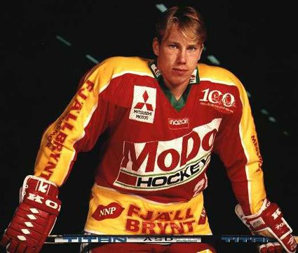
I still do a double take when I see him in an Avalance uniform. It just feels so wrong.
-
That's actually the first Major team Forsberg played for. Modo Hockey of the SHL. So it's the right uniform.
-
 1
1
-
-
I don't know if these are hated or not, but I love the Toronto Signature Series uniforms. I like how they have a logo on the front. I just wish that they'd ditched the front shoulder numbers.
Toronto would be perfect if they went with the signature series helmet full time, or added a light blue stripe to the current helmet.
See, that's why I said "I don't know how unpopular this is..." I was thinking there were a fair amount of people who like Hamilton and Toronto's uniforms.I don't know how unpopular this is, but there are a number of CFL identities that I really like.


The bottom three haven't been worn for several years.
My unpopular opinion is that CFL identities really aren't that bad. Aside from Montréal, all teams have good logos and workable colour schemes (however poor their execution may be). You've got two terrific looks (TOR, HAM), two-and-a-half good looks (BC, WPG, and EDM's home), an okay look (MTL), two bad looks (SSK, OTT), and two downright horrendous looks (CGY, EDM's road). The NHL has a similar ratio.
hamilton is still fantastic though
-

I really love the Browns' new brown jerseys.
JK!
I think that'd make me a horrible person if I really did.
I feel like those uniforms wouldn't be half bad if they didn't have the word Browns on the side of the pants. Or if they weren't paired with orange socks.
-
Wayne Gretzky in black and sliver (1988-96)
I don't think that's the wrong uniforms for Gretzky. Those kings unis were called the Gretzky era uniforms. Now Gretzky in a blues uniform, THATwas wrong.
-
Put me in the minority.... but I've never thought the original Sharks look was anything special. I don't really see why people go berserk for them.
I mean the Jersey looks good, but it'd never be in a list of my favorites.
Well all the looks after looked cluttered or way to bare... The orignial reebok edge was a MESS of black, teel, orange, and front numbers just slapped on, then the current look is stripped down to basically nothing. Except the front numbers.
-
BUT for a team like Carolina???
But old time hockey.Ya there was absolutely no need for those new jerseys. Complete downgrade.
-
The Montreal Canadiens overall set gets dumbed down by it's a way jersey. Hands down one of the worst jerseys in the NHL.
Also, the Carolina Hurricanes jersey isn't that bad. It doesn't look like a toilet bowl, it looks like a hurricane to me. It's still bad though, but what else can you do for a team called the Hurricanes.
I totally agree about the Habs road. As much as I respect tradition, it doesn't fit...
And the Hurricanes used to have that hurricane feel, but now they look bland and unoriginal...
-
Except there's a fine line between Bold and looking good and bold and stupid. And Adidas might just leap way over it. That's what Reebok did in the edge change, and Adidas owns Reebok, so...I'm surprised w/ all of the hate adidas is getting in this forum. Guess what? Save for this year's, I liked their March Madness uniforms. Also, I love the everything about the REV 30, although people often ridicule it. At least, adidas is not afraid to do something different. Can't wait for what they'll do w/ the NHL!
#teamadidas
-
Ken Dryden was the first player to win the Stanley Cup and have his name ingraved on it before winning the Calder Memorial Trophy as rookie of the year the next season...
-
Wrong, I don't see anything wrong with him in a Senators uniform, the Islanders though... yeah that's odd.Seeing Big Z in anything buy a Bruins #33 jersey is really weird


HE WAS DRAFTED BY THE ISLANDERS!!!!! Why does nobody get that?
-
Seeing Big Z in anything buy a Bruins #33 jersey is really weird
That's funny, because they're the latest team he's played for. He was drafted by NYI, then played for OTT.
-
This is a terribly overrated logo. One letter inside another, and one letter has nothing to do with the team name. It actually does, besides the Club De Hockey Canadien, the team's nickname is the Habs. Go Habs Go?
-
Found this one. It's Rare, because it's in MN, and these sweaters could have only played each other during 3 different seasons. http://cache4.asset-cache.net/gc/72924243-brian-rolston-of-the-minnesota-wild-skates-gettyimages.jpg?v=1&c=IWSAsset&k=2&d=OCUJ5gVf7YdJQI2Xhkc2QLcg1qRiRXgvUYU0zC0N%2F%2F7YSz5BnblX73niXDm7edbi1rpgE9nrFpeiBVyB4ePN5g%3D%3D

Unpopular Opinions
in Sports Logo General Discussion
Posted
I heard that the owner of the Kings owned the Lakers too, so he made them match colors, and technically it was Fourm Blue & Gold! Get it right!