


Cosmic
-
Posts
10,739 -
Joined
-
Last visited
-
Days Won
13
Posts posted by Cosmic
-
-
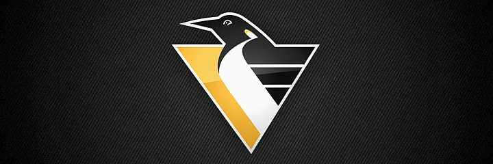
I prefer this logo for the Penguins.
Seconded. I have no idea why they didn't at least keep it as a shoulder patch. Worked well on the Pre-Edge set
Thirded.
Agree with the shoulder patch thing too.
I like it better than the skating penguin, but I don't think it should be a shoulder patch on a skating penguin jersey. Mixing logos from different eras almost always looks weird.
-
I fundamentally disagree with that about as fundamentally as I can disagree with anything. Thread titles should either be ridiculously specific or maddeningly unspecific. That way, who knows how they'll grow? Plus, I like the dialectic of Thread and Anti-Thread. My hope is that we arrive at NFL Syn-Thread by Christmas.
The mods don't share your enthusiasm. I made a thread when Tom Magliozzi from Car Talk died and I accidentally double posted, so I made one "Car Talk's Tom Magliozzi is Dead" and one "Car Talk's Tom Magliozzi is Dead Anti-Thread". Somebody didn't get the joke; that got them both nuked.
-
They're more for the business side and off-ice/field/court controversies.
-
Thankfully, the Blues don't play the Devils any more this season.
-
Yeah well, i think it´s okay to question why a team has so many championships , and other teams that played in the same time era have few or no cups, it was a long time ago, maybe we don´t know the whole truth. Yankees also have alot of chips, compared to the other teams, maybe there is something there we don´t know about either.
Joey: What are you guys woofing about?Monica: Chandler stole a Twenty from my purse!Joey: No! You know what? Now that I think about it, I constantly find myself without twenties and you always have lots!-
 1
1
-
-
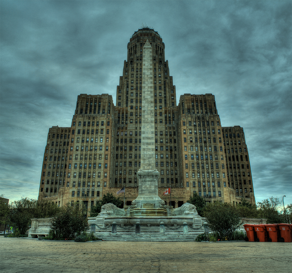
I know I'm late to the party here, but that's not just some random building... that's City Hall (and the McKinley Monument). It's not really suspicious that people would use that as a symbol for Buffalo.im not so sure about the poster example, it looks like both of you used the same inspiration and arrived at a similar thing, using a pretty common composition of top placed headline, 2 point perspective building-from-the-street view and a sun burst background. you could just as easily make the same connections between the two to Shepard Fairey's work.
Yeah I totally understand which is why I can't be 100% sure. However, you have to admit that it IS a little suspicious that it was used for a local Buffalo event as well as local Buffalo-area credit union.
-
I like every combination of the Titans' uniforms except the mono navy and mono powder blue. I like the helmet. I like the thumbtack. I think they're modern classics and shouldn't go anywhere.
-

Also the wrong goalie pads. He should still be in those same pads that used to be white once in 1992.
-
1
-
-
The Sabres are just trying to kill spectators so they can tank for McDavid. Take away their draft pick, relocate them to Houston, and then take away another draft pick, then give them a draft pick back to reward them for moving to Houston.
They know that they'd field a better team in Buffalo by moving this team to be the Las Vegas Heat Strokes next year, then fielding an expansion draft team back in WNY.
The Sabres are 2-0 against the Sharks, and 3-13-2 against the rest of the league.
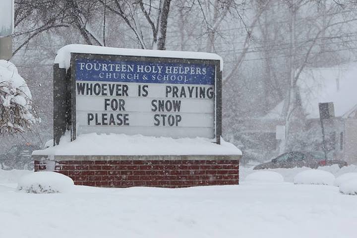
Blizzard, schlizzard. The people of Buffalo clearly don't give a
 about their team and this is concrete evidence of that. They should be moved to somewhere else, perhaps Las Vegas, where they will most definitely be supported!
Welcome to Buffalo "If Hockey Season Were In July, It Would Probably Be Done Snowing By Then"
Considering half the area is under a driving ban, the whole county is in a limited state of emergency, and the people that are even allowed to go out have to deal with closed roads/highways, it is what it is. Estimated about 6,200 in the building.
-
It's all cool... there's a clever 37 hidden inside the Majestic XII logo.
-
Forgive me if this has been posted before, but at 0:25 of this video, you have first year of those Sabres uniforms and the last year of those Canucks uniforms.
-
A Las Vegas-Arizona ice hockey game sounds like something from the fake future of an old movie.
-
1
-
-
Just feels like the right time to post this:
-
This is really gonna get ugly when it's like game 57 out of 82.
-
I'm guessing it's flash = short exposure time = things not lit by the flash are darkThat's why this is the unpopular opinion thread.. your comments aside, I agree that the last 49ers look was light years better than the new fauxbacks.. older doesn't necessarily equal better.. I thought the dolphins last set used the drop shadow pretty well, although I like their new look as well.. one of the best uses I've seen was on North Greenville University's grey football jerseys.. they had white numbers with scarlet outline and scarlet drop shadow, which REALLY popped... this is coming from a guy who was in the pressbox, which is the worst place to try to see numbers.. either way, I'm a huge fan of the drop shadow, even when not executed perfectly
I love the Laker drop shadow
Did the arena lose electricity that night?
-
But that's why this thread exists, people enjoy different things!
I think this thread exists to draw out dissenters and hold them up to public scorn.
-
I like the Pens/Sens template. It doesn't have stripes that randomly end or stupid piping, which are by far the two worst crimes of the Edge era IMO. Plus, only two teams use it; it's not like it's all over the place. And the color schemes are different, and the home jerseys are different colors. I don't like the Pens in khaki, but the template is fine.
Edit: I'm not saying everybody should love it (it's not a new classic or anything), but the hate it gets is way overblown.
-
I think those look good in a vacuum, but I generally dislike throwbacks that look nothing like the current set. I think at least some of the hate those get is because people don't think the Jets should look like that.
I agree with this.This throwback doesn't get near the love that it deserves.
Edit: The Eagles' blue and yellow jerseys are another example. I normally like bright colors like that, but it doesn't look like the Eagles to me.
-
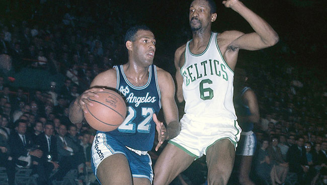
This is the unpopular opinions thread? Good. I always thought those jerseys would be cooler if they changed the location of the navy stripe depending on the player's shooting hand. In that picture, it's on the "correct" side. If he was a left-handed shot, though, the stripe would be all bunched up all the time because that arm would be the one lower on the sick. It would probably look better on goalies on the stick hand on the same principle.I love the 90's NBA trend of putting a vertical stripe on only one side of the uniform, and I really like these too:

Very sleek.
-
1
-
-
If the one on the right faded into the blue more gradually, I don't think it's much worse than their home jersey from the time.Holy mother of god, two absolutely horrific never-used third jerseys that the Penguins rejected in 1994:

icethetics source: http://www.icethetics.co/blog/2014/10/22/designing-the-90s-part-5-history-blue
Original source: http://pittsburghhockey.net/penguins/uniforms-overview/1994-95-pittsburgh-penguins-alternate-jersey-prototypes
-
Reebok lied at first about what teams would be able to do with the new template, so that might have something to do with it.
-
Along those lines, the Sabres' slug uniforms were supposed to debut with the Edge system, but Edge was delayed a year. The first year of those uniforms was the old cut of jerseys.Here's something I almost considered: the 2011 Buffalo Bills (First year of the new uniforms, but also the only year Reebok produced them)
-
Oilers Edge prototypes:
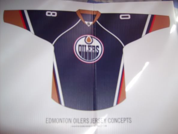
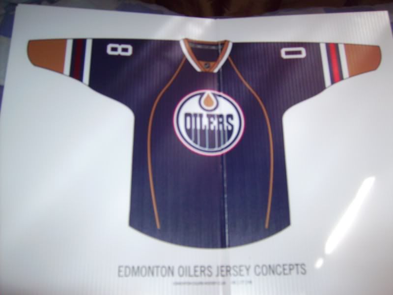
http://boards.sportslogos.net/topic/58849-logo-and-uniform-prototypes/?p=1116897
Still don't like that piping, and I think the red stripe probably shouldn't touch the orange, but the top one might look pretty good. It's somewhat similar to the Ducks' current jerseys.
-
New name for the curtain: The Honeymoon Suite sponsored by match.com.
One hell of a view! I mean, you can smoke weed, get hammered and get blown around the waistline, and the ushers won't give a damn because
you're at a Florida Panthers gameyou'd be behind a huge, black curtain.-
1
-

 about their team and this is concrete evidence of that. They should be moved to somewhere else, perhaps Las Vegas, where they will most definitely be supported!
Unpopular Opinions
in Sports Logo General Discussion
Posted
It doesn't look bad, but I don't like the way the styles of the penguins mismatch. Like putting a square peg in a rectangular hole... it might fit, but it's not quite right.