


jerrylawless3
-
Posts
339 -
Joined
-
Last visited
Posts posted by jerrylawless3
-
-
38 minutes ago, VDizzle12 said:
It's so odd to me that so many teams are doing away with pants stripes. My only thought is maybe they want to be able to mix and match with different jerseys. So lack of stripes keeps the consistency there? For the Lions, I'm surprised how much I like the blue/black/blue set and that's a good example. Blue pants with silver stripes definitely would have looked odd there. When neither the helmet nor jersey have silver stripes.
While we have some duds every offseason. Slowly I think some teams are gravitating towards their best looks. Lions, Bucs, Cardinals, Browns, Jets, etc are perfect examples. Just need to wait out the disasters and they join them soon enough.
Pant stripes don't increase jersey sales.
-
Scrubbing through the video of the Texans helmet, there is a very small version of the bull head logo on the back using the powder blue in place of white. Reminiscent of the Oregon O on the back of their winged helmets (but smaller) or the W on the Commanders black helmet (but on the back).
-
9 minutes ago, Sport said:
compare previous years

and last night.
hard to say. Something's different there.
You're actually on to something here. It's now a 'cast' shadow now instead of a 'drop' shadow. You can really see it in the serifs of the I and Ns.
The wordmark also looks slightly less tall before. I don't know, but it's definitely not the same mark as before.
-
 4
4
-
-
On 3/28/2024 at 12:02 AM, rainmaker17 said:
Rangers have a jersey sponsor, Energy Transfer, or something like that I've never heard of. Bummer.
So you're saying the jersey ad did its job? /s
-
 1
1
-
-
44 minutes ago, BBTV said:
The horn is basically a platform for the swoosh to live in, just like the Seahawks and Vikings have designs that highlight Nike’s advertisement.
It’s brilliant on Nike’s end, but lousy that it puts their brand on par or even above the team’s.
Not what they did. Swoosh is above the horn. Red line is just a stripe.
-
Just now, bowld said:
Looks like blue horns on each sleeve with a red nike swoosh in the center of them.
Can also see a letter H above the left horn which will likely spell out Houston or HTown
What looks like an H is just a navy Nike swoosh – you can also see it in the reflection. The red appears just to be an inlaid stripe.
-
1
-
-
I could totally see this being a planned leak, intentionally using the away uniform. If they are indeed using four different designs, you'd have to think the road combo would be the tamest. Leaking gets people talking and them some publicity before the big "splash" unveiling.
-
I feel like the numbers would be a little more palatable if they weren't so thick. There's not much room in the interior of some of those digits, and double-digit number, especially with a 3, 6, 8, 9, etc., could look really clunky.
Is it just me, or is that navy not as blue as their old navy? It looks a little less saturated.
-
1
-
-
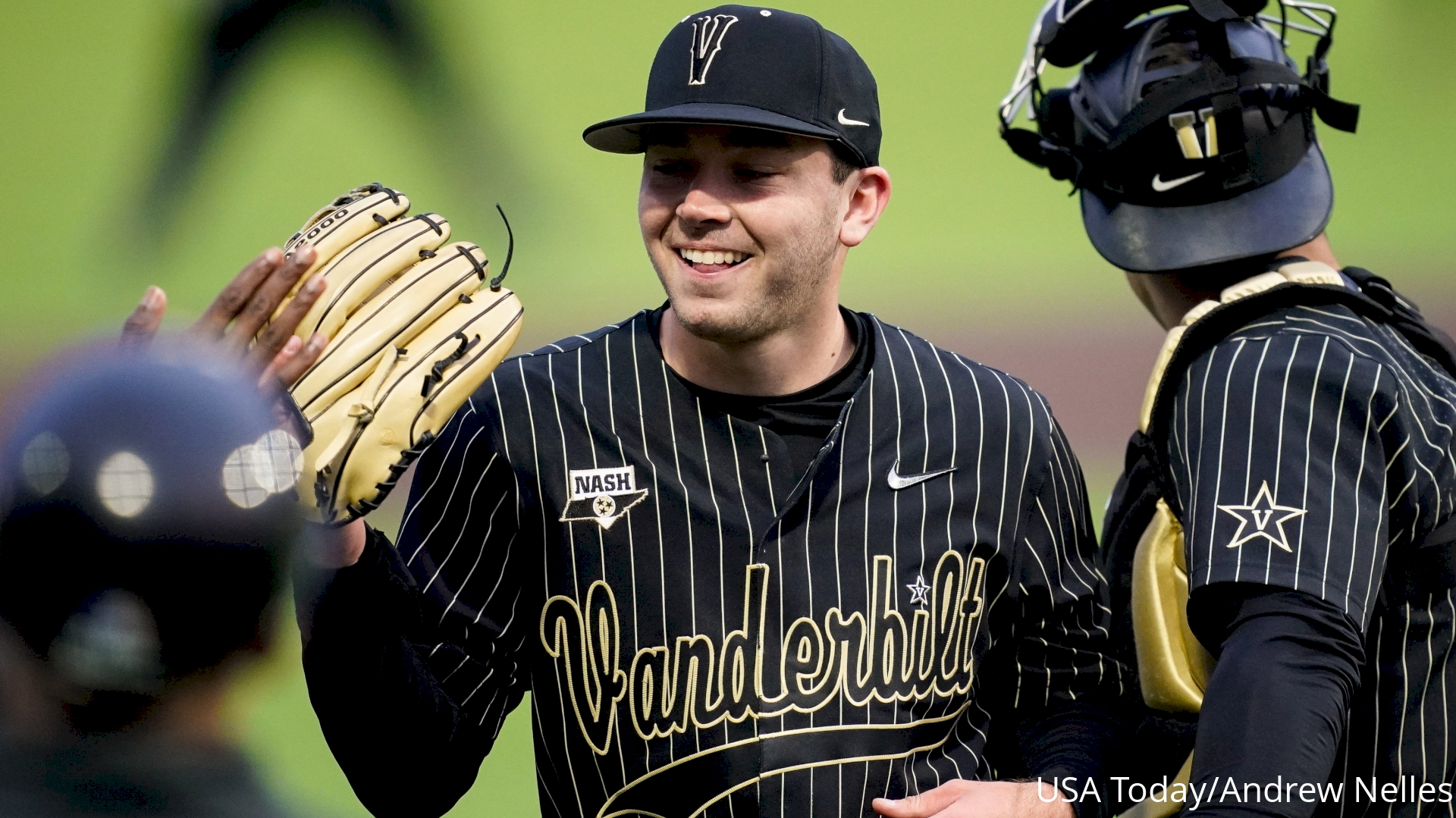
Vandy has unveiled an updated take on their 03–05 script for their throwbacks this season.
-
4
-
 2
2
-
1
-
 1
1
-
-
On 1/19/2024 at 12:26 PM, jerrylawless3 said:
Vandy has updated their lids with the new V branding unveiled a couple of years ago. Previously, they had a baseball-specific block V.
This year, both the football and basketball teams have used a darker, richer gold compared to the khaki-like color used by most programs. Not sure if that will be the case for baseball (and doesn't seem like it will be based on the above photo, but we shall see). I'm also interested to see if they update their script – the tittle of the 'i' was the old Star V logo.
A speculative update on the specualtions risen above:
-
22 minutes ago, DrunkKidCatholic said:
What a shame, in my opinion. I always thought the Jets’ current look was a good modern set – restrained and simple with just enough flair to make them unique.
All that y he “legacy” jerseys have going for them is just that – nostalgia. Without that they’re boring, nondescript, sporting goods uniforms.
-
7
-
 2
2
-
 5
5
-
-
Vandy has updated their lids with the new V branding unveiled a couple of years ago. Previously, they had a baseball-specific block V.
This year, both the football and basketball teams have used a darker, richer gold compared to the khaki-like color used by most programs. Not sure if that will be the case for baseball (and doesn't seem like it will be based on the above photo, but we shall see). I'm also interested to see if they update their script – the tittle of the 'i' was the old Star V logo.
-
2
-
-
41 minutes ago, MJD7 said:
Vanderbilt also appears to have at least a bit of an issue matching the helmet to the pants color, as well.
I’ll throw in the caveat that this game had some heavy rain, so that combined with the shiny fabric skewed things a bit. They were a much closer match on normal days.-
6
-
-
33 minutes ago, MJD7 said:
Unless I’m mistaken, I believe I saw somewhere that Vanderbilt’s pants are a case much like the Raiders where another manufacturer made them, & then Nike slapped their logo on.
I made the case in a reply to that Tweet that I’m not sure Vanderbilt’s & the Saints’ pants are all that different, I’d need a side-by-side comparison to know for sure.
Regardless, matching the helmet to either shade would be a massive improvement over the vegas gold, not to mention the mismatch they have now with their Color Rush (which, as a side note, was a lot more drastic and bothersome than I remembered).
I broke that down back in August. Basically, the new gold pants are a completely different model than their other pants – a model not found in the public Nike catalog or worn by any other college or pro team. That led me to believe they were outsourced.
The second tweet in that thread really shows the difference, and the Saints definitely lean toward Vandy’s 2022 gold. The change was much more pronounced on the field than I anticipated. I think it showed best in their games against Florida – definitely gold and not “pale khaki”.
-
8
-
-
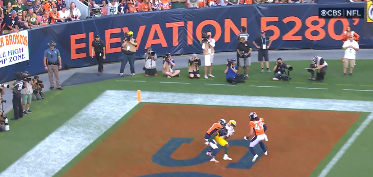
21 minutes ago, throwmesomepics said:
Also has anyone noticed that teams don’t fill in their end zones all the way anymore? There’s always a visible patch of green between the colored paint and the white paint and it’s annoying to see. I get why teams like the Rams and Chargers, and the Giants and Jets do it because they share the field and swap back and forth between the end zone paint. But even the MetLife teams didn’t do it until this season. And the rams and chargers had full endzone paint in 2020. Even in the London games this year they didn’t fill in the endzone paint.
Teams like Houston and Denver should have no excuse though.
just fill it in all the way

anyone know if there’s a new rule about endzone paint
I feel like this used to be somewhat common, but it's definitely making a resurgence. My hypothesis is that turf teams, mainly LA, started doing it to avoid trying to perfectly align the painted edge with the permanent white edge of the turf. If you look at the Houston image, the green-to-white line isn't exactly straight since the different colored fibers get bent in different directions. Painting right on that edge may be too difficult or time-consuming, so it's easier to give the painted background a little margin. Then, teams like Denver liked the look and hopped on the trend.
-
30 minutes ago, ruttep said:
The Titans do not deserve to wear these uniforms, I will die on this hill.
What if they called them Tennessee Oilers throwbacks?
-
1
-
 7
7
-
 1
1
-
-
First in-action look at the throwback Oilers helmets for the Titans. Initial thoughts – the stripes look extra large and modern helmets cause some awkward logo placements.
-
7
-
5
-
-
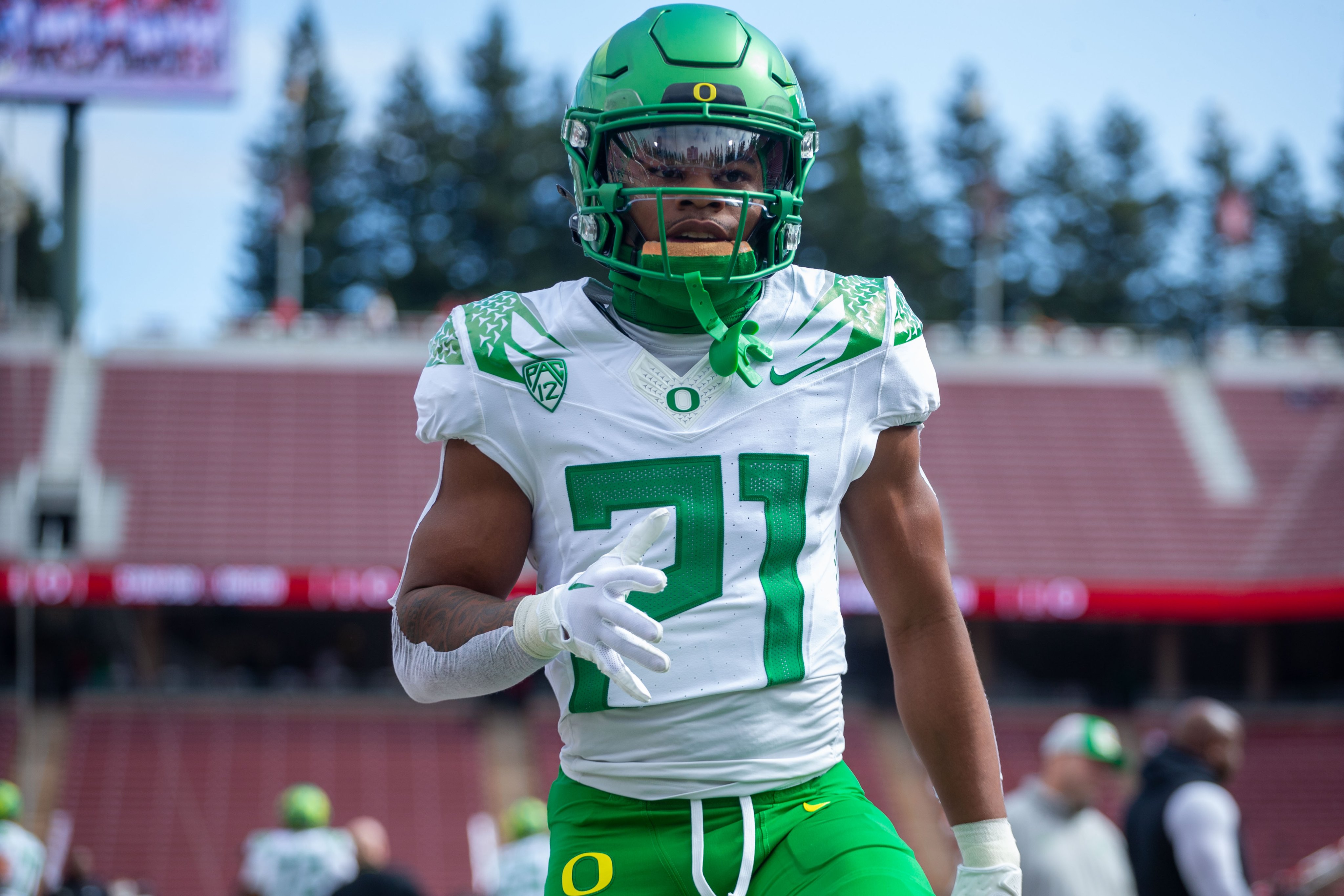
21 hours ago, upperV03 said:
The Ducks have finally revealed their long-awaited throwback uniforms:
They’re the exact same as the ones worn in 2014, just executed on the FUSE template. The only change is the addition of the front and back bumper logos. They’re going into a bye week, so this is an interesting time for them to do this reveal. They won’t be wearing them in their next game, at Washington, but they will be worn soon after that (very soon).
This is somewhat unrelated, but I noticed that Oregon has a custom neckpiece on their regular uniforms – not the standard mesh like all other F.U.S.E uniforms, including these throwbacks. Looking back, it seems like that's been the case since 2021.
-
3
-
-
29 minutes ago, upperV03 said:
Do we think it's just a coincidence that the V-seam is the same angle as the Nike swoosh
 on the F.U.S.E. template?
-
8 minutes ago, aawagner011 said:
Apparently Vanderbilt has multiple black jerseys. Their primary black jersey has white numbers.
Not the first time. The last uniform set also had a "black jersey but everything that's white is gold" jersey. Coincidentally, that uniform was also first worn against Kentucky back in 2021.
Also of note – this jersey is in the FUSE template, but the rest of the set debuted this year is in the Untouchable template.
-
2
-
-
1 hour ago, AndrewG70 said:
What a snarky article.
-
2
-
-
I'd always been a proponent of the Cowboys converting to navy/gray full time, but I'm starting to think that building around the royal/silver scheme could really work. Maybe find something between the saturated blue from Sunday night and the true silver, and the drop the black accents too.
Something like this could be a solid modern look.
-
9
-
-
1 hour ago, cajunaggie08 said:
herder to peel off a sticker and make it part of a trading card for the league to profit off of
Jerseys are being gifted to the players, not a part of some licensing deal like the MLB Debut patches. Credit to the NFL on this one, at least for now.
QuoteThe game-worn jerseys will be gifted to the rookies to further honor their first in-season game. (Source)
-
3
-
-
7 hours ago, aawagner011 said:
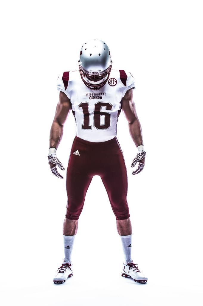
There was also that time Mississippi State wore Patriots themed uniforms because they played UMass at Gillette.
Then there's Notre Dame wearing Packers-styled jerseys for their game in Chicago against Wisconsinbecause becuase it was originally slated to be in Lambeau.
-
2
-
/cdn.vox-cdn.com/uploads/chorus_image/image/66506075/1174545295.jpg.0.jpg)


/cdn.vox-cdn.com/uploads/chorus_asset/file/23018401/1236552401.jpg)

2024 NFL Changes
in Sports Logo News
Posted
I didn't hate their previous use of gray, but seeing them side by side, the white does so much good for the uniform. It makes everything much more vibrant.