


jerrylawless3
-
Posts
339 -
Joined
-
Last visited
Posts posted by jerrylawless3
-
-
40 minutes ago, eRay said:
Has the SDSU work been scrubbed from the net? I can't find images anywhere, but I know they were out there at some point.
All the links are dead, but I found this article on the debacle.
I was wondering why so many schools have, or still, use PDW, and there's a nugget in there that may give an answer – $6,000 for a D1 rebrand. I'm sure they've raised their prices since then, but I imagine they still try to snag work by simply being cheaper than everybody else.
-
 1
1
-
-
12 hours ago, the admiral said:
I wonder if the Titans could have made Crapitals/Wizards slate blue work, maybe with Volunteer orange and Tennessee flag red as secondary colors.
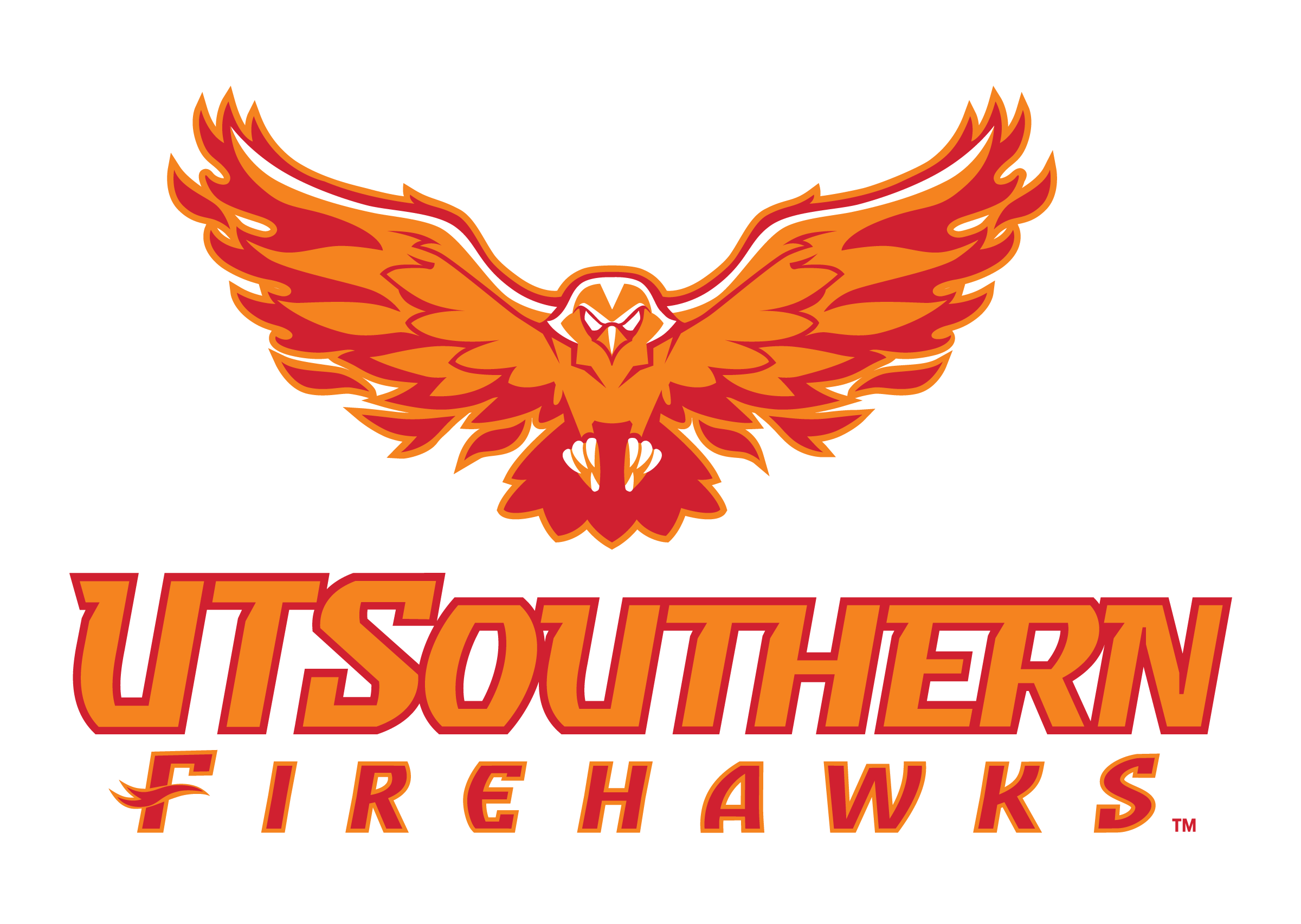
A school about an hour south of Nashville uses a similar concept, but with black and gray instead of blue. They recently rebranded to this name after joining UT system.

-
4
-
-
Put together an investigatory thread on the new Vandy uniforms. Lots of interesting questions surrounding this new set.
-
5
-
 2
2
-
-
19 hours ago, nuordr said:
Bevels, gradients on gradients, bitmap mountains, and vertically arched italic text – this branding has it all!
-
11
-
-
50 minutes ago, solvetica said:

Are the Gophers the most brand-unaware program in FBS?
-
1
-
1
-
-
I'm not usually one for plain field designs, but I was a big fan of the helmet stripe yard-line they used there for a couple years.
-
12
-
 1
1
-
-
21 minutes ago, upperV03 said:
I really don’t know what to make of the new Vandy pants, but I do think they’re dazzle. Kansas State is the only other big-name Nike program that wears dazzle pants, and those use a different template than these new Vandy pants. The pants that KSU have worn for the last several years seem like an altered version of Nike’s Elite 51 template, as they have the same exact upper thigh seams. I would say Nike makes them or at least provided specs for Ripon to use in manufacturing.
It’s possible that it’s the same for Vandy, but I find it a bit odd that it’s a different template. Very possible that they’re an actual Ripon template.
Vandy's pants have that same short horizontal seam reinforcement at the bottom of the thigh pad pocket seen in those gold pants and KSU's pants.
They may be an updated model from whoever makes Kansas State's pants.
My working theory is that Vandy wanted the gold to match the new branding, and Nike couldn't do that. Instead, they outsourced the gold pants and removed the gold stripes from the jerseys since they wouldn't match.
-
4
-
-
47 minutes ago, SCL said:
Are they buying the pants from someone other than Nike?
I didn't think so initially, but now I'm not sure. I can't find any other team wearing that particular model of pant – particularly looking at that seam running diagonally from the crotch then turning down to run parallel with the stripe.
-
Looks like Vandy will have new uniforms as well. These are a simplified version of there already simplified set from the last two years. The shoulder cap tri-stripes and unique block numbers are out, and extra large generic block numbers are in. Still on the Vapor Untouchable template as well
I think these look fine. I like the boldness, and I’m a sucker for color blocking, but it feels unnecessary – the old set was nearly perfect.
edit: It may be the lighting, but the gold pants also seem to be a darker, more true shade than years past.
-
13
-
 3
3
-
1
-
 1
1
-
-
Vanderbilt has inverted the logo on their gold helmets. They now accurately reflect the style guide.
-
13
-
1
-
-
For those wondering about the number font on Purdue’s new set:
-
According to the university website, both marks were designed by two members of the marketing team, so I'm not surprised by the observations above. Looks like a poor rollout, too – socials and athletic website still show old branding.
-
1
-
-
5 hours ago, tBBP said:
the pendulum has indeed swung back the other way toward traditional (okay, throwback, but traditional still the same.) Who'da thunk traditional would be the new trend???
I think it's swinging more toward simple, which is a double-edged sword. It can either lead to beautiful classic uniforms, or plain boring uniforms that lack any character or defining features.
-
4
-
-
54 minutes ago, MJWalker45 said:
Can you tell the head coach has been coaching at the high school level for a while? Hahahahaha!!! These are all horrible. IT's like someone got access to the old EA Sports teambuilder and just went bonkers with it.
I'm actually in Nashville, where he was coaching the past couple years. Let's just say he didn't face many budget-related restrictions at Lipscomb Academy – they had over $400,000 in athletic revenue in 2020, a part of $23M+ overall revenue, on top of donors and boosters.
Meanwhile, his uniforms at Lipscomb Academy were pretty reserved, save for their one-off grey and pink BCA uniforms. The only odd spot would be their helmets, which were more of a plum color than the true purple of their branding – an exclusive custom color by VICIS called "Mustang Purple".
-
2
-
-
Is this the worst new uniform set of the cycle? The combination of classic stripes and modern chest stripes is catalog garbage.
-
The SoCon just unveiled a brand simplification.
-
3
-
-
20 minutes ago, aawagner011 said:
Now that we’ve seen the Cincinnati black uniform, are we sure the white ones were placeholders? They are the real deal, in my opinion. Same template, same contrasting collars and cuffs, same font. Only difference I can tell is the chest wordmark is applied with a patch on the white jerseys whereas the black jerseys have a slightly bigger wordmark directly applied.
But why would the black jersey have the large, properly applied wordmark and the white have the patch? I think the likeliest outcome is they had the design down but wouldn't have had them in time for media days, so they cobbled together the closest approximation of the uniform that they could in the time frame given – plain stock white jerseys with black cuffs, and took care of everything else in house – the screen printed logo (which is a patch on the black), too small numbers (could have used numbers intended for basketball uniforms, for example), and the large wordmark patch.
I think they showed us the final design, just not the final production.
-
2
-
-
59 minutes ago, dgthree said:
Looks like UVM may have a new logo or updated its entire brand?
It's apparently been a thing since April. Looking at their website and social media, it doesn't look like it's gotten a lot of use.
-
3
-
-
38 minutes ago, Ted Cunningham said:
I'm not trying to be a jerk, but I do think the discussion is more nuanced than that. It has a lot to do with money, how it's spent on various sports at these schools, and how that does or doesn't mix with tradition moreso than strictly being related to tradition.
I think for some of the smaller schools without the tradition, it comes down to being cheap and lazy – or maybe not staying up to date with their brand standards or having a solid custom typeface.
I was at Austin Peay while their new brand was still sort of fresh and new, and they took a lot of care into making sure everything aligned with the brand standards. All uses of logos and branding had to go through the Assistant AD of Communication and Brand Advancement for approval – not even just to ensure it was the right logo/colors, but to make sure it was appropriate for the placement. Some assets couldn't be placed on apparel that would be prominently displayed on broadcast, and some could only be used on one uniform set, for example. Unless it was a throwback design, nearly all sports had the custom typeface on uniforms and practice gear. Some teams, mainly football and basketball, would go a little rogue, but overall it helped create a fairly cohesive look across the department.
-
4
-
-
40 minutes ago, cajunaggie08 said:
huh, i wonder if Adidas "owns" the font since it was a Reebok creation
37 minutes ago, MJWalker45 said:I think Nike offers a similar version as well ,not just for the Texans, so it may not have been copyrighted properly.
This has piqued my interest, so I took a look at the Adidas Catalog. Looks like it is the "Western" typeface.
When you see how few stock options there are, it makes sense why all these uniforms get so repetitive. I wonder why more schools don't use their own custom typefaces.
-
2
-
-
Arkansas State with new uniforms. Looks like they got a hold of the Texans' number font somehow.
-
3
-
 1
1
-
1
-
-
I think it's a pretty good uniform, but it feels like one of those apparel-only designs made its way into an on-field uniform. I like the heathered pattern, the racing stripe, and even the limited use of black.
I think a better helmet option would have been blue with white decals outlined in black, to match the numbers, but trying to match a blue helmet to the pattern color on the jersey may have been difficult. They could have even done what the Cowboys did and double-dipped to use blue helmets with their throwback as well.
-
2
-
-
2 hours ago, PERRIN said:
Might be a scorching take but this throwback set is a just a tiny bit overrated. Still very much worthy of bringing back and a damn good uniform, but I honestly prefer the Vikings' current set to these by a good amount.
100% agree with this take here. Their current set is unique and has subtle design elements that tailor it to their brand. The throwback set is great, but it's just stripes.
Their current uniform does a great job of blending classic uniform elements with unique flourishes that make it more than just something out of a catalog.
-
8
-
1
-
1
-
-
8 hours ago, Discrim said:
So...I know logic doesn't completely apply considering we're looking at an anthromorphic horse, but we aren't gonna talk about how this horse is somehow holding a sword with a hoof?

I also can't fully comprehend what's going on with his mouth. Does he have a severe underbite?


/cdn.vox-cdn.com/uploads/chorus_asset/file/23266859/usa_today_17454453.jpg)


College Football 2023
in Sports Logo News
Posted
Not an old pro team, but Arkansas mimicked the Cowboys back in 2017 for the Southwest Classic in Jerry World. Still think this is a unironically great look for the Razorbacks.