


Crabcake
-
Posts
4,101 -
Joined
-
Last visited
-
Days Won
1
Posts posted by Crabcake
-
-
Everyone seems to be nuts over the avs' mountain striping that they had pre-edge. While it looks better than what they have now, I don't think it's absolutely amazing, 10/10, best striping pattern in the league. I have seen great avs concepts here that don't use the mountain striping.
-
I'm a classic guy, but I love the Buccaneers helmets. There's just something about them that dosen't seem to work for any other team.

The helmets aren't the problem, I think they're great. The problem is the jerseys and those alarm clock numbers.
-
Yeah the dark jerseys from that era were actually blue, not teal. They look lighter in that pic. Here is a video of them in those jerseys from the '98 eastern conf. finals against Hasek and the sabres, this is their actual colors: https://m.youtube.com/watch?v=T4d6qjVzASI
-
I must be the only one who doesn't like these. Yeah, the primary jerseys aren't great, but this is incredibly dated and should not become the permanent jersey.

I know I've said this before, but I would have the Caps look like this:


The red, white, and blue thing, I get it, nation's capital and all that. But this was the color scheme and look I grew up with watching the Caps. To me, this is how they should look. We don't need the all black uniform with the Capitol Building logo on the front, no thanks. (And ps, I'd wear the white jerseys at home)
Agreed. That blue jersey is probably my favorite caps jersey of all time, I have one at home.
-
Honestly, my problem with these unis wasn't the Fisherman, it was the jerseys themselves. If the Fisherman was in normal Isles colours on a traditional hockey sweater, it would have been a hit.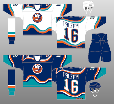
If the Islanders had used this 1997-98 style uni originally in 1995 without the Gorton's Fisherman logo in the middle, it would have been very well received and lasted a few years longer.
I totally agree. The logo itself isn't bad, and neither are the colors. But there are two main reasons, imo, why this jersey was such a colossal flop:
1. Followed one of the sharpest and most classic uniforms the NHL has ever seen.
2. The wave pattern and how the numbers are tilted to make it look like waves.
These two reasons are why I still give this uni a 1.5/5.
-
I don't like collared soccer jerseys.
At all.
-
I must be the only one who doesn't like these. Yeah, the primary jerseys aren't great, but this is incredibly dated and should not become the permanent jersey.
Get rid of that and PLEASE give us an updated blue jersey!
-
You win the internet today my friend.
Also notice how that looks like one unhappy 18-year-old.
-
Roundel logos are great.
I think they're good, so long as they're not too generic.
Ditto. I also like roundel logos because they're easy to make. I made a roundel logo for a soccer team in MS Word and then recolored it in Photoshop.
-
I'm going to take you one further and say that I LOVE the orca logo.I don't care for Johnny Canuck at all.
Its an alright logo, but anything's better than the stupid stick-in-rink (yes, even the orca is better).
Agreed. I actually like the orca logo.
I actually like the stick-in-rink logo, but everyone raves about what a great logo Johnny Canuck is, and why they need to put it on the primary, blah blah blah. Give me the stick-in-rink logo or the orcs any day of the year.
-
 1
1
-
-
I don't care for Johnny Canuck at all.
-
Just replying to a few of the recent posts all at once...
I love the idea of Miami using the red-orange more. The red-orange shirts and socks were only used a few times in their first year but they looked gorgeous. The red orange caps came back for like two or three games last season but according to the team have been shelved yet again. It's the teams best selling piece of merchandise yet they neglect it on the field. At least they'll be bringing back their underrated road grays this year.
As for the Mets I can't understand how anyone, especially their fans, would like any single thing they've ever done with black. They look so sharp in blue and orange the black is an absolute abomination in the middle of that.
Cardinals do have a simplistic jersey but it's that clean look that I like. Maybe its because despite their being almost nothing going on beyond the chest logo, that logo is so detailed interesting and timeless that it makes the whole look pretty sharp.
The ONLY reason the BFBS jersey is better than their current road alt is because of that horrendous gray script. All the Mets would have to do to make the BFBS jersey inferior would be to make the gray script orange.
-
Of all of the Marlins' color combos, my least favorite is the white jersey/orange hat look.
-
Love the current fc Dallas primary with the sublimated hoops, hate the new secondary with the thin hips and new advocare logo.
^ hoops
-
Also, I don't like the capitals' retros uniforms. I'd much rather them wear their regular unis and wear a modernized version of their blue jersey from their Stanley cup run in '98.
-
I don't mind the fact that adidas makes every mls uniform and I love the mls number font.
I don't mind the Miami Marlins' current unis. I actually really like the Padres' current unis.

Players in the "wrong" uniforms
in Sports Logo General Discussion
Posted
Soccer edition: